The design industry is an ever-changing, evolving, and organic being. Each year, the designers get a new perspective on design sense given the circumstances, consumer behavior, and general audience trends for the last year. So, what graphic trends should creatives be expecting in 2021 – a year that succeeds the dreaded 2020.
To answer that, we’ve sampled opinions and researched expert standing on what 2021 holds for graphic designers.
Table of Contents
Hint: It’s awesome and will bring freshness to your designs
Not to mention, while many designers played safe in 2020 because of unpredictable consumer behavior, this year will be more hopeful. It means that you’ll have more creative freedom to experiment around the trends and fit them as per your brand positioning.
But before we start, here’s a necessary clarification. Graphic design isn’t just the design you see on websites. That is more a part of the UI. Instead, graphic design is a vast field that includes all types of graphics you see around. It includes book covers, social media posts, the graphics used in packaging materials, and even websites. So, in essence, it consists of all designs made to communicate with the user.
With that in mind, let’s analyze and check the 10 graphic design trends that will be reigning in 2021.
1. The revival of symbols
Design is all about communication. And effective communication involves every aspect, even the tiniest things that we tend to overlook. As it happens, one of the most ancient and impressive means of communication are symbols.
We’ve been using them since, well, as long as humans have existed. At the same time, symbols stand for more significant meaning. Its stands for universality. And the way 2020 unfolded, it comes as no surprise that in 2021, we’ll be seeing a revival of symbols in designs.
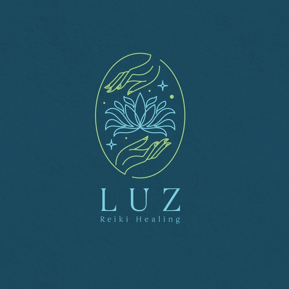
Take this symbol logo as an example. It is a logo by Vraione for a healing brand. Now notice how the designer has cleverly used the universal symbol of flowers and palm to signify healing. We’ve seen this imagery before as well – mostly associated with natural healing or earthly aura. This symbol as a healing brand logo strengthens the brand image and develops an immediate connection with the audience.
This way, designs become more recognizable and influential. You can form immediate connections with the audience based on the symbols they would most probably already know.
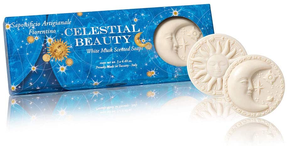
Here’s another example of using symbols in the design. This Italian artisan soap brand, Saponificio Artigianale Fiorentino, uses celestial symbols to enhance their soap bars’ packaging design. Italy is a culturally rich country, and the use of symbols to appeal to an international audience is nothing short of brilliant and beautiful. The soap brand also has another variety of soaps – all marked with beautiful and universal symbols.
So, in 2021, we’ll be seeing a lot of symbols being incorporated into the design. And that’s primarily because these symbols are universal and stand for growth and a sense of resilience.
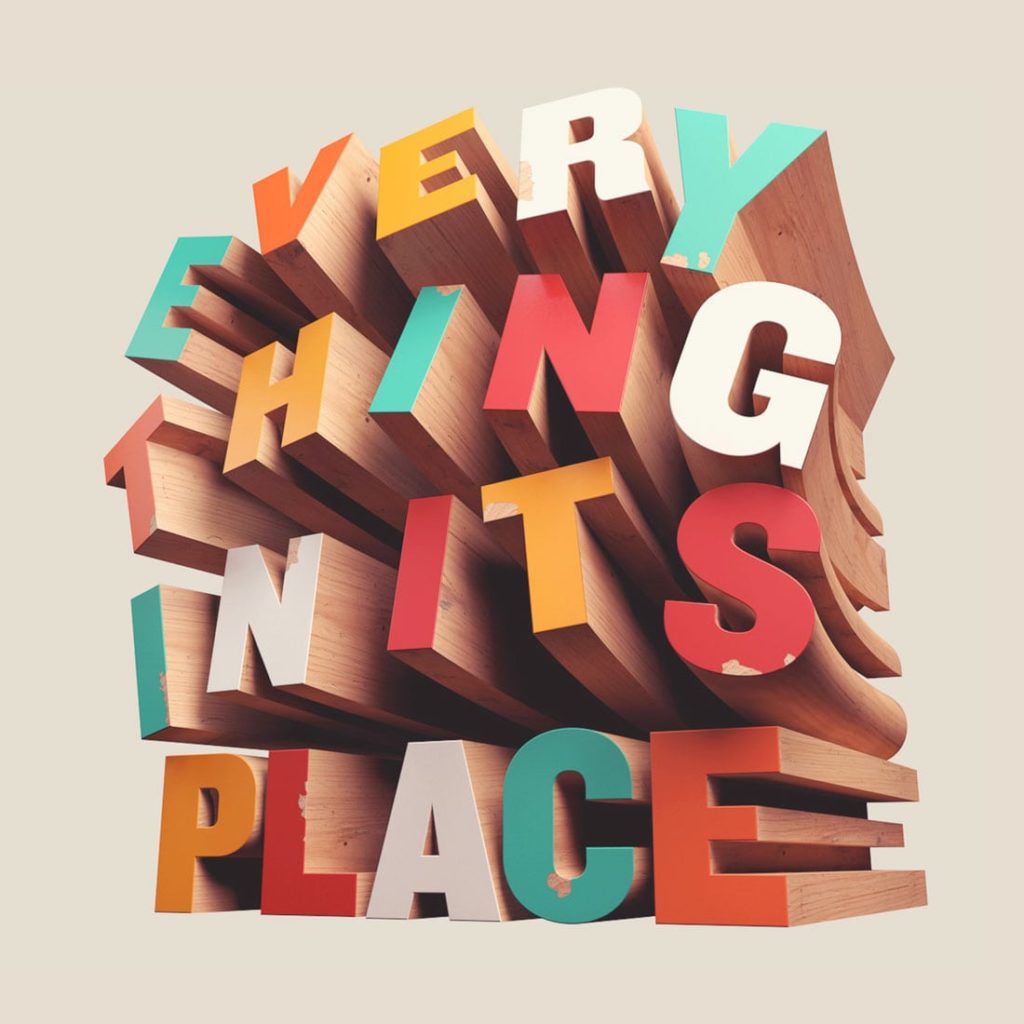
2. 3D illustrations and typography
3D illustrations have been a part of the prominent graphic design trends for quite a long. However, this year, designers are also creating 3D typography. In fact, judging by some of the leading designers on Behance’s designs, it will be quite big!
This design by Life at Home, a Behance designer from Italy, showcases the precise use of 3D typography. The events of the pandemic inspire this series. However, there’s no denying the fact that it demonstrates sheer innovation and creative techniques. And that is exactly what this trend is about.
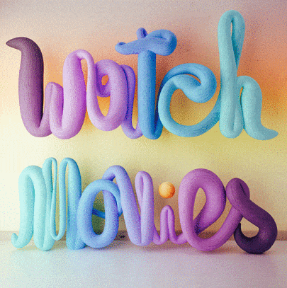
Here’s another example of the 3D typography trend in use. The best part about this trend is that the effect can be applied to almost any font. So if you want to rely on popping elements to gain your audience’s attention, this is the key to do that.
3. Geometric shapes for the win
Our next trend is one of my favorites – geometric shapes. This trend speaks of creativity from every aspect. It’s a simple showcase of creative abilities at work. All you need to do is take a simple geometric shape and evolve it into something creative. In turn, this becomes a representation of your idea.
See this geometric icon that we made for GoVisually. See how this simple icon represents the idea of creativity as a whole. This is what this trend can spark in designs.
Similarly, you can also use 3D geometric blocks or shapes to enhance the appeal of a design. Or you can stack geometric shapes atop each other to create an aesthetic effect.
View this post on Instagram
Look at this design for Casa Espresso Coffee Roasters by The Archipelago, a branding studio in the UK. Notice how the shapes are stacked upon each other to enhance the visual appeal of the product.
Pro tip: Neutral tones blend well with this trend.
4. Retro meets futurism
The retro vibe of the 70s and the 80s surprised us when it started becoming a part of modern designs. And in 2021, we’ll be seeing reform in this design’s sense; retro-futurism. This is the theme where sci-fi patterns and retroelements meet to make a spectacular design.
This theme’s inspiration comes from the dream of a bygone era that the future is optimistic and full of flying cars or robots. But evidently, since that is not the case, it can still be implemented in the way designers are creating new designs now.
The exciting aspect is that this theme can be spotted in architectural designs, such as the one below from a Kuwait mall.
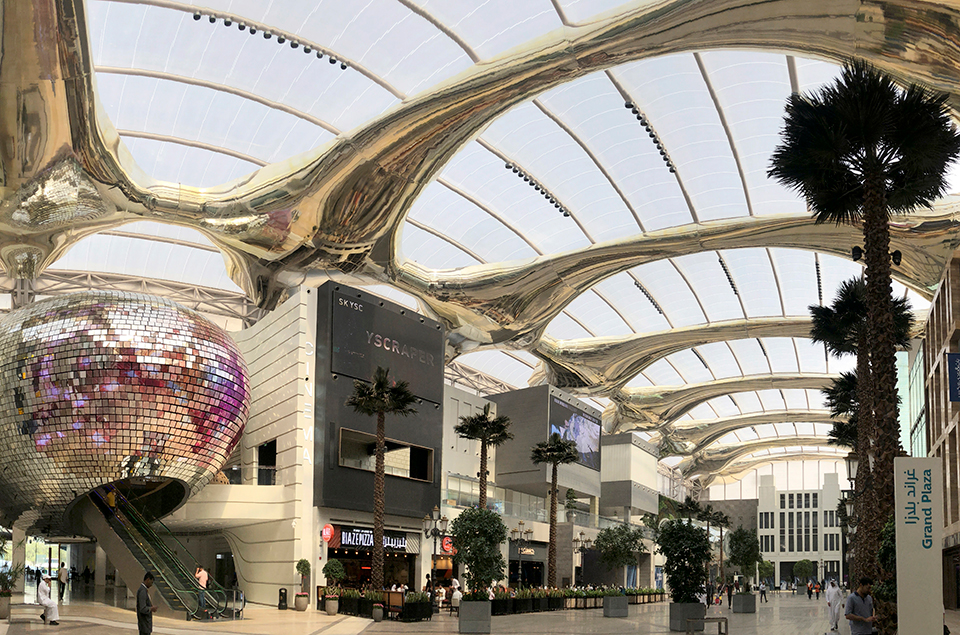
See how they’ve infused small elements like a retro disco ball with a futuristic layout? That’s what we’re talking about.
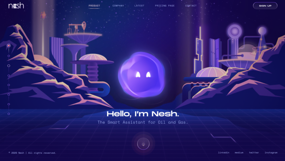
Here’s another example of a retro-futuristic design by Serhii Polyvanyi, a designer on Dribble. This is a layout for a website, but look how the designer has cleverly leveraged the theme to combine two different things; smart assistant (a new technology) and oil and gas business (an old trade). This is what the retro-futuristic theme is all about. It’s the connection between what has happened and what is yet to come. More importantly, how the gap between the two can be bridged.
So what does this mean stylistically? A lot of bright colors are infused with technology. We would also see computer-inspired typography and curved lettering with elements of a futuristic place.
However, there’s a fundamental difference in this theme. Rather than glorifying an unachievable future, these designs aim to promote a more inclusive future with newer technology but the same people.
5. Enchanting surrealism
If you were to create a design that makes sense and doesn’t unless you really look into it for meaning – you’d have created yourself a surrealistic design.
Surrealism, in essence, is the juxtaposition of different life realities. It came as an artistic and literary movement after WWI. And the chaotic events of 2020 has warranted a demand for it again. The pandemic felt like one of the worst nightmares coming to life, as was the case with the circumstances when surrealism came into being. So naturally, designers are drawn to bring in those elements as well.
But this theme is mostly being used for book covers, product packaging, or posts on social media. Web designers aren’t really fondly incorporating it because it might confuse the audience type and become counterintuitive.
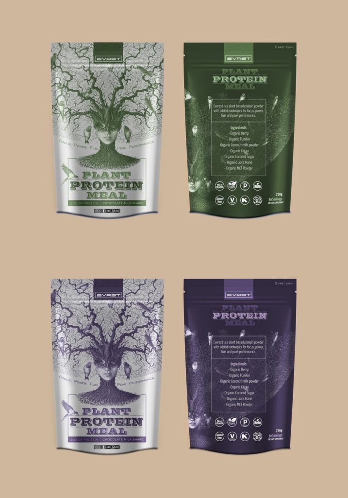
Take a look at this packaging design for a plant protein meal by Recreo Studio. Notice how surrealistic aspects are used to convey a message of growth. Also, see how the designers have used a human figure infused with branches from a root to signify change. They have taken two concepts of human growth and plant growth to portray a single strong message. This is what surrealism designs are about, and Recreo Studio has done a great job at using them to convey the brand message.
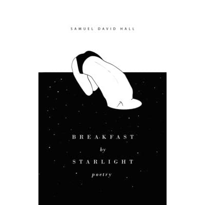
Similarly, take a look at the illusion of this book cover designed by Boja. Again, notice how the use of contrasting images enhance the appeal of the book. This is one reason why this theme would specifically go well for book covers, album covers, or art posters. That’s because they can be cleverly designed to bring out curiosity among readers and the audience.
6. Abstract and fine art infusion
A design is typically used to convey an understandable meaning and communicate to the audience. That is one of the primary reasons why a designer might not necessarily be an artist.
However, in 2021, we will see a blend of both. The traditional boundaries of art and design will be infused with the art infusion trend. Again, this is a design trend that would mostly focus on either wine labels or cosmetic packaging. Or simply product packaging where there’s more room for creative elements to breathe.
View this post on Instagram
Take a look at this bottle packaging for Off-Piste Spirit by a branding agency, Kingdom and Sparrow. The brand is focused on creating drinks for adventure lovers, and that is perfectly captivated by design. Notice how the designer has also incorporated a unique typography style to enhance the product’s visual appeal. The use of a mountain painting and bold typography is a great way of changing young and fearless!
View this post on Instagram
This art piece is a bottle design by none other than Mr. Black Spirits, a leading coffee liquor producer. Notice the choice of color and the bird painting that blends to produce a deeper aesthetic.
Do keep in mind that fine art or abstract has always been associated with a fine taste in culture or class. And that is what can be spotted in these packaging designs.
They might look a bit refined for the modern taste. But then again, that is the kind of target market that these designers are targeting. And without a doubt, the fine art theme is here to stay in 2021.
7. Natural elements and sustainability
In a new world marred with the aftermath of a pandemic, it’s a fact that people are more drawn to spending their time inside their homes. And that leaves room for yet another one of the graphic design trends to kick in – natural elements and sustainable designs.
This trend is all about bringing the nature of the earthy tones in design patterns. This can include leafy patterns, illustrations of natural scenery, or even earth-tones in different shades.
View this post on Instagram
Check out these packaging designs for a coffee brand by Abby Kwon. While this is a mix of several other trends, such as using experimental typography, the overall theme chants natural elements.
The idea behind this trend is to bring back the connection with the outside world in every little thing that we consume. The best part? This trend isn’t confined to environment-oriented products or brands. So you wouldn’t only see it in products that are organic or natural. Instead, many cosmetic brands or even website layouts are using it.
One of the primary reasons for that is to impact the audience with the serenity that comes with natural elements. Don’t believe us? Check out this packaging design for a bar of chocolate by Mono Studio.
Again, notice how the leafy patterns dominate the overall design sense. It is paired with earth-tone color schemes that bring out the overall breathless yet calm design effect.
The idea of developing a connection with the outside world will be dominating graphic design trends in 2021. The in-house designer at Pentland Brands, one of the leading branding agencies, also believes in this power trend.
“Consumers are going to need to obtain some form of physical connection with nature and with fellow human beings to improve mental health. Apps could aid this.”
8. Social consciousness in designs
This trend had been in the making for quite a long time now. It was first seen in the 1960s to empower people. And in 2021, we will see a revival of it. However, social media graphic designers are mostly using this trend to contribute to their part in making their community better.
From movements like the Black Lives Matter to a reminder to wear masks, this trend is all about making people socially aware through designs.
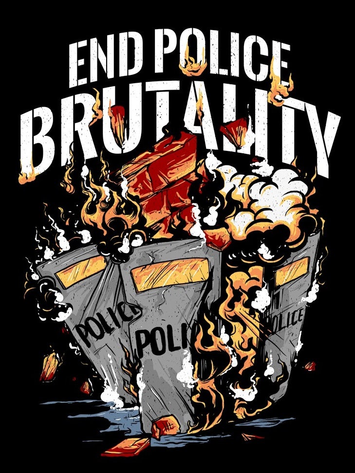
This design by Wiwincahayani portrays a clear and direct message in favor of the BLM movement. Notice how it is paired with contrasting typography and stark colors to affect the audience even more.
Similarly, many designers and brands are using this trend to strengthen a cause. The following design by Mary DeArment is a phone cover case. But the message is to promote peace amidst a chaotic world, and that is wonderfully executed.
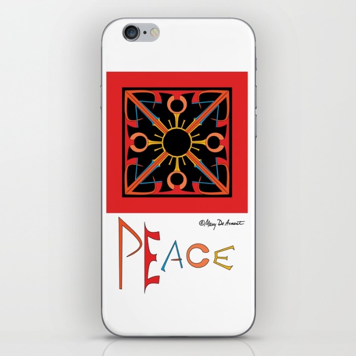
Notice how a bold color scheme is infused with typography to bring out the desired effect. This phone cover is from her Society6 collections. Her goal is to inspire and motivate people to think with hopefulness and peace. And that is visible through her designs.
9. Experimental and bold typography choices
So far, we’ve discussed the use of typography a lot. We’ve seen how typography is used in several graphic design trends to enhance the appeal. And with that, it’s time to identify it as a trend in its own right. A lot of designers rely on experimental typography alone to get their audience inspired.
View this post on Instagram
This can design by A Can A Day is visual proof of how typography alone can be an absolute winner in designs! Notice how the designer has used a striking orange color to bring out the playfulness in the design.
View this post on Instagram
This is another powerful and creative example of bold typography in use. This design is by Annemarie Buckley, an artist, and designer from Vermont. The design is for Shacksbury, a cider brand based in Vermont. The designer has paired it with 2D illustrations that depict the scenery of Vermont.
10. Playful and optimistic designs
This is one of the most surprising graphic design trends for this year. However, it’s very much happening.
The interesting part about this trend is that it can be portrayed in various ways. You can use emoji designs within this trend to bring out a true playful image. Or you can rely on cartoon illustrations to do the creative bit.
View this post on Instagram
For instance, this packaging design for Mikkellerbeer is a fine use-case example. The design uses bold and bright colors to gain immediate attention. It is paired with cartoon illustrations that appeal to the younger demographic even more.
Again, while designing, you must keep your audience in mind. While the best part about this trend is that it appeals to almost all demographics, you can still keep it more targeted for better results.
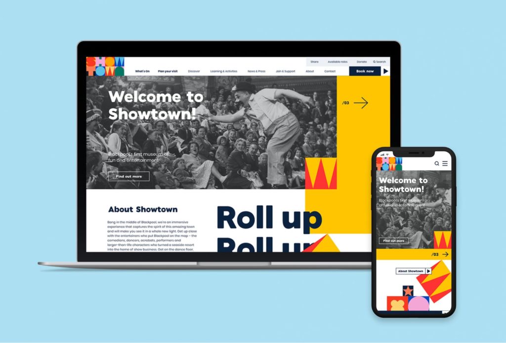
Here’s another example of playfulness at rising! This website for Blackpool’s fun and entertainment museum shows that Showtown is literally becoming the town’s talk for its optimistic design. This layout is all about fun and positive vibes from the use of bright colors and contrasting slides.
Final Word
In 2021, graphic designers all around the globe are making graphic design trends more responsible. You must have noticed that almost all of these trends are either reconnecting to nature or are playful. That’s because with everyone moving towards a hopeful future, even the designers are happy to make a few tweaks in their design process.
However, at the same time, many of these graphic design trends have been in use for many years now. So take a design direction according to what suits your taste or the agency you work for the best.