2020's Top 20 Google Font Pairs For Your Next Project
There was a time when the content of every website looked similar. And that is because the typography was so similar to each other, one could hardly make out the difference.
As a designer, you may always be overwhelmed with the idea of choosing the right font for your design project. However, as and when the situation arises, you need to view the larger picture.
The challenge of selecting the right combination of fonts will always be there, hence we bring to you the best Google font pairs or combinations to try out for your next project.
1. Montserrat and Oswald
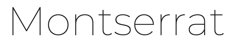
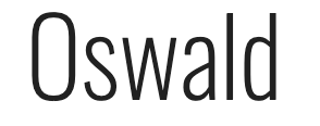
The Monsterrat font was designed in agreement with the urban typography of the 20th century. The generous spacing between the letters is one of the striking characteristics of this font and makes it so convenient to follow. On the other hand, the Oswald font is known for its narrow appearance in spacing and letters. Together, they make an ideal impact in the mind of viewers.
2. Merriweather with Oswald
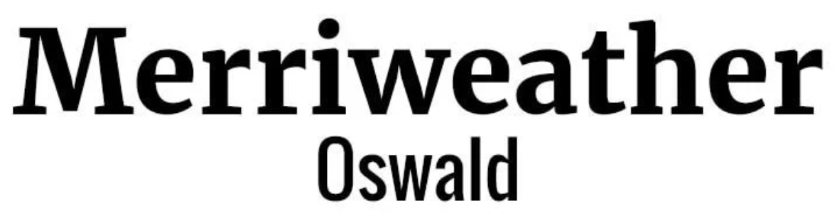
This is another ideal font combination for your classic design project. Easy to read and one that can be altered for its height and width, the Merriweather font is a designer's delight. Paired with another sans serif font, this combination is sure to stay.
3. Montserrat with Merriweather
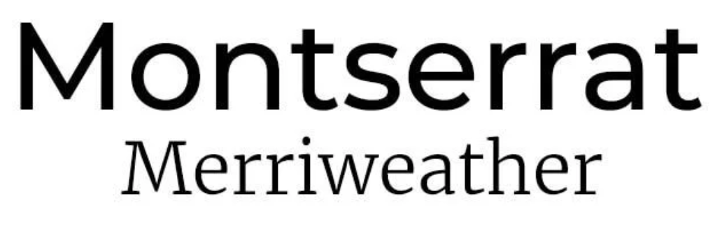
Considered to be a legible and streamlined font, Montserrat was the brainchild of Julieta Ulanovsky. And when paired with a serif font like Merriweather, the design appears simple yet striking.
4. Raleway with Lato
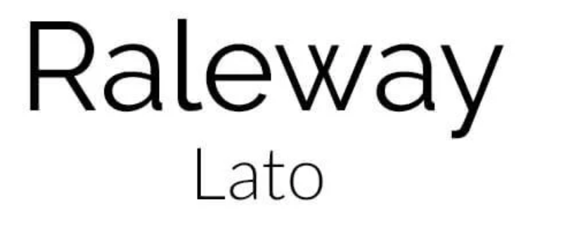
The Raleway font is characterised by its simple and stylish design. It is a versatile font and when paired with a font style like Lato that is equally functional with its thinner and smaller text, it can undoubtedly be passed as a winning combination.
5. Elsie with Roboto
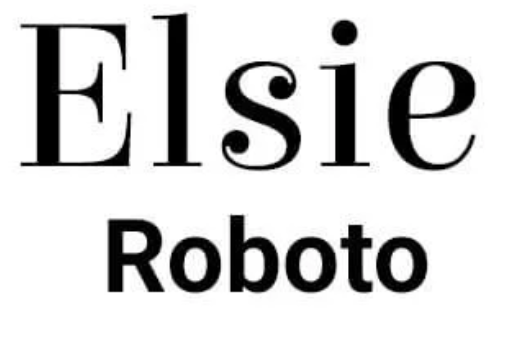
With its free-flowing design and serifs, Elsie is a beautiful font that was created to celebrate women and will immediately captivate your attention. It looks even more striking when paired well with a simple font like Roboto.
6. Dancing Script with Josefin Sans
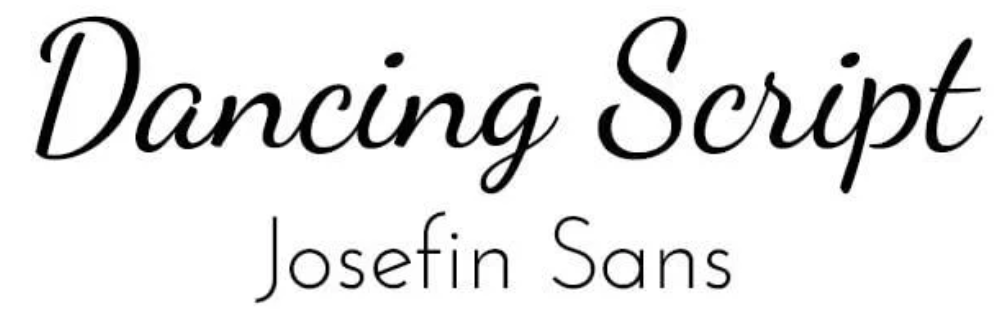
True to its name, the font is free flowing and an ideal choice to be used in creative designs. Most of these uniquely designed fonts need to be paired with a simple serif font and hence Josephin Sans serves as the ultimate option.
7. Abril Fatface with Roboto
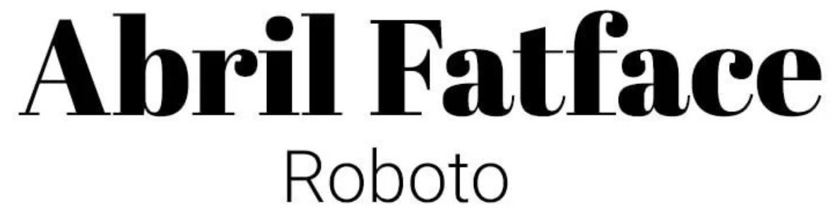
This is again a very unique combination of fonts - the Abril Fatface font style is known to capture your attention immediately with its bold lettering and Didone style serifs and another sans serif style font, Roboto is known for its clean appearance.
8. Corben with Nobile
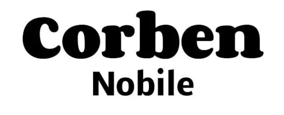
Corben is a modern day font with its many interesting curves. Any design that uses this font will surely stand out from the crowd. This font is ideally paired with something as simple as Nobile.
9. Spirax with Open Sans
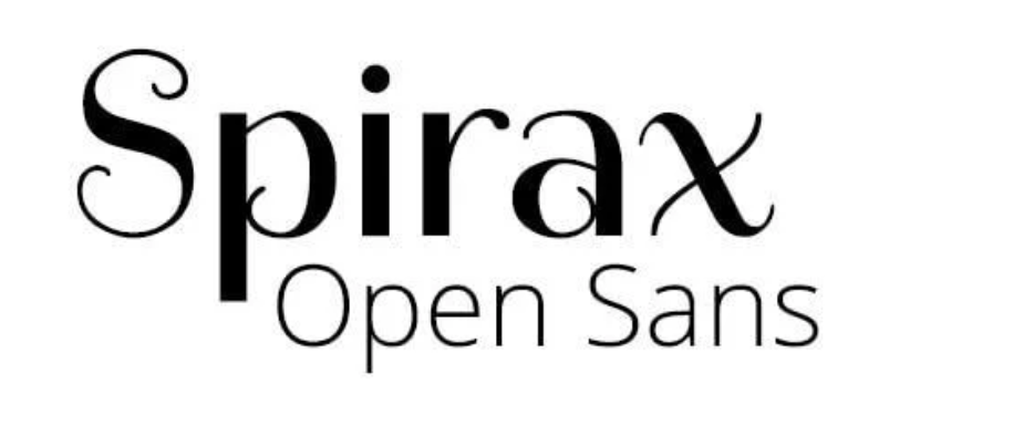
The Spirax font style will immediately transport you to a world of intense storytelling and mystery and if it is paired with something simple like Open Sans, it will surely lead to a winning design.
10. Wendy One with Lato
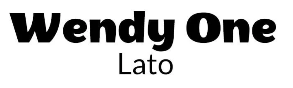
Alejendro Indro is the brain behind the bold and quirky font style, Wendy One. The modern appearance of this font style demands it to be paired with a slim and easy-looking font like Lato.
11. Baloo with Montserrat
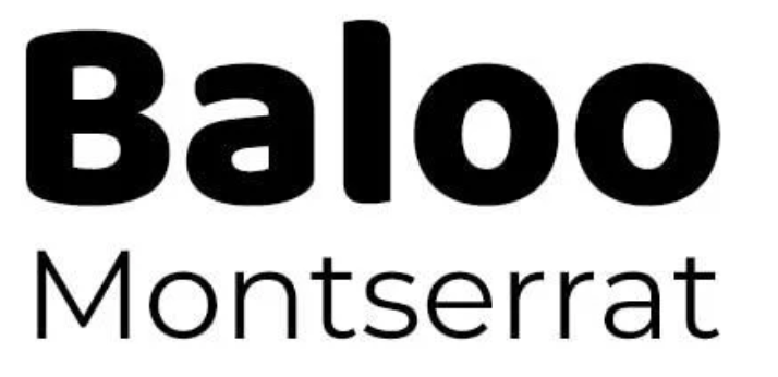
This font is uniquely characterised by its round and bubbly style and works perfectly with something lightweight and simple like Montserrat.
12. Amaranth with Open Sans
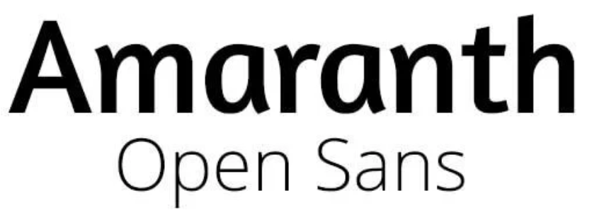
This font raises the interest level with its slightly curved edges. It can very well be used across a wide variety of design applications and is ideally paired with a simple sans serif font like Open Sans.
13. Palanquin with Roboto
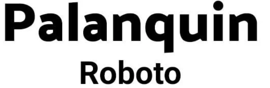
Considered to be one of the most versatile typefaces, the Palanquin font is designed by Priya Ravichandran. It can be used in a variety of widths and heights and will look best with a similar font style like Roboto.
14. Sansita with Open Sans
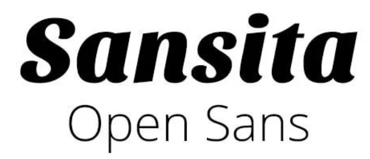
This font created by Omnibus Type, is characterised by its striking and wavy design pattern. It is available in a wide variety of sizes and looks best when paired with a simple font like Open Sans.
15. Playfair Display and Fauna One
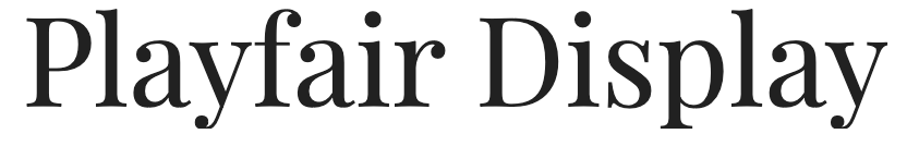
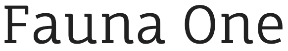
With ultimate grace and sophistication of the 18th century, the Playfair Display is one font that is a perfect fit for certain graphic designs. And with its contrast strokes and soft terminals Fauna One is a font type which can be easily followed in bulky paragraphs and headings alike. Together this is a killer combination.
16. Six Caps and Josefin Slab
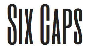
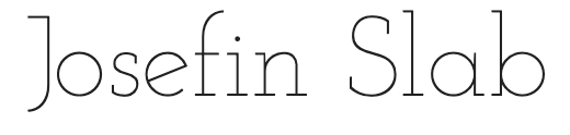
Designed by Santiago Orozco, the inspiration of the Josefin Slab font is derived from geometric sans-serifs. When paired with a highly condensed font like Six Caps, it serves as a perfect balance that is typical of any ideal font pairing.
17. Alfa Slab One and Open Sans


If you want a font style that demands attention like none other, then go for Alfa Slab One. And if you wish the remaining text to be equally prominent, pair it with a simple serif font style like Open Sans in smaller weights in sub headings and body text. The end result is an attention grabbing message.
18. Amatic SC and Josefin Sans
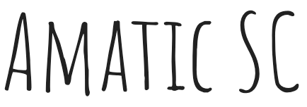

If you want a font combination to work well in a friendly and interesting design, then this should be your go-to option. Amatic SC is a freestyle typeface that can be used to communicate openness and informality whereas Josefin Sans is an elegant font without much fuss.
19. Playfair Display and Source Sans Pro

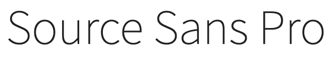
The designer of the traditional style Playfair font is Claus Eggers Sorense. It perfectly complements another simpler font style, Source Sans Pro. This font pair is not just visually appealing to your sight, but also lends a feeling of excellence.
20. Oswald and Quattrocento
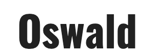
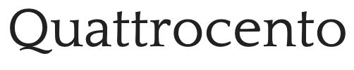
This is a very unusual font pairing in the sense that Oswald is an impactful sans serif font while Quattrocento is quite a contrast with its elegant typeface, which is an ideal choice for subtle body text.