As a graphic designer, you’re always on the lookout for better design techniques. And this means incorporating all the latest trends within your design. Today, we’ll be discussing typography trends that we can spot in modern graphic design and what that means for graphic designers.
But before we dive into it, it’s important to understand the purpose of a design.
One thing that we should clear right away is design is not necessarily art. And there’s a strong reason behind that. It’s because art is open to interpretation and can be subjective. However, the purpose of a design is to communicate clearly, and that is why its message has to remain objective.
Still, it doesn’t mean that you can’t experiment with your design. Yes, you can make it artistic and aesthetic, as long as the meaning remains.
This is where typography kicks in!
It’s one of the most important ways you can modify your designs and transform them.
Table of Contents
What Is Typography?
So what exactly is typography?
If you’re a graphic designer or in the designing field, you’d probably know the answer to this question. Still, let’s do a quick recap and refresh your memories!
Typography refers to the arrangement of text in a design. This doesn’t only include the font but also how the designer uses it and incorporates it within the design.
In many cases, typography highlights the design’s message most accurately and catches the targeted consumers’ attention. And that is why the text needs to be both clear and aesthetic. Most importantly, it should represent the nature of the brand well.
Now with the ever-changing market trends, typography trends evolve as well. This means that you need to keep looking for designs that keep your audience engaged. However, do keep in mind that there’s nothing like perfect typography. It all depends on your brand image and design needs.
5 Typography Trends To Look Out For In 2021
There are several important reasons why typography is important in a design. And because of its importance, subsequent typography trends evolve (some of which we will be discussing today!)
For starters, typography is essential for representing a brand. It helps in reflecting the brand personality and capturing the consumers’ attention. For example, Nestle has changed its logo and font several times to depict the brand image better. This is why selecting the right typography is crucial to retaining your brand image.
You can also leverage typography to make your design stand out among a crowding competition. Used to make an image or a design stand out.
So let’s move on to look at the 5 typography trends!
1. Animated Typography
Keeping up with the fast-paced typography designs and adding a new flair is not easy, considering how fast trends change.
However, animated typography is amongst the most common design trends. Lettering that moves, switches, or is affected by a hover state is becoming more common in the typography world. And we have recently seen the latest variation of animation stepping up high; kinetic animation typography.
See the video below? Yes, that is kinetic animation typography.
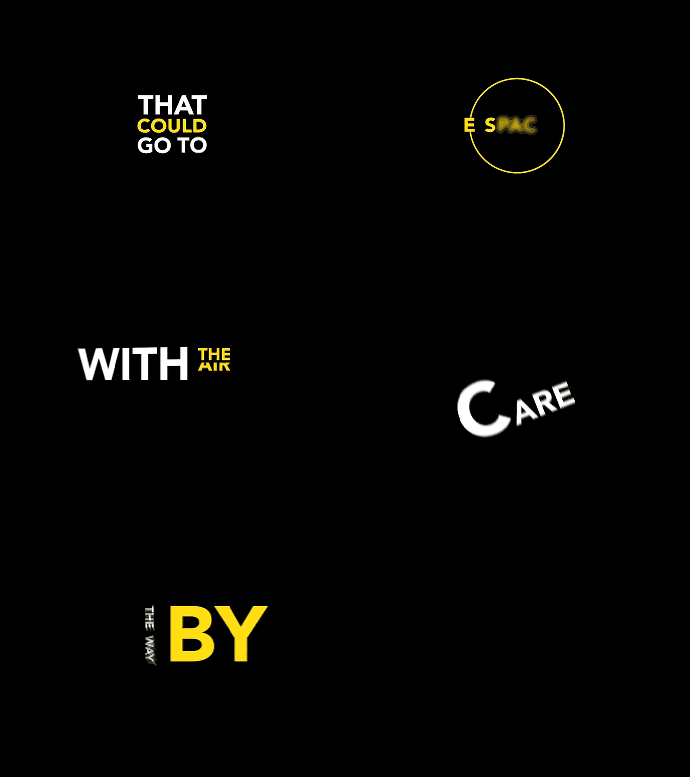
Notice how it keeps you hooked the entire time! You can use this trend in your marketing campaigns or for important announcements.
Features of an Animated Typography
- It’s essential to reflect on the platform through which consumers can read the details while animating text. For instance, a few animated components don’t fit well or aren’t exactly compatible on all mobile devices yet. So make sure that while working on an animated typographic design, you ensure the motion-work functionality.
- Also, keep the user interface simple and enjoyable so that it’s easy to follow.
- For typography animations, consider speed meticulously. If the text’s movement is too sluggish, the viewers might get impatient and click or scroll away, defeating the entire purpose. If the text’s movement is rushed, the viewers might not get the message and miss the point. Therefore, establishing the right speed is very important. The testing process will assist you in deciding the optimal speed for your interface.
- Lastly, keep the message simple and straightforward. If you try to communicate a complex idea through this trend, it might be lost in animation.
2. Layering with Other Elements
Text and other components are usually kept apart in most designs. That’s because infusing them can often create a chaotic image for the consumer or blur out the purpose.
However, with the changing trends in the design industry, designers are no longer afraid to let textual and other components collide. The collaboration of the two styles and its outcome can be super interesting, as it can also make people concentrate more on the words on the page and grab their attention.
Don’t believe us? Take a look at this image from Pinterest. Notice how the text has been used to highlight the image even more.
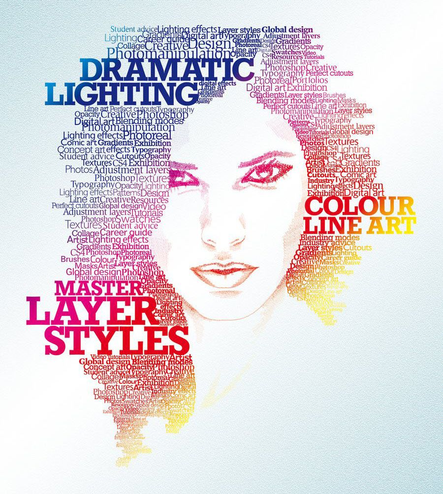
This trend is widely being used in various design types, especially for designs that have a deeper message to convey.
Different text types that overlay or intersect over boxed images or colors are currently the most typical typography movement applications. You can play around with the warping of text around objects or even humans, combining the elements with typography. This gives the effect of a person making their way towards the typography and is super cool!
If you want to test out this trend, remember, the key is to choose the correct picture while ensuring each letter’s legibility. Avoid using incomplete character strokes or sections to render accidental words.
3. Handwriting Styles
There’s something beautifully soothing about a handwritten letter, isn’t it?
It’s vintage personalized and at the same time has a modern feel to it. And that is why in 2021, the handwriting style is back in the typography design game!
When it comes to showing typefaces, the Sharpie marker style is prevalent with website designers. There are various handwriting fonts to choose from to achieve the desired look and effect that the designer wants to create.
All the latest typeface patterns that follow a handwritten style are focused on printed letters with a little roughness and broader strokes within the upper and lowercase characters.
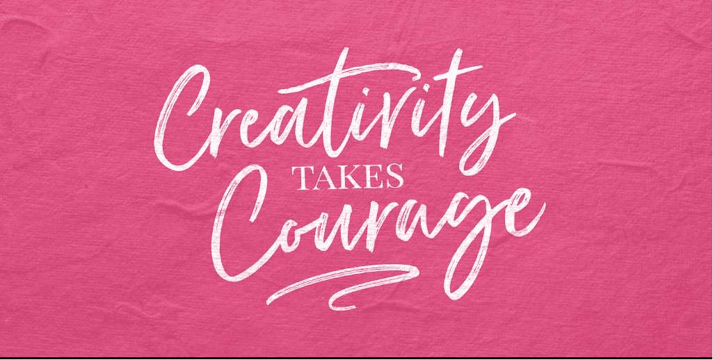
You can also incorporate illustrations or refinements within the typeface to make those characters seem even more distinctive. Or perhaps, to give it a life-like, paper point look. However, if you wish to make the design more dramatic, use large trails and intricate with more cursive or script-type patterns.
4. Cutouts and Overlays
This is one of my favorite typography trends this year. It’s innovative and allows for a greater creative vision.
When you use layer effects, you can give a lot of dimension to a template and flatness away from the text design. In fact, incorporating some layering within your typography is definitely a good idea as it adds depth and dimension to your interface and helps elevate your interface design.
It is one of the most effective ways to bring the audience’s attention to the design message. Take a look at this graphic design for Earth Day!

Notice how the graphics have been perfectly infused with typography to highlight the message.
Text objects with no shade fill are known as cutouts and overlays. The animated cutout causes everything else in the background panel to appear and peek through the typography design. Typography that involves translucent lettering on a background is known as an outlay. An outlay allows you to view the background through the letters whilst reading them.
Both of these approaches have many visual appeals and can be a lot of fun to construct. They look better when the lettering is big, the typeface is a show typeface, and there aren’t many words.
Although overlays complement images, textures, and even video backgrounds, this technique’s overuse can overwhelm the user. So make sure that you don’t overdo it.
5. Stacked Text Blocks
Typography, although shrinking in size, is still an essential element when it comes to design.
To add weight to a message, designers may often layer or stack various lines of text. This trend engages customers better and catches their attention. Take a look at the example for this trend below and see how it prompts out!
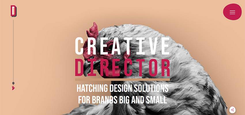
However, if you wish to use this trend, make sure that the text is readable. Also, keeping the optimal space between letters and the line spacing is essential. This would help differentiate letters as well as lines.
Similarly, the flow must be continuous and distinct to ensure that the words are read easily. The structure of the lines, as well as space, must be well thought out as well.
Test Out Typography Trends With GoVisually!
Choosing the right typography trend for your designs isn’t as difficult as you might be making it out to be. In fact, you can use all of them for different purposes.
Remember, the main purpose is to grab your audience’s attention. So we’d advise you to experiment a little with these typography trends and see which one works the best for you!
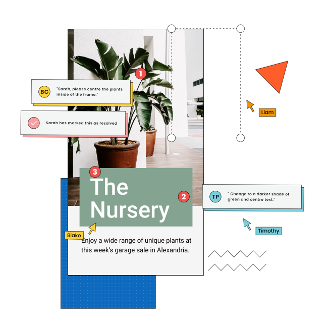
Now, we understand that even experimenting can get a bit tricky. You’ll need to float the designs internally among the designs and marketing team. You might have to include your clients in the reviewing process as well. And naturally, a lot of back-and-forth emails or suggestions can become hard to track.
And that is why we have a simple and modern solution for all of you! The best part? It works for agencies and freelancers alike!
The magical answer? GoVisually!
We support multiple file types, including PNG, GIF, and MP4, to upload as many design types as you want and review them easily. You can even keep track of revisions and include everyone in the process.
So start experimenting today and create great typography designs!
