6 design elements that form the anatomy of a great logo
The anatomy of a logo plays a significant role in establishing your brand identity.
There's a lot of power for such a small piece of graphic design to have. This is why logo designers approach projects with a mix of dread, excitement, and passion for creating something that can carry this massive responsibility.
The design elements and expertise that go into creating the perfect logo are often taken for granted by businesses today.
Yet 60% of consumers will avoid a brand if its logo is unappealing or odd.
You know what that means, right?
It would help if you made your logo represent your brand's philosophy while making a stunning visual expression of your brand identity and growth.
So here are 6 design elements that form the anatomy of a great logo to help you come up with the perfect symbol for your business!
The history of a logo - an ultimate component of brand identity
Before we move on to designing the perfect logo, let's dive into the brief history of logos and why they became such an important component of brand identity.
Logos originated in the Middle Ages when businesses used signage to communicate their purpose. The first modern logos were designed in the early 1900s and have evolved alongside printing technology.
Since the printing industry boomed, logos have been used to help people identify and recognize a brand.
For example, the Chase bank logo, designed by Tom Geismar, was one of the first such logos to be used by an American corporation. He wanted to create something bold and original that could be printed on a small scale and have meaning.
The geometric design and colors of the bank's emblem conveyed confidence, loyalty, professionalism, and unity. These qualities showed that the bank was strong and able to provide services to its customers.
The idea became widespread and now forms the basis of good logo design, where logos symbolize company values, appeal to consumers, and are used as a branding tool both in the digital and real world.
Why does the anatomy of a logo matter?
Being part of a competitive digital market today, many small businesses forget to invest in their visual assets as they should. The rise of free logo generators has made things worse, where every brand takes the generic path to brand identity without understanding its shortcomings.
Like Tom Geismar, who realized the power of a logo, many modern brands like Target, Airbnb, and Netflix have used the anatomy of logos to etch their brand into people's memory.
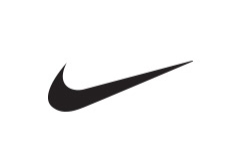
A logo design matters because humans rely on visuals far more than we do on other forms of information. From the bite we take out of an Apple to the Nike swoosh we think about even when checking off our to-do list, your logo makes your brand memorable and hence more popular.
The importance of a logo might still not be so obvious, so we'll spell it out for you.
The main reasons logo designs matters are:
1. A strong first impression
There is a one-in-two chance that you will be successful in this endeavor. A logo is your company's first chance to make a good impression on potential customers. If your company's marketing is executed well, it can capture the public's attention and encourage them to learn more about your company.
If it's not done well, you risk alienating potential customers and significantly damaging your business. Your first impression is an important way to communicate who you are and what you stand for as an entrepreneur.
2. Making your brand memorable
Logos are an important part of a brand's identity; they help customers recognize your company. To ensure that your logo is effective, you should ensure that it is visually appealing and associated with positive memories and feelings.
Logos are visual elements that can help increase consumer recall of your brand. And if we're all honest, some of your audience will probably forget your business name, but they'll instantly associate your logo with their brand memories.
3. Standing out from the competition
Usually, your company logo tells customers why your business is special. For example, your city may have beauty spas, but your spa is the only one that takes sustainability seriously. Your green logo makes that clear.
Good company logos can communicate everything from the company's background to its mission through the right icon or typeface. In other words, your logo is the forum to convey your values and show consumers why you're not like your competitors; you're better.
4. Forming the foundation of brand identity
Whether UX in the real world or the digital realm, your logo design is of utmost importance in establishing your brand's identity.
Branding is all about telling a story that will affect customers' emotions. And while it's true that logo design is only part of a company's brand, it serves as the foundation for the entire narrative upon which the brand is built.
Your logo can help tell your story, and the different colors, tones, and fonts you choose can help create an appropriate atmosphere for your brand. Using these elements in your logo and branding materials will create a recognizable brand identity that consumers will easily recognize.
5. Encouraging brand compliance
Consumers crave familiarity and consistency. As your brand grows, your logo will become more familiar to a wide range of consumers, which creates the impression that you are trustworthy and accessible.
In the long run, trust and brand compliance are based on a well-designed logo, and brand loyalty is quick to develop. You'll probably use the fonts, colors, and design elements from your logo for your brand's merchandise and paperwork, so it's important to have one that can last long with its design.
The 6 design elements used to create unforgettable logos
The reasons why logos are important and the design elements used to make them go hand-in-hand to fulfill the key roles, like standing out, becoming memorable, being aesthetically pleasing, and sticking to consistent design.
Now, with all that explained, it's time we jump straight into the 6 design elements that experts use to make logos as great as they should be!
1. The negative space
Negative space is a part of the logo that cannot be seen. The space around and inside the logo is a neutral background that provides a platform for all the elements that make up the logo.
If the logo is too crowded on the page, it may become ineffective and confusing. Logos must be designed with careful attention to negative space between logo elements and between each letter in typography for the perfect anatomy of the logo.
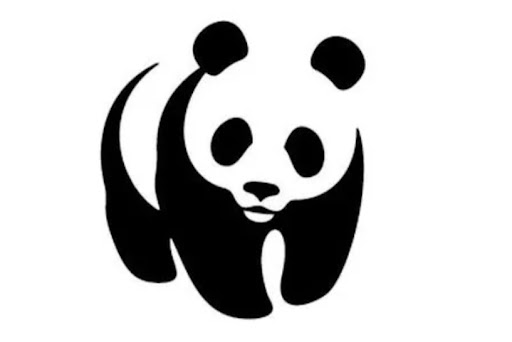
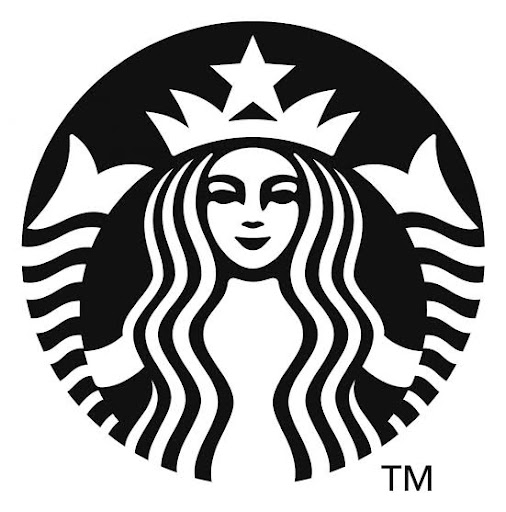
Negative space can also be used to create shapes out of nothing. This approach can create multiple silhouettes out of a monochrome palette; some famous logos that use negative space as a part of the logo are WWF, Starbucks, and FedEx. Overall, the part of the logo you can't see is just as important as the part you can.
2. Iconography and composition
The logomark can come in various forms and often imitate a specific icon's look, such as the clamshell on the Shell logo. An abstract brand will use organic shapes or geometry without reference to explicit images.
Icon design can also be a monogram with a stylized version of the initial letter of the brand name, like McDonald's M. It can also be character designs of mascots like KFC to create compelling characters.
If you're combining design elements like icons and text on your logos, the composition matters the most to make it stand out. Yet most brands use iconography as a standalone logo and brand names, like Nike's swoosh, Rolex's crown, and Audi's rings.
3. Innovative letter fonts
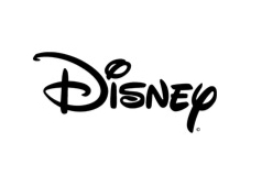
One of logos' most popular design elements is using a unique arrangement of individual letters. This can create the desired logo. For example, Coca-Cola, Disney, and Kellogg's all use hand-drawn letterforms to create their logos, making them very distinctive.
For logos like this, it is important to keep the individual letters consistent, such as keeping a similar baseline, x-height, angle, or down stroke thickness. Having variables in these will make your logo design disjointed. Some letterform logos can be beautiful and elegant, even if they break some rules.
4. Psychology of colors
Just like with fonts, colors can have an impact on the way we feel and react. Different people have different preferences when it comes to colors. You can enhance logo designs by using color psychology in branding.
The first step is never to use too many colors. Using a signature color in your logo and across your branding can help your brand be more easily recognized 80% of the time.
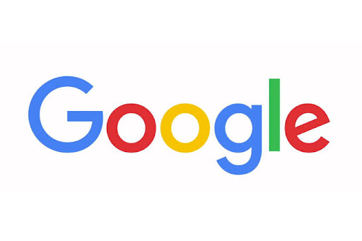
Experts recommend no more than two or three different design ideas because the color choice is important in creating brand memorability. However, you can also use several colors at once if you use them wisely to symbolize diversity or if you wish to compete with Google's trademark color scheme.
5. The right balance
Logos that are well-designed use principles of proportion and symmetry. Many famous logos use circles of proportional values and symmetry to create a pleasing, balanced aesthetic quality. For example, Apple's logo presumably uses the golden ratio.
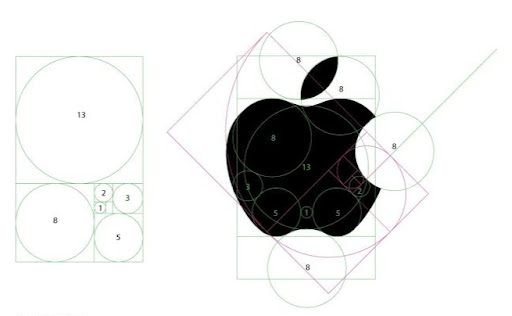
While such symmetry and balance aren't noticeable to people with scales and figures, it affects our perception of the logo and attracts our eyes wherever they come up.
6. High branding potential
Your logo must be effective; this is one of the most crucial design elements in the anatomy of a logo should be based on.
With a high branding potential, your logo will be used in various ways and contexts, like merchandise, prints, or banners.
Adding too much detail to a logo always hurts readability. Too many colors and elements can spoil the branding in a smaller size. It is also important to remember that you will not be able to use a full-color logo all the time.
The logo should be versatile enough to be used in black and white without visual effects. Take the Starbucks logo for an example; we can all recognize it at one glance, whether it's the usual green, black, or even red.
Bring your designers on board with GoVisually!
Well done on making it to the end. You're probably good to go and implement these design elements for your perfect logo. However, remember that great things will take time.
Great logo designs come from effective collaboration, clear feedback, and impeccable team communication, and there's a platform solely for designers to make all of this possible without hassle.
GoVisually is a powerful online review and feedback tool that helps designers and creative teams save time and streamline their workflows. It makes it easy for them to work on projects together from one place.
The endless features help you with visual annotations, diverse file support, online proofing tools, and an approval workflow. Additionally, version control and comparison are available.
Want to unleash the power of a great logo with a quick review process?
Book a free demo with an expert and see how GoVisually can help you get the perfect logo approved in minutes!