Table of Contents
“The first impression is the last.”
We’ve often heard this phrase in our daily conversations, but do you ever think about how true that might be to your business as well?
Well, most people assume that it only applies to when meeting other people. However, first impressions are just as critical in businesses, especially when you’re devising a pitch for a new client. And nowhere does this saying hold more importance than in the field of graphic designing.
But Why Is That?
As a graphic designer, you’re responsible for the designs you create for the client. Since most interactions take place digitally nowadays, a lot of designs are shared in the very initial stages of a pitch or during a project.
In a way, the designs you create become the first impression that a client will come to hold about the company you work for. Whether it is glancing at a logo, surfing the company website, flipping through a brochure, or even looking at a business card, that interaction will play a pivotal role in determining whether they choose to avail the business’s services or not.
That is why there can be no proofing mistake when it comes to selling your design services. But as it happens, the most common proofing mistakes are made in graphic design proofing.
Wondering why? Let’s find out!
Problem In Understanding Graphic Terms
Communication is key. We know what you’re thinking; that you’ve heard it many times before, but that’s because it’s true. However, there’s a twist to what communication means.
It isn’t only about your clients telling their needs to you, but more so about whether or not you understand it and vice versa. You can create the most dazzling logos, but if they don’t meet the specifications set by your client, then you are setting yourself up for failure. And that majorly happens when either of you isn’t clear on the graphic design jargon.
5 Most Important Terms To Know
Here are the five most important terms that you should be clear on to avoid graphic design proofing mistakes and save your business from losing millions!
1. Typography (Leading and Tracking, Ascender and Descender)
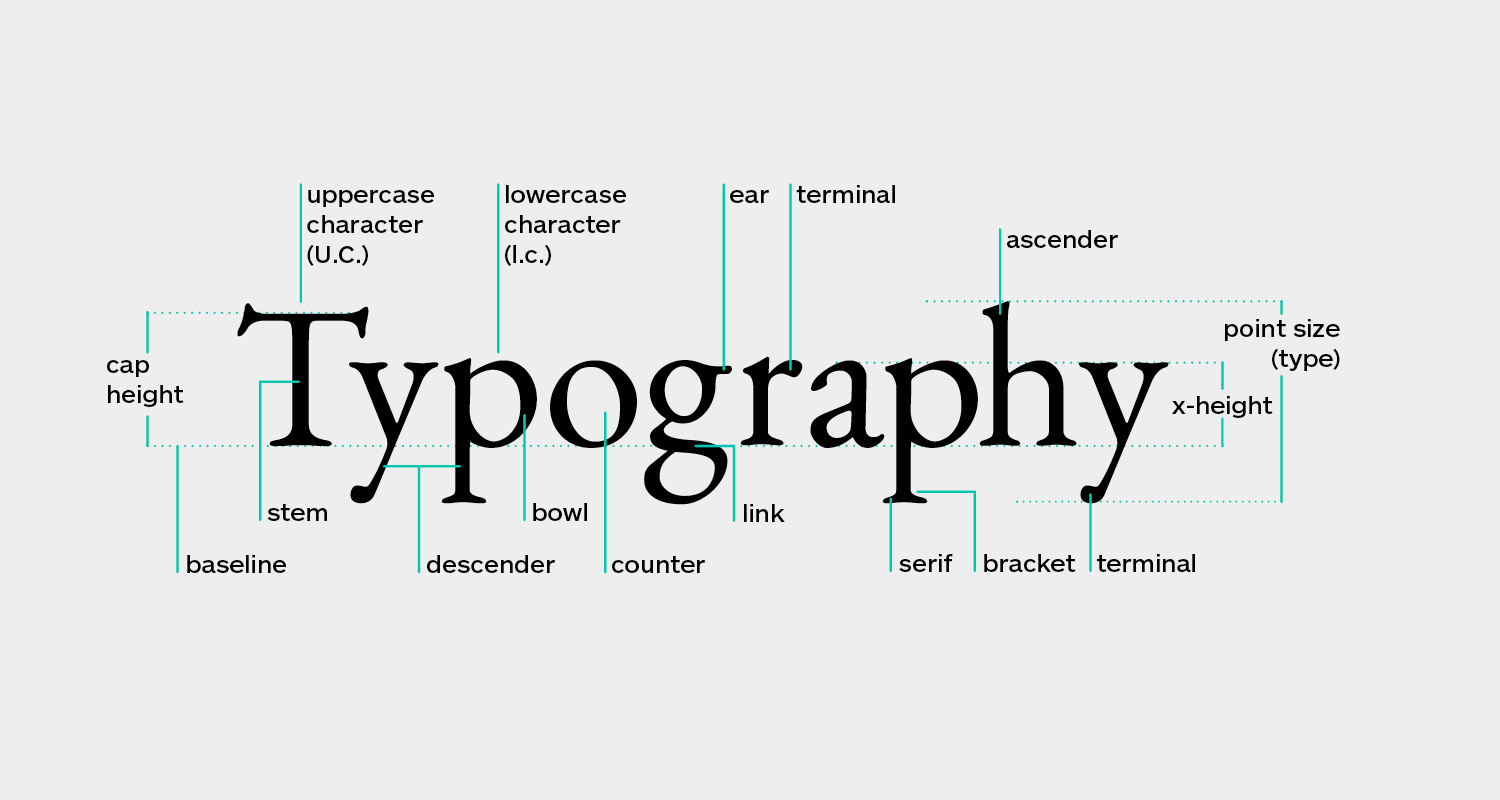
Typography refers to the style in which text is arranged. It is a visual display of how your text will look in the design. Now, there are a couple of terms that you should know in terms of typography, such as:
Leading: It refers to how a text is spaced vertically and determines the readability of the text.
Tracking: It determines the adjustment of space between the letters in a word. Remember, shorter words should be spaced out more and flush lines should be created between headings and subheadings to improve readability.
Ascender: It is the vertical stem that is found on the mean line of the font. Texts in this space should be small, focused on supporting or introducing a topic.
Descender: It is the text that extends below the baseline of a font. Texts that are not so significant should be fitted here, such as simple taglines or embellishments.
All of this may sound very boring and unnecessary to you, but remember, a single mistake in spelling or numbers can potentially cause your company losses worth millions of dollars.
If you think we’re exaggerating, let’s take a look at what happened with Mizuho Securities Co., which was offering single shares at 610,000 apiece. A simple, unnoticeable error in typography caused the two quantities to be switched in their place, meaning that the company was now selling 610,000 pieces at the price of one yen!
In a day, the company incurred losses worth 340 million dollars.
2. Hierarchy
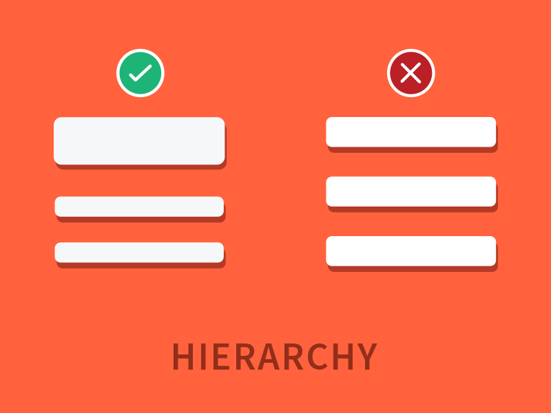
Just like any hierarchical system, hierarchy in designing refers to how elements in your design page are displayed to convey their importance.
Your text should be organized in a smooth and engaging flow so that the reader doesn’t lose interest. Keep the following tips in mind if you want to avoid proofing mistakes:
- Make your headings and subheadings larger in font to reduce the risk of any mistake.
- Use color contrasts to increase the visual appeal of the text.
- Isolate essential points in the text, such as the company’s name, by highlighting them.
- Always remember to place your logos in the top leftmost corner of the page.
3. Resolution and Contrast

If you don’t want to be rejected right away, use high-resolution pictures. The higher the resolution, the better it’s quality!
On the other hand, contrast is the degree of difference between two images that are juxtaposed on each other. Contrasting dark and light colors make the interface more appealing and make it easy for you to detect any mistakes during proofing.
There are various contrasts that you can also use to your advantage in enhancing the appearance of your design, such as the contrast between color temperatures and hues, as well as between organic and geometric shapes.
4. Stock Photograph

Get this, using licensed images without copyright permission can cost you millions of dollars. Don’t make the mistake of simply copying an image from another designer without giving them the due credit.
Instead, you can opt for a stock photograph, which is a professionally shot picture available online for licensing.
5. Branding
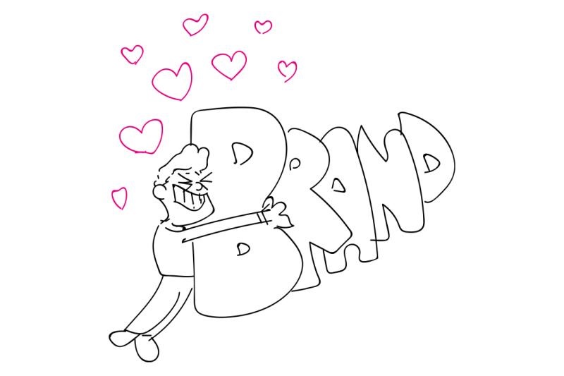
Branding represents the identity of the company or business. That is why there’s no room for mistakes there. You should only be using the best branding practices to ensure success.
To start, you should know these three terms when it comes to branding:
Brandmark: It is a type of logo where a symbol is used in place of the company’s name, such as Apple or Pepsi.
Logotype: It is a logo that has the company’s name designed aesthetically, such as Coca Cola.
Improper Kerning Of Fonts
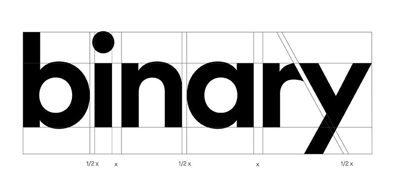
The second reason why proofing mistakes can occur is because of kerning. It is the adjustment of space between two characters in your text. Its purpose is to make your design more proportional and pleasing by evening out the space between letters.
Kerning is essential to prevent awkward gaps and interactions between your letters in the design. These mistakes become especially visible in large, bold font text, where letters are sometimes squeezed so tightly together, or spaced so far apart, that even the meaning of the text may change.
Grammar and Spell Check
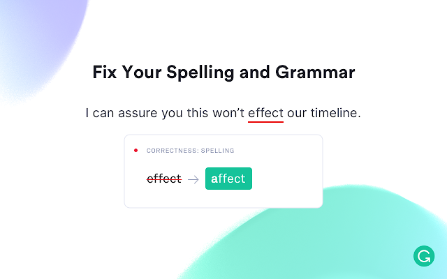
The third kind of proofing mistake is the one that a lot of graphic designers might think has nothing to do with their domain; grammar and spell-check. But they’re wrong!
It’s because while the content team is primarily responsible for the grammar and spell check in a document, ensuring that no such errors occur in the final design is your job.
To eradicate those errors, make sure you know these two basic graphic jargon:
Body Copy
This is the essence of your design; it is also the final stage in a customer’s consideration of your work that will decide whether they will be interested or not. If you’ve managed to make a unique, appealing logo, and have organized your work in a way that invites the eye to consider it, then congratulations! You’ve made it. Well, almost.
Now the customer will finally invest some time in your product by sitting down to read it. So, make sure your design attracts their attention and there are no errors in it.
Lorem Ipsum
For those of you who might end up seeing it as a spelling mistake, it’s not. It’s a universal dummy text that is used as a way of checking the form your work will take when you have filled it in with the text.
Picking A Font Style That Is Hard To Read

Do you ever find a stunning design, except that the font is a disaster, and that just puts you off? We get you!
That is why not picking the right font style is one of the major crimes you can commit while proofing the design. It’s because if your audience can’t read it correctly, they’d end up not purchasing from you since they couldn’t understand the information, and surely you don’t want that. To avoid that, you can opt for the best free font pairs.
Also, make sure you’re aware of legibility and alignment rules while proofing.
Legibility
It is merely a measure of how easy-to-read your text is. Remember that if a design requires even a little bit of concentration to be readable, customers will just move on rather than waste their time trying to understand the wording. Serif or Sans Serif interfaces are ideal for making your work easily distinguishable and understandable.
Alignment
It is the lining up of your elements to achieve balance and order. Without any order, you’re just writing gibberish in your design.
Selecting A Color Palette That Is Too Cruel For The Eyes
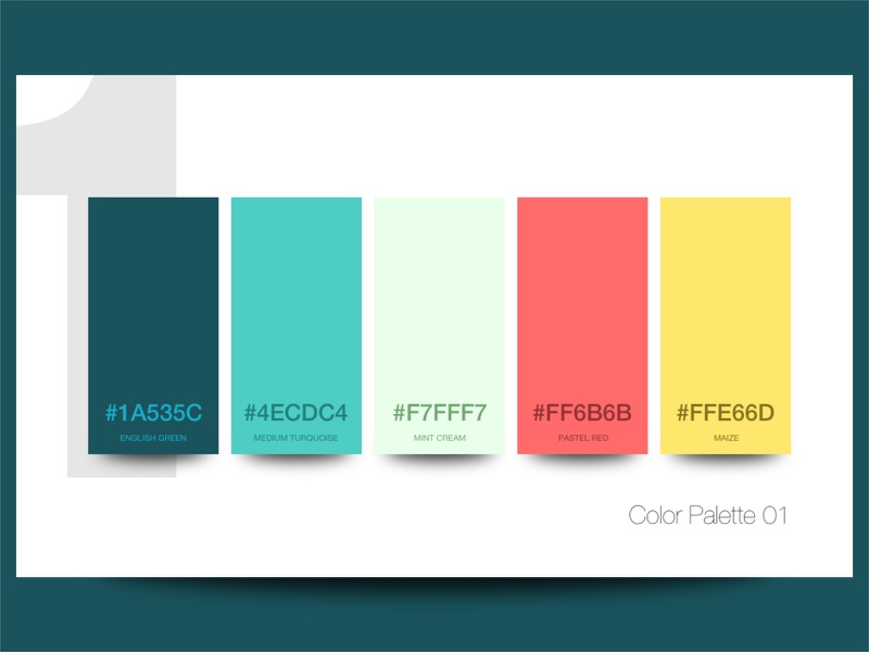
Everyone knows that color is the one ingredient that will breathe life into your work. But only a few know how to apply that to make their work more lively. As a general piece of advice, you should focus on a single strategy and select colors that adhere to it. Otherwise, your color palette can turn out to be disastrous.
One possible technique is the monochrome look, which only includes various shades of a single color. Use it to give your work a sober, professional feel.
Analogous is a similar technique that chooses three colors that are similar to each other. You can use this palette to convey a mood or emotion.
Complementary is a more bold approach that takes two colors that are opposite to one another. Make sure that you choose colors that look good paired together instead of giving an awkward feel. Similar to this is the triadic approach, which selects three colors in place of four.
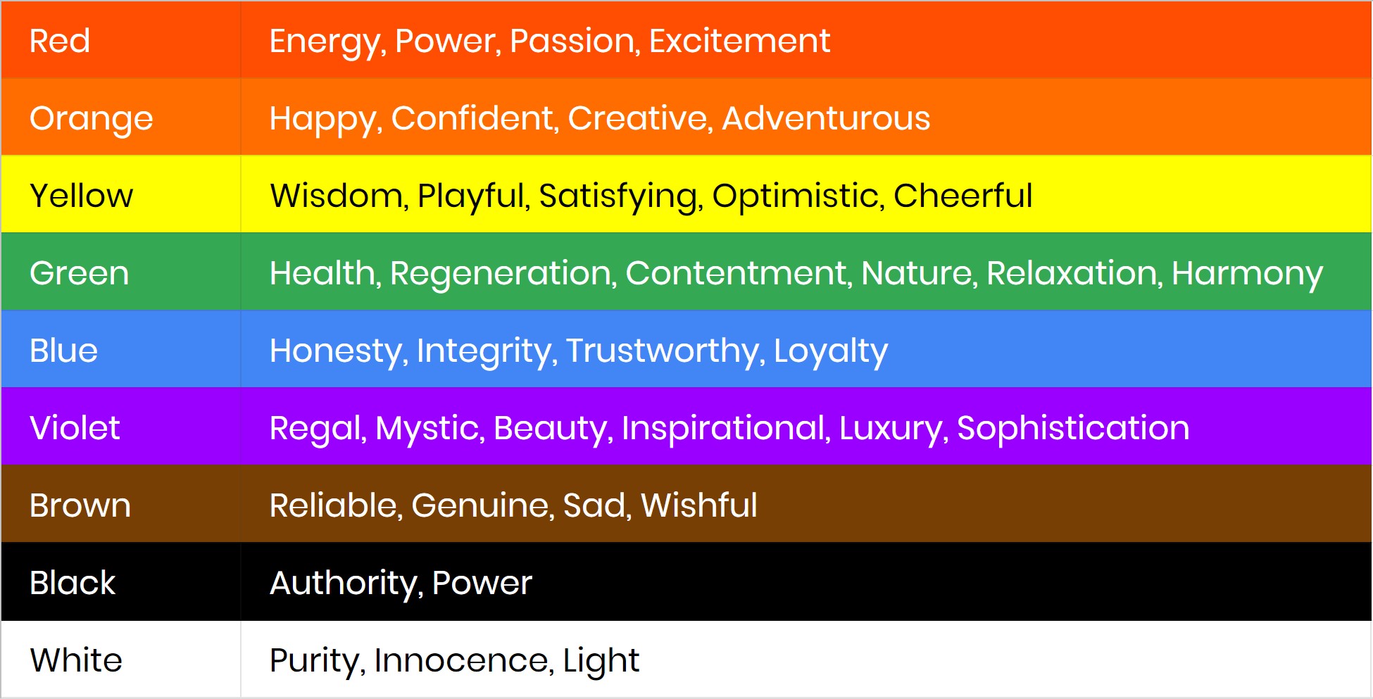
You’d be surprised to know that colors have an observable effect on people’s moods and behavior. So, before deciding on what colors to choose, ask yourself this: what sort of people will your client’s business attract, and what would be the best mood to establish for them?
Final Word
Well, there you have it! These are a few easy techniques and ideas you can keep in mind while proofing for graphic design. If you follow them correctly, you might just end up saving billions for your business or company. And more importantly, it will help you elevate your work and make it more appealing!
