Never judge a book by its cover.
We’ve all heard that phrase countless times. And while this saying applies to almost everything in life, generally, ironically, it doesn’t apply to book cover design.
That’s because, in the modern world, book cover design has become just as important as the book content. Think of it this way – would you even pick up a book if the design doesn’t intrigue you? Most probably, no, you wouldn’t.
So essentially, most people don’t pick up books if their cover art doesn’t intrigue them enough. In short: they do judge a book by its cover.
Table of Contents
But Why Is A Book Cover Design Important For Appeal?
As humans, we tend to shop with our eyes. We search for something familiar and comforting while still being new and unique. The same applies to books and their cover designs. That’s because nowadays, people want the best of the very best.
So when they’re choosing a book, they aren’t simply paying for the content inside a book; they also pay for its cover art. That is why book cover design now has to be literary and visual masterpieces to get sold out.
So if you’re a writer or want to publish your book, you’re in for a real treat! Today, we’ll break down the various aspects at play to get you the perfect book cover design. Let’s roll!
3 Things To Know Before Deciding On A Book Cover Design
Before creating any product, you must know its raw production knowledge. The same goes for a book cover design. To create the perfect one that will sell, you must know some raw production knowledge and what goes in to create a one-of-a-kind book cover. Here are the 3 things to keep in mind.
Deciding On A Print Format
Decide whether the book cover will be on print paper, hardcover, or digital for an eBook. This is important because print and digital formats utilize very different shading spaces and colors. The book will be printed on the off chance; plan out its printing format (paperback or hardcover).
Setting On Illustrations
Illustrations are a great way to make the cover more interactive. If you’re a publishing house, we’d suggest seeking the author’s suggestions on the type of illustrations that would best match the content. It doesn’t have to be a finished product. Just a rough design that can later be worked on or edited for your final book cover.
Finalizing A Budget Plan
Both the creator and the publisher ought to know about the additional costs that can add up while designing the book cover art and then printing it. This will majorly incorporate the following:
- Text style licenses
- Stock pictures or royalty for the licensed ones
- Graphic designing costs
5 Most Famous Kinds Of Book Cover Design Trends
Now, let’s move on to our article’s most exciting part – the 5 most famous kinds of book cover design.
Knowing about these trends will help you create a fail-proof cover for your own book. In fact, these trends can lift any book and elevate its success rates by 51%. So let’s take a look at these trends one by one.
1. Depth-Illusion
It was a breakthrough in the field of book cover art when book cover designers realized that tricking a watcher’s eye with a convincing illusion is an extraordinary method to stand out enough to be noticed. It is cool, fascinating, and will change a simple book into a work of art that anyone would love to have on their coffee tables as mere art pieces.
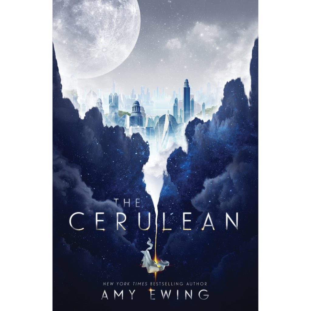
Nowadays, book cover designers are putting their turn on adding depth illusions on covers while keeping up an intriguing visual effect. Cover arts that include depth-illusions such as a book cover with torn up effect covered up texts, using the effect of wide art prints such as a print of a field or ocean set in a way that makes it feel 3D are all the rage right now.
Eye-tricking plans like these that burst through or jump off 2-dimensional covers will keep being the aspect that sells the books faster than their content. The book cover design for The Cerulean by Amy Ewing is a good example that uses depth as a mesmerizing book cover art.
2. Go Minimalistic!
Minimalism art hasn’t left the trend market ever since its arrival. In book cover designs, minimalistic art form highlights clean textual styles, straightforward illustrations, and many voids or free areas. The color scheme is also straightforward, often ranging from greys to whites and black. This can be a potent cover design strategy for attracting customers to your book.
The essence of using minimalism in a book cover design lies in choosing the perfect typography, illustrations, and format. You need to find the perfect balance between the three to come up with a book cover art that is thought-provoking looks effortless. For instance, the title should utilize a bolder textual style than the author’s name. Each realistic detail should convey the correct message.
The abundant whitespace left for pictures or illustrations should be orchestrated to attract watchers’ eyes to the significant words and designs. This will not be as effortless as it looks; however, the sales of your book will make up for it. Be that as it may, when executed well, minimalist book covers designs are exceptionally successful. Stillness by Richard Harmer is a perfect example of this art design.

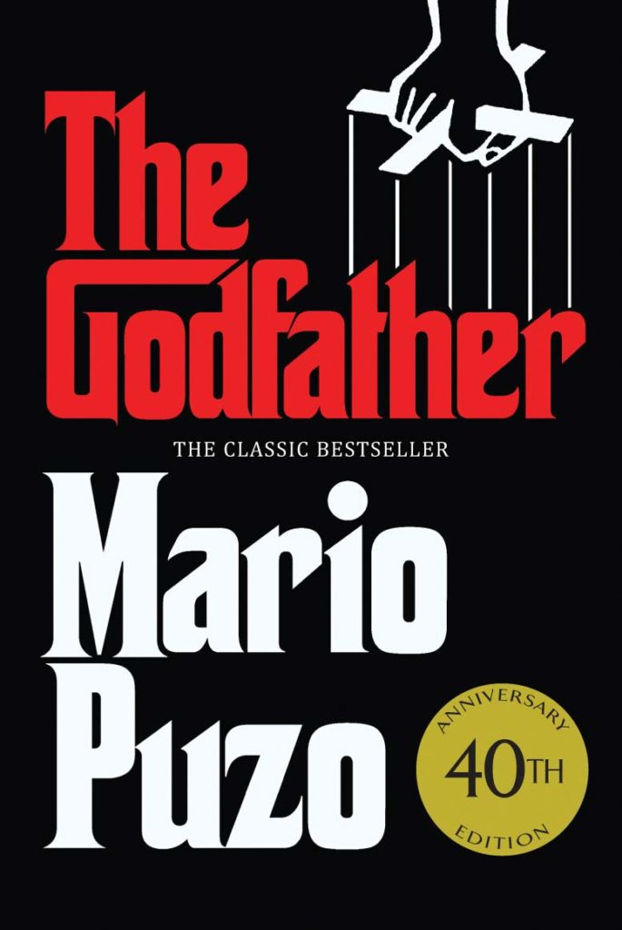
3. Bold and Brave
Catching customers’ eyes can often work out in your favor if you go all out with book cover designs that are bold and out there. Going all bold is a great way to stand out amongst the sea of book covers with dull color themes and fool-hardy illustration art that look unbalanced. To accomplish that, first, your book genre should be suitable for this art style.
Books with genres such as motivation, lifestyle, or rom-com are a great pick for this art style. If you decide to include bold style art on your book’s cover, it’s imperative to make sure to pick similarly intense typography that will not be overwhelmed by the art style. Opt for bright colors and make sure they are balanced with neutral tones. Big, bold lettering can also get your book by. A similar example to this art style is The Godfather by Mario Puzo.
4. Outlines Are Never Boring
Quite similar to the minimalist art style, using outlines as your art style is also a great way to be unique while staying familiar. This is an art style that has been around for a while. This is a versatile pick for a book cover design and will work tremendously well if your target audience is not a fan of too modern or stylistic art approaches in their books.
Outlines can be perfect and aligned, straightforward or disorganized, lively, or harsh. This all relies upon the message you want to put out there. This versatility in this art style permits book covers to catch the book’s tone and character viably. The book cover design for this art style is 2001: A Space Odyssey by Arthur C.

5. All Natural
In the world of modernization taking place for natural art, t huge crowd of people seek out books that use nature as their art design. There is an undeniable beauty in using leaves, trees, blossoms, seas, lakes, mountains, etc., in a book cover design. It is making a comeback because people felt its absence in the book cover art world.
This catches the eye of people like no other art style while remaining simplistic and elegant. You can achieve the same with your book cover design by using illustrations of birds, honey bees, mountains, or even butterflies. This is a genuinely adaptable art style that can address your book’s subjects, plot, or setting. The book cover design for the sun and her flowers by Rupi Kaur shows how simplistic yet utterly beautiful this art style can be for a book cover.

How To Create The Perfect Book Cover Design?
Now that you’ve done all your homework, the rest is simple enough to follow. Here are the 5 steps to getting the perfect cover design.
Understanding The Features Of A Cover
A book cover has three compulsory features: the intro page and the back cover, associated with the spine. A softcover book’s pages are stuck along with a paper cover. A hardback book’s pages are sewn or stuck into a “case” made of cardboard, then covered with material or paper. The paper cover folds over the book.
This is the anatomy for your book cover and what will act as a platform for your art style that you choose for it.
Conducting Extensive Market Research
Firstly, you must know your genre. If you know your genre, your audience is easy to isolate, and thus, your art style is easy to pick out for your book cover design. Go hard while conducting this research and scrounge the internet for examples and inspirations.
While doing that, you may see a pattern. Books with soft stylistic art sell better in paperbacks, and books generally thriller or action genres with modern or bold art styles sell better in hardcovers. Think of all this before creating your book cover design.
Picking Out Designs And Textual Styles
An extraordinary aspect concerning book covers is that there is practically no real style that can’t work. There are a plethora of art styles and materials that are waiting for your book cover design. However, it is up to you to decide on the one that will work out for you.
Book cover designs can highlight an illustration, illusion, or a theoretical plan. They can highlight everything from childish doodles to distinct and feature typography. Consider what message the realistic style ships off a reader. An illustration of a tree should not be used for a book that is about space.
Seek A Fresh Pair Of Eyes
Let’s suppose you have finalized a book cover design. Everything is set and in motion. But there is one thing you didn’t consider; how will the audience like it.
So while the cover may look all well for you, the other person may not like it. That’s why it’s always a good idea to seek reviewers. You can ask your friends or colleagues to tell their opinions on the cover design. If you work in a publishing house, use your creative and marketing team to guide you better!
Remember, the more sets of eyes you get on the plan, the more you’ll have the option to assess whether a cover is sending the correct message to an expansive crowd of individuals.
Understanding What Works Well With The Printer
The last and final step in creating a book cover design is printing in a print format that anchors all the appropriate and text data for the front and back covers, spine, and folds. The printer will need this as one wide document that they can print to fit the book.
Most printers favor PDFs, yet others take .ai or .eps. So make sure that the style of art you choose sits well with your printing settings.
Review your cover design easily and remotely with GoVisually!
Here’s a pro tip for you; to get quick reviews, suggestions, and comments on your cover design, get it reviewed on GoVisually. It will only take 4 easy steps:
- Upload your book cover design. GoVisually supports PNG, JPG, and PSD files so you can upload any of these.
- Invite reviewers to leave comments and suggestions on your uploaded PDFs.
- Keep track of their feedback and upload the newer version.
- Get it approved and tada! You’re all set to sell out your book.
Key Takeaway
Designing a book cover is no walk in the park. It is a task that requires patience, hard work, and heaps of creativity.
So remember to keep an open mind towards art styles, a deep understanding of your book’s niche and audience, and the market knowledge of book cover designing. Only then can you end up with a book cover art that will knock off every other book from the shelf.
