Color Theory and Color Palettes: Everything You Should Know

Close your eyes and think of the color blue. Does it bring the image of a happy sky in your mind? What about green? Does it make you feel the warmth and the brush of soft and freshly cut grass?
Now open your eyes and think about it - why did you feel what you felt? More importantly, if colors have such strong power, can it also influence our behavior? And how do we decide on the right colors to do that?
Before you start panicking, we’d have you know that this article has the answers to all your questions. It is your guide to color theory, color palettes, and how you can use them as designers and marketers to create better product lines or influence buyer behavior.
So, let’s start and learn how we can color the world around us!
What is Color Theory?
So naturally, as a designer or a marketer, your job is to ensure the best production. And that has a lot to do with the manner the product is packaged, or how it's represented. Everything is surrounded by colors, from a company’s logo to its colors on the website and the social media accounts. This is where color theory comes in.
It's the process of identifying the colors that complement one another. Of course, it’s a lot more than just what meets the eye and has a scientific process behind it, which was first identified and created by Sir Isaac Newton.
Newton classified the colors in a wheel, now known as the color wheel. Using this wheel, designers can craft creative color combinations for their company use.
What is the Color Wheel?
So now you know what a color wheel is, but the question is whether there’s just one type of color wheel that we use for reference today. And the answer would be no.
Several color wheels are in use, but most of them are based on the traditional RYB color wheel - red, yellow, blue.
Why, you ask?
Let’s take a quick memory trip down the lane to your early school days. Now, if you were an artistic kid or liked your art class, you’d remember that mixing these primary colors can give you other secondary colors like green, orange, and purple.
Furthermore, if you mix the primary and secondary colors, you get tertiary colors like magenta or a darker green shade. That is why most color wheels are based on the RYB color wheel.

7 Important Color Terminologies You Should Know
You can likely confuse the different color terminologies. That could be a recipe for disaster. You might ask your designer to add more shade to an image without knowing what that means, and it can spoil the entire picture.
So here are the seven most essential color terminologies that you should know about:
1. Hue: it refers to what is the color of an object. For instance, is it black or blue?

2. Saturation: it represents the strength or weakness of color used.

3. Chroma: it determines the purity of color and how much black, white, and grey is added to it or missing from it.

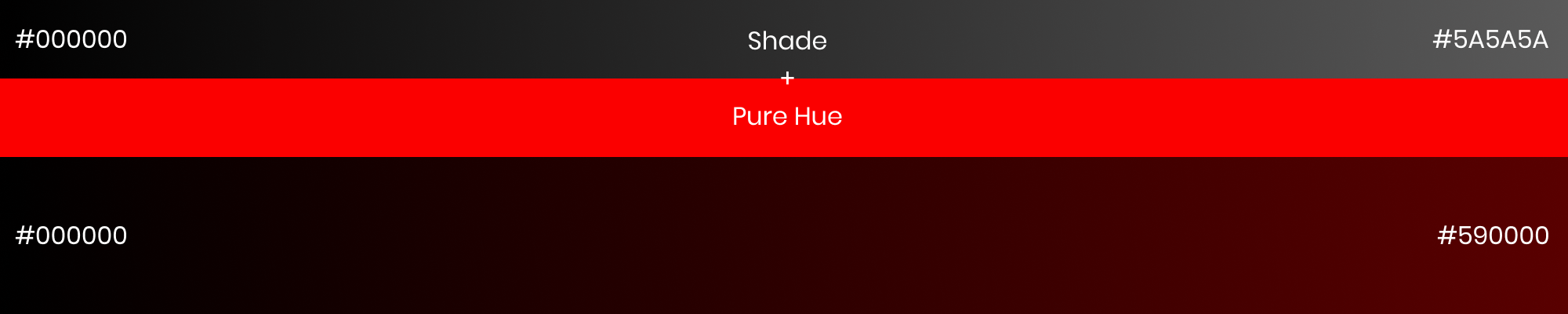
4. Shade: you can create shade by adding black color to a pure hue or color.
5. Tone: you can add tone to a color by adding grey to refine it.

6. Tint: you can add tint to a hue by mixing it with white.

7. Value: it shows how light or dark a hue is. Value is used to create a focal point within an image.

4 Main Types of Color Palettes
While there are several kinds of color palettes that you can use to create your own color scheme, these four main types rule them all. So, let’s have a look at them.
1. Monochromatic Color Palettes
If you like keeping things plain and simple, you should go for the monochromatic color palettes as they consist of the same hue in different shades and tones.
The plus side to creating monochromatic color palettes is that they’re nearly impossible to mess up. Its because you’re playing with the same color, so the chances of disasters are relatively minimal. However, keep in mind that it can often become way too plain and boring too.
It would be best if you went for this color palette when working with a corporate color that probably doesn’t like to mix up a lot of colors.

2. Analogous Color Palettes
These color palettes are quite fun and straightforward to create. You have to pick the primary color and the hues around it from the color wheel. For instance, if you choose the color blue, you other blue shades around it.
These palettes are great for creating consistent images and texts where the focus remains on the content. The only difference that occurs is different shades of the same hue or their consistency.
We’d recommend you to use analogous color palettes if you’re trying to be creative yet design a striking image.

3. Complementary Color Palettes
If you like to keep things balanced and maintain order, you should pick out a complementary color palette. It consists of opposite colors in the color wheel. For instance, red and green.
These palettes can help you get the immediate attention of your viewers are easy on the eye. Most companies use them for product packaging or logo designing, as it can become quite captivating!

4. Triadic Color Palettes
If you genuinely want to create something remarkable, then choose a triadic color palette. These palettes are made from three colors at equidistant points. For instance, red, yellow, and blue.
This is where you go gaga over the colors and come up with an exceptional and lasting palette. However, keep in mind that you’d have to do a lot of experimentation and sampling to get the right colors together.

10 Widely Used Colors and their Meanings
Do you ever wonder if the colors around you have a meaning? Think about it; why do you feel more passionate about the color red? Or why do people wear black at a funeral?
Well, you might be pleasantly surprised to know that colors radiate energy. This energy is essentially the vibe of the color that can impact your mood.
Many designers and marketers use color psychology to strategize and create better product lines that increase sales. That is to say that they make use of the right colors to send out the right meaning among the target audience and get the desired reaction.
So how do you decide what colors to use? For that, you need to know the meanings and feelings associated with different colors. To give you a headstart, here’s a list of the most common colors and what they mean:
- Yellow: joy, positive energy, zest
- Black: mystery, power, grace, mature
- Blue: serene, confident, tranquility
- Red: passion, energy, power
- Green: freshness, growth, natural, safety
- White: purity, cleanliness, perfection, sophisticated
- Purple: royalty, luxurious, creative
- Pink: feminine, safe, delightful
- Orange: creativity, intelligence, initiative, enthusiasm
- Grey: elegance, uncertainty
So once you’re aware of these color’s meanings, you’d find yourself in a better position to decide the right color theme to go with.
More importantly, you’d also see a pattern of colors in the existing brands. You’d notice how the color green is mostly associated with organic or sustainable products because of its vibe. Similarly, red is more commonly used to promote energy and inspire action.
3 Color Generator Tools To Ace Up Your Color Game
So you know what color wheels and color palettes are, but how do you craft up a color palette of your own?
Well, understand this - it’s not difficult, especially when you can use helpful tools to aid your process and assists your creative sense.
Here are the top 3 color generator tools that you can use to ace up your color game.
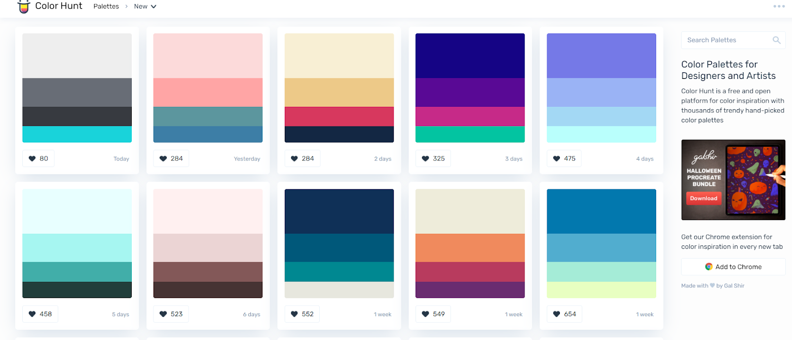
1. Color Hunt
Color hunt is one of the coolest tools that can help as well as please your aesthetic sense. They have a plethora of color schemes that you can choose from and use as you like.
Their already made color schemes can also give you an insight into making your own pairings.
The best part? It shows you the number of likes on a color palette, giving you an excellent way of seeing what color schemes are more liked by people.
2. Muzli Colors
Muzli colors is yet another exciting tool that you can use to skyrocket your color and aesthetic sense. It showcases popular color palettes widely used by designers, agencies, and companies around the globe. You can download these palettes and use them as you like.
Or you can search a color code of your choice and create a palette for it online while keeping in mind the color suggestions being given.
In any case, the results will be great and eye-catching!

3. Colorbox
Colorbox by Lyft Design has to be our favorite tool for picking your color palette. It presents you with a live graph of the color sections you make to see if the colors complement one another in real-time.
It also gives you the color code for your selections so you can use it in any other software as well. You can also modify the saturation or brightness of color as per your taste and liking. How cool is that?

Key Takeaway
In the end, choosing a color palette is a creative task and depends on your company’s requirements. If you want your brand to look more empowered and niche, you can opt for mature colors that give out an elegant vibe.
Similarly, choosing more lively and vibrant colors would work well if you’re striving for a creative brand image. It all comes down to what you want for the brand.
But do keep in mind that if done poorly, color palettes can be quite disastrous, so make sure you use the tools and, if necessary, consult with a professional team too.
After that, let the colors paint your story!