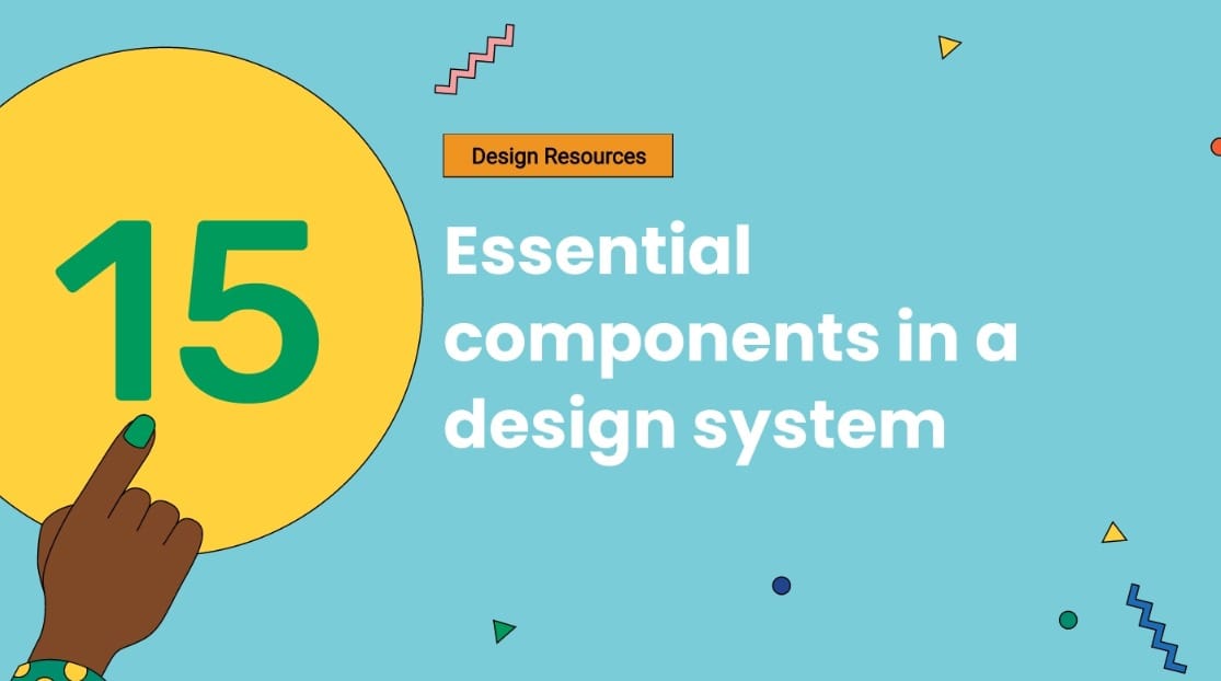
15 essential components in a design system
The digital realm is concentrated with mind-blowing visuals that we encounter every day.
You might find yourself looking at them and wondering how you can create an equally impactful design. The answer is right here.
Most organizations have integrated a design system into their business development process to be a part of this realm. While 74% of creative professionals also reported that their design system had a component code library.
I'm sure that sounds super important and super confusing at the same time. If you're here, you're looking for ways to create a design system or improve an older one to make better progress. Whichever the case, this guide will be the answer you're looking for.
We will cover everything from the basics to professional uses and examples in this short, information-packed guide.
So let's get started!
[elementor-template id="3538"]
What makes a good design system?
Before we explain the aspects of a good design system, it's better to reinstate what a design system is and why it's important.
A design system is a collection of patterns, functional elements, and components that align an organization's persona across all its services and products. Design systems are usually put together by a collaborative effort of creative, marketing, and product teams.
Having a predetermined design system helps maintain consistency in your enterprise's operations and makes it easier for your developers to create projects in line with your organization's online persona.
A good design system will also strengthen the base of your design process and lead to an unprecedented user experience. For organizational growth, consistency is key. And that key can be obtained by combining your brand philosophy, design vision, and principles to make a design system unique to your organization.
So what do we call a good design system?
There are some pillars necessary to establish early on when making a successful design system:
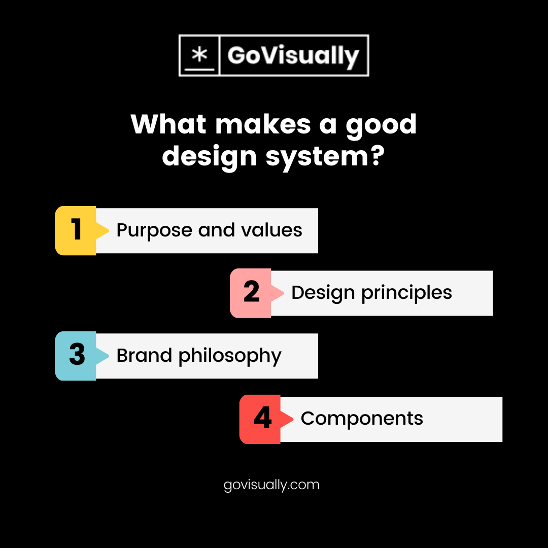
Purpose and values
You should always start by outlining clear goals and company values to help your teams understand what they are working toward. Defining a clear purpose will help your teams maintain brand compliance and work cohesively over a shared goal.
Design principles
Crafting design principles gives your organization's purpose and values a visual representation. Everything will contribute to your company's design principles, from your brand symbols to color schemes and the type of content you wish to share.
Brand philosophy
Design principles and brand philosophy are two sides of the same coin. Imagine if Google decided to make all its logos a different color or style? It would be a wreck for both the users who see them and the developers who try to fit them on their web pages. Once you decide on a brand philosophy, you need to stick to it.
Components
The most crucial part for creative designers is the components available to them that can convey information and perform functions that can represent their purpose, principles, and philosophy all at once. The rest of this guide will further elaborate on a list and effective use of these components.
But let's first look at an exceptional example of a great system design for inspiration.
What is an example of a design system?
You might have come across the term atomic design. Yes, that's currently the basis of every great design system you can use as inspiration.
The main features of an atomic design are its simple codes, abstract visuals, and straightforward layouts. Many digital giants use atomic designs globally as their fundamental design concept.
Organizations like Google, Apple, Amazon, and many others have implemented this type of design in their web structures. Component design software powered by these big sharks also uses the same theory in action. Now let's move on to system design components, what they are, how they work and
What are components in a design system?
Design components are the functional factors of a user interface (UI). Components are derived from design elements that come together after the whole design thinking process. Such as color, typography, and spacing.
When choosing the right components in a design system, an important thing to consider is how your organizational procedures are structured.
For example, if you want your audience to fill a survey on a relevant page, you need to optimize it to appear as a questionnaire. In that case, you'll probably be using forms, check boxes, and progress indicators as the key components.
15 main components in a design system
There are 15 essential components in system designs that you will be using one way or another. And we have listed them here with guidelines on their use cases and functionality.
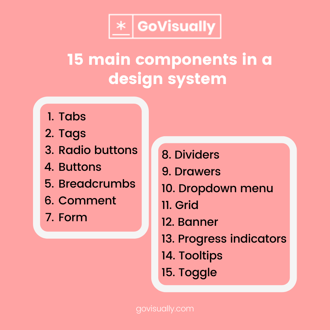
1. Tabs
Tabs are the best way to organize similar information on the same page. They help you break the pages and make them more readable and easy to navigate.
However, tabs should be used effectively instead of placing multiple categories on the same bar to outline tiny bits of information. Tab titles should also be concise and small to improve their appearance on the page.
2. Tags
Tags are used to label UI information for quick recognition and the navigation of similar items. A great example is Pinterest, where you can use tags under an image to find more similar ones.
Custom colored tags have also proven to organize large amounts of user-friendly and less noisy content. A simple tag can link to tens of different variations of the same product.
3. Radio buttons
Radio buttons are a key component in limiting user responses by enabling them only to select one option at a time. This can help reduce system errors by an overload or misinterpretation of information, and you should use them when you should.
4. Buttons
You can't complete a design in the absence of buttons. This is one of the most essential features that you won't be able to leave out even if you want to. Buttons are used to move users through a sequence of pages or screens or as CTAs. Every design must have a primary button followed by secondary and tertiary buttons if required.
Buttons serve as a great means to lead your users to an intended destination because, let's be real, we all have the urge to click on them at least once.
5. Breadcrumbs
Breadcrumbs are an alternative way to help users navigate your design without getting lost. They show hierarchical progress from the first level into other levels or links in a chain.
This component is also very useful to increase the user-friendliness of your design because nobody wants to click on the back button 7 times to land on the initial page again.
6. Comment
Comments are a crucial component of any design system because they are a great tool for user interaction and engagement. If there weren't a comment section on this blog, we'd miss out on your precious feedback!
7. Form
Forms are used when a user response is required to complete an action. Forms are the best way to collect user data and are combined with other components to complete it, like checkboxes, radio buttons, or free text fields.
8. Dividers
Do you ever notice a divider on a page?
Of course, you don't, we don't either. But dividers help reduce page noise and make the layout of the design look more organized without the users actively registering their presence.
9. Drawers
We wouldn't be able to find a different section or category on any webpage if there are no drawers and will have to constantly jump from one search to another to find relevant results. That says everything about drawers and their value.
10. Dropdown menu
Everyone loves drop-down menus.
Why?
Because they make our lives easier while taking less space and giving our designs a great modification. Drop-down menus are a norm for every design system, so don't forget to add them to yours.
11. Grid
A grid is especially essential for home page designs. It makes your layout more organized for visuals and gives your design a blueprint for later development.
12. Banner
Banners act as a notification bar or a promotional component for your page design. You can make them look as vibrant as possible or as minimal as possible. Either way, banners never fail to do their job.
13. Progress indicators
Progress indicators and progress bars are a great way to enhance your design. It lets users know how far they've made into a certain process, whether reading an article or registering to a new platform.
14. Tooltips
When you're focusing on the big things, you're more likely to forget to add delicate details.
Tooltips are essential for creative concepts or any general design where tools play a major role. It would be a baffling experience writing this article without seeing where the cursor is or what am I clicking on, right?
15. Toggle
Toggle bars first became a thing from mobile baser UI, but now are a great addition for any component design software. When making your design make sure to add a toggle for light/dark mode because we night owls appreciate this feature.
Get started with a component design software
Now that you've learned everything about design systems and the essential components in a design system, you must be thinking about the software you can use and bring your design system to life.
No need to fret, you won't have to look elsewhere. Here's a list of the leading design systems to help you develop your design components and elements.
Final takeaway
This is where we wrap up our journey to find system design components. Remember that good collaboration is the main aspect that drives everything in an organization's design process and operational management.
If you still haven't started building your brand philosophy or face difficulties bringing all concepts and teams to the same platform, use a multifunctional collaboration software like GoVisually. Because in the digital realm, all creative journeys begin in visual.
[elementor-template id="9369"]