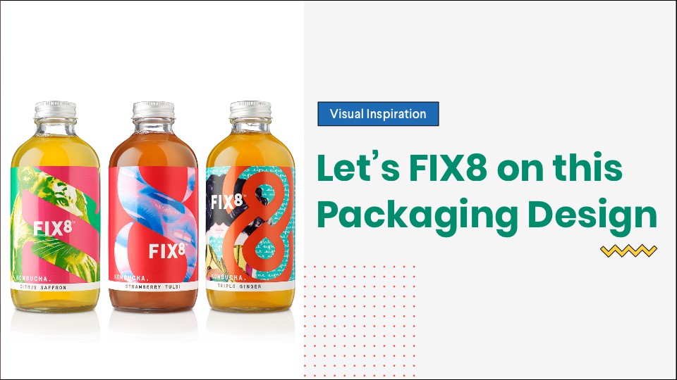
Last week, the team from TRIP suggested to check out FIX8 Kombucha for my next design inspiration blog, and boy am I glad!
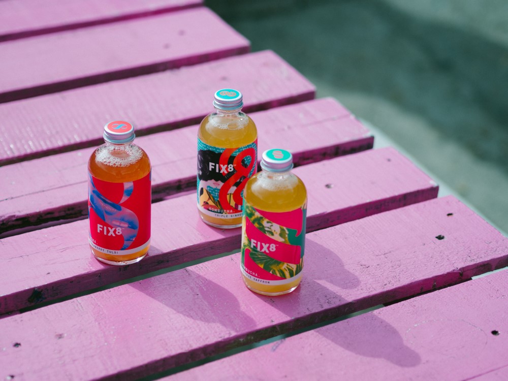
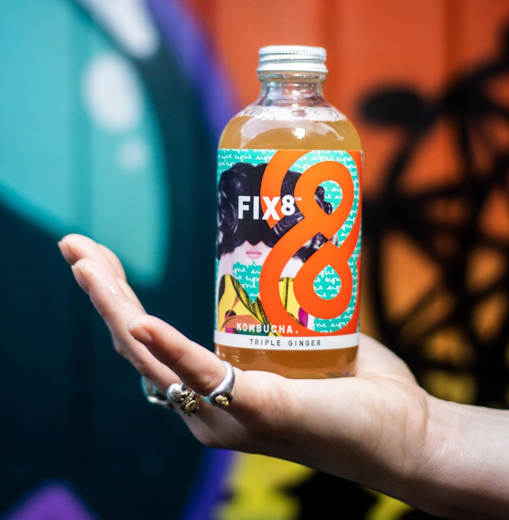
The colours on FIX8 bottle are vibrant and filled with art that it just makes you more curious.
FIX8 Founder Freya and her teammate Helen has been kind enough to share their journey and inspiration in designing and building this amazing product. It is just amazing how the simplest of moments in life inspire you to do great things.
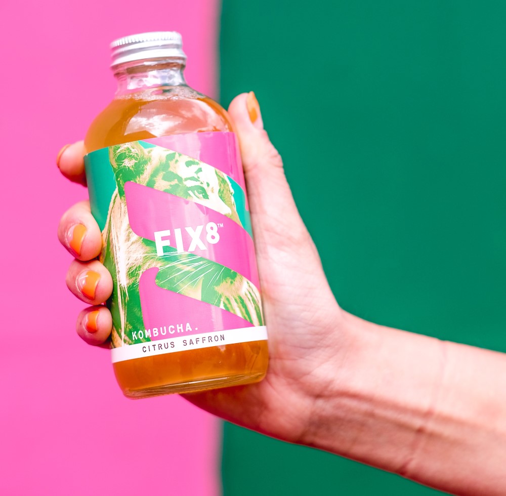
Table of Contents
Tell us how about how FIX8 project came to be?
We wanted to be more than just a ‘drink’ on a shelf. We wanted to create a brand, a lifestyle, and celebrate the positive feelings associated with drinking kombucha – a drink considered the ‘tea of immortality’ in Asia where it originated from.
The design was one of the important ways we planned to do this. Traditionally through design, kombucha was categorised by what it wasn’t: a medicine or a beer. For example, most kombucha brands existed in medicinal apothecary bottles reminiscent of a ‘potion’, or in traditional beer bottles.
We wanted to celebrate everything kombucha WAS, not what it WASN’T.
It was uplifting, buzzing, a loud and positively addictive drink. It is not a medicine or beer.
So, instead, we chose to focus on the feeling associated with drinking kombucha; the buzz. The live cultures and unique fermented taste are commonly known to refresh, rejuvenate and create a buzz for the consumer. FIX8 reflects this outcome in every drip of the brand: its vibrant colour pallet, direct tone of voice and graphic, and layered imagery to evoke an obsessive, addictive feel.
What was the inspiration behind FIX8?
In 2014, I moved to Shanghai for my year abroad during my time at Edinburgh University. I took a module in Traditional Chinese medicine and discovered my first kombucha sitting in the back of my teacher’s fridge during one of our classes. It was here that I first discovered the mysterious kombucha, which was commonly drunk across Asia to promote stomach and liver “Qi” (energy).
And it escalated from there; after drinking my first kombucha I became obsessed. I loved the unique taste at first but what kept me drinking it, again and again, was the vibrant feeling I experienced after drinking one. A fizzy, tasty, refreshing drink and a sense of mental clarity and a positively good feeling, you just don’t get from drinking a coca-cola.
When I returned to Edinburgh to finish my degree, I was brewing by the batch load underneath my desk and in my bedroom, and when I moved to London, I turned my parent’s flat into a micro-brewery.
6 years later, and I’m still doing it! The design is totally inspired by this raw connection I got from discovering kombucha, and is reflected every time we present our bottles to potential consumers; they love the vibrancy, want to learn more about what’s inside it, and what kombucha is all about. The hook of the colours, the words and the simple yet captivating bottle draws people in. Then they taste it, and they’re sold.
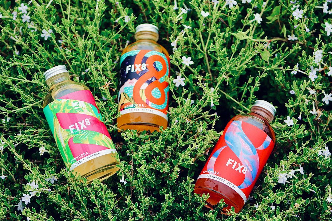
Fix8 was never going to be quiet or subdued, and it was just a case of searching far and wide for stand out, vibrant imagery, that could bring the buzz to life. I looked at brands I already loved, including brands from American i’d been watching for a while. We loved the vibrancy of Beavertown beer. We would discuss what we liked and didn’t like about various brands on the list, and what elements or ‘trait’s we wanted Fix8 to embody.
Our design partners – B&B Studio – were crucial in realising this, and helped direct and curate the conception of our brand, tone and artwork.
How did you bring this to life from a design and branding perspective?
In terms of design, hats off to B&B Studio who truly brought our vision to life, from our beautiful bottles to tap handles for our kegs, to our bespoke kegerators for ‘kombucha on tap’ that we have used in the Selfridges Food Hall, Eat17 and Atis London.
In terms of product, the process remains the same as when I was introduced to kombucha in Shanghai, 6 years ago. I truly value the authenticity of a kombucha, and my product is no different. We do not pasteurise, sterile filter or add additives of any kind, this is the real authentic thing!
What’s the response been like from the community?
The response to our design has been consistently positive. For me, it was really important to nail the brand in an increasingly visual world – it had to look sharp in the digital world and stand out on a shelf.
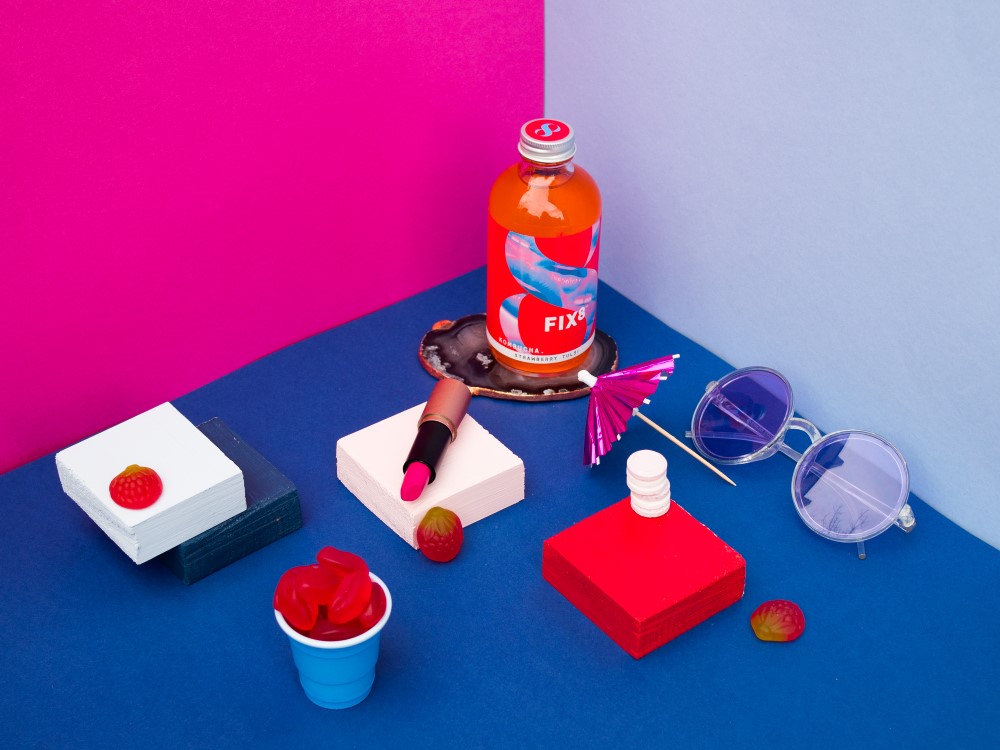
Most love the vibrancy of the brand, the celebration of colour and high energy. We had people even approach us at the London Coffee Festival, when we first exhibited in 2019, and ask if they could buy prints of our artwork to put up in their room! Now that was a real pinch-me moment.
Check out FIX8 on Instagram
Meet Freya Twigden, Founder of FIX8
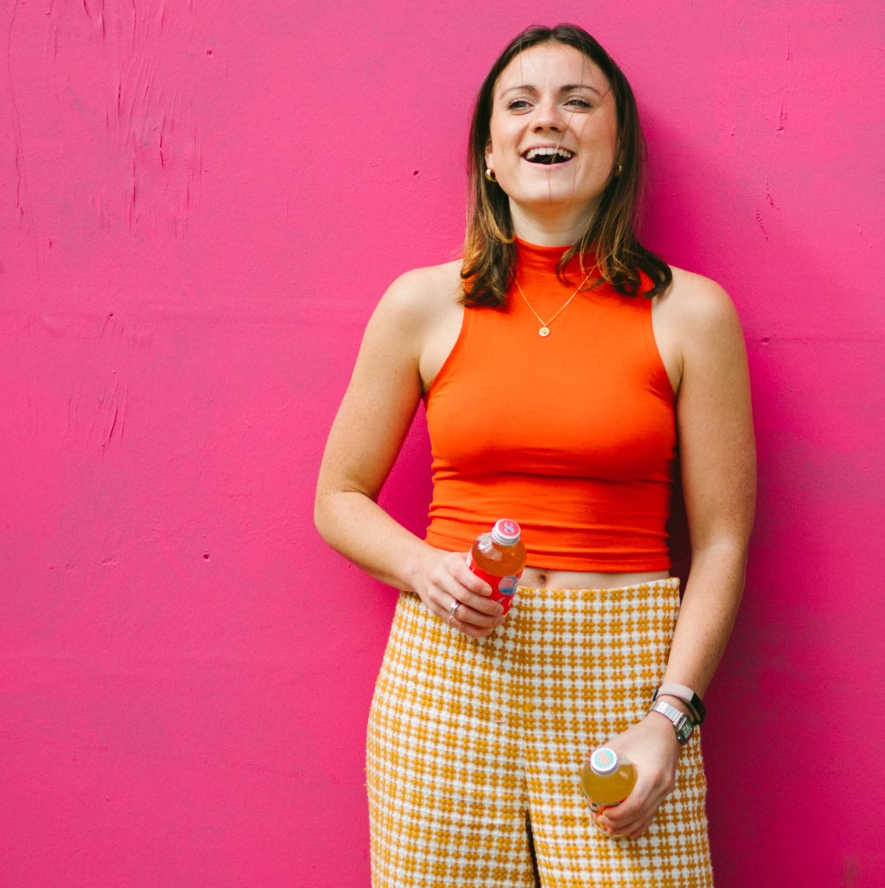
“Fix8 is the creative expression of my Kombucha addiction. A healthy high for sensible hedonists, a fix for the fermentally-fixated. I hope that you enjoy this wild, weird + wonderful drink half as much as me.”
What podcast and Spotify playlist do you recommend?
Oooo I have quite a few! I like listening to podcasts I can learn from so I’m a big fan of The Tim Ferris podcast, Rich Roll and Fearne Cotton’s ‘Happy Place’.
In terms of Spotify playlist – this generally depends on my mood. Recently, I’ve been enjoying putting ‘Rodriguez’ on a radio shuffle and just letting it play for the perfect Sunday tunes.
