A simple glimpse into your brand, an everlasting legacy, and a symbol of trust, a good logo is precious. Creativity is only the beginning of the game when you step into the design playground. But to really be impactful with your logo (or have a “good” logo), you must go several steps higher than the average designer. The market is oversaturated as it is, and there’s no room for boring or repetitive.
Influential logos are unique, practical, appropriate, graphic, and simple in form. Most of all, they can successfully convey a brand’s intended story or message. Usually, there’s a lot more at play here than just the technicality of it.
A good logo has a concept or meaning behind it, something that’s a visualization of what a business is or what it stands for, and speaks to customers. It should work in both small or huge sizes and be effective even without color.
But often, that is not the case. Case in point? The new logos for Google. As it happens, people aren’t thrilled with it.
CAN WE ALL JUST TAKE A MOMENT TO DISCUSS WHAT HOT TRASH THIS LOGO IS?? Literally lost my gmail tab MULTIPLE times today because it's so hard to see & read. WHO DID THIS? Whyyyyyyy? pic.twitter.com/eWAyxfgBGx
— Robin Hunicke (@hunicke) October 29, 2020
Why did it happen? And how does one distinguish a good logo from a bad logo? Let’s find out.
Table of Contents
So What Is A Good Logo and Why Does Your Brand Needs One?
To comprehend what a logo is, we must first understand why it is necessary. A logo usually aims to inform, inspire, or attract. You should work to ensure that it is easily recognizable, inspire loyalty and admiration, and has a pull-in factor (the ability to attract potential customers).
That aside, it’s also important to make your logo versatile and timeless. In other words, it should work in all places and at all times and shouldn’t be made less valuable by any slight change. Perhaps, that is one reason why Google has decided to change the logo for its applications – to make them timeless and unified.
What are your thoughts of the new Google apps logo? pic.twitter.com/tbZBZlZfFE
— NinjaDude HD™ (@IamNinjaDude1) October 28, 2020
For example, the logo featured below is that of the high-end fashion brand, Chanel. You may already know that but what you may not know is that this picture is from Tokyo, Japan. So, despite being a US-centric brand, the power of a good logo can extend beyond borders, in different countries, and throughout time.
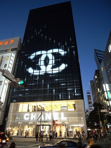
The Unbelievable Power A Logo Can Have
If you think that your logo will only act as a plain symbol that you can place on one corner of your website and be done with it, think again. Logos are incredibly powerful. They can sometimes achieve what even extensive marketing campaigns and clever sales tactics may not be able to.
Let’s take McDonald’s as an example.

This famous McDonald’s branch from Times Square is one that stands unparalleled in just how intriguing it is in its appeal. The pull-in factor is incredibly strong here as you take one look at it and immediately feel the need to go in and get yourself some fries, a coke, and a burger. (Did anyone say “Big Mac”? No, it’s just the logo.)
How Your Logo Ties Into Your Brand?
With that, let’s come to how your logo should connect to your brand and have the ability to speak to your customer base. This part is significant because it’s one of the primary ways you can tell whether a logo is good or not.
Aesthetics aside, a logo may represent your brand’s values, what your business sells or promotes, and exactly how you can be of value to people.
It would help if you thought of it this way. If someone who has never heard of your business before looks at your logo for the first time, what would they see or feel? Then, use that perspective as a guiding compass on the kind of brand aspects you may want to consider before creating your logo.
That aside, let’s now dive into some basic questions that you can ask yourself to determine whether a logo is good or bad. These are essentially the key components that any effective logo should have.
Is It Simple?
Some of the most famous logos of the entire world are the simplest and most minimalistic ones. Take Nike as an example. If you step away for a second and think of this brilliant shoe brand as just another ordinary business that once started from scratch, you may throw up all your metaphorical papers in confusion. A checkmark? Really? That’s the best you could do? AND SOMEHOW, IT WORKED?!
Even saying it worked is an understatement. The point is, you shouldn’t think too hard. If an idea comes naturally to you, chances are it’s a good one.
Is It Versatile?
So while creating a logo, one of the most crucial things to keep in mind is that this small symbol will appear in places of all kinds and forms. From print media to digital, do you think it will be effective no matter where it’s placed?

Versatility is an aspect of whether the size, color, and design of a logo will work in different situations. As a general guide, you can take help from the following exercise to determine how versatile your logo is. So, ask yourself whether your logo is effective:
- In different shades (perhaps light logo on a dark background)?
- In one color?
- The size of a postage stamp?
- As large as a billboard?
Is It Memorable?
One of the primary purposes of a logo is to create an indirect call-to-action for potential consumers. So, unless you have one that “sticks” in mind as soon as you see it, it’s not likely to be very memorable. Take a look at the Slack logo for instance – people seem to think that it’s definitely memorable.
You’ll never unsee this new slack logo refresh pic.twitter.com/2qv2APkLG9
— Kyle 🍔🍟 (@kpmdev) January 16, 2019
And to avoid this, the best thing you can do is to ensure it’s clean, simple, and minimalistic. In other words, don’t try too hard or get too fancy with it. However, do put enough effort into it that it successfully represents your brand.
Is It Timeless?
Meanwhile, if you’ve committed to building a brand, chances are you want it to stay around for a long time (perhaps even after you die). Considering this, have you made sure that your logo is timeless? In other words, can it stand the test of time?

Is It Appropriate?
Depending on the kind of business or brand you have, your logo must be one that’s appropriate to your niche. For example, cafes or restaurants have no place sticking their logos into dark themes (whether that means color codes or non-food related implications).
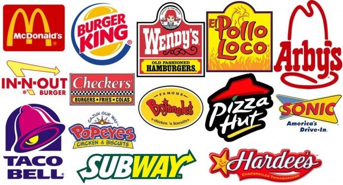
You may have noticed that many fast food joints commonly use red, yellow, and orange colors. Well, that is for a reason. Studies show that colors like that can make people feel hungry and create a sense of urgency! So, you may want to delve into some good value market research before finalizing it.
Similarly, a toy store for children would be a lot better off having a colorful logo, appealing to little kids, and stated, looks cute.
Key Takeaway
The power of a logo is unbelievably influential, and unless you’re doing it right, you may end up missing out on an entire ball game. Simplicity, versatility, memorability, and timelessness are the key components of a “good” logo.
It has to be one that can emotionally communicate with your audience, truly represent what your brand stands for, and reflect all the potential you may have, is one that has real power.
We hope that these simple tips help you create better logos and that you can spread the value around!
