A killer guide to typography design for beginners
Typography design is a bigger part of our life than we realize. From the list of ingredients on the back of a pack of chips to the size of the letters on a street sign, everywhere we go, every product we see, typography is present.
Of course, if you want inspiration and typography design ideas, you will not be looking at street signs and product ingredients. Some countless graphics and designs can be an inspiration for you.
Typography in graphic design is one of the most crucial elements. No matter what you are working on, you need to know and understand some rules regarding typography design. Knowing the principles that apply to typography can help you excel.
As a designer, when you know the elements of typography design related to the fonts, etc., it can make your work stand out and have meaning. Your clients are also more likely to be impressed once they realize that you know your craft.
Before getting into this typography design guide, let's go through the basics.
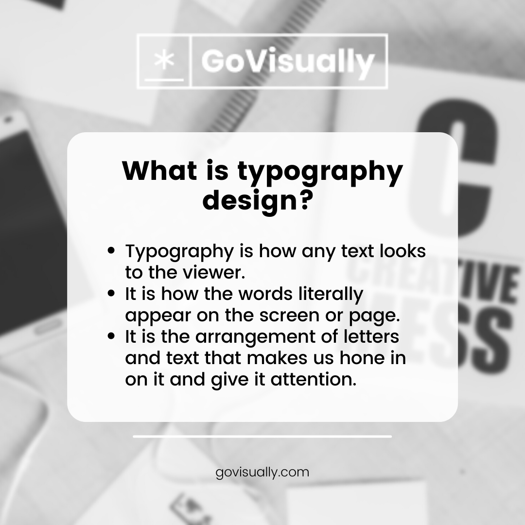
What is typography design?
In general terms, typography is how any text looks to the viewer. It is how the words appear on the screen or page. The arrangement of letters and text makes us hone in on it and give it attention.
Typography designers should know the art of arranging the text in an aesthetically pleasing and nice to look at. It is also essential that the text is readable. You don't have to develop your letterforms for typography design, but you must work with the existing typefaces.
As a designer, typography can be done by choosing the most suitable typeface, adjusting the size and weight of the text, managing the kerning, changing the line spacing, and coming up with a layout that looks good and is readable.
Thanks to technological advancement, typography design can be done using your desktop, laptop, tablet, or mobile phone. It can be done quickly and more efficiently, making typography design more accessible for the designers.
Common typography design terms
Typeface and fonts
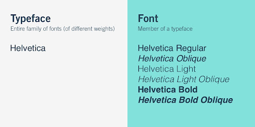
The typeface is the feel and looks you apply to a set of alphabets or numeric characters. Some of the most popular and common typefaces include Arial, Times New Roman, Helvetica, Calibri, and Courier.
Most people think typefaces are fonts, which is not true. Fonts are specific kinds of typefaces. A font that falls within a typeface can have different weights (it can be bolder or lighter), various sizes, and other stylizations (it can be italicized or rounded).
For example, Helvetica light, Helvetica bold oblique, and Helvetica regular are all fonts found within the Helvetica typeface.
Hierarchy
Whether you are doing typography graphic design for digital work or whether it is for print, hierarchy is used to divide the text into sections from most-prominent to least-prominent. Hierarchy contributes heavily to the readability and ease of navigation of a page.
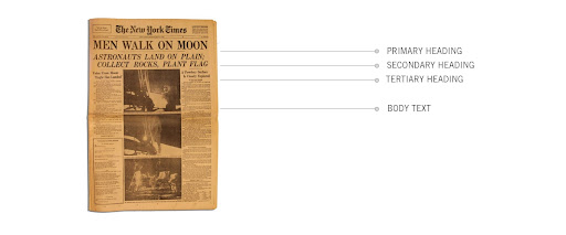
Readers and viewers should be able to get to the section they want to read about by reading the headings alone. Typography design determines the hierarchy on the page by using different font sizes, styles, weights, or even by using different typefaces.
Leading
Leading, also known as line-spacing, is the vertical space between text. It is pronounced as the element "lead." The leading of the text is often determined by terms such as "single-spaced" or "double-spaced."
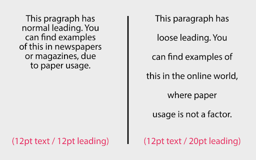
Leading can also be described using units of points or pixels. It is crucial to get the leading right for typography design as it can help navigate the text. Too little or too much leading can make the text challenging to read.
Kerning
Kerning is the space between the letters horizontally. The kerning for fonts can be wide or small, depending on which one makes the text more readable. Adjusting the kerning of a font can also help avoid awkward gaps between letters and improve legibility.
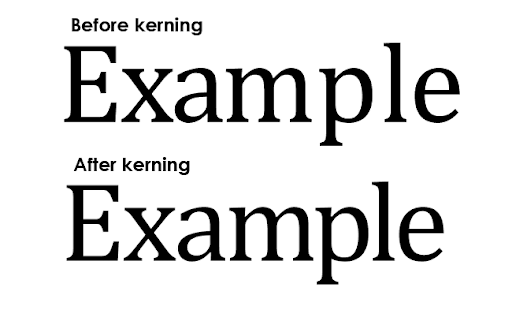
Fonts commonly have specific kernings for every pair of letters, ensuring that all text characters fit together nicely. You can also make custom adjustments to the kernings to see which setting makes the text look better.
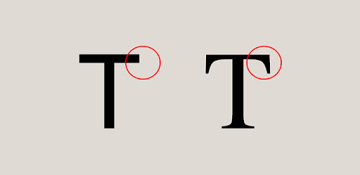
Serif and sans-serif
Almost all fonts have one of the two styles: serif and sans-serif. A serif is a small projection off of the main body of a letter. Sans meaning without in French and fonts without this ornamental projection are called sans-serif fonts.
Other than serif and sans-serif, there is another font style called script. Script fonts are designed to match the fluid strokes created by handwriting. Script fonts are used much less than serif and sans-serif fonts because they are usually difficult to read.
5 typography design rules all beginners should know
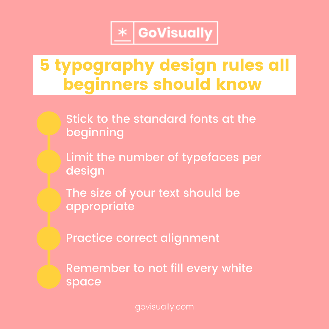
1. Stick to the standard fonts at the beginning
There are many typefaces available to you as a designer. When you first start, it's okay to play around with different typefaces and see which ones you like the most. However, there are a few typefaces you should always avoid until you're an experienced typography designer.
These typefaces are not standard and won't be supported by various devices and platforms. If you use one of these, you're likely to end up with a design that looks much different on a smartphone than on a tablet. This can make it difficult for your readers to follow your content.
When starting with typography design, you should stick to the tried and true fonts in the beginning. There are hundreds of thousands of fonts out there, and it can get overwhelming for a beginner to choose from all the options. Always start your journey with the common typefaces and fonts that everyone knows.
2. Limit the number of typefaces per design
Typography is one of the most important aspects of web design, and it can make or break the user experience of your website. To make your typography stand out from the crowd, you need to be using the right typeface in the right context, and you need to know the basics of how to do it.
Good typography is crucial to a good user experience, and a good user experience is essential to a good website. It's the difference between making a good impression and making a good sale. Proper typography design makes words and letters look good together. It is important to choose the right font suited for the purpose.
When choosing typography for your design, choosing one typeface and using it consistently is important. If you need to use more than one typeface, choose fonts from the same typeface family.
3. The size of your text should be appropriate
The typography design size refers to the size of the text on your website or blog. If you choose too large or too small text, it may affect your readers' attitude. However, some users may feel that it is not easy to read if the text is too small.
One of the most important things to consider is the size of your text. There is a difference between a large text and a big text. A big text can make the whole web page look bad and unprofessional, but a large text can make your website look more attractive and appealing to the viewers. If the text size is too large, it may affect the user's eye fatigue.
In the web design world, the text used for the web pages is the body copy. It is the most important text on the website. It is also the most difficult text to make readable. The reason why is because there is usually a lot of text.
[elementor-template id="3538"]
4. Practice correct alignment
Creating a well-formatted document requires a lot of effort and precision. You must pay attention to the alignment of your text, as it will reflect your level of professionalism. The text alignment is also called "justification," and it determines the spacing between all characters.
There are 3 basic types of alignment: left, right, and centered. The left and right alignment are the most common and are used for body text. They are usually used in documents, like reports, articles, and essays.
Clients judge the value of your design based on the visual appeal of the typography. The correct alignment can be the difference between a good and a great design. The purpose of alignment is to create visual order and unify the text's appearance.
5. Remember not to fill every white space
Whether print or web, your job is to guide the reader's eye in any design project. This means that you need to use a variety of elements to lead the viewer's attention from the beginning to the end. One of the most important elements is the white spaces or the spaces.
As a beginner typographer, you may be tempted to fill every white space that you come across, but this is something that you should avoid. It would help if you left some white spaces to create a visually appealing typography design.
White spaces are great because it helps to draw the eye to the content. If you have too much white space, it can be distracting if you fill the white space with something.
When you fill white spaces with text, your page looks cluttered and messy. For example, if you have a header and fill it with a background color, it can be distracting because your eye will be drawn to the header instead of the content. White space is used to draw the eye to the content.
Make your typography design approval process efficient with GoVisually
Typography design is a vast domain that all graphic designers and web designers must understand. The entire field of typography is full of possibilities and excitement, but it can also be intimidating, especially if you're starting. Understanding the basics of typography design can help you excel in the field.
GoVisually is one of the top online proofing tools. You can upload any typography designs you create and get approval from the clients without any hassle. Through GoVisually, your clients can view the design and leave comments regarding any changes that need to be made to the design.
GoVisually makes it easy and simple for you to make edits in real-time, without the need for long email chains and sending the design and edits back and forth to your clients. It streamlines your workflow and makes it significantly more efficient.
[elementor-template id="9369"]