Today millions of businesses are trying to make a name for themselves and having a strong brand has become crucial to differentiate yourself from your competitors. When creating a brand, there needs to be an overall goal and vision for what you want to achieve. It’s not a – “I like this design, let’s keep it” scenario. Branding decisions should be based on business goals, research, and discovery. When asking ourselves what we stand for, the answers should resonate on our brand.
Branding is a system of colours, forms, shapes, patterns, and photography that speaks everything you are, and you are not.
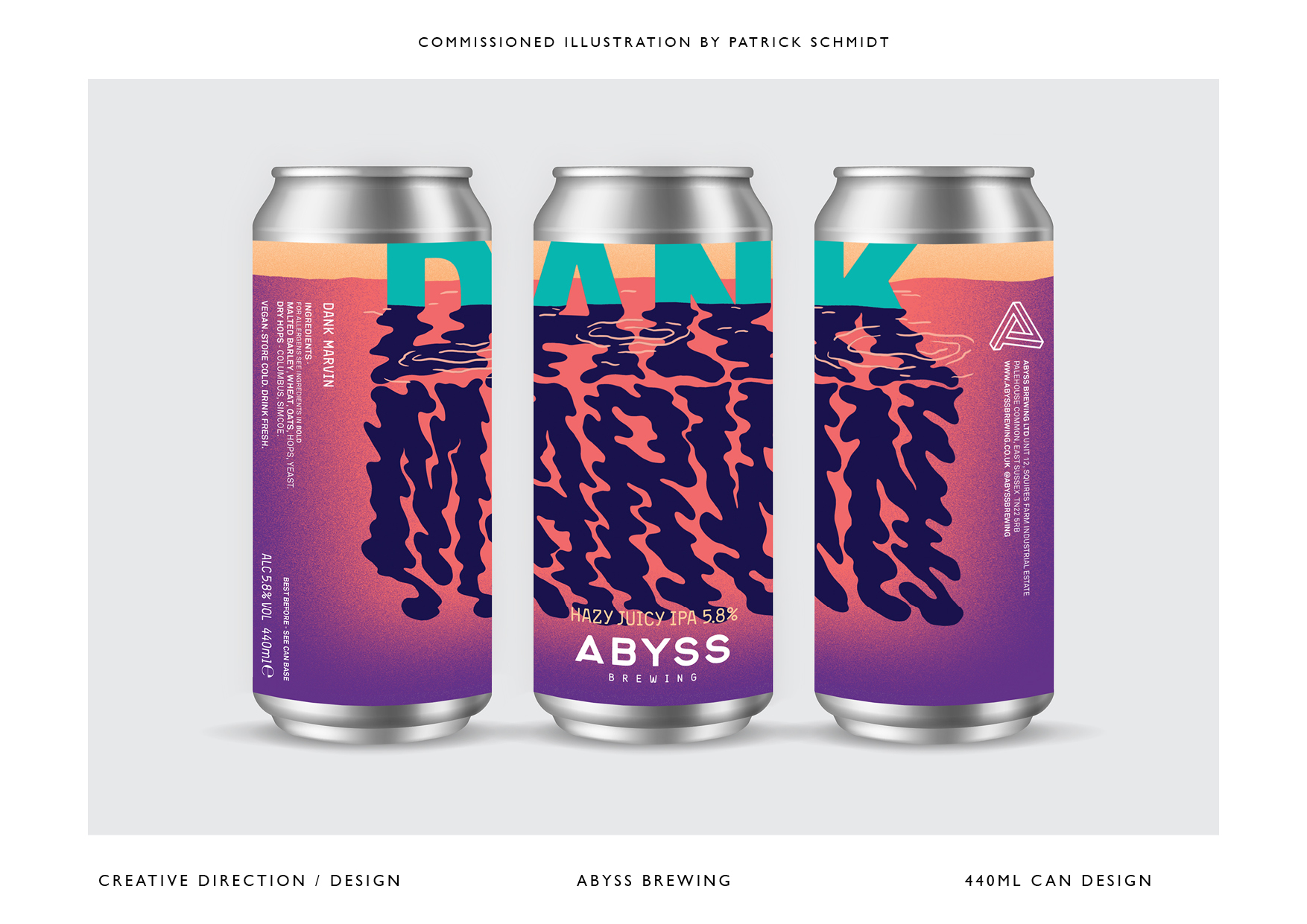
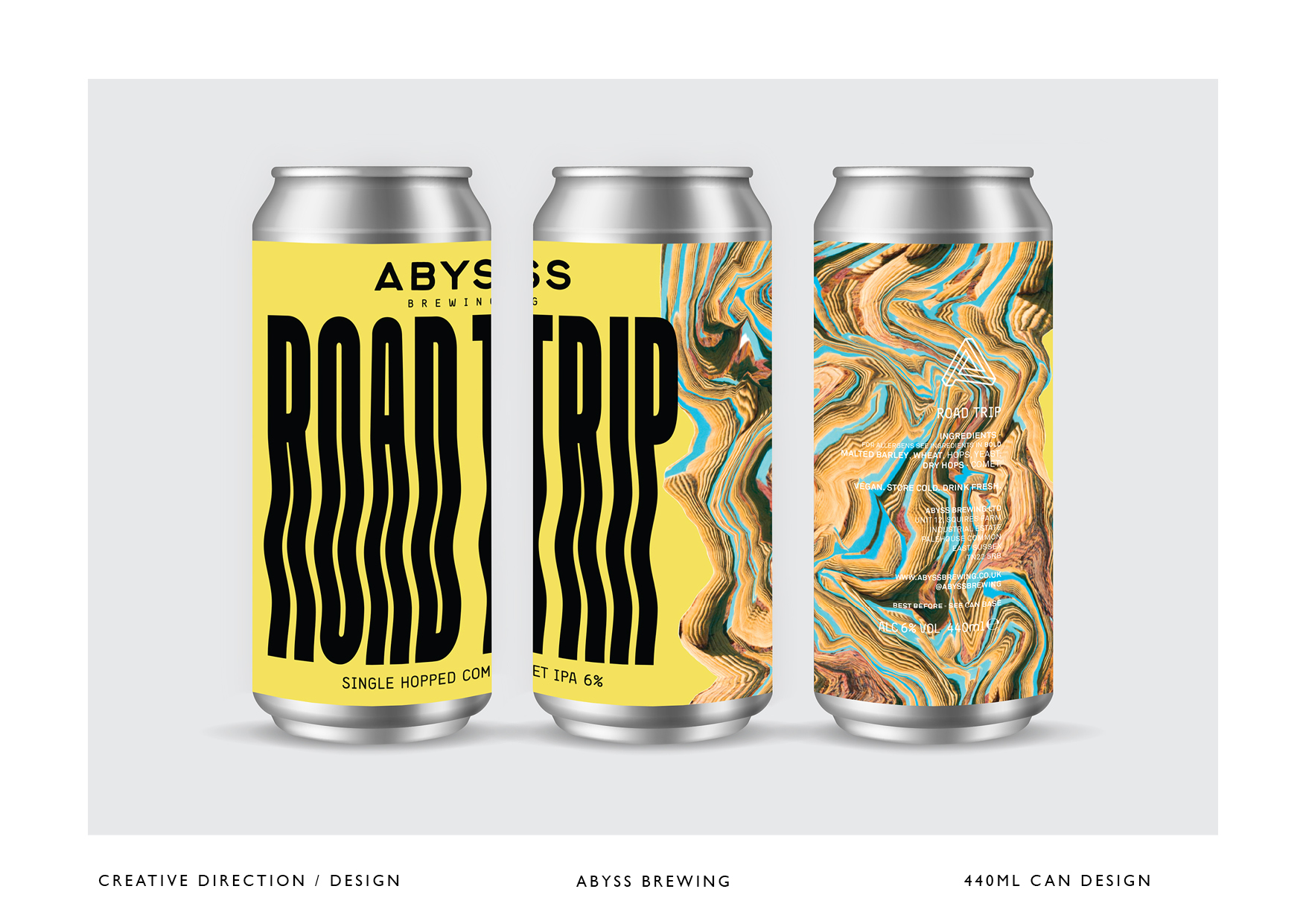
Few weeks ago we came across a set of stunning beer cans from ABYSS. Not sure if the beer adds to the effect, but it felt like the cans were speaking to me! We spoke with Art Director and Senior Creative, Gill Patchett, to discover how she came up with the amazing branding design for ABYSS Brewing Ltd.
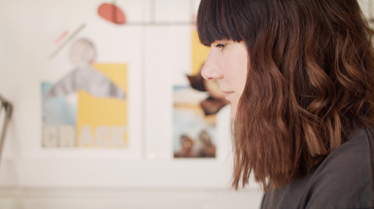 “Follow your own path – don’t be afraid to go against the grain!“ – Gill Patchett |
|---|
Table of Contents
What was the project briefing you received?
ABYSS team reached out to me to create a contemporary brand identity for a forward-thinking microbrewery that would stand out and shout in a visually busy and saturated market as well as creating a strong identity.
I was also tasked with creating the visual direction which would be used throughout the brand, for example; can & keg badge designs, online presence, exhibitions/festival stands.
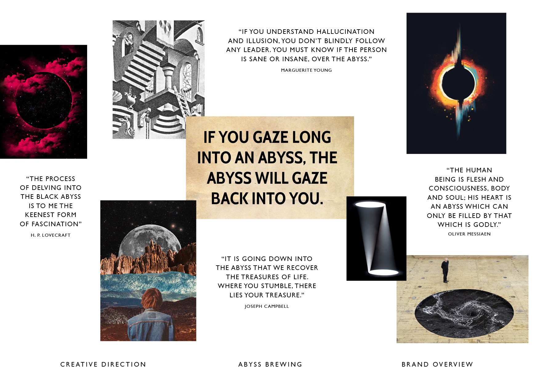
Working with the Friedrich Nietzsche quote ‘If you gaze into the ABYSS, the ABYSS will gaze back into you’ – the challenge was to develop an aesthetic that conveyed a positive version of an ABYSS; a kaleidoscopic world where the consumer could discover their own ABYSS through a range of modern beers.
How did you find inspiration?
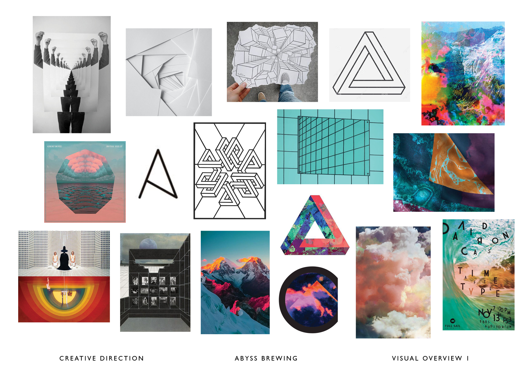
I discussed with the client what inspired the name and what it meant to them, what they were drawn to visually, their personal tastes and their interests. I then explored the notion of an ABYSS and how that would be represented visually – I looked at Escher and his impossible, perpetual art, psychedelia, optical art and collage, the DIY grunge & punk ethos and references from the album art and old graphic comics.
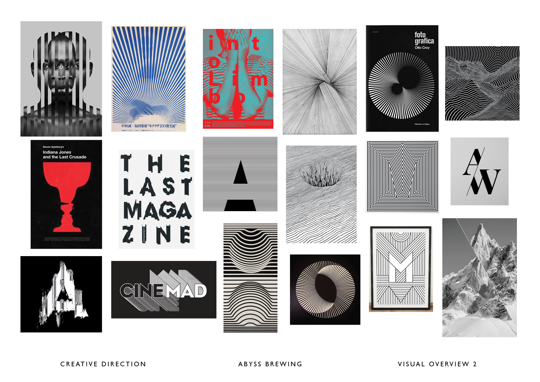
I think the internet is a great tool for research, but this shouldn’t be the only source of inspiration – look around you, take photos, read books, go to exhibitions (obviously pre COVID-19!) A lot of inspiration can come from personal experience; I once designed an invite for a fashion brands design show that was inspired by an element from a childhood board game, and I love it when a photo you may have taken a couple of years ago, or an exhibition you went to see, suddenly jolts your memory and in turn inspires a project.
What tools did you use for designing this project?
I work on a MAC using mostly Illustrator, InDesign and Photoshop. I also like to try and move away from the computer whenever I can, and because of the nature of this project, I was able to include some hand-drawn elements. I’m a big fan of manipulating artwork on a scanner or printer, so I got to play around with that too!
How did you bring this to life from a design and branding perspective?
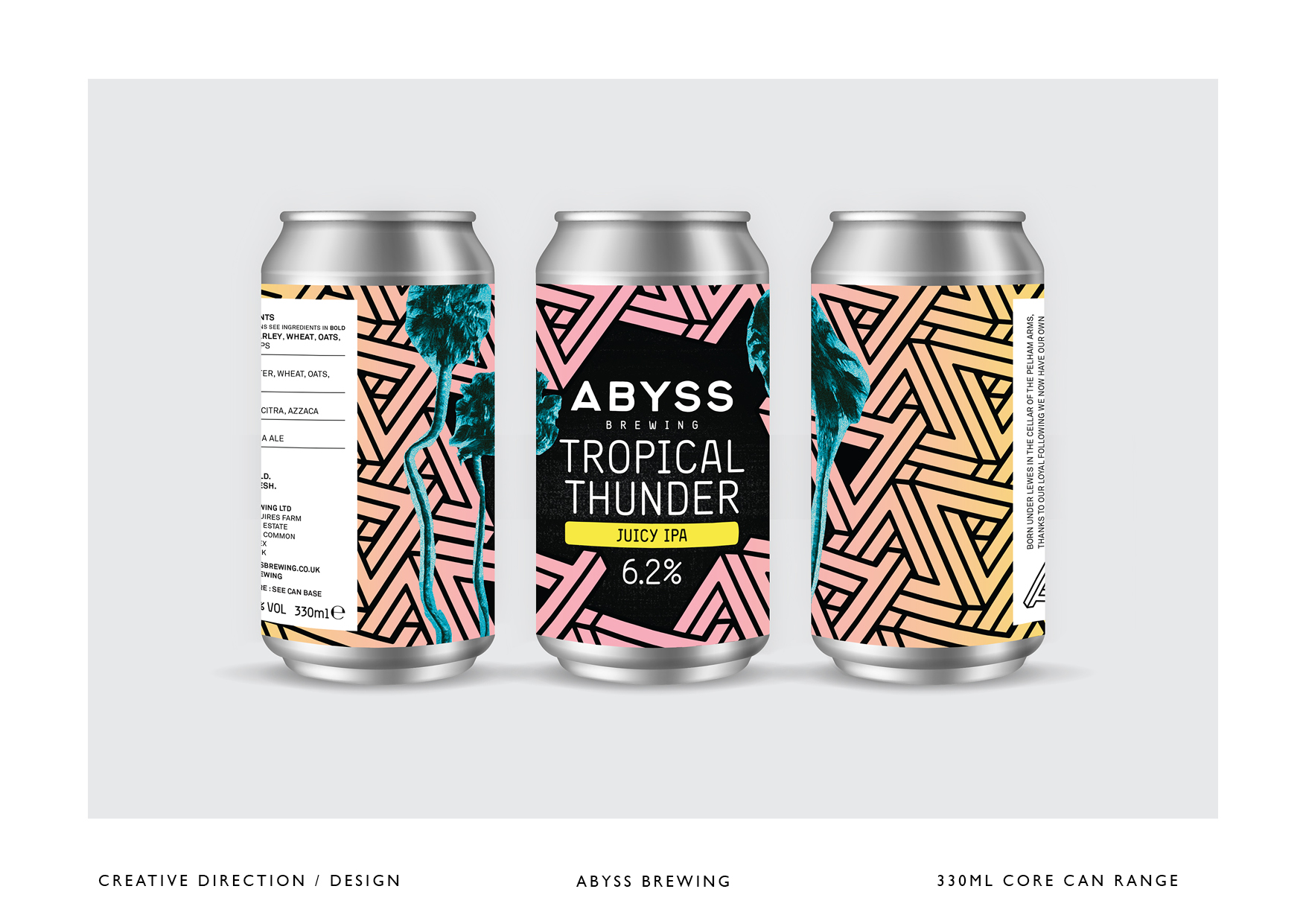
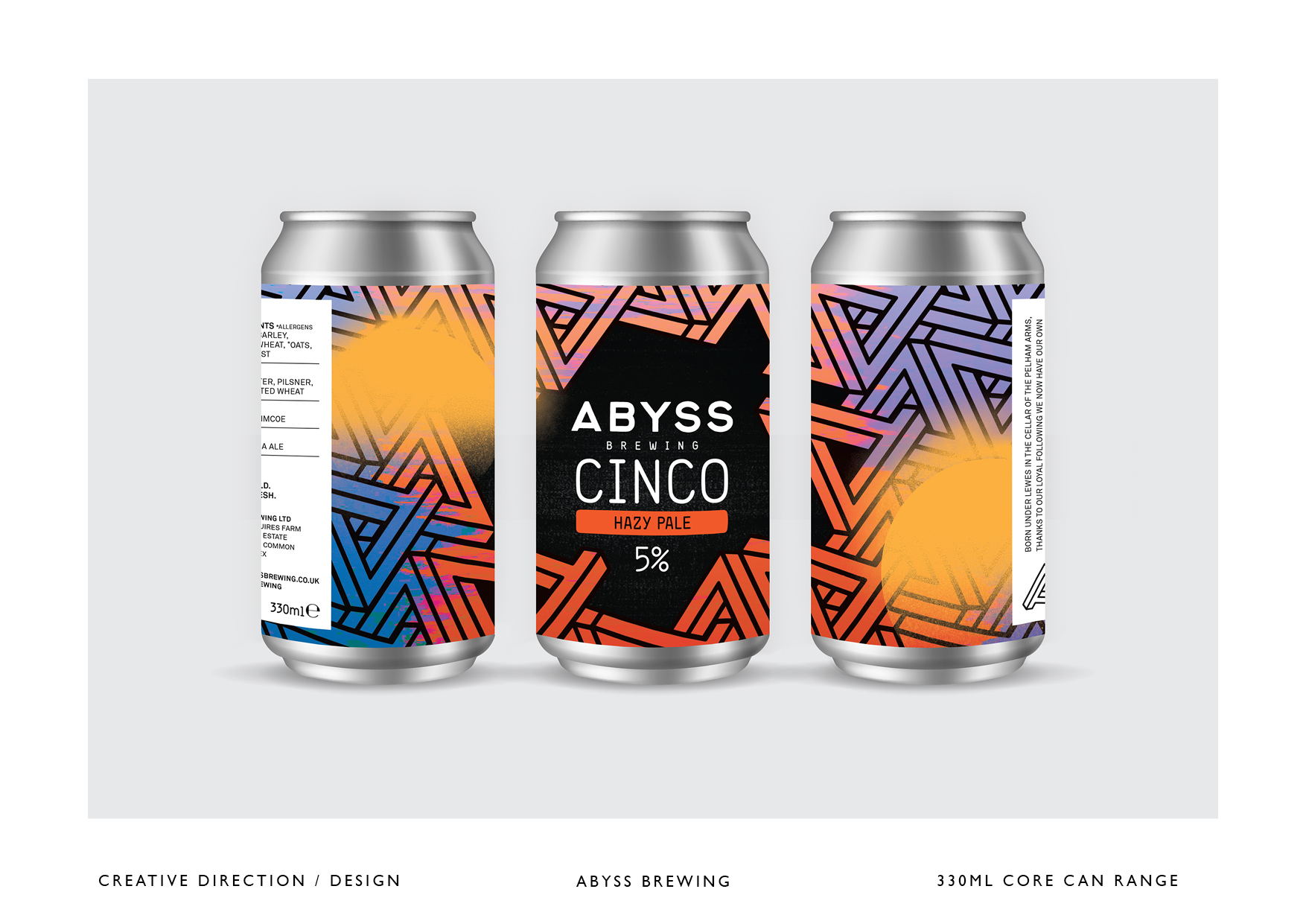
The first stage of the project was a soft launch, implementing the branding on social media, tap handles for bars, and banners for various beer festivals and promotional events. Initially, there was an urgency to launch the brewery as the beer was ready to keg and sell, though we were still figuring out the visual language which would guide the design for the keg badges and cans.
To get around this we produced a set of brand-specific keg badges to launch with – basic black and white designs using the brand identity, graphics, and fonts – this way it allowed us to get a feel for the market and see where we wanted to position ourselves, rather than rushing ahead with a bold statement and then possibly having to change it further down the line. For me, this was a very different way of working than I was used to, but it worked really well in terms of designer-client relationship, as it allowed us to slowly build the brewery’s visual language together as the business grew. And I feel by doing so, we’ve produced a brand that both client and designer are proud of – and as any designer will tell you it doesn’t always work out that way!
What result this project had in terms of response from client and community?
The client loved both the branding and design aesthetic – it’s an ongoing project, with new can designs being released nearly every month, so we still work closely on developing the brand and keeping it relevant.
The branding was also applauded by both peers in the craft beer world and customers alike. I’m quite unassuming by nature, so although I find praise slightly uncomfortable, it’s also great when a project you’ve been working on for months receives positive feedback when launched.
More recently, the brewery took part in a prominent craft beer festival in London, where many different breweries are represented – both attendees and brewers alike commented that the ABYSS branding, and aesthetic, stood out amongst the crowd. That for me was the ultimate feedback as it meant I had done my job in fulfilling the original brief.
