How to Choose the Right Typeface for Your Design
As a designer, you would probably know the difference between a font and typeface. However, the big question here is; how do you translate that into a business or brand image? How do you make sure that your brand's designs have the right typeface?
But why is that even important?
At this point, you might be thinking about why choosing the right typeface is important, especially if you don't have a background in design. Here are a few important reasons why choosing the right typeface for your design can uplift or drown your design work.
A complete design is made up of different elements, including design and the typeface used. So without the right typeface, the overall quality or appeal of your design can be affected.
Yes, there are a thousand different fonts available for use. However, not all will suit your design or brand image. That is why you need to carefully choose fonts that complement one another and look great in digital and print forms.
Convinced? Great! Let's move on to decide the right typeface selection process in the next section.
So how do I make sure that I pick the right typeface?
We wouldn't lie to you! With so many great typefaces and fonts to select from, it is possible to get confused. However, some ways can help you complete this task.
So, to help you choose the best typefaces for your design, we have a few secret tips for you! Use them to have a more precise understanding of the different types of typefaces.
Let's start!
Serif and Sab Serif Fonts
The first thing that anyone should understand is the different types of fonts and the difference between the various typography types.
There are serif, san serif, script, and decorative fonts that are used for multiple brands. The primary difference is whether the fonts are serif or san serif, and where should the particular fonts be used?
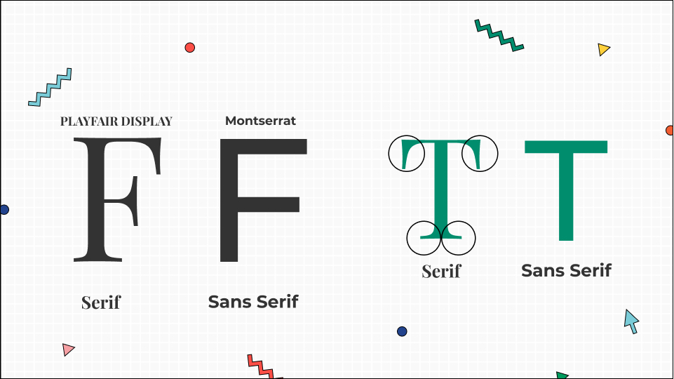
Serif fonts are used to represent something traditional and give a more retro feel. On the other hand, san serif fonts are used to create a very modern and updated look. Check out websites like Dafont and Font squirrel provide a wide range of fonts.
Use Contrast
Avoid using fonts that are massively the same because then neither you nor your audience will understand the difference between the two. Instead, go for contrast.
Different fonts are used to make sure that you express a difference and emphasize headings, subheadings, and general text. If all the texts are going to be look-alike, then it is impossible to see the difference. And you will not be able to move the reader’s attention towards what is essential.
Also, make sure that the contrast looks better and are not contradicting one another. You can contrast serif and sans serif font or try out fonts from one category of fonts.
But we'd suggest that you generally avoid using fonts with a lot of contrast. Too much contrast can ruin the entire look and kill the whole vibe you might be creating for a particular design.
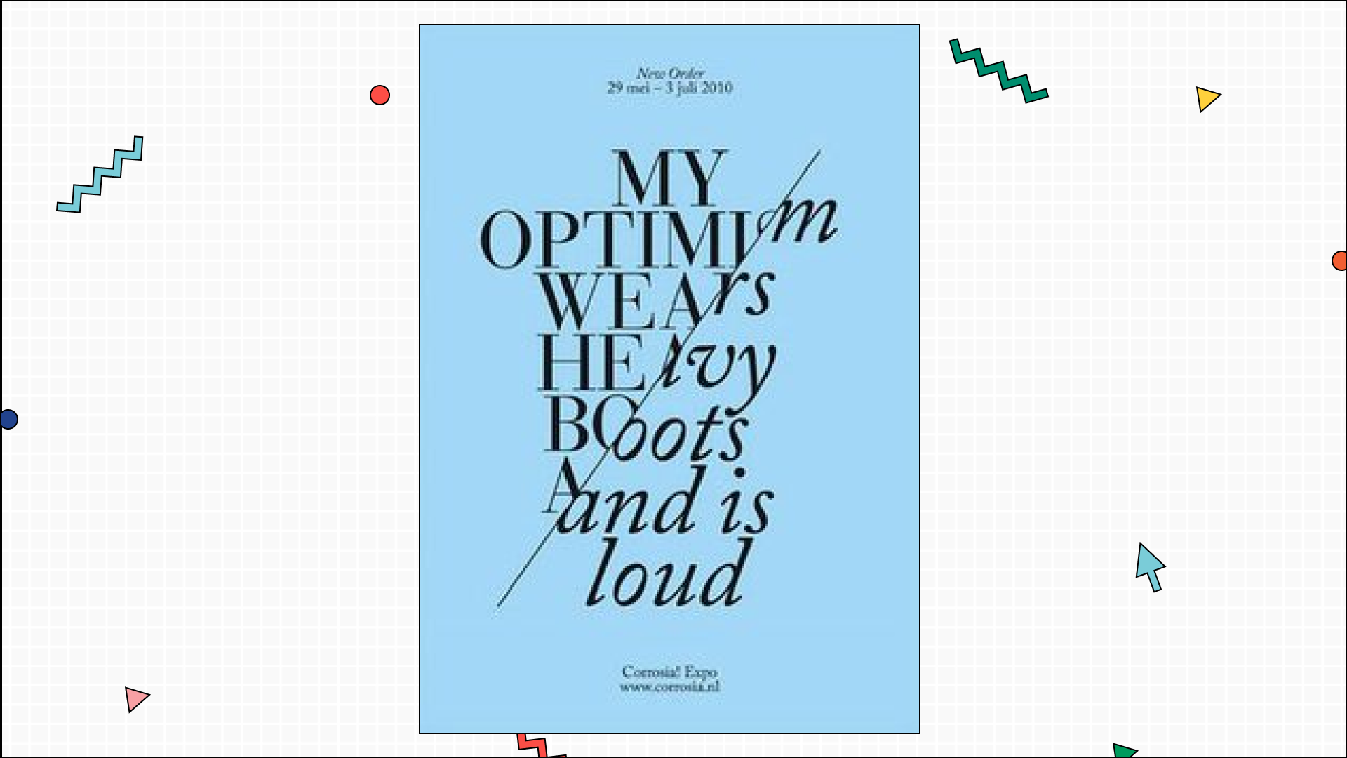
Here's an example of a great way of using contrast in the typeface. See how the different fonts enhance the appeal and the underlying message of the design. This is what you should be aiming for!
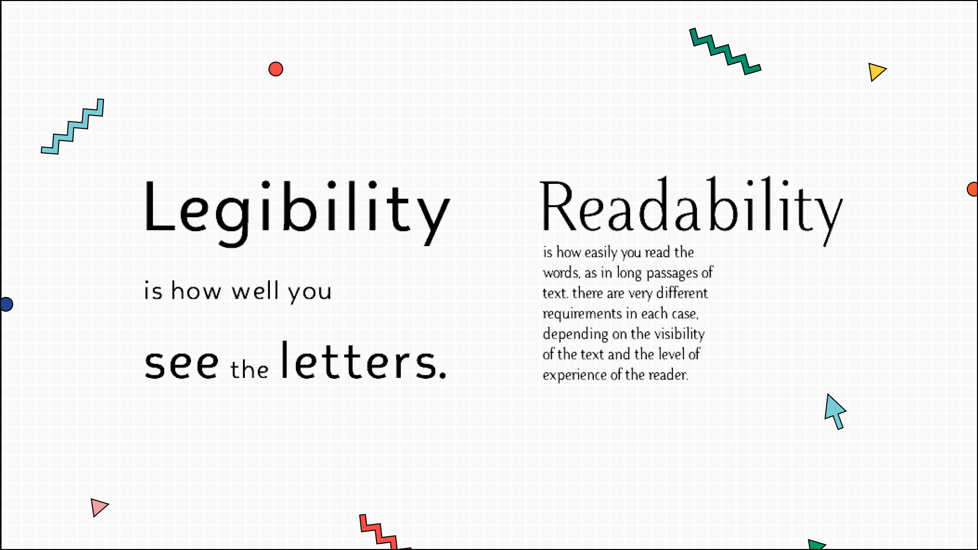
Readability
Readability is how well someone reads your text, whether in print or digital form. You want people to read what's on your design, right? Otherwise, the design itself would become counterintuitive. So as a designer, you should always choose a readable font.
Make sure that all the letters of the font you use are clear and readable. If it is not eligible, you need to change the font and select a readable one.
Legibility
In straightforward terms, legibility is how easily a person can distinguish multiple characters or text. Legibility is a crucial rule to see that the design is not ruined.
You can determine it by many different yet essential factors. These include:
- Contrast
- Uppercase letters
- Lowercase letters
- Kerning
- How serif or san serif font is.
According to many designers, upright fonts are more legible than fonts that are slanted or italics.
Now, it's even an essential part of UI design. That's because the text should be readable to people on both laptops and mobile versions of the website or the application.
However, these rules are not fixed; they can be changed according to the design's needs and requirements. So then, how do you find out that the typeface is legible?
There is a simple test that you can try to see if the font is legible. Write a capital I, lowercase I, and the number one. If you cannot distinguish between the three, you have a legibility problem, but if you can do so, then the font is good to go.
Goal
Another vital point to keep in mind is your goal for the design you're working on. If your goal is to give a vibe that the design is for a child, you should use a similar font. Similarly, if you want to show that your design is for a different kind of generation, you use fonts to match the goal.
And that is just one of the things you should consider while creating the design goal. You should also keep the brand image in mind while creating your goal.
So, to reach your goal, here are 4 things you should do:
- A lot of research
- Look into the particularities and requirements of the project you are working on.
- Discuss internally with your team the targets you hope to achieve with this design.
- Check if there are any projects similar to the one you are currently working on and use those as reference guides.
Web Safe
This part is quite important to ensure that you're picking a web-safe font. So while selecting a font, see that it is rendered on the browser without any issue. Ensure that you are using OTF or WOFF, a web-safe font file that means your font would be web-safe.
Another vital element to consider here is the performance. Web fonts have comparatively good performance as compared to the other fonts. Avoid using fonts with low performance as it will also affect your website’s speed, simultaneously affecting its loading time and affecting the user experience.
We'd suggest you try Google fonts; they are web-safe and offers a variety of them. Moreover, they are available in different languages as well.
Keep Testing
Don't be afraid to make something that might fail. The best way to go about it to keep testing with different fonts that you have. That is until you find the perfect one.
Check out different websites as well and see the kind of typography that they are using. It will eventually help you get a better idea of the kind of typography to use and the different styles you can use to pair them up.
You'd be surprised to know how useful testing and research can prove to be in times when nothing else seems to be working correctly. With the help of multiple examples, you get time to brainstorm and have a clear idea of the various options you can try.
Learn More About Typography & Typeface
This might be a starting point for you but make sure that you keep learning more about it. Learn what typography is, the types of font faces present, what looks the use of different fonts gives out, how you choose the best fonts for your projects, and how you can improve your typography use.
There are so many different YouTube channels and Blogs present that focus on typography. You can learn:
- The basics of typography
- Important typography and typeface terms and rules you should know.
- Different font types
- Use case of the typeface.
- Inspirational content to get motivated from or inspired by
- Designing typography
- Typographic art & illustarions
Once you have learned all about it and have started using it actively, that is the time that you turn into a teacher yourself and begin teaching others about it.
Key Takeaway
Choosing the right typography is crucial to your design. But what's more important is making sure that they align with one another instead of contradicting. However, as it stands, doing so can be one hell of a task. So we hope that with these right steps, you can easily do that. Just make sure you combine elements that look good together and give your brand a complete feel.