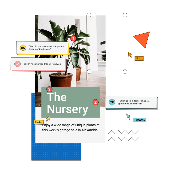
Getting feedback on banner ads from your clients is always something we all dread. How do we get them to see the banner ad design efficiently? How do we get their feedback and make the edits quickly?
Well, thanks to GoVisually, that problem does not have to exist anymore. Sharing banner ads with clients and getting them reviewed and approved is easier than ever!
No more hassle of setting up a mock web page and hosting the ad, taking screenshots, sending them to the team leaders for edits and approvals, and then going through the same time-consuming process with the client.
Thanks to GoVisually, you can upload your files to the platform. Other stakeholders can review the content, leave suggestions for edits, and approve the design without any long back and forth or email chains.
Before we get into the details of how GoVisually has made it incredibly easy for you to share banner ads with clients, let’s have a look at what banner ads are.
Table of Contents
What are banner ads?
If you have ever browsed the internet, you have most likely come across hundreds, if not thousands, of banner ads on Google. The best way to describe a banner ad is by calling it a digital billboard or digital display ad. It uses brand elements and beautiful and eye-catching imagery to grab the audience’s attention and generate traffic for the website.
You can generate traffic leads and grow your brand awareness and reputation online through banner ads on Google. These banners are placed on web pages that have high traffic. The banner ad designs always stand out and ensure that people get intrigued by them. Banner ads are usually located on the side, bottom, or front of the page so that more people can see them.
Elements of banner ads
When it comes to banner ads, various elements have to be included. These elements and aspects of the banner ads make them stand out and effectively generate traffic and leads. Let’s look at some of the elements of banner ads that are essential.
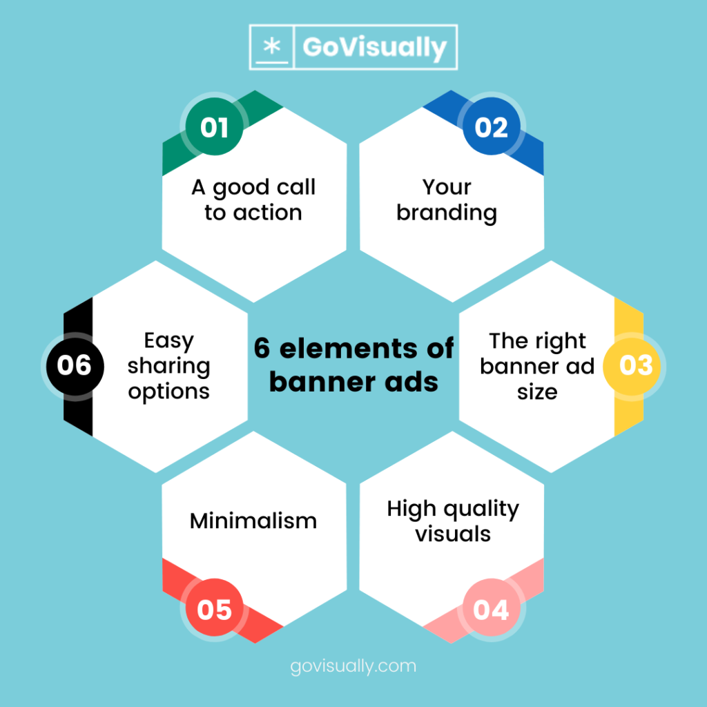
1. Call-to-action
Having a call-to-action (CTA) makes the banner ad more inviting and welcoming for the audience. If there is a CTA incorporated in the banner ad design, there are more chances that the people will click on it and visit your website to find out more about your brand.
Having a CTA that is eye-catching and pops can help you grab the audience’s attention. Whether the CTA is simple or fancy, it should do the job of getting people to click on it and visit your website. Through the CTA, you let people know that you want them to discover your products and services, and they feel intrigued by the call to action.
2. Your brand
The banner ad you display should have your brand elements and let people know what your brand is about and what you stand for. You must add your logo to the banner ad design. This way, people will know who you are and which ads they see on their screens.
You don’t need to put all the attention on your logo. It can be small and at the side of the banner ad design. However, it needs to be incorporated. Without your brand logo and elements, the banner ad will not be memorable, and the audience might not even remember who you are and whether they saw an ad for your business or not.
3. Banner ads sizes
One of the most crucial elements for your ad is the banner ad size you choose. Selecting the suitable banner ads sizes can have a massive impact on how effective the banner ad is how many people see it on the website you host the ad on.
Some of the most commonly used banner ad sizes that perform the best include:
- Square: 250 x 250
- Vertical Banner: 120 x 240
- Full Banner: 468 x 60
- Half-Banner: 234 x 60
- Portrait: 300 x 1050
- Billboard: 970 x 250
- Large Rectangle: 336 x 280
- Skyscraper: 120 x 600
- Small Square: 200 x 200
- Leaderboard: 728 x 90
- Wide Skyscraper: 160 x 600
- Half-page: 300 x 600
- Medium Banner: 300 x 250
- Large Leaderboard: 970 x 90
4. High-quality visuals
When creating a banner ad, you have to keep in mind that you make the ad for professional purposes. It would help if you used high-quality visuals for the ads. Whether you use GIFs or images, they need to be excellent quality.
MovinThe imagery of the banner ad can be fun or convey a strong message related to your services or products. Images like GIFs are an excellent way of grabbing people’s attention. However, you shouldn’t look down on still images because they can work just as well if they are aesthetically and visually pleasing. The Keywords
Never underestimate the importance of keywords! Yes, even when it comes to banner ads. Using keywords and action terms ensures that your ad is optimized for the search engines. It also helps the audience understand what your brand is offering and how you can provide solutions for them, increasing the chances of clicking on your CTA.
There are various keywords when it comes to advertising. The keywords you use can help you get the audience’s attention and generate traffic and leads. When you want people to click on the link the ad contains, you need to use the right words that make your service and brand seem like the best available option.
5. Simplicity
Simplicity is also one of the most underrated elements of banner ads. If the banner is crowded with text, images, and other elements, it will be nothing but a nuisance for the browser that comes across your ad.
Keeping things as simple as possible is the best route you can take for banner ad designs. Most of the time, having one sentence, your logo, one image, and the CTA are more than enough for the banner ad. It is always better to use minimal text and a few images.
Banner ads examples
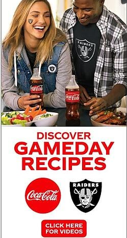
There are some excellent banner ad examples that you can look at for inspiration and a better understanding of what banner ads are.
1. Coca-cola
2. The New Yorker

3. Pottery Barn

Share banner ads design with clients with GoVisually
The good news for everyone is that now you can share your banner ad designs with your clients with GoVisually. Yes, you read that right. Forget about the hassle of getting feedback on banner ads through staging sites, screenshots, reference images on PowerPoint, and all of those pesky tasks.
If you use GoVisually, you can efficiently upload your files to the platform and share the files with your clients. GoVisually is a tool specifically made to upload all your content and get feedback from all the stakeholders in one place. If any edits need to be made, you can get the feedback directly on the file and make the required changes in real-time.
How can you share banner ads with clients with GoVisually
If you aren’t using GoVisually already, you are missing out! Fortunately for you, you can start the free trial today and start sharing, reviewing, and approving content with ease. Once you have registered yourself with the tool, you can share files like banner ads.
Here’s what you have to do:
- Create your banner ad design
- Save the banner ad you created
- Upload the project file(s) to GoVisually. You can upload as many projects as you want.
- Invite the other stakeholders, team members, and clients to have a look at the banner ad design you uploaded
The clients you invite to look at the content will interact with the file. They can leave comments and request you to make the needed changes. Once you make the edits, they can approve the design if it meets their requirements and you know they are satisfied with your work.
Not only is GoVisually the perfect tool for the approval process for your banner ads, but you can also upload other content like:
- E-learning content like newsletters and eBooks
- Dynamic display ads
- Emails
- Videos and GIFs
Final Takeaway
Getting clients to approve banner ads and other content has always been a challenge. It used to be a time-consuming process. The back-and-forth between you and your client is always a hassle.
However, with the help of GoVisually, you can upload banner ads to the platform with one click and share them with your clients to get them approved.
