Landing page design: how to design a good landing page?
A landing page is the most critical component of any website – and although creating a landing page design may seem easy, many professionals constantly look for resources on how to design a good landing page.
Luckily for you, you're just in the right place to learn all there is to know about landing pages.
In this article, we will take an in-depth look at what landing pages are, what elements go into making one, and what you should do to ensure that you make a design that converts.
Excited?
Let's get started.
What is a landing page?
The first step to creating the perfect landing page design is to know what a landing page is.
Seems a little obvious, no?
And yet, one look at a poorly created landing page is enough to tell that the website owners didn't understand what a landing page was to begin with.
Before you get started with anything to do with the landing page design, you must be very clear on what a landing page is.
Essentially, a landing page is a page on your website that the consumer lands on. It is usually a "follow-up" of the promises you make to your audience in the content of the rest of the website. So, think of a landing page as a bridge between you and your potential customers. If the landing page design does what's supposed to and convinces the visitor that you will provide them with what they need enough for them to cross the bridge, you'll get a new customer.
So, landing pages usually allow you to offer customers something they can't refuse. In this regard, a landing page can be a click-through page that leads the visitor to another page on your website or a lead magnet where you get the client's information in exchange for their contact information.
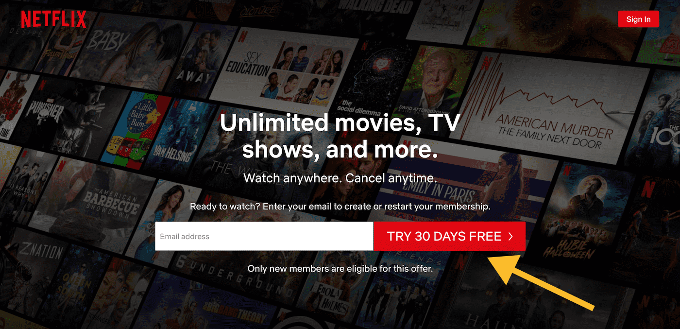
Here, have a look at Netflix's famous landing page.
Now, we know what a landing page is. Let's look at what a good landing page is and how to design a good landing page.
How to design a good landing page - 4 pillars of landing page design
A good landing page is the one that gets you the most leads or conversions. Netflix's landing page, for example, is considered to be one of the best because we can quickly tell that the ultimate goal behind the page is to get as many people to sign up for the page as possible.
But how can we tell that?
When it comes to a landing page web design, you must remember that certain elements must be incorporated to make a convincing page that meets the website's goals. Let's refer to these elements as the pillars of a landing page design, and they are as follows.
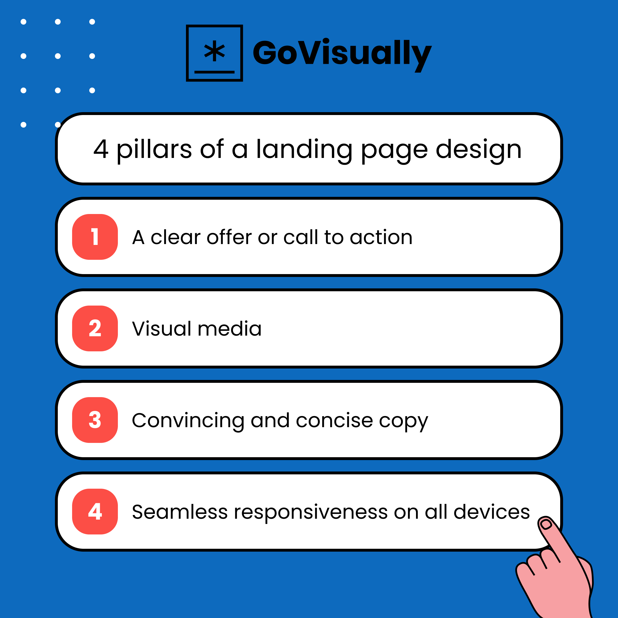
1. A clear offer.
What makes a landing page different from any other page on a website?
It has a particular goal.
This goal is usually to provide the visitor with something they want, to tell them that your business or brand has exactly what they are looking for.
Exactly what they are looking for. And hence, a good landing page needs to include a clear offer that gives the visitor to-the-point directions to getting what they want.
So, your landing page should consist of a clear offer.
Kind of like this:
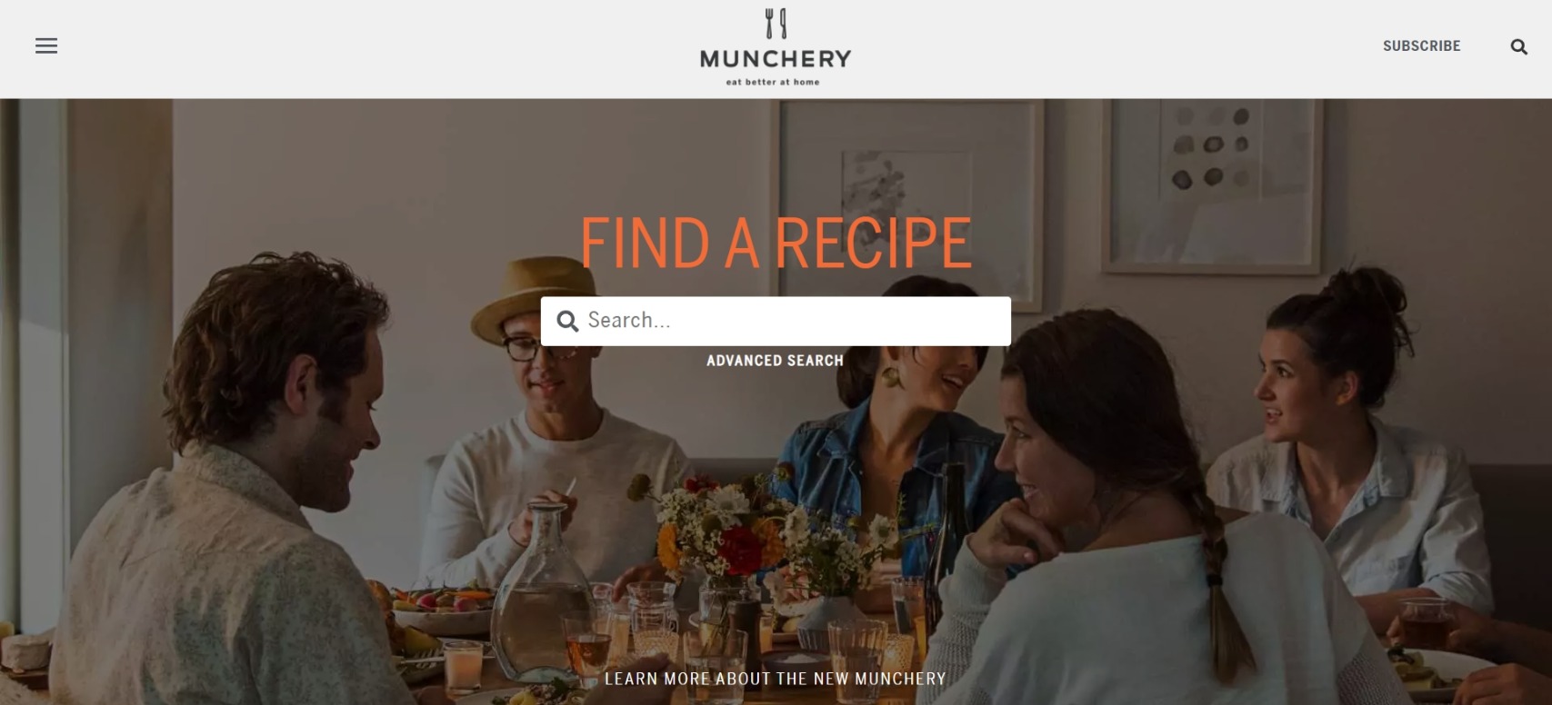
This landing page design by Munchery checks all the boxes. Not only does the visitor know exactly what the brand is offering, but it also clarifies what the visitor has to do to get the offer.
Your landing pages can offer many different things. Each landing page design can present information to another search query. If you are an eCommerce website, then your landing page can be the way you disperse the traffic around your website.
But that's not all!
You can use your landing page for many other purposes, such as promotions, announcements, introduction to communities and resources, and access to whitepapers.
2. Some visual media.
The no-brainer rule you'll find in every "how to design a good landing page" guide.
It is no surprise that visual media is perhaps the most effective form of media, especially for landing page design. This is mainly because it is easier and less draining for human beings to perceive than text. But this means that when creating a landing page, we must incorporate visual media in its design.
Through pictures, you can be impressive, emotional, and informative at the same time - which means that a single picture can be a lot more compelling than just streams and streams of text.
But if we tell you that visual media is essential, that will be too broad to be used. You must ensure that the visuals you include in your design align with the rest of your assets. Primarily, you must ensure that the visuals are strongly connected to your overall brand image and message.
This also means that although you create special images for each landing page, you must ensure that the overall visual message connects to your website and brand. In short, it is important to maintain a special level of consistency when making a landing page web design that resonates with the visitor.
Geico used simple yet effective imagery to link this landing page to auto insurance's primary service. This is what you should go for - imagery that doesn't overwhelm the visitor but swiftly links your landing page to your brand.

Some other forms of visuals you can add to your landing page design include:
- illustrations
- photos
- 3D graphics
- custom icons
- mascot
- minor graphics
3. A convincing copy
A copy of your landing page is just as important as anything else. Every word you put out on your landing page needs to be there for a reason because every word in the copy counts at the end of the day.
Just because visuals get more attention than text doesn't mean you can neglect your copy and get away with it. But how does that fit into the landing page design?
When planning a landing page design, you must see how the copy fits. This will involve figuring out the visual hierarchy, text alignment, and other aspects that link text to the visuals of a landing page design.
Other than that, there are other things that you have to take care of as well. For example, you need to see what length you should go for when your copy. There is no hard and fast rule in this regard - different needs call for different kinds and lengths to copy. So, if you pitch a corporate service to older individuals, you might want to be more detailed. If you offer a younger audience, you will see that being to the point and super simple in language will help you the best.
Let's look at this copy by Microsoft for landing page design inspiration:
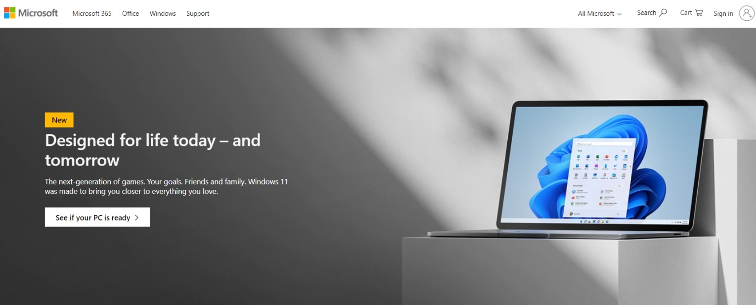
The copy is straightforward, informative, and even authoritative in a sense. It resonates with the landing page design and their overall brand image.
On the other hand, we have this landing page copy by Quip:
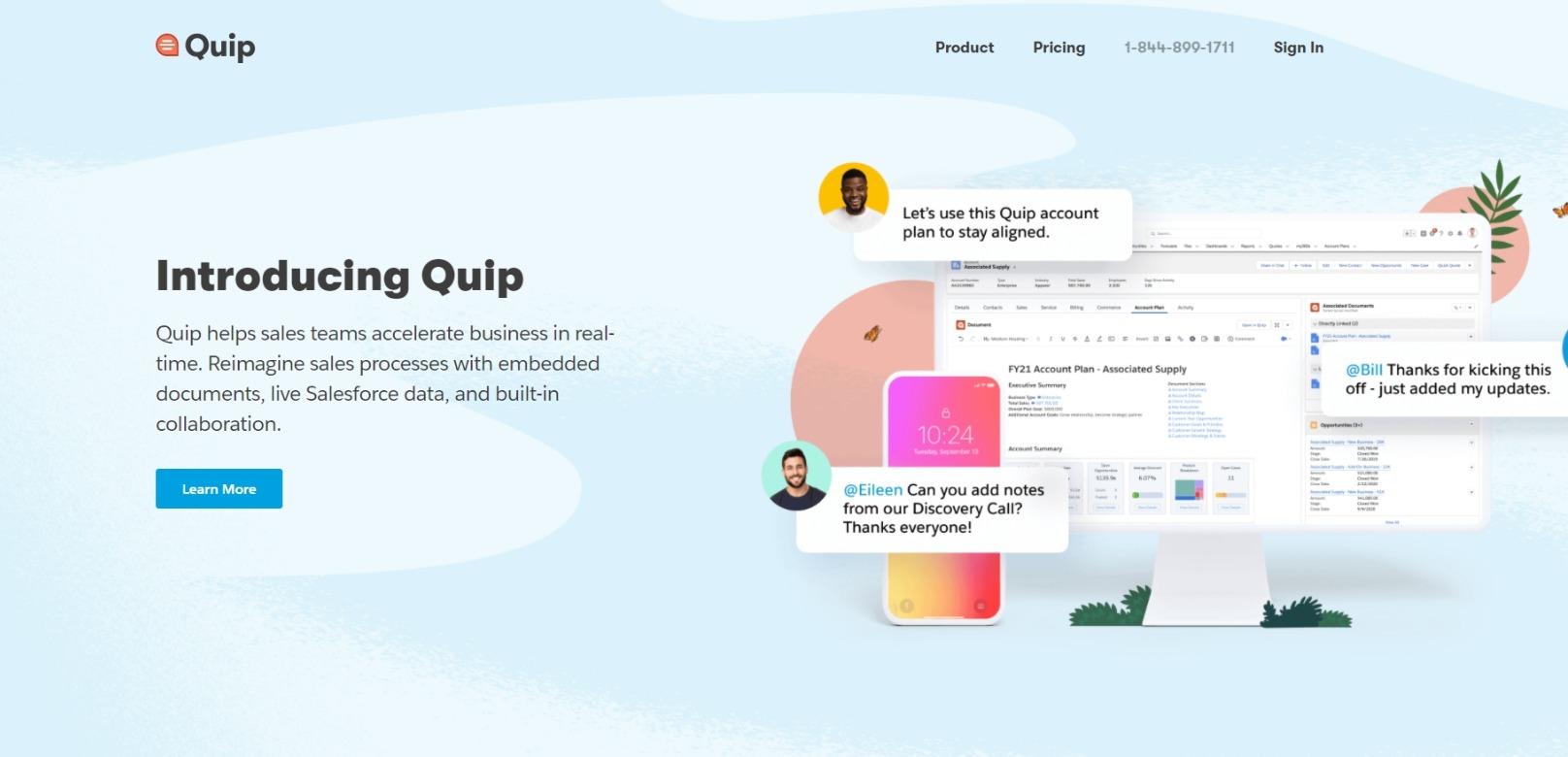
This copy is simple, straightforward, and accessible to everyone - something bound to resonate with the audience Quip is targetting.
So that's what you must master when deciding the textual elements: make sure they link to your visuals and correspond with the audience you are trying to tap into. Other than that, all good, compelling, and convincing copies have in common: they are all easily readable and scannable. So, while deciding on the textual elements of your web page design, make sure you keep in mind to check for that too!
4. Seamless responsiveness.
Most web visitors in the present day expect all websites and webpages to work seamlessly, respond to their needs, and work well on every device. This may seem obvious and simple to achieve, but it isn't! Thanks to technology, many devices can be used to access your landing page.
You must ensure that your landing page design offers a seamless experience on every device. It should be navigable, mobile-friendly, and perfect in speed and interface.
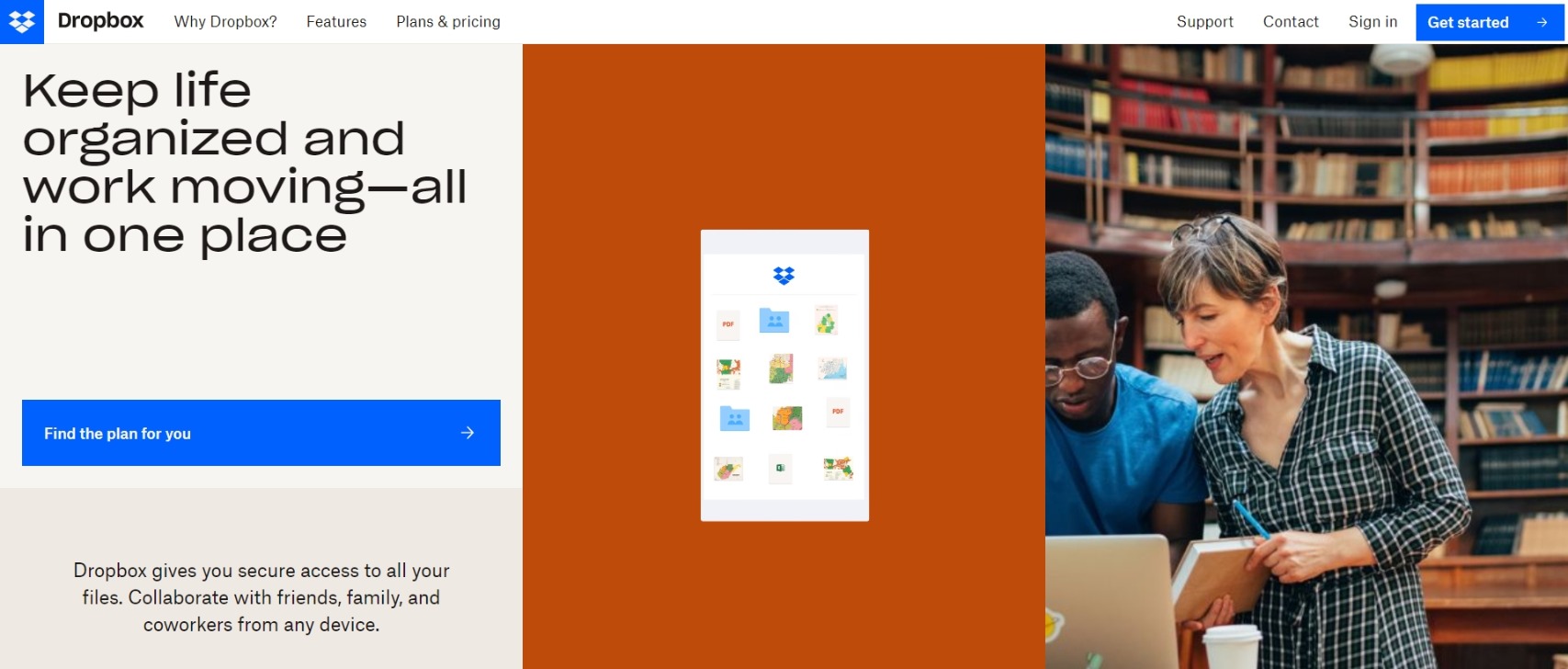
Dropbox is one of the most responsive websites out there, and this is what their landing page design looks like:
Landing page design best examples
If you are still wondering how to design a good landing page for your website, you can consider this list of best design examples as a landing page inspiration for your next project.
1. GoVisually
We can't leave GoVisually out of the list regarding the best landing page designs.
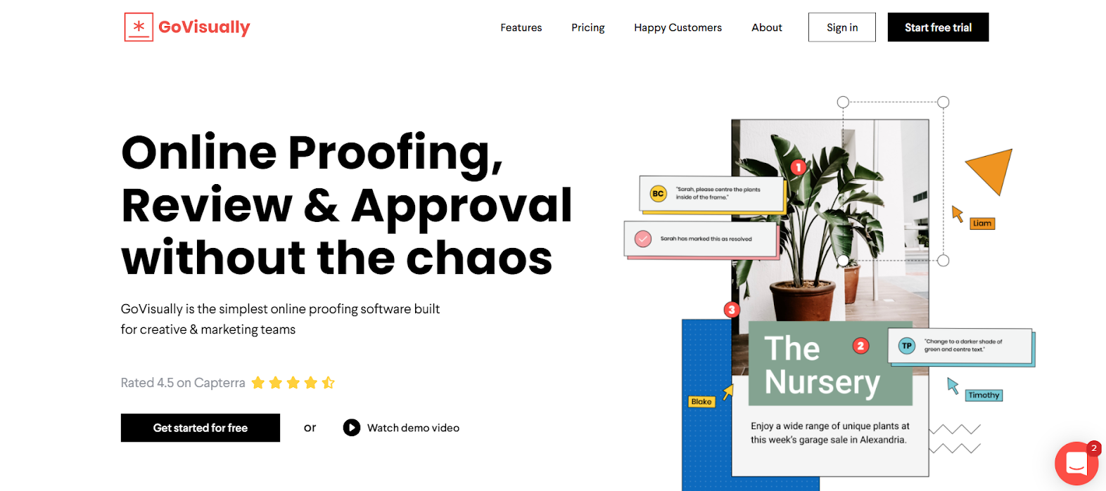
The landing page design for GoVisually checks all the boxes. Not only that, but it also has CTA inserted in just the right places. See how it maintains consistency regarding the branding throughout the page? You can engage your audience by presenting a consolidated brand message and image.
Overall, the GoVisually landing page makes for quite a successful design and can inspire your landing pages.
2. LinkedIn
We have all heard of LinkedIn, but did you notice how LinkedIn probably has one of the best landing pages you'll encounter?
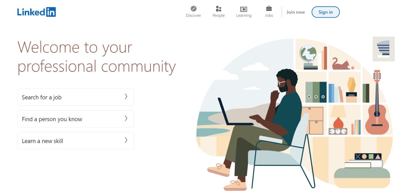
The LinkedIn page, for its Premium feature, checks all the boxes on our list. It mentions its offer, has visual elements, incorporates a compelling copy, and is responsive across different devices. Anyone moving from basic LinkedIn to LinkedIn Premium will find this landing page very to the point and easy to navigate.
3. Goby
Another website that checks all the boxes for us is Goby. Goby is an electric toothbrush brand, and its website is very dentistry-related. However, all the elements on their landing pages are consistent and create a solid connection between each landing page and the overall brand message.
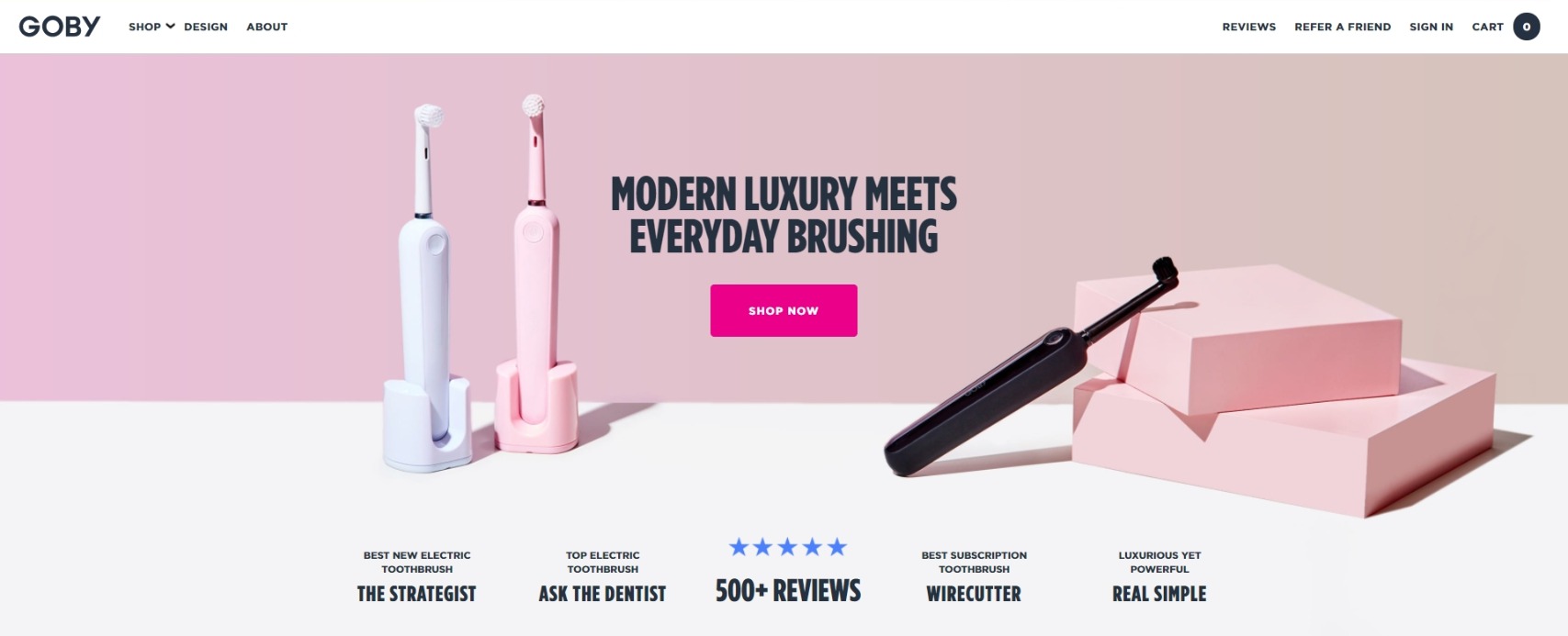
Notice how intuitive yet straightforward the landing page design is? That's something you should be aiming for! By keeping the copy short, Goby brings attention to its product and enhances its brand message.
4. Netflix
And we come back right where we started: Netflix. But can you blame us? Netflix's landing page design is just perfect. It makes it extremely easy for new users to sign up and old users to log in. The design is simple, user-centric, and just amazing.
Netflix's visual elements in its landing page design are posters for some of its shows. That clever way of enticing potential customers and getting them to sign up.
The text is simple, making sense, considering that they probably want their audience to pay attention to what they have to offer in terms of the audience's media.
Review your landing page design with GoVisually!
Creating the best landing page is one thing; getting it approved by your client effectively is another. While we got you covered with great resources to make your next great landing page design, we also covered you with the most advanced review and approval platform!
GoVisually is an online proofing software for creative professionals who work in all things visual. With the platform, you can use some of the most advanced tools to speed up your review cycle and get real-time feedback from your clients and team members.
With several features for visual annotations, comments, file attachments, and a one-click approval cycle, GoVisually supercharges your design collaboration, communication, and feedback workflow.
You can add watermarks to your file versions, compare them side-by-side, and rotate them for perfect reviews that leave no corners unseen.
Wanna know why all creative professionals love GoVisually?
Watch our product demo video below or book a free demo with our experts to see how GoVisually fits perfectly in your creative workflow!
If you require further help, you can visit our blog for some other excellent resources to help you!