What’s the first thing you notice straight away about any brand, big or small?
Their products?
Their services?
Probably not.
That’s because, without a fail, your eyes will always focus first on the brand’s logo. And that will set the first impression of the brand in your mind.
It’s no wonder that most brands want their logo to be outstanding and something that makes a statement. After all, the logo design is representative of your brand’s identity. All the choices that go into its creation, from colors and symbols to image options, must be carefully evaluated and decided.
You have to understand what makes a memorable logo design and how to make the right choices that will be the best choices for your brand and what it stands for. So let’s begin with first understanding what a logo is.
Table of Contents
What is a logo and why is it important?
A logo is a symbol or design used to identify any company or organization and its products, services, employees, etc. Ideally, it is how your company is recognized among your audiences, whether they are your audience, investors, or competitors.
You might forget what Ronald Mcdonald’s clown mascot looks like, but the Mcdonald’s ‘M’ logo will always be identical no matter where you go. And it will be plastered all over your business’s marketing assets, from websites business cards to packaging materials. It is the face of the business.
A logo design can come in different forms; it can be text-based, image-based, or a combination of the two. That depends on how creative you are capable of getting.
What your logo isn’t
It’s easy to get ahead of yourself and end up with some misconceptions about the function and impact. So before going any further, let’s find out what a logo is not.
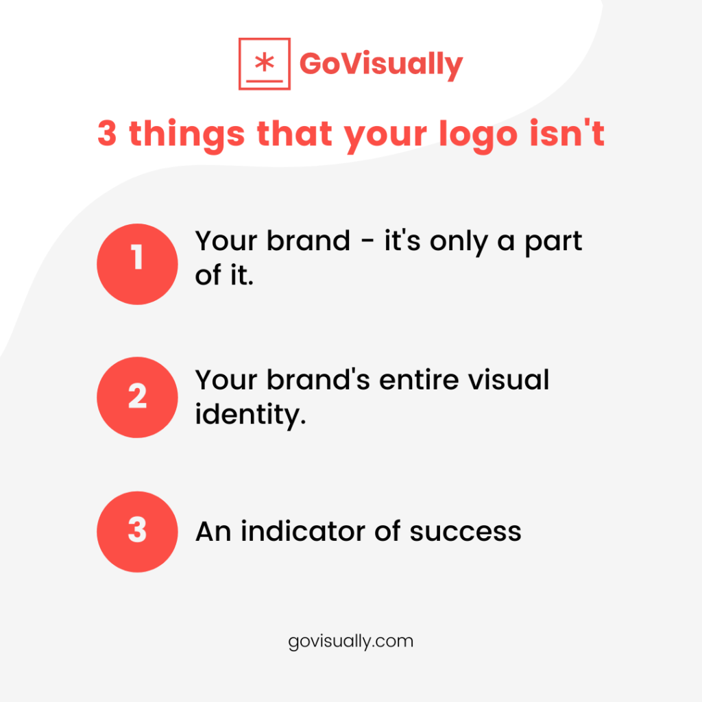
Your brand
Your logo may be the face of your brand, but it isn’t your entire brand. And your brand isn’t all about the logo only either. Your brand is built on other factors that directly interact with your customers, not just the logo.
The logo gives customers a reference point when they hear your brand name – the image that pops into their head when they think of anything associated with your business.
Your brand’s entire visual identity
Logos are a part of your brand’s visual identity for sure, but that’s not all there is to it. A logo design will be one cog in the entire visual system that includes many more factors such as colors, typography, photography, layouts, and much more. And to treat it as if it is not the way to go.
An indicator of success
There are disadvantages if you don’t have the best logo, but it’s not a dealbreaker that will make your business tank if it’s not as mindblowing as your competitors. Just think of it like when meeting an attractive stranger for the first time – you might have an excellent first impression if they have a pretty face, but maybe you’ll be put off after getting to know them more. It might be their actions, personality, or something else.
A business is the same. A good logo doesn’t guarantee anything. It will attract your target audience to you for sure, but what will make them stay and convert them to loyal customers is how their experience with your product/service goes.
The best logo in the world won’t be enough to save an incompetent business with bad practices, so don’t think you can hide behind it as a shield.
What makes a logo memorable?
It might be hard to believe, but a memorable logo is all about simplicity. Nothing flashy or complex is needed for a logo to be effective. Just something simple and maybe a little clever will do.
Around 3000 consumers in the US and UK were asked to give their takes on logos for more than 100 of the world’s largest and most well-known brands.
The findings showed that the most memorable logos came with clear and simple designs, like Nike, Apple, Coco-Cola, and Apple. Some of the other logo designs that made it to the top 10 were Google, Microsoft, Pepsi, Amazon, and Adidas.
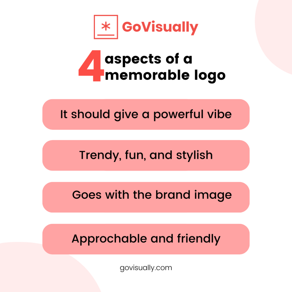
Here’s a list of the common attributes associated with these brands’ logo designs and something you can incorporate for your own.
Powerful
Going for a geometric logo will be more commonly associated with a powerful image than others, and the same goes for logos with initials.
Trendy, fun, and stylish
Logos illustrative with custom wordmarks will usually come off trendy, stylish with a fun vibe compared to others, and more in with the younger generation within target audiences.
Sophisticated
If you spot a logo with a Serif wordmark, it’ll probably carry an air of sophistication and exclusivity.
Approachable/friendly
Holding shape logos are used when a brand wants to become more approachable and welcoming to its audience. They are also associated with reliability.
How to design a memorable logo – 3 basic steps
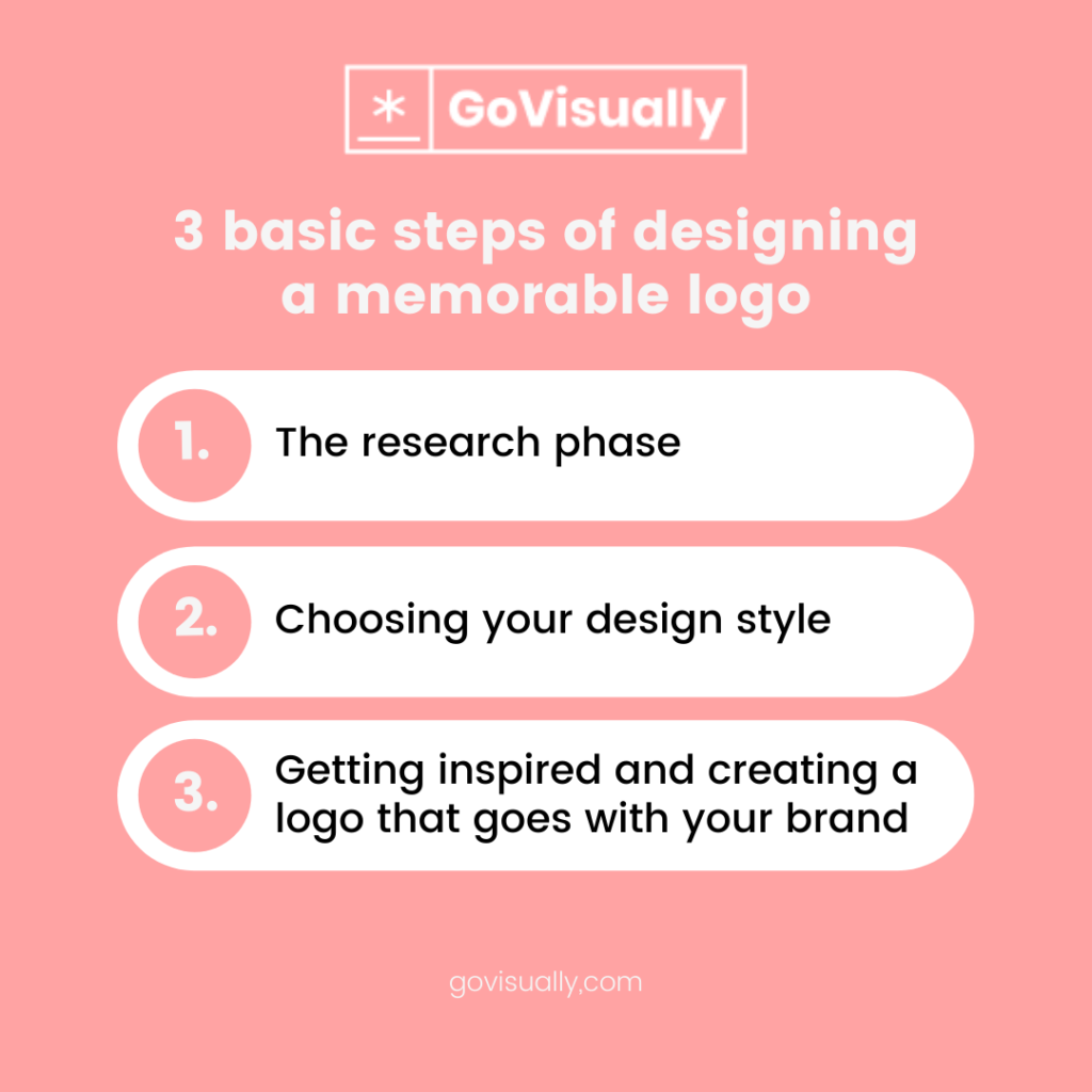
1. The research phase
Your research into your brand will help you create a solid foundation for your logo design. You will have to get as much information as possible on your company’s context and background in the design process. Everything from the business’s values and brand attributes should be laid out in front of you.
What does the company believe in, and what are its future goals? Since you are giving a face to their brand identity, knowing the answers to these questions is also essential. You also have to consider who your target audience and main competitors are.
Analyzing the logo designs of other brands that stand out to you is a good practice to figure out what look and feel you want your logo to have. Concerning this, think about what type of feeling you want people to experience when they see your logo and whether the brand has any unique characteristics that you can incorporate into its visual.
2. Choose your design style
With an in-depth understanding of what your brand is all about, it’s time to get to incorporate all of it into the logo design. And a big part of that process is deciding on a design style. There are plenty of elements that come under this umbrella – colors, shapes, graphics, and typography, to name a few.
There’s no correct answer to the style you should go for because different types work for various brands.
For example, if your brand has a classic feel, then you’d go for fonts that are sophisticated with more basic color schemes. If your brand is trendy, you’re more likely to use a bolder approach with more abstract designs.
A good starting point can be googling basic design principles and reading up on all the fundamentals. Different colors and shapes tend to be associated with specific emotions and behaviors, and you’ll have to decide what you want your audience to feel when seeing the logo.
You can browse through what the design community in online spaces is up to and get feedback from other professionals to get a better idea. The best way to do this is by utilizing an online proofing software like GoVisually into your workflow.
This way, you’ll be able to organize your projects and logo design idea drafts efficiently, receive all feedback from one communication channel only, and meet deadlines quickly.
3. Look up various types of logos
There are a couple of broad logo design idea categories that you should know about. Some contain only text, while others combine text with images.
Wordmark logo
This is the classic form, and usually only your company’s name as text without any fancy symbols or monograms. This type of logo works best if your business name is short and sweet and doesn’t have an associated slogan.
Brandmark logo
A brandmark logo is also known as a pictorial mark which indicates how brand marks are the graphic symbol in this type of logo. These symbols are often unique and usually recognizable because they have succeeded in staying in their audience’s memories.
Many companies add their brand name into the logo when they are just starting, and then once they are popular enough, they remove the text altogether as the symbol can stand on its own by then.
Abstract logos
Abstract logo marks are less recognizable than other categories and have geometric forms that don’t directly to existing ones. Instead, they are a new creation entirely for your brand.
An abstract logo will represent your business uniquely with a modern look brimming with personality. Looking up the different meanings of geometric logo shapes can help create a certain mood or feeling that you want to be associated with the brand.
Wrapping Up
Now that you’ve got a clear understanding of all that goes into a good logo design and what it can do (and not do) for a business, it’s time to jump into the fun part and get creating.
And once you’ve designed your logo, it’ll be time to review it internally and get it approved.
This is where you can leverage online proofing software to make the design review process hassle-free. You can use GoVisually to get feedback on your logo designs without a hitch and have all reviewers in one place.
With GoVisually, logo design review becomes easy, simple, and fast.
So what are you waiting for? Book a demo and get started today.
Want to send big files?

Need a quick way to share large files and creative assets?
With GoVisually Share, it’s absolutely free! Try today.
