Modern Packaging Designs - PANTONE Colors That Endure and Sparkle In Your Eyes
You should never judge a book by its cover!
We all hear that phrase now and then, especially when it comes to other people. And while that might be true for not judging humans, it certainly doesn't apply in the world of sales and marketing.
Think about it - what is one of the first things that appeal to you in a package? It can't be the information written on it that is often too minute to read. It's the color of the product package. The reason behind that is that colors have a powerful effect on behavior. Specific colors infuse certain emotions in people, and that is what most designers rely on while designing modern packaging design.
But to give you a headstart, we've selected the eight best PANTONE colors from the PANTONE colors institute.
So, if you're a designer or a businessperson currently designing your product line, make sure you take a look at these colors. Their features and effect will help you make a better decision about which color tone will sparkle in the eyes of your target audience.
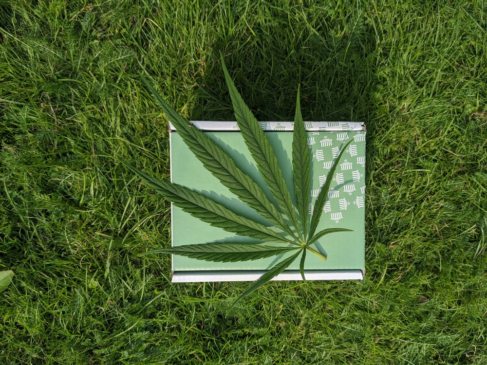
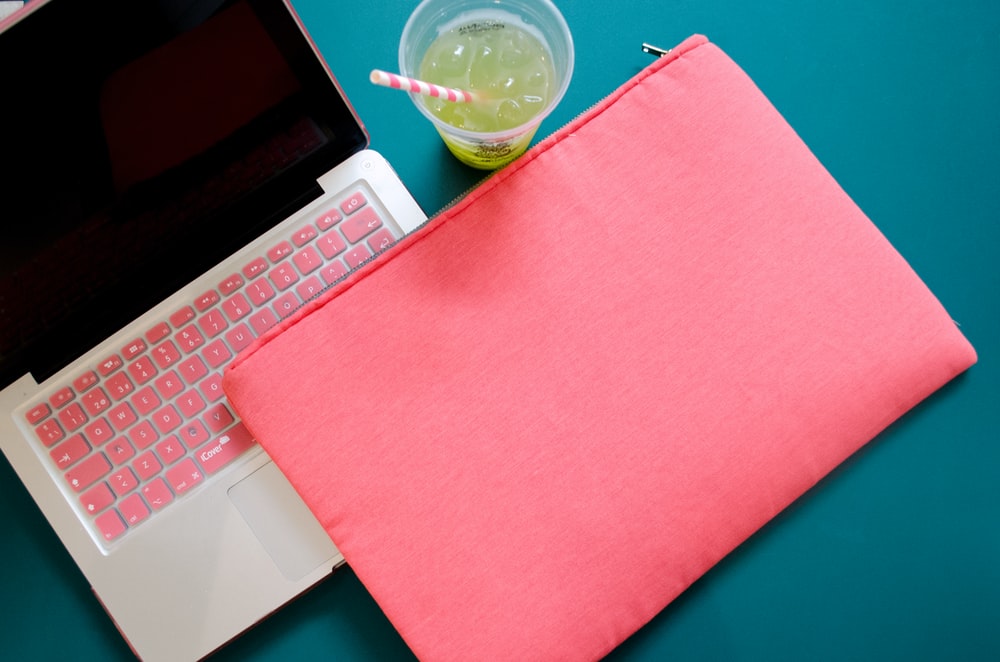
1. Summer Green
(Pantone 14-0156)
If you want a refreshing outlook for your product, then summer green should be your go-to color. It resonates with the natural elements of our environment. For that reason, it has become a staple for organic products.
The soft, undulating hues of this color suggest feelings of peace, prosperity, and growth. Moreover, the color evokes a sense of oneness of the body and the consciousness of the surroundings. All of its different shades have their uses with natural products or medicinal lines. They're all equally popular because people associate this color with healing. That is why they're likely to purchase an organic product of this color.
If you want to present a beneficial product such as a reusable removal product or recycled travel bottles, go for the lighter or more controlled shades. They will help you establish the necessary trust and calmness with your target audience.
On the other side, the darker or more feral gradients of this color communicate a wild, untamable quality, alluding to jungles and forests. This shade would be ideal for the packaging of cosmetic products such as a face wash or shampoo, which have ingredients found in the wild.
If you're appealing to an environmentalist audience or someone who wants to add a lush of natural elements in their room, then you can also use this color for room furnishings such as curtains and bedsheets.
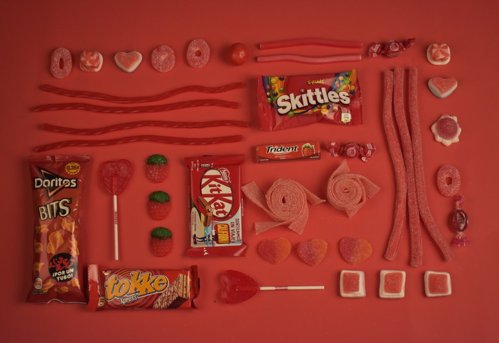
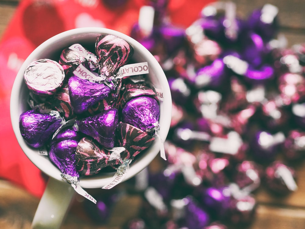
2. Samba
(Pantone 19-1662)
Do you want to ignite passion and energy in your target market with your product? Do you want them to feel motivated or aroused by temptation? If the answer is yes, then go for the color Samba.
It is one of the most famous color shades that you will see in a vast assortment of products' packaging worldwide. Alongside communicating vigor and energy, Samba is also used in evoking intense feelings of motivation/ This is why you will see the color being used in a great variety of sporting equipment. Of course, the shade percentage can vary from product to product, but you will find it there.
It is particularly popular in the packaging of many high priced electronic devices such as video game consoles and mobile phones. The reason behind that is video games appeal to a particular class of either teenagers or gamers who usually seek thrill and amusement, and the color Samba ignites that spark in their emotion.
3. Mauve Mist
(Pantone 15-3207)
Mauve Mist is strongly associated with femininity and love. The color, Mauve Mist, stands for feelings of idealism and an overly optimistic view of the future. This is why it is most commonly used in the packaging design of products whose primary demographic is young teenage girls.
So if your product line will target the same demographic, we suggest that you start creating samples of this color.
You can use this color for the packaging design of cosmetic products, romance novels for teenagers and young adults, and almost any item whose central theme is love and companionship.
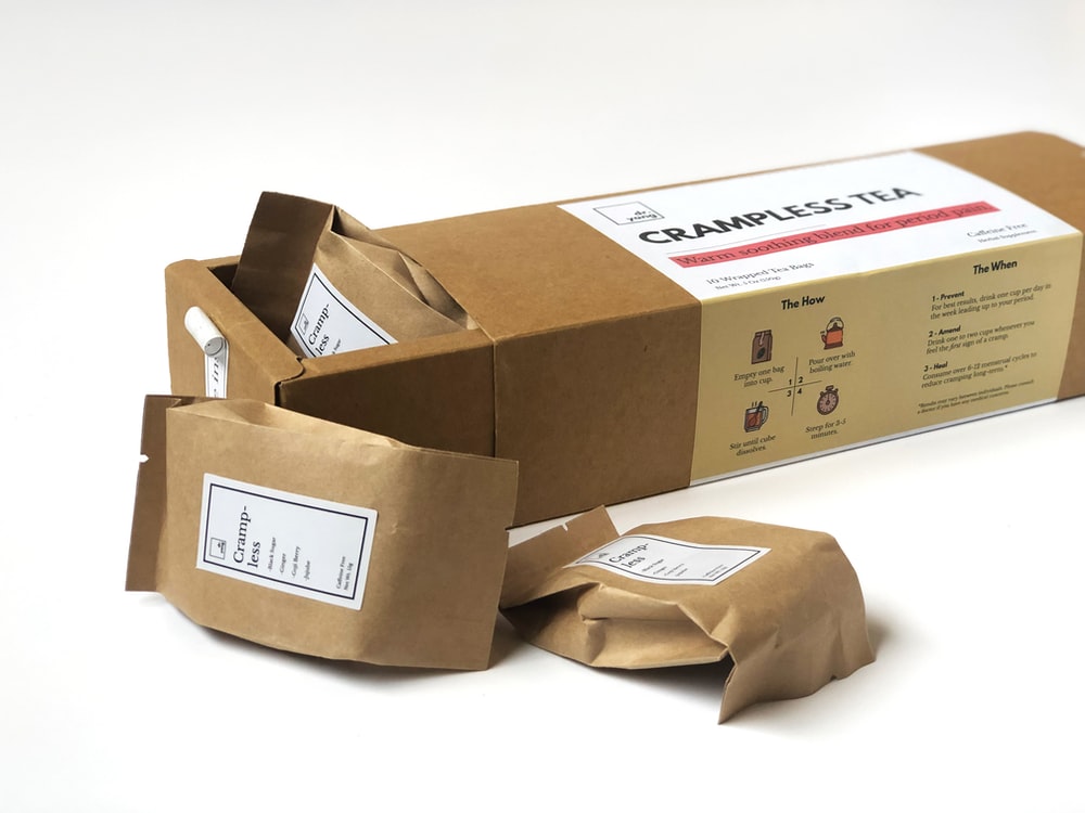
4. Bamboo
(Pantone 14-0740)
Have you ever looked at a courier package? It is a sign of trust for many of us - a trust that your parcel has arrived safely.
Why do you think that is? Well, it could be because of the choice of color for those packages - bamboo color.
Bamboo is a rugged, more mature color that does not serve to embellish but instead communicates feelings of honesty and realness. It is mostly used for achieving an elegant and minimalist look, such as packaging furniture and parcels.
The reason behind that is this color's primary demographic is people who value simplicity and peace over chaos and complexity. Of course, no one would like to see their parcel arrive in a rainbow box. That'd take away all the charm of the actual product inside. That is why Bamboo color makes an excellent choice for packing to enhance the value of the product inside while appearing to be both minimal and trustworthy.
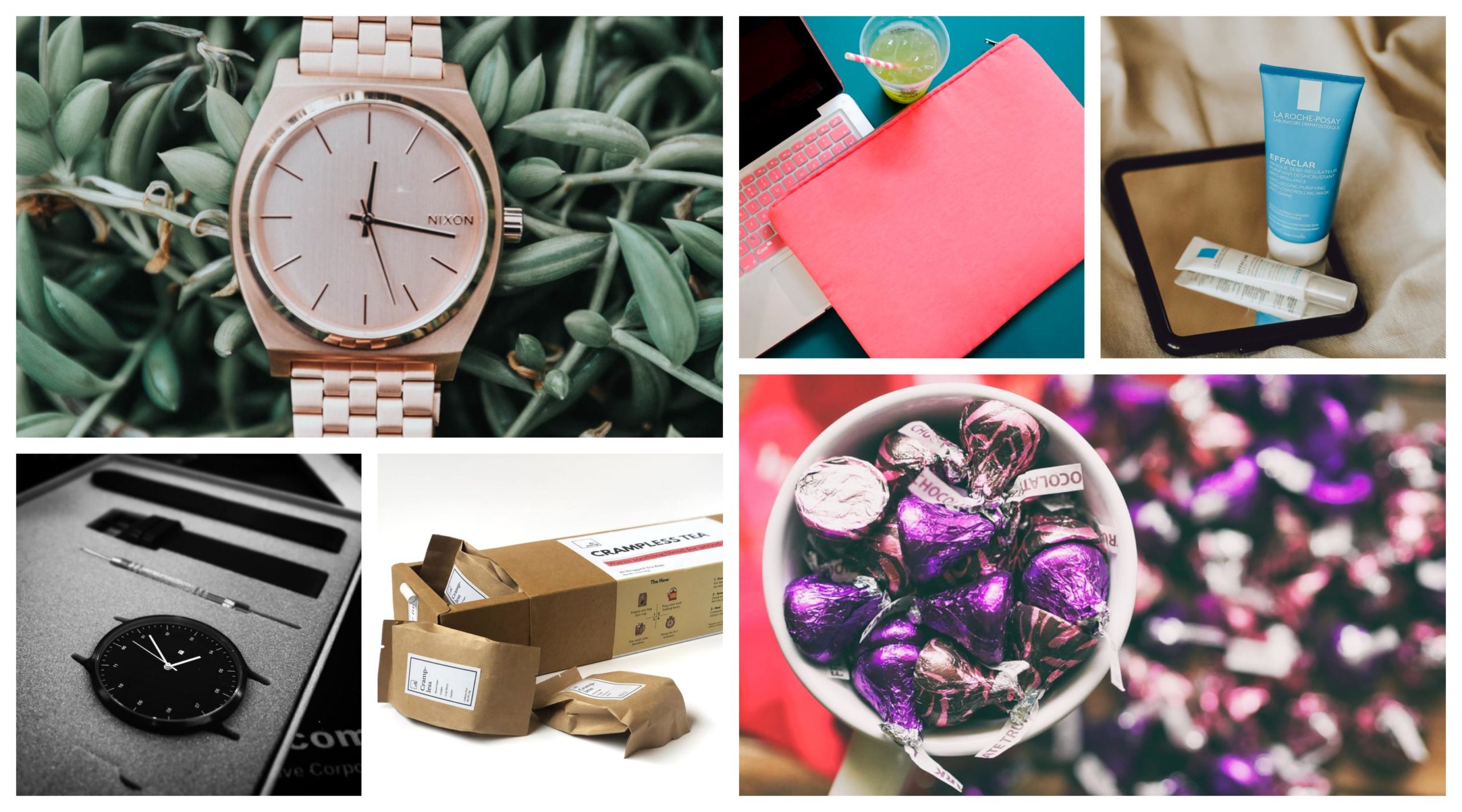
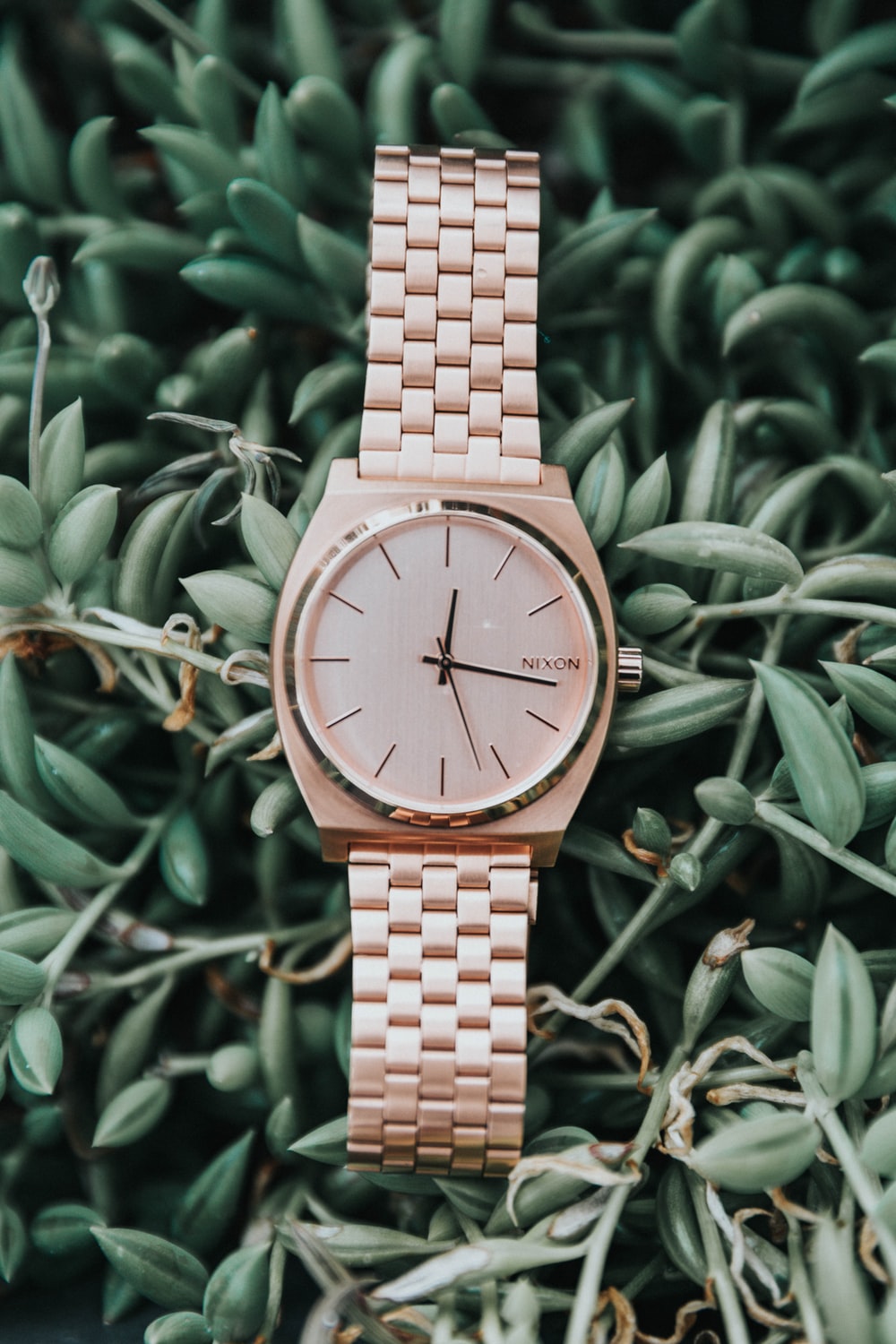
5. Artisan's Gold
(Pantone 15-1049 TPX)
If you like challenging your designing abilities or pushing your limits, then choose the Artisan's Gold color. It is one of the most challenging colors to use correctly.
However, when used appropriately, Artisan's Gold highlights and enhances the product's quality and exclusivity. It makes the buyer believe that they are paying an excessive amount to receive a product worth every penny.
For instance, Rolex, a status symbol amongst Men, has one of its most beautiful watches, a Gold Rolex, packaged in Artisan's Gold to convey its worth.
6. Tornado
(Pantone 18-3907)
If you are aiming for subtlety and a feeling of reservedness, Tornado gray is the way to go. It is a color that is most often used in the background and does not incite any particular beliefs or emotions on its own unless paired with another sparkling color.
Tornado is commonly used in the packaging of objects which are devoid of any passion or energy. For instance, you can use this color to packaging coffee mugs, pens, and cutlery.
While the color is often taken as bland, Tornado's stylistic element comes out in the packaging of electronic appliances, such as mobile phones and laptops. Business people more frequently use it to achieve a sleek and professional look.
7. Purple Hebe
(Pantone 16-3828 TN)
Much like Artisan's Gold, the color Purple Hebe is also associated with premium quality and features. It is a color that is striking in its beauty and has a high aesthetic appeal. Dark shades of purple are especially entrancing, and they are a lot more likely to catch the customer's eye and hold their attention.
The color alone has the power to uplift the standard of quality and value your product displays and distinguish it from all other products on the shelf.
So, if you want to give a royal look to your product, start by categorizing its features. After that, see which of the features resonates the best with the smooth tones of Purple Hebe, and you'd find the effect startling.
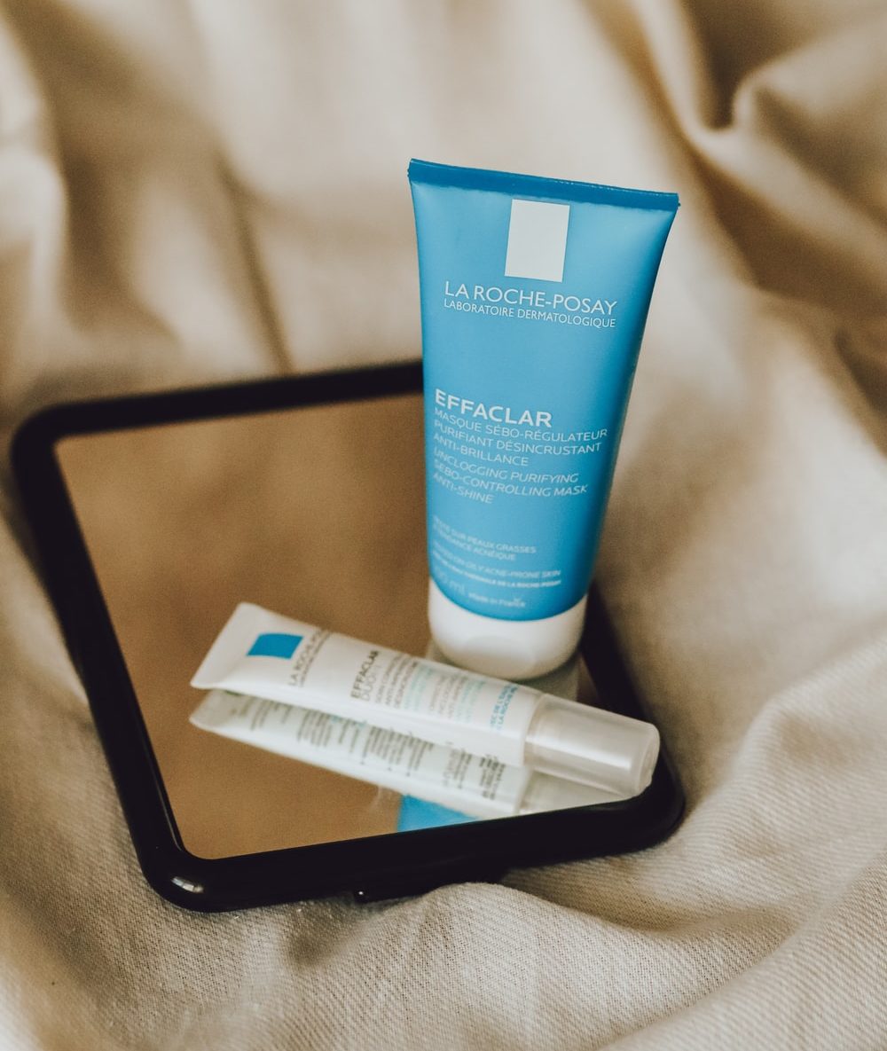
8. Classic Blue
(Pantone 19-4052)
Have you ever looked at the ocean and sought inspiration from its beautiful blue color?
Well, that is what the Classic blue color offers - feelings of coolness and serenity. If you apply the moderate tones of this color, you can almost conjure up soothing images of someone drifting peacefully out on the sea. For that reason, this color is very successful in the packaging of cosmetic products, like lotions and moisturizers.
However, unlike other cosmetic colors, it appeals equally to both genders but is geared towards slightly older people since teenagers tend to go for more vibrant and bright colors.
You can also use the Classic Blue color to packaging household decoration items, such as paintings, keychains, paperweights, and snow globes, since the feelings of calmness that it stirs up are diffused throughout the house.
Final Word
PANTONE colors offer a diversity of unique hues that you, as a designer, can take advantage of. You now know how different colors elicit different emotions and moods in people. So, before you design your next packaging for the product, think about how you can use one of these colors to maximize its appeal.