Packaging Design Inspiration 01:Herb & Olive
Designing a catchy packaging design is no easy task. It defines the very product you're trying to sell, many times, it decides if your customer picks up the item. Funny enough, you never see a full cover at first glance. Depending on the shape of the package, portions of the design goes out of view. This means that the cover should look attractive from multiple angles, right? Well, I'm not sure, I've never designed a package 😅. So I set out on a journey during this pandemic (on Instagram 🙄) to understand how a good package is designed.
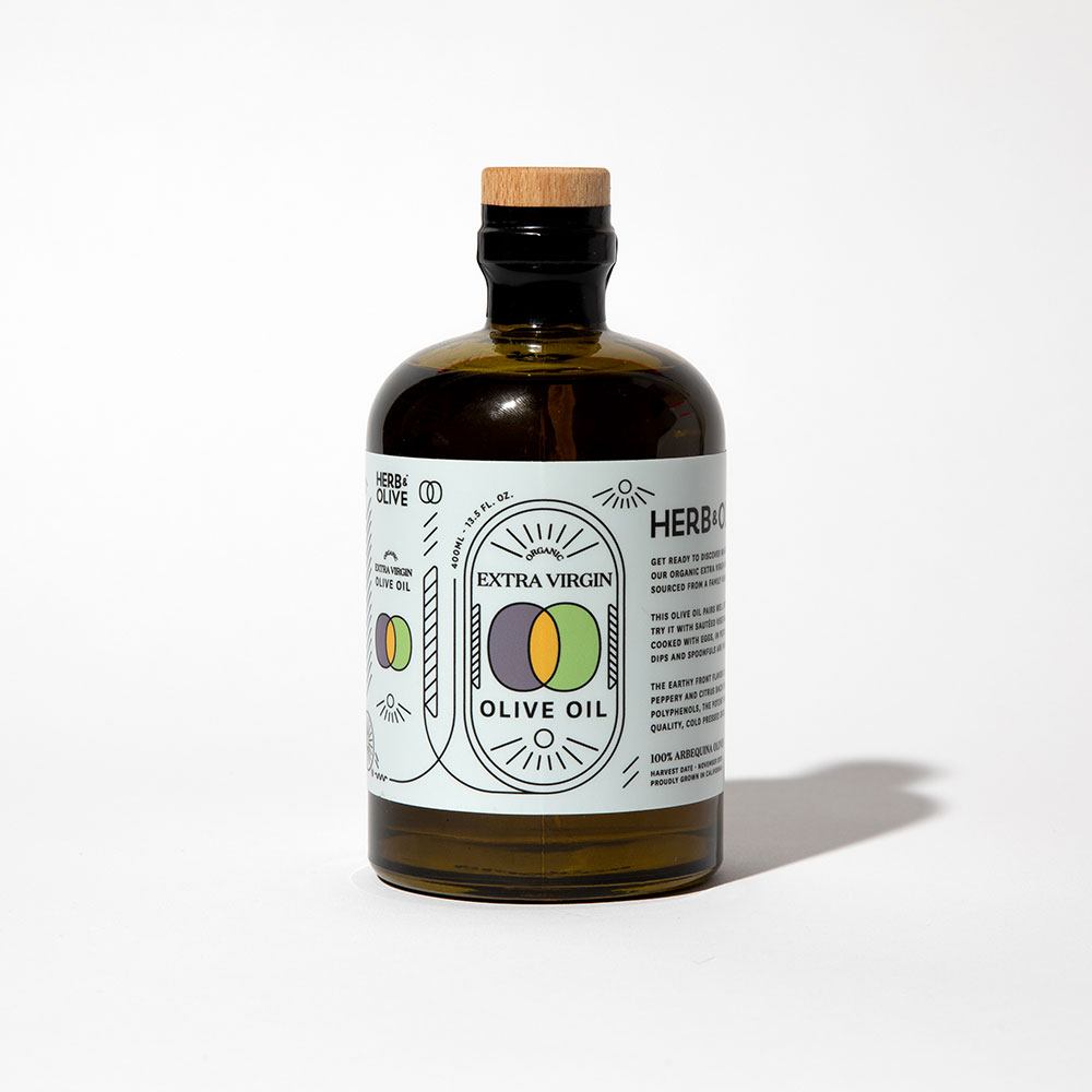
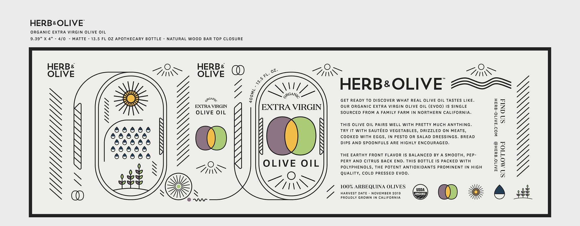
My first stop was a small bottle, a "vial" of extra virgin oil, from Herb & Olive. There was something so innately gleaming about the cover that caught my attention.
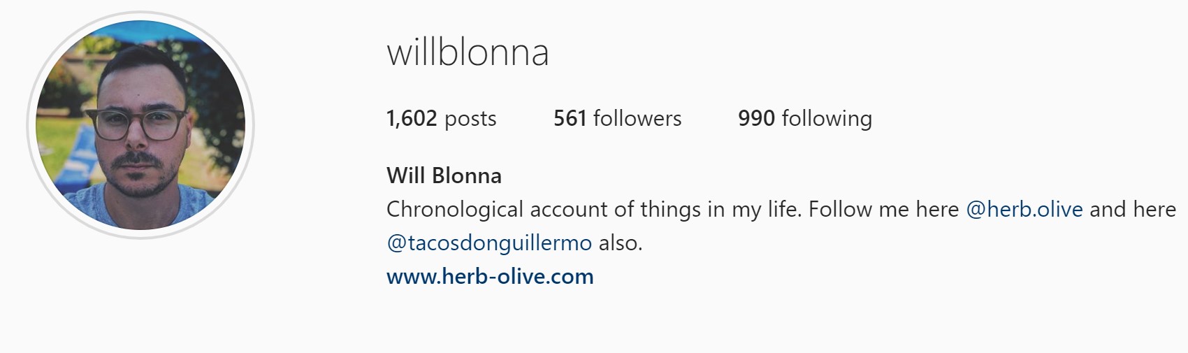
What do I do now? I wanted to find out how they did this. So, I reached out to Herb & Olive's Creative Director Will Blonna over Instagram to know more.
I had my questions ready:
What was the project briefing?
The brief was to evolve the overall Herb & Olive brand, and add more storytelling into the design. We use really high-quality ingredients, and never skimp on that, so conveying that story to our customers about our ingredients and the natural elements in the growing process is even more important. I have been a part of creating the entire Herb & Olive brand from the beginning, and we have been evolving the brand with every new product we launch.
How did you find inspiration?
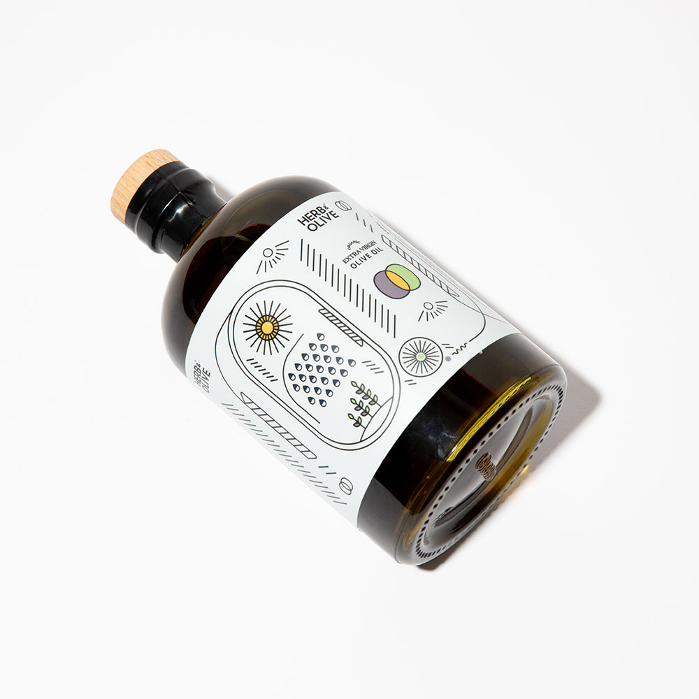
I found inspiration from a few places. The first place was nature and the ingredients we use. Our color palette is derived from the actual ingredients we use and the elements that make up the process of growing and producing our product. I also found inspiration in the process of visual storytelling. Our label design is meant to tell the story from seed to production of the olive in a simplistic way.
What tools did you use?
I used Adobe Illustrator exclusively.
How did you execute?
I had to do a lot of sourcing to try to find the correct bottle. There was a lot of trial and error involved when trying to find the perfect bottle for us. We are trying to be as mindful as we can about sustainability so it was important we used a recycled glass, which limited the bottles we were able to use. We ultimately found a really great 50% recycled glass bottle with a cork bar top closure. It is a high-end look while still feeling approachable.
Once we had the bottle sourced, I started to experiment with different shapes and style labels. I also looked into different printing processes (sticker labels vs screen printed) to see which would fit with our brand best. From there I went a few different directions on the design and met with the founder several times to narrow the style down. We finally aligned on one style, and were set to go into production with a screen-printed bottle.
But at the 11th hour we found out that the screen printing ink wouldn’t hold on the recycled glass, so we had to pretty much start the process over. Luckily it forced us to think about the label and brand from a new lens, and led us to the more story-driven label. This negative and frustrating situation was flipped into a positive in the end, and helped us unlock some creative blocks with the brand, and led us in a new direction. Patience in this business is so important. Our founder says that unless he literally gets chills from the design, then we aren't quite there yet. This can be frustrating at times, but I do believe we've accomplished that.
What result has this packaging had?
We just launched, so the long term effects aren't fully clear year. In the last month, we've received a lot of compliments on the design and packaging, and a good surge in early sales. We've also had numerous features with IG design pages (with hundreds of thousands of followers), print and digital publications, IG foodies, and celebrity chefs. I think the most pronounced effect the packaging has had, is that people want to share this product to social media and their friends without us even having to ask. Our goal from the jump has been to create a brand that can grow organically, and I believe we've done that. I am very proud of this design, and excited for the direction this label has elevated our brand into.
Wow! Just amazing how much work goes into one cover! My journey has just begun, as I explore more designers create magic with colors. Until next time...