“Don’t design for brands. Design for people interacting with brands.”
– James D Roumeliotis
As a designer, we feel most excited and enthused by the blank canvass opportunity clients give us. The potential to harness artistic expression and brand strategy is a challenge we relish. At the same time, we must remain mindful of the role design plays in driving marketing and sales goals of the brand and business.
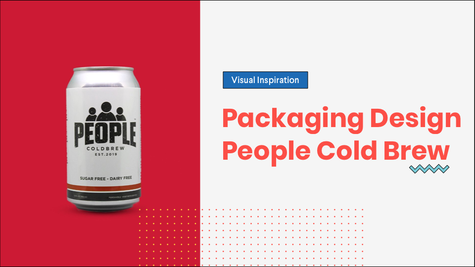
Packaging design has a big role to play in delivering the desired brand experience. After all, it is the first brand touchpoint a customer engages with following a purchase. Being cognizant of the target audience doesn’t necessarily impede the creativity of designers. Rather, it can be a great design imperative. In this article, we feature the design process employed by People Cold Brew (SAH.OL Cold Brew). With a community focus branding strategy, it was natural for the process to be people-centric.
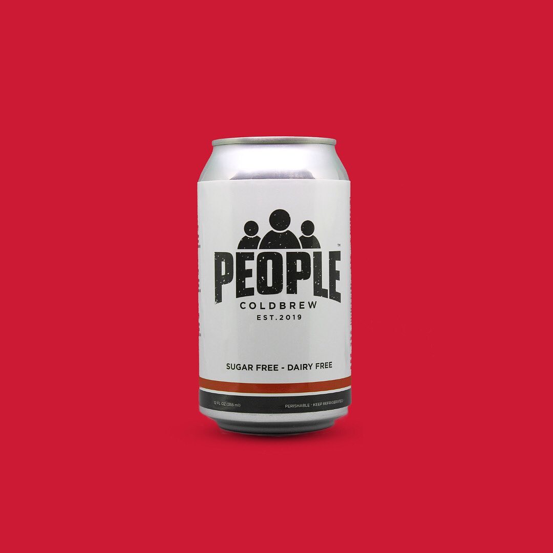
Being a fresh entry into a highly competitive market added to the design challenge. The design needs to achieve the desired cut-through as well as communicate the brand’s positioning and values. It has to avoid adding to the noise and clutter. “By people, for people” must be clearly communicated by the design.
Getting a product designed that matches your vision and connects with people is important when your business is fresh in an industry filled with competitors. Aman Ailani, founder of People Cold Brew, and the chief designer Ian McFarland has done it right, with a packaging design that translates the founding family’s vision to share their love with coffee with the community.
Table of Contents
The inspiration behind People Cold Brew’s design
Bringing people together over a cuppa isn’t new. It’s a strategy beverage brands have used for decades. Hence, one can imagine the challenge new brands face in penetrating this fortress. But this was the goal set by the founder of People Cold Brew. To add, the design must share the story of the founder’s family love for coffee with the community.
“I drew the most inspiration for the design with the creative brief conversation that I had with Aman. During this phone call, we talked about what People Cold Brew’s mission was, and how it was different than other products on the market. People Cold Brew wants to bring people together, and use coffee as an opportunity to bond.”
“Using this mission as a basis of my design, I started to draw inspiration from simple, clean, and modern design styles. I knew that I wanted to go in a direction that would emphasize the mission of the coffee, and I felt that the simpler the better.” says Ian.
This sets up the design challenge, which is best summed up as such:
i. Community, or people-centricity
ii. Simplicity
iii. Authenticity
A sleek and minimalist design concept was born. Anything too loud or cluttered will drown out the “By People, for people” line in the design. In addition, it was important that the design wasn’t seen to be trying too hard to communicate it. Keeping it subtle yet clear was a delicate balance that needed to be achieved. Only a splash of colour was used to make it stand out in the chiller or aisles.
How did you bring this to life from a design perspective?
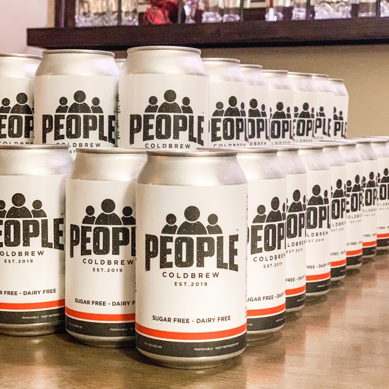
“I wanted to design a brand that would stand out among other cans on the shelves, and catch a consumer’s eye, all while keeping our focus of “By People – for People.”
For Ian, Adobe illustrator was a great tool to use. It allowed for multiple iterations of the design ideas. In this way, together with the Aman, zooming into the finer details of the execution was easier. Very little was left to the imagination.
Next, using Adobe Photoshop allowed them to mock-up the designs and visualise its application. It’s the final acid-test before the packaging goes to print.
The Final Design
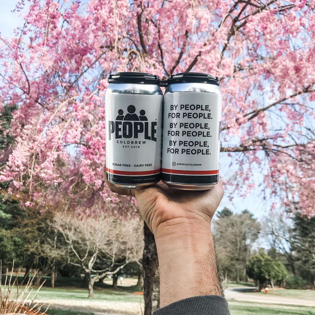
“Our can is pretty simple: black, white, and a red racing stripe along the bottom. The red stripe points to the sugar-free and dairy-free callout and really helps us drive home the all-natural benefits of our coffee.”
“On the back of the can, we have our tagline, “By People, For People” written 3 times to emphasize the community-driven aspect of our family-owned business. Unlike bigger corporations, People is managed by our family of 4, and all business decisions we make go through a social, ethical, and economic filter that is hard to find these days!”
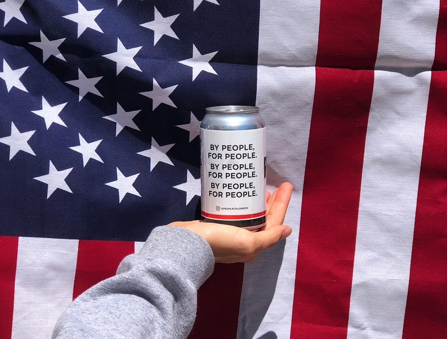
“In general, I believe this design was simple and reminded my target audience that my brand is rooted in the community. Along with our slogan and logo, we make our brand about ensuring that others have the best coffee possible, and that’s something that we will never move away from!”
“Apart from that, our product is a clean label and our coffee has just 2 simple ingredients: coffee grinds and filtered water. The ratios of our brew is what differentiates us against the competition and provide a bright cup of coffee that gives our customers the guilt-free caffeine boost they need!”
Packaging design is a journey more than it is a process. It’s not just a to-do-list. It’s kneading the client’s brief, business objectives, brand strategy and community. They are the paintbrushes, colours, and canvass to be used. Every stroke leads to the next, ending in beautiful imagery of the product.
Aman Ailani, the man behind the vision

