These 13 Packaging Design Trends Will Fly Off The Shelves in 2021
Are you ready for the packing design trends in 2021? More importantly, is your product packaging ready for this year and the ones to come? Should you be making a change, if at all?
If there's one thing that I can say with complete certainty, it's that the year 2020 has been crazy about changing a lot of perspectives. There's no denying that!
Now we've come to realize the importance of eCommerce more than ever. However, eCommerce can never truly replace the branding and vibe of a store. And at the same time, there's a dire need to adapt our products according to the changing times. The idea isn't to replace the in-store experience but rather adapt to a future dominated by online experiences.
And with that, packaging designers and brand experts are putting in a lot of effort to deliver the branding experience right at your doorstep. This doesn't mean that you absolutely have to change your packaging designs as per the newest trends. However, if you can adapt the existing design with some of the features discussed below, it would go a long way!
So here's an exclusive list of the 13 packaging design trends that will dominate the future from herein. Let's look at them.
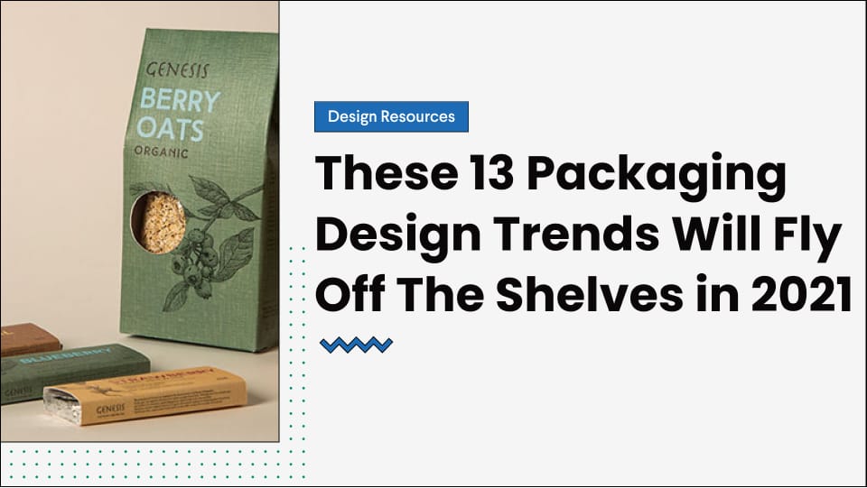
1. Neutral & Earthy Tones
Minimalism has been on the rise lately, and 2021 will carry forward this trend. The best tones that match with a minimal design are neutral and natural shades. That is why the product designs this year would be leaning more towards focusing on the natural elements. This means that we'll be saying more shades of brown, green, off white, and subtle blue. Together, these shades make up for a strong brand image. They also help neutralize any bold effect.
The most suitable niches to adopt this trend would be pharmaceutical companies or home products brands.
If you're looking for inspiration for this trend, check out Kirk's brand. The company is a women-owned American brand. They produce soaps to be used at hope and prioritize a clean and healthy environment. Their thematic alignment goes perfectly well with the natural-toned product packaging, as shown in this Instagram post. (Completely in awe of their feed, wouldn't you agree?)
Apart from this, you can also take inspiration from this packaging design by Design Hill. They have many creative designs that you can take help from and even get your own custom packaging design made. Isn't that great?
But more importantly, you can see how natural tones go perfectly in line with certain brand images. These could also include coffee brewing companies or specific food industries.
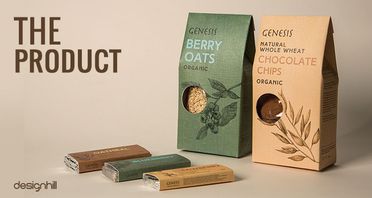
2. Textured Packaging
Have you ever thought about how important touch is? The sensation of feeling something almost invokes emotion in you. Think of it this way - when you touch leaves or grass, you're automatically infused with a serene emotion. Similarly, touching an old paper or parchment might make you feel nostalgic.
You don't necessarily have to have an experience associated with the texture. It's a part of our subconscious, in simpler words. Humans thrive on emotional connections, and touch is a strong element in propagating this emotion. Only recently, we've realized just how powerful it could be in light of the pandemic.
Hence, to revive the sensation of touch or enhance the product's emotional appeal, most packaging designs aim for textured packaging. For instance, if your target market is more towards the high-end class, you might want to consider embossed labels or glossy appearances. These are seen as premium packaging, and many customers feel that it enhances the product's appeal.
Remember, the idea is to maintain a complete brand presence, and textured packaging can really bring that out. The skincare industry is more inclined towards including this trend as it also aligns with the general concept behind the trend.
Look at this sample packaging for a skincare brand. See how the gold foil is used to add texture to the packaging? Yes, that's what we're talking about. Adding a little element of texture to enhance the appeal of both the product and the brand presence.
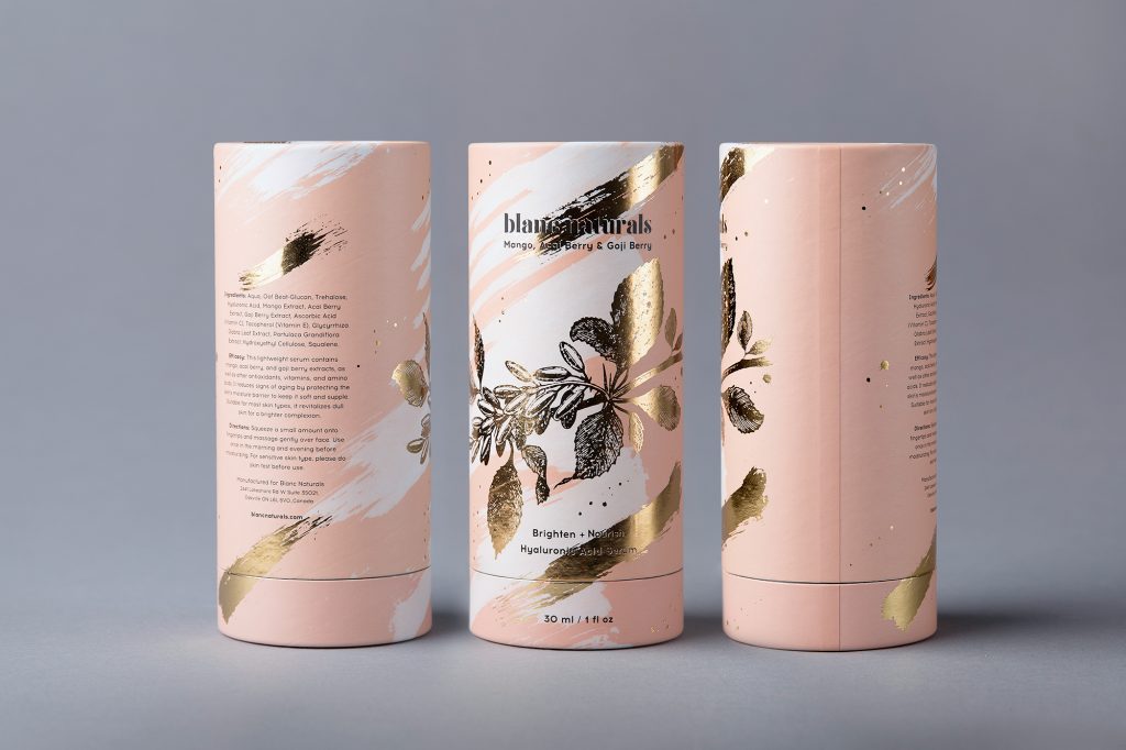
Similarly, look at this textured design for a coffee company - Cellini. Again, the use of a gold foil at the top has enhanced the entire product appeal. The twirl patterns also go in line with the textured trend, so you can probably keep an eye out for that.
3. Bold & Modern Illustrations
Next up, we have one of my favorite trends - bold and modern illustrations. If you ask me, illustrations are the best way to communicate an emotion or bring out your product's appeal. It speaks of personalized connection and is unique to your brand.
Thankfully, in 2021 we'll be seeing a lot of illustration packaging combined with a touch of bold and modern designs. Yes, minimalism is on the rise, too, but that doesn't mean that your packaging has to look dull or robotic. The idea is to make them engaging so that your customers can interact with them and enjoy the experience.
Check out this product design from Olympus Labs. See how they've creatively used illustrations to stand out? That's what we're talking about! Just as they've played around with bold patterns and standout illustrations, you can also employ similar techniques to enhance your product's intricate details.
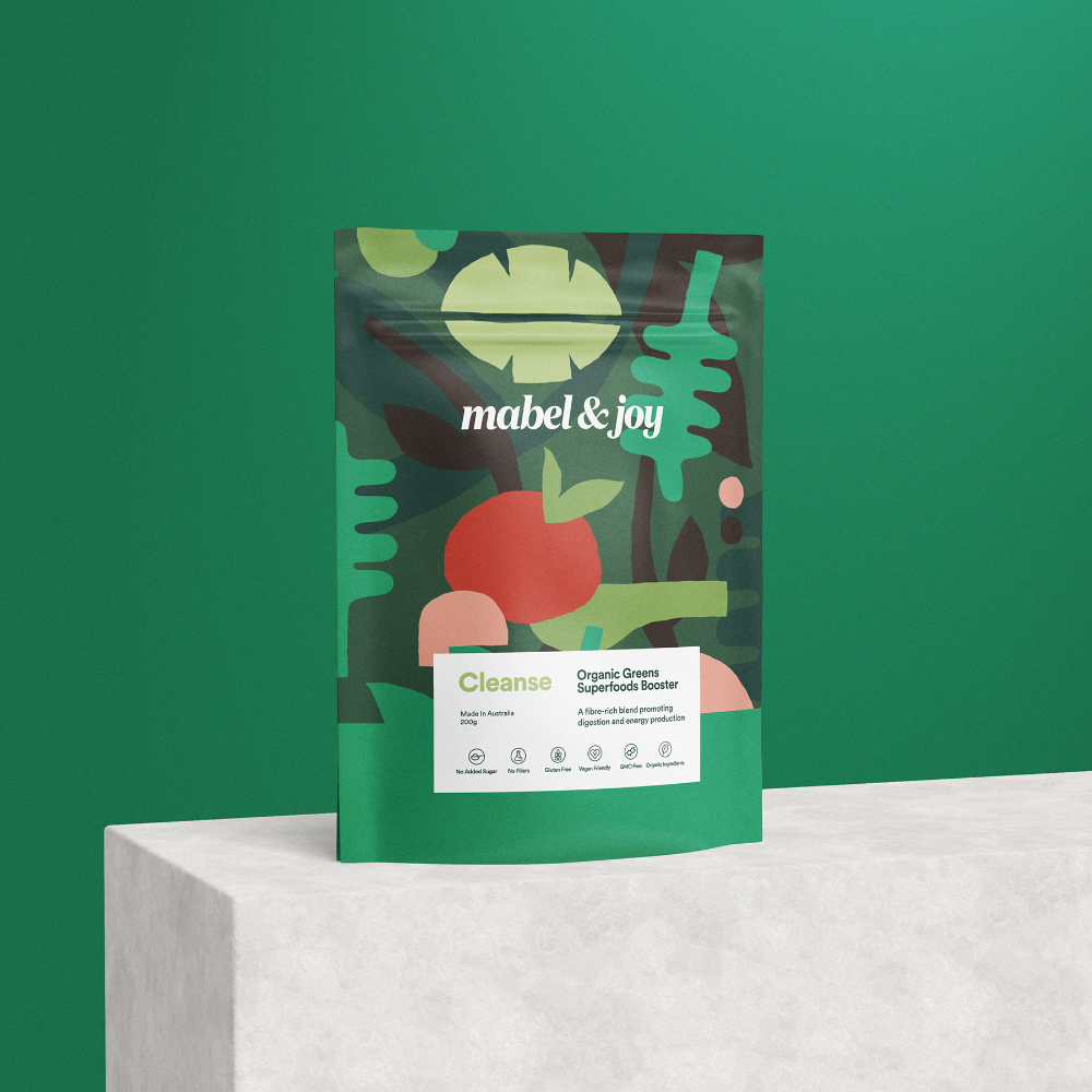
Similarly, look at these beautiful designs for Superfoods by Mabel and Joy. They serve as an excellent example to showcase bold illustrations while keeping the design clean and readable.
4. Creative Storytelling
As a writer, I can say with absolute certainty that storytelling is one of the most effective communication modes. There's no other art in which you can as beautifully connect with the audience as you can through creative storytelling.
The best part? People love stories! They want to be engaged in a product that's more than just a simple product. In fact, statistics suggest that 81% of consumers are driven by emotion to decide. That means that if your packaging design is not apt for storytelling, you might be missing out on a big chunk of your target audience.
Now your packaging design can be inspired by your brand story or how you started. It could also be a series of illustrations recalling your brand values. Or simply a graphic fleshed out with a story.
Take this packaging from a Medium blog as an example. See how they've built a narrative around the simple package? A simple thing like this can engage your audience and make them feel like a part of a community. This isn't something exclusive to the packaging design industry. Big brands like Apple also take up this strategy of building narratives and creating a loyal customer community.
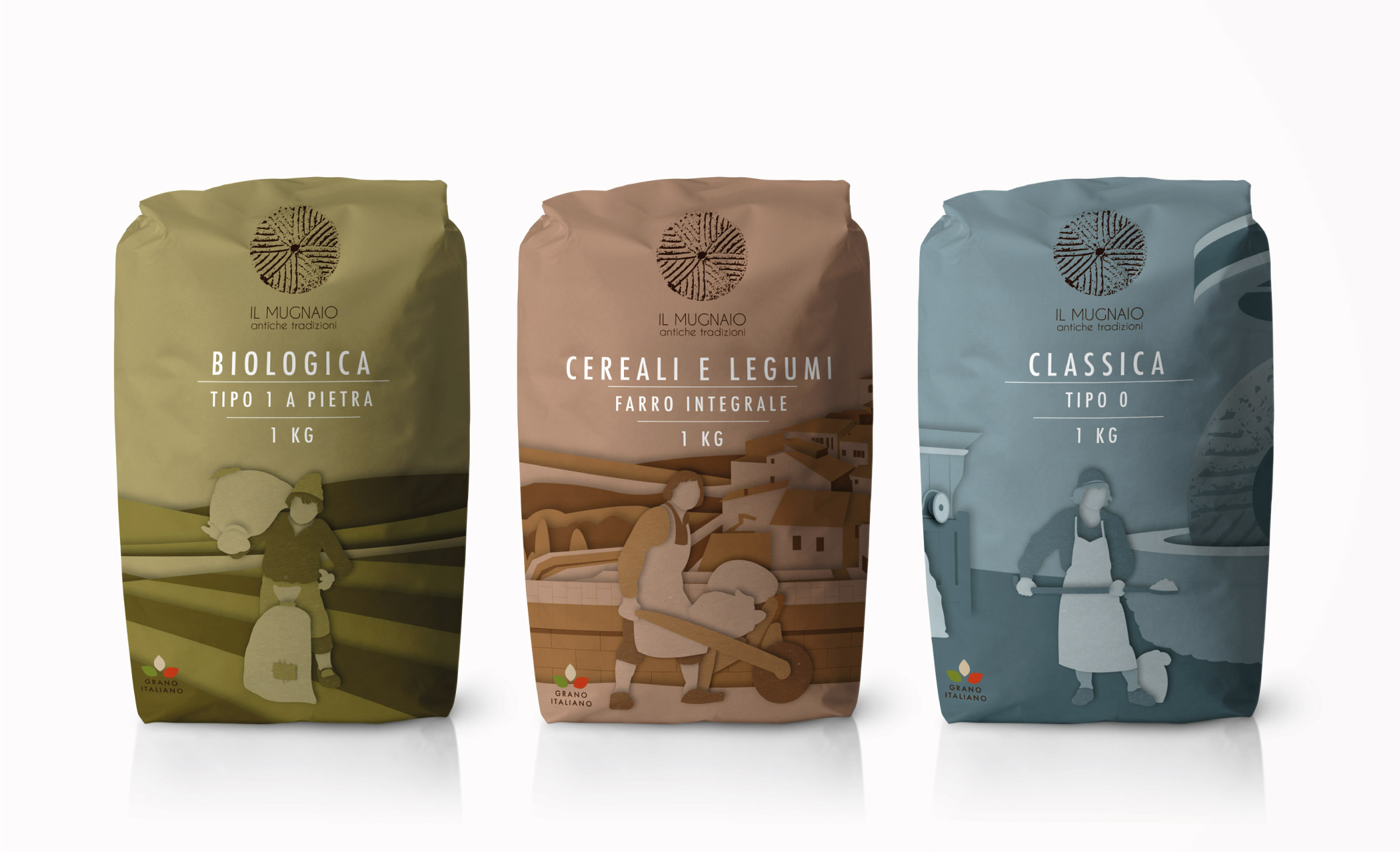
This is yet another example of effective storytelling through packaging design. The packaging for Mugnaio Flour has used simple typography and illustrations to convey the struggle of creating wheat - step by step, all the way through. Creating such narratives also allows the consumer to empathize with your cause. Hence, creating a stronger bond with the brand.
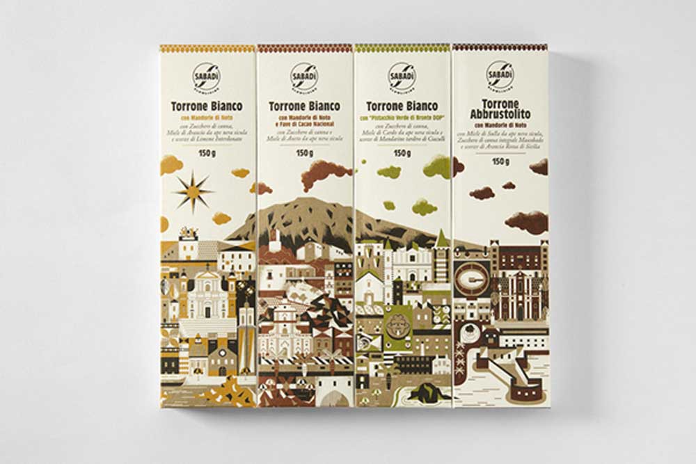
5. Vintage Packaging
Ever feel like going to the past? To times when things were normal, and things seemed easier? While that might not be possible, what is possible is including vintage sense in your packaging designs. Our 5th trend for the year 2021 is vintage packaging.
This trend is all about tradition. From font selection to colors and even the wrapping itself, the entire look is vintage. The best part about this trend is that it can be used for pretty much any product or in any industry.
The best colors to bring out the vintage vibe will be brown and pastels' shades if you ask me. You can use them for chocolate packaging, medicinal products, or even popcorns. Sounds unreal? Take a look below.
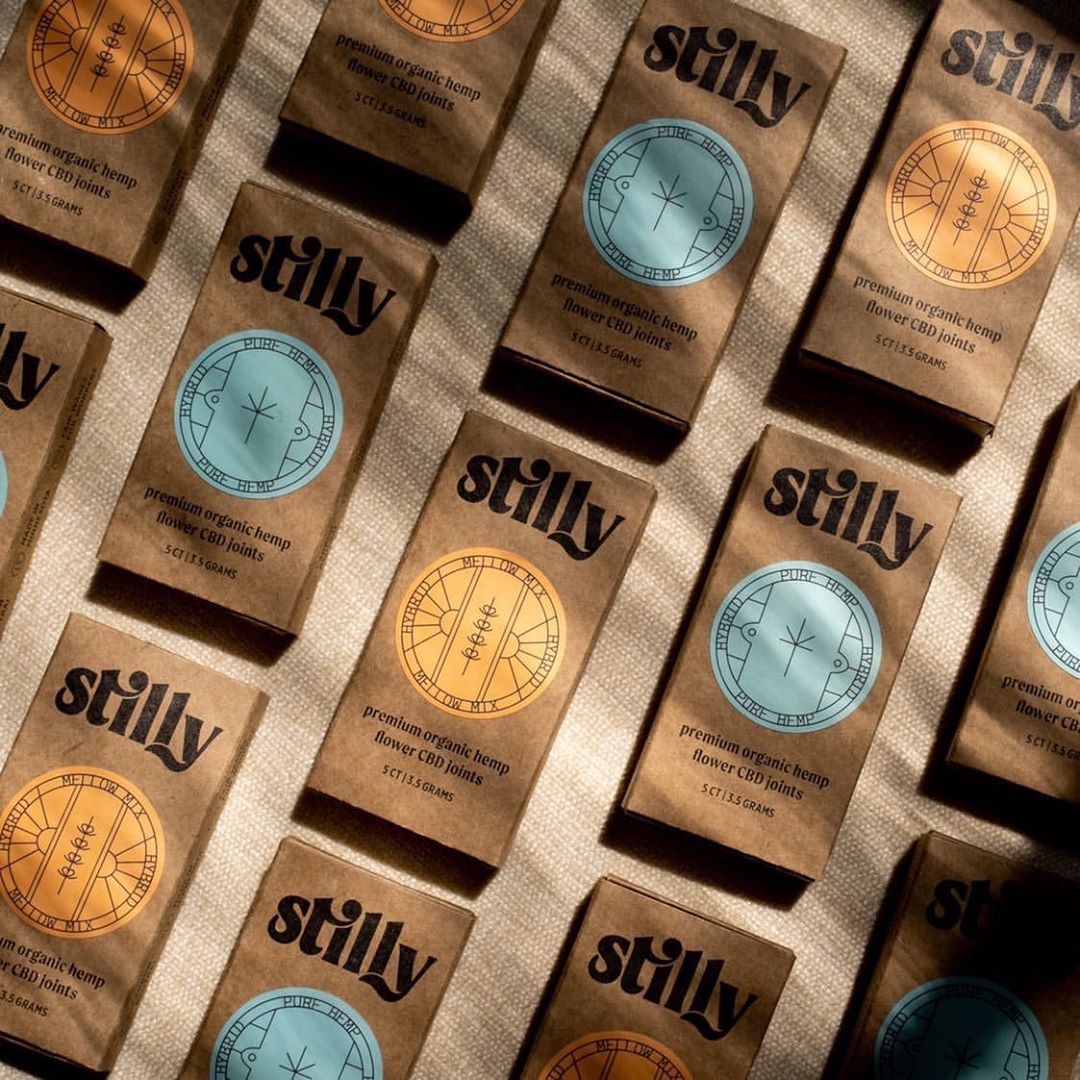
This vintage packaging design from Stilly CBD sends out a sense of grounding and strengthens brand presence. Remember, while playing out with illustrations and patterns is all cool and fun, it's also essential to stay grounded in any company's roots.
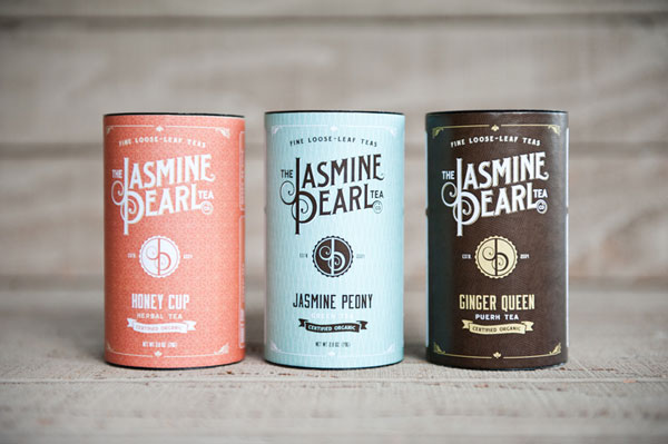
Here's another vintage packaging example to inspire you! This tea company, Jasmine Pearl, has quite remarkably incorporated the vintage feel along with a modern theme. So if you feel that your company is aimed towards old-school consumers, it would be advisable to design the packaging accordingly. Besides, you can always incorporate modern elements through typography and create a balanced design.
6. Abstract Designs & Prints
The next trend that we have is abstract designs and prints. Abstract originates from Aboriginal people giving it a completely artistic and cultural vibe. That is also why abstract designs are mostly filled with bold and highlighted fonts or intense approaches.
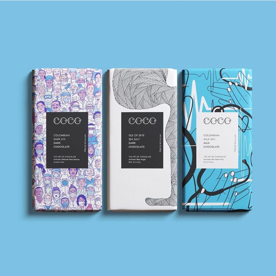
Take a look at this design from Coco Chocolatier. The use of illustrations, vibrant colors, and unique typography together creates a powerful and abstract packaging. These kinds of packaging are more suited to the younger audience group. The main reason for that is the visible attraction of millennials and Gen-Z towards arts. So you can use this trend to your advantage and target this audience set.
On the other hand, abstract design can also be used to complement the loud design. That is to say that often it adds elegance to an extremely bold design by bringing art inspiration to it. Abstract in itself is mostly used to induce creative exploration among individuals. So in this way, the abstract can also subdue the other highlighted elements of a design and allow consumers to make faster and creative connections.
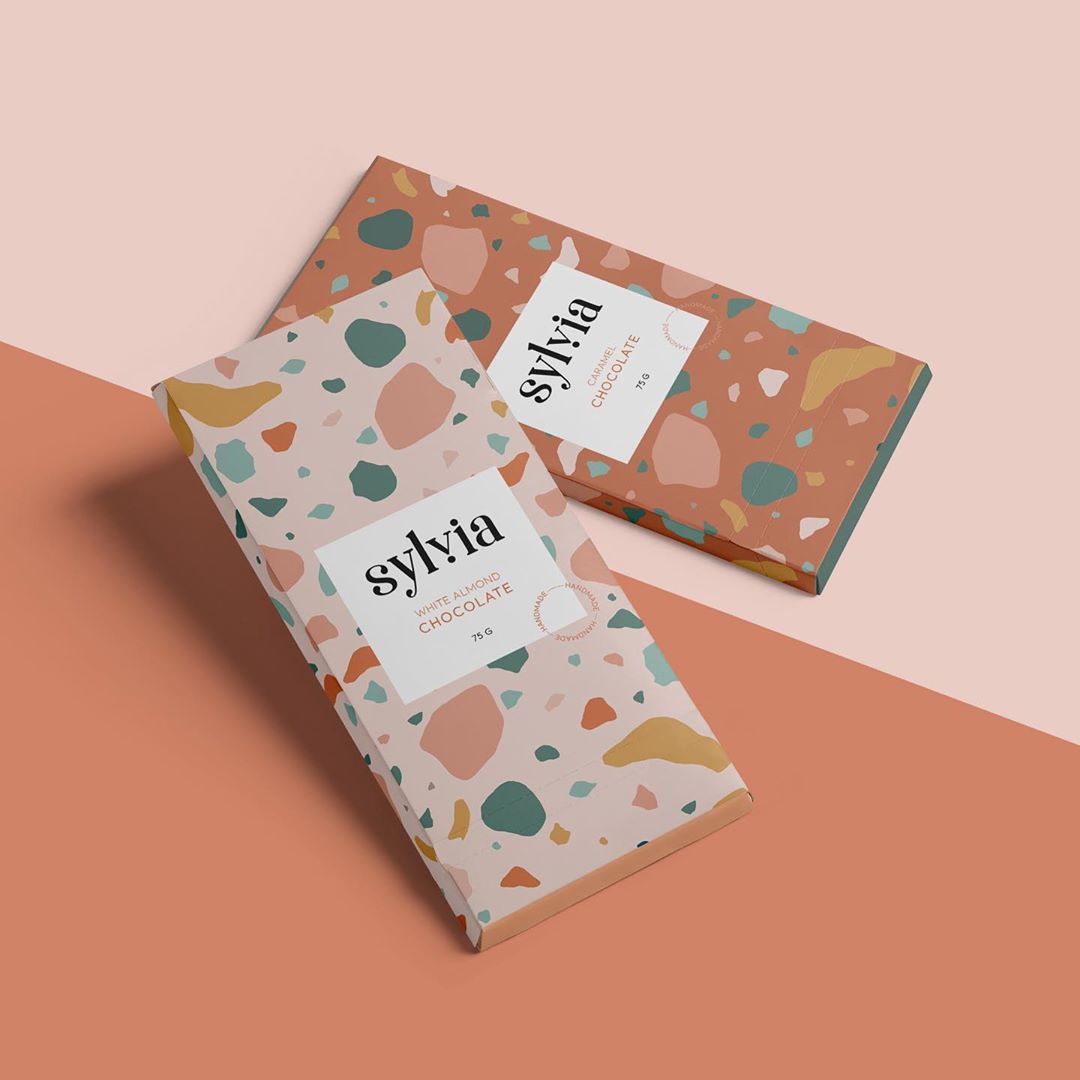
This packaging design for Sylvia Chocolate also illustrates how abstract can capture the essence of a brand. See how it can be used for minimal designs as well. So it isn't always about the bold designs.
7. Transparent Window Packaging
38% of consumers are willing to purchase a newly launched product with clear product information. That is because people like to make an informed choice about the products they will be using. That is the same reason why social proof or reviews work so well with certain customers. It's the certainty of knowing that the product will be as good for them as the brand claims.
So if you want to assist your customers in making a choice, your brand assets should reflect that. This is where our trend #7 comes in; transparent window packaging.
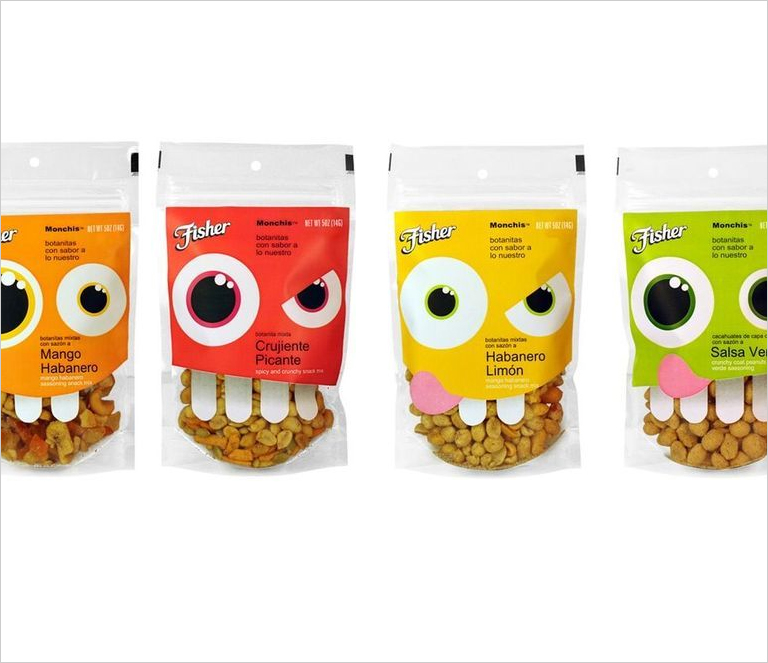
For instance, if you look at this packaging by Fisher, you'll see why the trend is becoming more important than ever. We're still amidst a global pandemic, which has changed many consumer behaviors and buying patterns. So if you can give a glimpse of your product (especially if it's an eatable) to your audience, you stand a better chance of winning them over. Doing so also adds authenticity to your brand.
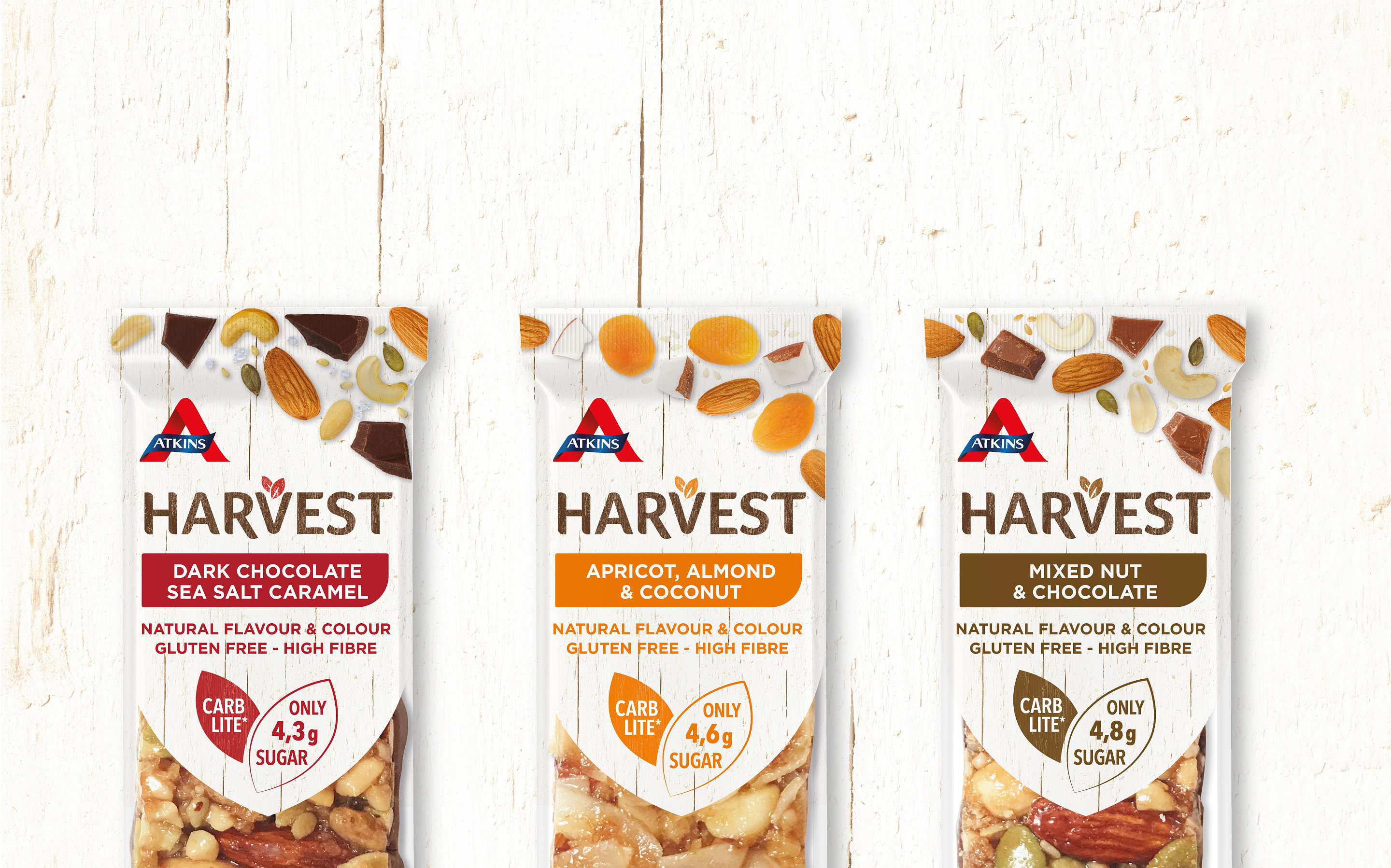
Similarly, the packaging design for Atkins Harvest is nothing short of great creative effort. Not only it illustrates the nutrition facts, but it also gives a peek into what you'll be eating. Now that's a great packaging design!
Proofing Packaging Designs
Before we move on to the rest of the trends we'll be embracing this year forth, let's stop for a minute and ask ourselves the most pressing question; how to roll out great designs?
It's a question that haunts many creatives and designers. It has a simple solution; review your packaging designs with the #1 online proofing software. You'll be surprised to know that using review and proofing software can make your work 5x faster. Many leading design agencies and companies use GoVisually as a part of their design review process and are happy with the results.
The best part? You can invite as many reviewers as you want!
8. Patterns & Flat Illustrations for the Win
Now, onto trend #8; flat illustrations.
Flat illustrations and patterns are the most commonly seen packaging design. It's one of the trends that have survived years and is here for the win again in 2021. Design agencies and companies love this alike because it makes any simple color stand out and the text more readable.
Patterns and flat illustrations make the design clean and allow more creative freedom. You can even play around with different patterns and mismatch them to create a new design altogether.
Check out this rebranding done for Sacred Grounds - a coffee brewing company. See how it perfectly captures the modern chic vibe with clear typography and illustrations. Using patterns or illustrations in packaging design is much more than just embellishing them if you think about it. It can completely reveal the vibe of the product by presenting your vision for it.
In Scared Grounds design, the idea is to showcase young and active people cruising around the day! And that is quite visibly depicted through the design.
Similarly, check out this other coffee packaging design Lilia Quinaudo. See how you can use different patterns and illustrations for the same industry. This is why this trend is likely to stick for many years to come. So get ready! In 2021, expect some great illustrations and simplified patterns for artistic expression.
9. Geometry & Shapes Will Be Back
Another one of the packaging design trends to dominate in 2021 is to use geometry and shapes. We've already discussed and seen how patterns and bold illustrations are here to stay - and shapes and geometry will be one of the most commonly used elements in those patterns. This also includes the precision of designing in packaging. You'll notice defined shapes along with neat lines.
For instance, look at this packaging design for a coffee brand by Studio VCR. See how defined the lines are and how they geometrically divide the packaging into different sections for increased readability. Creating designs like these can really give you an edge over your competitors. Plus, it helps the customer read through and understand the content as well.
Here's another example of the geometric shapes used in the packaging for Wnder Chocolates. The pairing with the font and the color really brings out the charm in it. Mind you, it may look simple and pretty straightforward, but aligning everything to fit together in symmetry can be harder than you think.
So kudos to all the packaging designers for creating awesome symmetry and using geometry!
10. Color Blocking & Gradients
Color blocking and the use of gradients has been in trend for a while now. But earlier, we had seen this trend more prevalent among UI and UX designs. However, get ready to see some spirals and color dips in packaging design as 2021 is ready to fly off your shelves with these.
Take a look at these packaging designs for the Mancha Green Tea can. The designer has used hues of green in waves and patterns to bring out the product's texture. Also, notice how this trend can be leveraged to convey emotion as well. Green tea is a natural herb and is more commonly associated with natural colors and green or white elements. And if you can incorporate the color as cleverly as this product, you'd be creating a design that connects to the customers.
Here's another great design from the packaging of Good Flower Farm. The soft palette of pastel colors is used to complement each other. Moreover, they're paired with traditional, calligraphic typography that enhances the organic feel that the product is going for. However, if you observe closely, you'd see that the color blocking used is really the one that combines all these outstanding elements to bring out the product's life.
With such artistic yet straightforward use of color blocking and gradient, the product gives a more realistic and organic vibe. It makes the product look balanced and easily readable. Our suggestion would be to use it for organic products to bring out the effect.
11. Experimental Typography
The clarity in design promotes ease and convenience for the customer. And with all that has happened in 2020, most consumers now prefer the ease of shopping over other features. That is why it's also important for the packaging designers to ensure that the design is easy to follow and appealing. To that end, 2021 packing design trends include experimental typography.
Now, what does that actually mean? Simply that instead of keeping the logo or a specific illustration as the focal point for the packaging, you can choose to prioritize the brand name or even the product name, so it's visible and readable.
This isn't anything new. Several leading brands have been doing this for a long time. Any guesses?
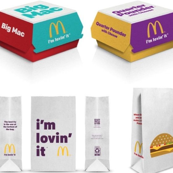
McDonald's! They've been prioritizing clear typography for decades now, and that has effectively lead them to create a distinguished brand presence. The primary reason behind that is that clear typography is easier to read from a distance. That is especially true if you use complementary colors to enhance the features even more. If you want to be inspired by the way McDonald's does it, you can probably design a few illustrations to complete the look.
It can also be something as simple as this packaging design for a can. Notice how you don't even need crafty illustrations if you choose to prioritize typography. It can say it all in itself.
A general piece of advice would be to avoid using multiple fonts as that can be hard to follow. What you can do is stick to the brand guideline or select the top fonts for 2021.
12. Solids Are Back
While most packaging designs are preferring bold illustrations, solids are still getting back in the game. So expect to see products with just a single color ruling the design. And while there are so many colors to select from, it can become a bit limiting towards the creative side. That's because you can only use one solid color. Still, it can be paired with impressive lettering to bring out a charm in it.
Check out this packaging design for Bee Good Drinks. Now that's an excellent way to strengthen the brand message, image, and all with a solid color and big typography. This is exactly what you'd notice about this kind of design. Most of them use bright colors paired with a beautiful font to make them stand out.
At the same time, the use of solid colors can be leveraged to communicate an emotion. Colors impact human psychology a lot. That's why it's important to know their meaning and use case so you can employ them effectively in the designs.
Here's another example of using solid colors. This packaging was designed by Design by Sakia, an Instagram packaging designer. The packaging is for chili oil. Notice how the color is used to convey mood and message again. So our suggestion would be to use solid colors in your packaging if you want to prioritize an emotion or invoke a certain feeling among the customer.
If you're wondering about what solid colors to use, check out the Pantone colors of the year for inspiration.
13. Personalized Packaging
And finally, the last trend for 2021 might be the winner of all.
Do you ever look at the packaging and smile just a little because it has some message engraved on it? It could be something as simple as the line. You've been expecting me.' The idea behind using these phrases is to promote a personal connection with the customer.
While so many designs focus on creating a design that would stand out, personalized packaging can instantly connect with the consumer. It makes them feel included, and often that is alone to prompt a purchase.
See this packaging, for instance. It's straightforward typography over a box, but it can be equally effective in warming up a customer's heart, and that's because it's personalized. Most industries using such packaging are eCommerce stores or food delivery boxes.
In recent times, both of these industries have become vital sources for people. And that's why the designers are also paying attention to improve the packaging that the customer interacts with. This way, it allows them to communicate with the customer without a physical presence.
Many companies take in custom packaging orders too. You can either have your name engraved on it or a line. But those are majorly used for gifting.
Are You Ready For These Packaging Design Trends?
The clock is set at these packaging design trends. So what do you think? Do you feel that these packaging design trends are ready to take off in 2021? Will you be using elements from these trends and adapt your brand to embrace the modernity that comes with it?
Let us know in the comments below. We'd love to hear how you plan on incorporating these packaging design trends.