13 Principles of Design and How They Can Re-Invent Your Design Game
If you're a designer or part of your job requires a lot of design approvals, you'd probably think that by now, you know all about principles of design.
However, we'll have you know that designing is a vast field that considers several essential things for creating beautiful artworks. It is anything but an easy job. And that's because getting the right design requires time, effort, money, and most of all, knowledge of the principles of design.
Sure, you can often rely on the already existing templates available online. But to use them properly would require the proper knowledge of these principles. So if you want to avoid design mistakes that cost millions of dollars, acquaint yourself with the basic principles of design.
Now, there are different types of design principles. But today, we will discuss the 13 most important ones.
Surprisingly, these design principles are actively used in projects concerning applications and websites where the user interface is the top priority.
But first, let’s revise what design principles are.
What Are Design Principles?
In simple words, they are guidelines that help you create some fantastic visuals for different platforms. You can also combine different design principles or apply them individually. It depends on your design type because the primary goal is to enhance the design's appeal.
Moreover, you can apply them in your creative work to better understand how all these work in coordination or independently, making your design stand out from others.
Let’s look at the various design principles and try understanding each of them with a suitable example.
Principles Of Design
To be honest, we don't think that there is any fixed number of principles when it comes to designing. However, today, we will be discussing the 13 most important ones observed in the various successful designs and creatives around you.
Principle #1: Contrast
Designs that look the same are often seen as boring, and this is where contrast helps. When two or more than two visual elements in a composition combine, it creates a contrast.
You can use it to create emphasis on particular elements and create specific special effects. Contrast also helps to ensure visibility and makes it pop out.
To create contrast in designs, try experimenting with:
- Colors
- Shapes
- Sizes
- Hues
- Fonts
- You can also include the other elements to create contrast and get the ultimate look that you wanted in the first place.
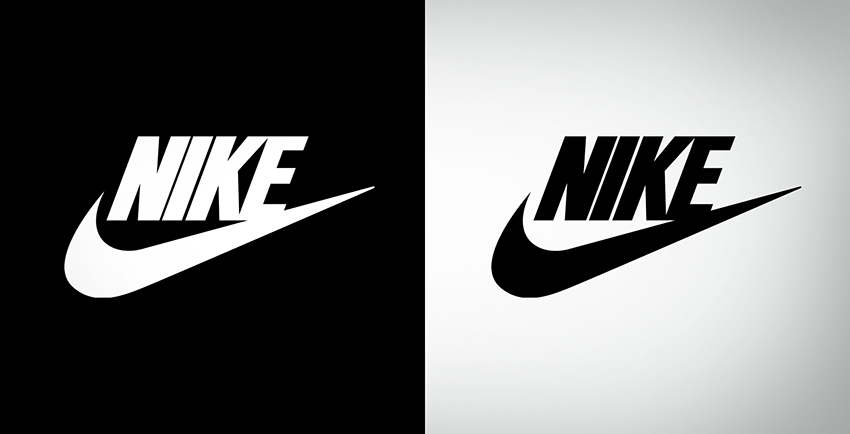
Observe the contrast in the image and how the logo stands out from the background in both styles. It is not merging in the background, but it is visible and prominent enough.
Principle #2: Balance
Every object and element you add to a design has a specific weight regarding size, color, color shape. You can achieve balance in a design when there is an equal weight of components on both sides of the design.
This doesn't mean that all the objects are of the same size, color, or shape. However, it does mean that all of these elements should have a balance on each side.
By achieving balance, one can create a sense of harmony and balance in the design without the viewer feeling overwhelmed. Three types of visual balance can be achieved with the larger and smaller elements. Let's discuss them one by one.
Symmetrical balance
This uses the drawing of an imaginary vertical or horizontal line, usually in the center, to divide the canvas into two halves. Then the elements that are present are balanced on each side of the lines creating symmetry. Symmetrical balance is usually found in most logos.
McDonald’s logo is an excellent example of symmetrical balance where both sides are balanced. The two vertical halves are exact mirror images of one another.
Asymmetric Balance
Asymmetric balance is when a designer uses unequal weighted elements in the design. A simple way of explaining it that when a designer uses heavy elements with multiple lighter elements. It allows giving the design a more dynamic and balanced feel.
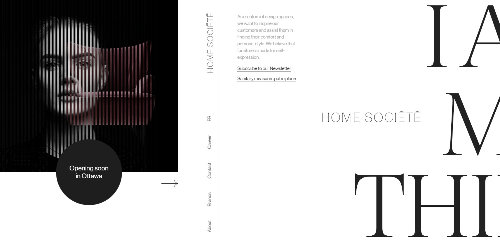
This website’s landing page helps to see the asymmetrical balance mentioned above and follows the principle very precisely, keeping the essential information in focus.
Radial Balance
Radial focuses on a common center, precisely what radial balance is all about in design. It means that the multiple elements radiate from one point in the center of a design. This type of balance adds more depth and movement to the design and automatically draws attention to the composition’s center.
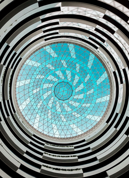
This picture very clearly helps you to see how radial balance works. The viewer's focus immediately goes towards the center of the image because of the color and the radial balance that it seems to be carrying along.
Principle #3: Emphasis
Emphasis is applied when a part of the design needs to be highlighted and means that that information is meant to be conveyed to the audience.
This design principle uses various elements like:
- Typography
- Size of different elements
- The shape of the elements
- Color and hues that help bring forward the essential parts
- De-emphasizing elements of less importance.
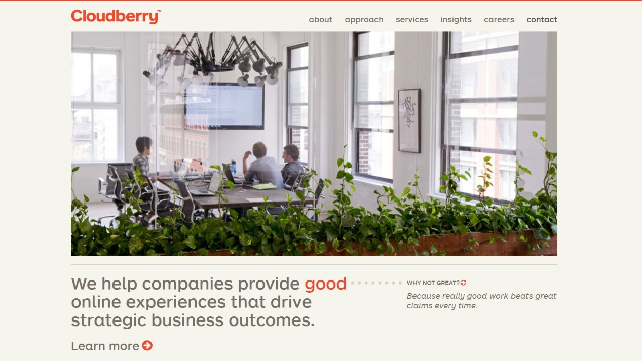
The landing page of Cloudberry is a perfect example of how emphasis work. If you carefully look at the website’s landing page, your eyes immediately adjust to the essential things present in orange color. At the same time, everything else is another neutral color. Furthermore, even in the neutral color, the information-carrying is bold and has a relatively larger font size than the other text present on the landing page.
Principle #4: Hierarchy
Another principle of design is the hierarchy related to organizing all the elements in the design according to their importance. In other words, it is ranking the information from most to least important, which makes it easier for the viewer to understand and comprehend the information better.
Headings and subheadings are aligned to depict the importance of all the various elements with each other. This element is being actively used in User Interface design to cater to the audience and ensure that the hierarchy is followed, drawing attention to the right things. You can further use this hierarchy through different ways like:
Colour and contrast
Various colors have various effects. Bright colors have another impact, while dull or dark colors have another type of impact. Use colors that suit your objective and help you bring attention to what is essential.
Typography
The use of different typefaces and stylizations helps move the eye and attention of the audience and follow the basics of hierarchy.
Size and scaling
Increasing and decreasing the size of an element can also help to increase or reduce its importance and emphasize where it is required.
White Space
This is used when you want a particular element to stand out and shine in the entire space it is present in.
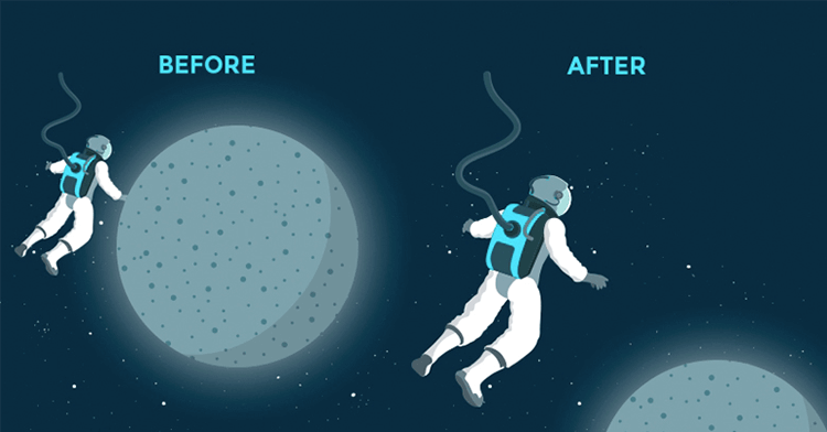
If you look at the above image as an example, you'll notice how the designer attends the astronaut by applying the hierarchy principle. The before design clearly shows how the emphasis was on the planet, which might not be the intention of the design. So, to fix that, the astronaut is made bigger, and voila!
You can also apply the principle of hierarchy in designs to bring attention to the most important aspect.
And remember, you can do so by playing with the font size as well.
Principle #5: Movement
Movement does not always refer to something moving.
In design, it focuses on the path created for the viewer’s eyes to guide them using:
- Lines
- Shapes
- Path
- Colors and gradients
- Edges
- Creating focal points
- Encouraging a particular way of viewing things when they look over a composition.
Movement can be used effectively to pull a viewer’s gaze towards something or even distract the gaze away from the design. A designer uses different ways of playing around with the elements present for the process. They can actively use lines and cues to make images feel alive and moving.
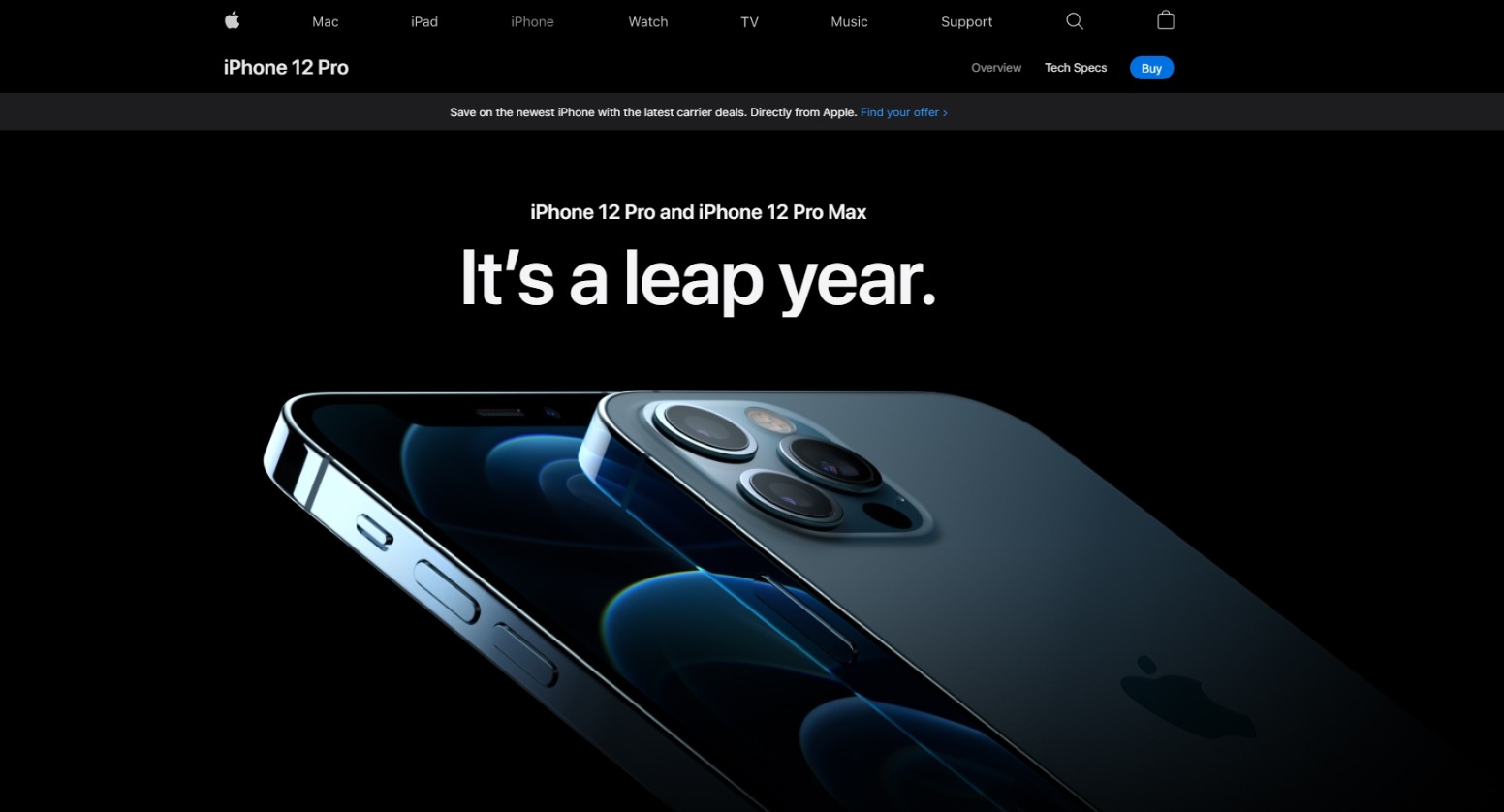
We read above how shapes, designs, and edges can help us create movement and capture the audience’s attention. Apple’s website uses exactly that feature to cleverly use the different elements to show movement on the web page, leaving the viewer mesmerized by the phone's look.
Principle #6: White Space
Commonly referred to as ‘negative space’ is the area in the design that does not include any design elements, and that space is empty. There is a lot of importance served by this white space, which primarily comprises giving some particular element space to be highlighted like content or part of a design.
One of the fundamental design principles has two types; micro and macro. Micro means the white space between the small elements, while macro means space between the significant elements.
White space helps to increase focus as fewer elements on the screen mean it is easier to pull the viewer’s focus towards one thing. It helps improve readability because it leads to less cluttering of text and better comprehension. It further helps create balance by controlling the white space around each element, establishing better visual hierarchy by aligning them in the order of importance, and adds visual rhythm through the elements and white space present in a design.
Notice the white space surrounding the above design. See how it helps improve the readability and presents a clear image. This is one of the primary aims of using white space.
So if you want your designs to breathe and look appealing, use white space.
Principle #7: Unity
Unity shows how well the different visual elements work together in a design. Unity ensures that the communication of different concepts is apparent to the audience. Designs with good unity are more organized and have higher quality and authority than designs with poor unity.
You can either choose to go for visual unity or conceptual unity. While visual unity refers to elements like color schemes, styles, and elements working together, conceptual unity talks about whether all the elements were brought together for the user’s convenience.
While trying to add unity, there are some important questions that a designer needs to ask himself. These questions include if the elements used have a valid reason to be there, work together in harmony, and deliver the message and concept clearly to the audience.
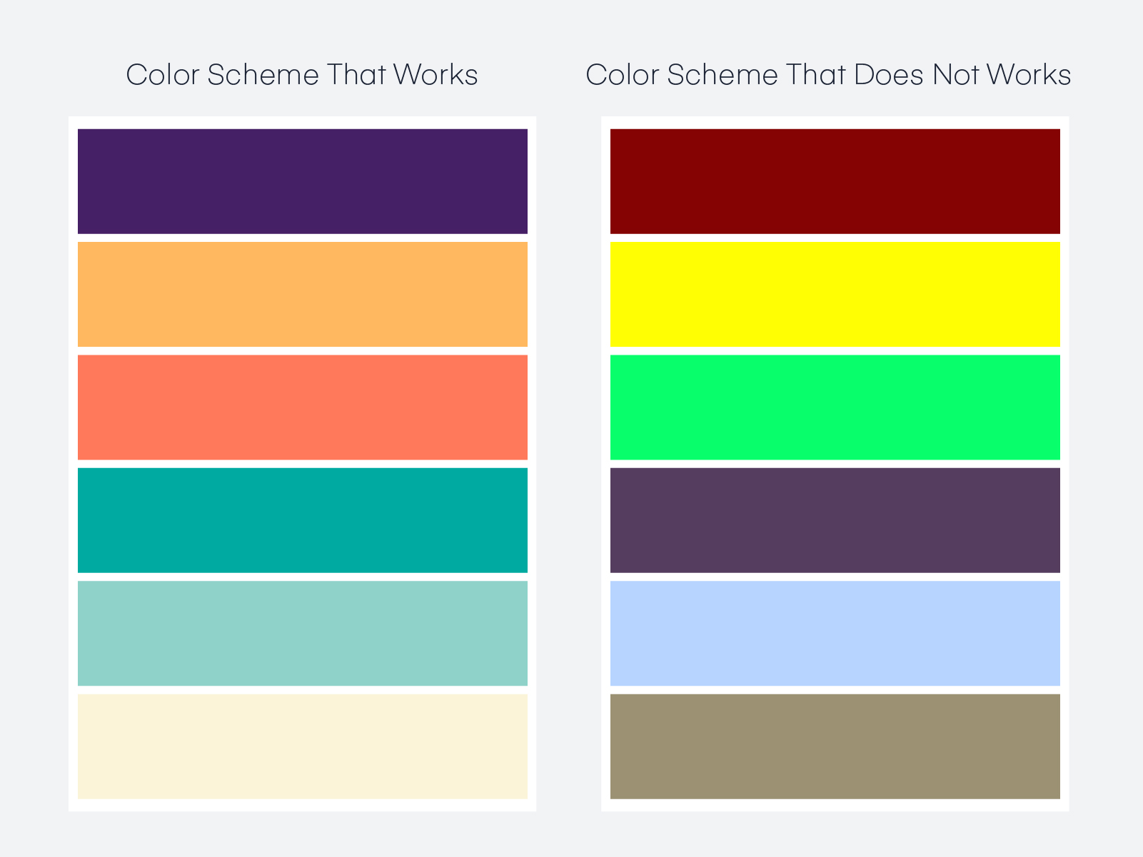
We can all very easily conclude that while one scheme has a good level of unity, the other scheme does not, so using the color scheme with the bad unity will only cause problems in creating the best designs.
Principle #8: Pattern
You can create patterns in a design by repeating multiple design elements that work together. A great example of the use case of pattern in designs would include wallpapers.
The pattern is a repetition of multiple elements, but it is achieved when different components are repeated in the same way. These patterns are used as a background for many websites and mobile applications.
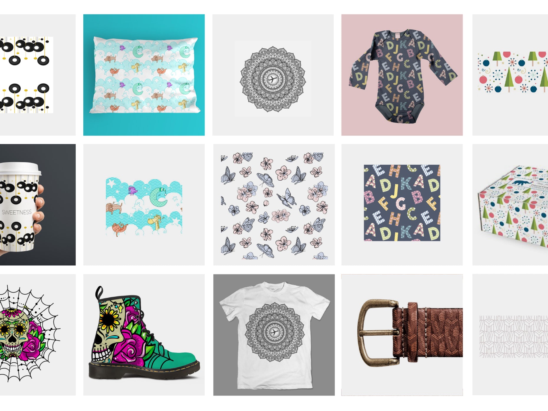
Look at these amazing designs with patterns. We like to call these the world of patterned designs. Aren't they neat?
Well, you can create them too if you want your design to have uniformity and look aesthetic.
Principle #9: Repetition
Repetition is an excellent way of reinforcing an idea and unifying a design that tends to bring together various elements. You can achieve repetition by repeating an element throughout the design.
- Repetition is achieved in various ways, including:
- Repeating the colors, shapes, or other design elements.
- It can also be achieved by repeating a particular font which makes the design more precise and consistent that the viewer starts to remember it.
- This helps while one is trying to create a brand identity as well.
An important aspect to remember is that brand identity is a vital element of the brand. Everything in a design, including the colors, logo, and even the typefaces, helps the customers distinguish your company from the numerous competitors you have out there. Therefore, it is essential to use repetition in the best way possible.
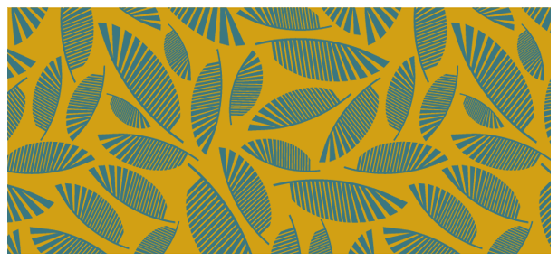
Observe how the designs occur in repetition. And they still look whole while simultaneously reinforcing the idea in mind.
Principle #10: Rhythm
The space present between the repeating elements can form a rhythm just like that in music. Rhythm helps give the composition a feeling of action and movement by repeating lines, colors, shapes, and other elements and further allowing the viewer’s eyes to build patterns and see the flow in the design.
There are four basic types of visual rhythm that designers tend to create through their designs. Random, regular, flowing, and progressive.
Random rhythm
The repetition of the elements in a design without any regular and continuous interval.
Regular rhythm
This indicates that the elements are arranged, repeated, and spread out with regular intervals and are of the same size and length.
Flowing rhythm
The pattern is natural, and the intervals are completely organic when being repeated.
Progressive rhythm
It is a gradual change or element in a sequence that happens to change after some steps.
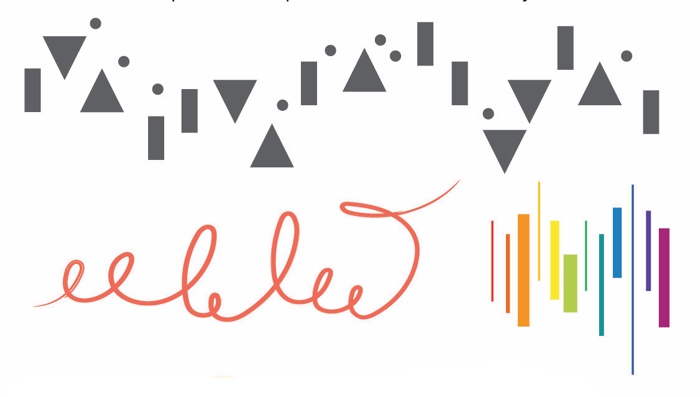
You can notice the different types of rhythm in the designs in the image above.
Principle #11: Proportion
It is one of the easiest design principles to understand.
Proportion basically refers to the size of different elements that work about each other, particularly its size and scale. It is all about finding harmony between the various elements.
Proportion further tells what is essential in a design and what is not that essential. Simply put, larger elements are important while smaller elements are less essential. If you want to use the principle of proportion in your design, then it is essential to keep some of the tips in mind that include:
- Assembly of elements identical to one another.
- Establishment of major and minor elements and areas in the design preventing monotony.
- Less size variation
- Keeping a balance between all the relevant elements.
- Prevent from separating the compositions into portions like halves, thirds, or quarters.
Airbnb’s logo is an excellent example of a proportionate logo. The logo and the text share the same level of space, so they do not look weird next to one another.
Principle #12: Variety
If you want to create visual interest to break the monotonous and uninteresting look, use the principle of variety.
There are different ways to create variety through:
- Color
- Images
- Typography styles
- Every other design element.
Also known as the spice of design, it helps make things interesting for the audience by keeping everything engaging and interesting. It does so by making sure that your work does not look drab and uninspiring.
With this principle, the key is to experiment with the elements as much as possible, use text next to images, bright and light colors to keep the viewers engaged and the designs interesting.
Using imaginative and abstract shapes and colors and various sizes, the artist can capture the audience's attention. The visual variety he creates keeps the viewer busy and engaged.
Principle #13: Scale
Apparently, elements in a design have a scale when compared with other elements. The scale has its importance because it heavily influences the tone, meaning, and complete composition of the work. It is a top factor in visual hierarchy and mentions the viewers where they should precisely place their focus.
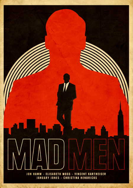
Very cleverly, the designer shows the main character in black, while he uses the red silhouette as his presence and a remembrance of his past that is not ready to leave him just yet.
Key Takeaway
Irrespective of your design sense, applying these principles of design will help amp up your design game. More importantly, they will help you implement the age-old and proven concepts in a contemporary way.
The important thing is that you play around and experiment with what you have and the various techniques that you might have learned along the way. But without practice, you will never be able to know anything.
So, don’t hold back; open up your minds and start designing fantastic artworks right away.
Happy Designing!