First impression is the last impression.
If you think that this only applies to a person, you are wrong. An impression about a brand or a website also creates a lasting effect. When you are selling in person, you would not want to welcome your customer to a dirty shop as you know that any interaction you have with your customer creates an opinion about your brand in their mind.
Even if your product or service is good, your customers will judge based on your visual identity. From Michelangelo’s art in the renaissance period to the contemporary Instagram artists, our obsession with aesthetics is continuous. And with this much competition out there, your brand needs a strong visual identity that stands out from the others.
Cut design & video review time in half
Try GoVisually free today!
Table of Contents
What is the visual identity of a brand?
The visual identity is an assembly of various elements consisting of imagery and graphical formulations that differentiate your brand from others. It can vary from a brand’s logo to the color scheme that your brand follows. To break it into simple words, a brand’s visual identity is everything that your customer can physically see or feel.
Visual identity graphic design provides your brand with a constant theme or cohesive aesthetic for you to follow in any situation. It acts like your brand’s core value and provides instructions for representing your brand to the audience.
Over time, a brand’s visual identity is what your customers associate your brand with, which can help you create an emotional connection with them. Your brand visuals can help you make loyal customers.
How do brands benefit from a visual identity?
Your brand’s visual identity graphic design leaves a permanent impression on how the customer perceives your brand. There are numerous benefits of following visual identity design.
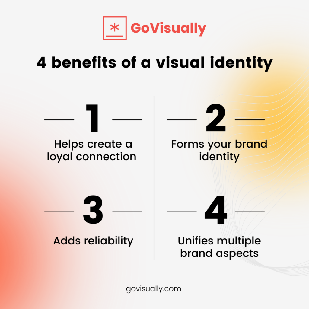
It helps create a loyal connection
84% of customers seem to trust a brand when its core values align with theirs. To build a reliable connection with your customers, you need to create an emotional impression. A solid and well-represented visual identity design makes it possible to develop a relationship with your customer. A bold visual connection helps your customer identify you and familiarize themselves with your service, creating a reliable connection.
Forms your brand identity
If you want your brand to be distinct from your competitors, you need to create a unique visual identity graphic design. Different yet recognizable visuals will set your brand apart and create an identity that will be imprinted on your customer’s mind.
Nestle is one of the great visual identity examples. In a market full of plastic straws, Nestle started the promotion of paper straws to help reduce the global use of plastic. This initiative made them different from the competitors and provided the brand with a visual aesthetic.
Adds reliability
Customers go with the mindset of ‘you buy what you see,’ and creating an appealing brand identity can help you come across as trustworthy to your customer. A visual that is easy to understand can help the customer relate to you, making you reliable.
You need to understand that your logo is the ‘face’ of your brand. And the customer often judges you based on your logo or the color template you follow. Keeping this in mind, you will design a visual identity that speaks for your brand and stimulate a connection between you and your brand.
Unifies multiple brand aspects
It is essential to keep it consistent and use it in any situation representing your brand with visual identity. Maintaining consistent visuals at any brand aspect can help your customers identify you and support a loyal customer experience. The easier it is for your customers to understand you, the more they recommend you to others.
Moreover, as your brand grows and evolves further, having familiar visuals will help you grow. Even if you change the aspects of your brand, having a consistent visual identity will help you set a strong foundation and will prevent confusion among the customers.
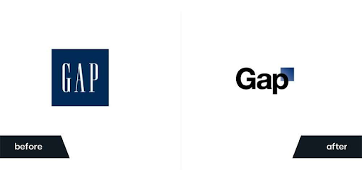
Rebranding Gap is one of the bad visual identity examples when they suddenly changed their logo design and caused confusion among the customers. They eventually had to go back to their original format.
4 primary elements of a brand’s visual identity
Like a house, if made up using brick blocks similarly, the brand’s visual identity is made using small elements like color, words, and graphics that make an identity of your brand. Here we will look at features that form your brand’s visual identity when aligned.
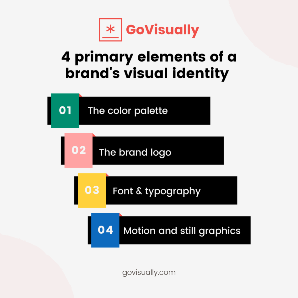
1. The color palette
Through the use of colors, you promote what you are selling. The color palette should be wisely chosen to form strong emotions within the viewers. If you are a luxury brand, you might use black, gold, or purple, which creates a sense of royalty. However, if you are selling healthcare products, you might want to use green or blue, which generates a sense of calmness within the viewer.
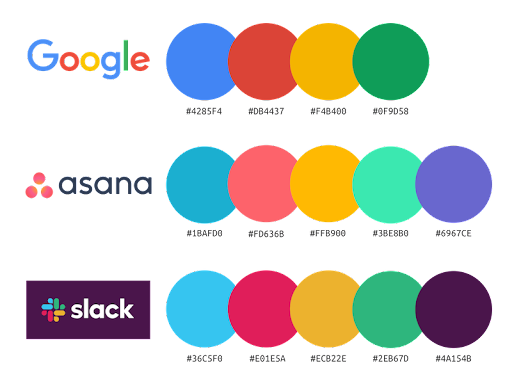
Color plays a significant role in your brand’s visuals, and though the color palette begins with the logo, you should follow it for all the brand material. Your brand needs to have three types of color, primary, which will act as the main color of your brand. Then comes the secondary color, which can be used in backgrounds, and accent color, which will serve as a contrast.
2. The brand logo
Your brand logo design is the face of your brand. It needs to convey the purpose or message of your brand. How you design your logo is essentially essential. The colors and the font you use for your logo create a lasting effect on your customer’s mind. Your brand logo is what helps the customer identify your brand.
3. Font selection and typography
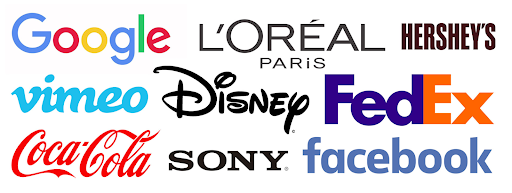
Typography is the type of font you use and the scale size and arrangement of the text for your branding. There are various styles and various fonts available that each has a different effect on the viewer. The typography you use should be legible, and a distance should easily read the size of font you use.
The key is to keep the text simple. The fancier it is, the more confusing it will be for the customer. Even big names like Facebook and Google have kept their text simple to be legible to the customer.
4. Motion and still graphics
The graphics and imagery of the brand are the types of icons you use or the photography and video content you use in your brand visuals. Using images or graphics that represent your brand personality creates a pleasing sensation in the mind of your customers.
Your customers want to relate to your brand, and when they see content that they can connect to will help you develop an emotional sense of connection with your customers. It is essential to identify your brand’s target audience, which can help you design graphics or form videos that your customers can relate to.
5 steps of creating a visual identity of a brand
Following are ways that can help you develop an excellent visual identity.
Step 1: identify your target market and research them
Once you can understand your audience’s context and values, you can easily create visuals with a deep understanding of your target audience. It will help you use appropriate colors, visuals, and text that your audience can appreciate. Without knowing about your target audience, you will not design an identity that your customers can relate to.
To help you with this, you need to develop a buyer’s persona to narrow down your audience using the age, gender, income, and values of the customer you are targeting. It helps you set clear guidelines with who you are talking about.
Step 2: create your mission and vision
The best strategy for creating a strong visual identity is to speak about your brand. When combined with the core valves and the purpose of your brand, your brand identity helps you with the framework of your identity and becomes easier for you to handle.
When you know what your brand is about and what you represent, you automatically develop ideas and solutions for your visual identity. Moreover, it can help you form loyal customers as they will trust your brand more when they can see what they are investing in.
Step 3: organize and align your brand assets
If you want your visual identity to stand out from your competitors, you need to understand every medium of your design. It will help you communicate better with your audience and help you set a clear set of guidelines for your brand.
You need to deeply analyze the assets you are using, whether it speaks about your brand’s values and whether or not it sets you apart from the competition around the market. The way you use the color palette, font, and size for your brand combine to form your visual identity. Anything out of the ordinary or done without meaning can ruin the whole image of your brand.
To keep things right, you need to pay close attention to the behavior and habits of your customers. Remember thinking out of the box after deeply analyzing everything can help you go a long way.
Step 4: finalize a brand book and brand guidelines
Once you have your brand values aligned, it’s time to pen it all down.
We’d strongly recommend creating a brand book and brand guidelines so it’s easier for everyone in your company to follow them.
Step 5: stay consistent in branding
And lastly, understand that consistency is the key. Going through the creative process with a purpose and consistency can help you grow your brand and deliver value to your customer. Visual identity enables you to create a strong sense of connection with your customers, and you do not want to ruin it by going out of the way or making decisions against your brand’s identity.
Consistency is what keeps your customers loyal and comes back to you every time. However, it is essential to understand that consistency does not mean being rigid in what you do. Your brand can evolve and grow with momentum; however, there has to be a strong foundation your brand can expand upon.
Visual identity examples
Here are a few examples that can help you better understand visual identity.
Chobani’s visual identity
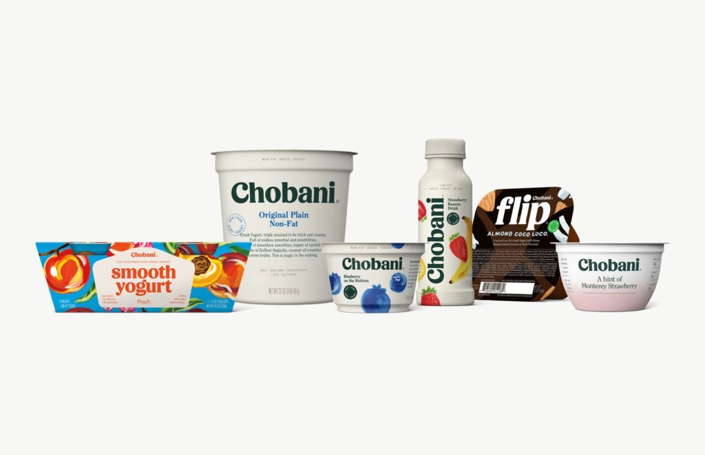
Is it possible to make yogurt advertisements exciting? Chobani says that it is. The minimal, neutral color base elevated the signature green writing, which symbolized the natural, non-GMO ingredients used during the manufacturing. The use of fruits in the background enhances the whole design of the brand.
Headspace’s visual identity
Headspace is a meditation app. Therefore, it uses a cheerful color palette that helps to lighten up one’s mood. The app does not limit itself to the cheerful color palette but is followed by inspirational quotes and character illustrations, reducing strain.
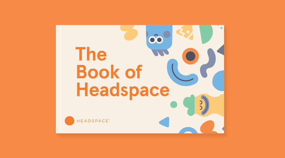
The color palette perfectly completes their mission, i.e., less stress and more joy just by using the sense of vision. This style is a signature used in their app, site, and even Instagram handle.
Airbnb’s visual identity
Illustrations play a vital role in convincing an individual, specifically when it comes to traveling. Airbnb is all about living a healthy and active life.
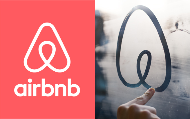
They encourage people to make the most of their routines, which is done via prominent and massive people-based images. A bold pink logo adds the pop everyone needs in their life.
Review your brand’s visual identity assets with GoVisually
By now, you must have understood just how impactful a good visual identity can be for your brand. But to create the one that best represents your brand, you’d need to review it thoroughly.
Often, reviewing and approval processes can turn out to become your personal hell. That’s because there are a lot of stakeholders involved and feedback tends to be misplaced because of a lack of a centralized platform.
This is where you can cut your reviewing time in half with GoVisually.
GoVisually’s the leading online review software to provide feedback on your brand’s visual identity. You can upload all brand assets and invite stakeholders to review them. That’s how easy it is!
Don’t believe me? Book a demo today to find out.
Want to send big files?

Need a quick way to share large files and creative assets?
With GoVisually Share, it’s absolutely free! Try today.
