Being the creative professionals we are today, it’s quite easy to think about user experience design only in digital terms and forget real-world UX.
We design so much of our lives online nowadays that it’s hard not to. The navigation menu goes there, and social media buttons are here.
You get the idea.
However, good user experience design should take place everywhere. Whether it’s a website, app, brochure, product packaging, or even a printed piece of paper, being able to create great experiences wherever they are helps us deliver better products and services across the board.
This is why product designers who go around looking for design resources and ideas that could help them create something in the real world fall short of inspiration or feel lost on where to begin.
So we’re here today with a one-of-its-kind guide that brings you inspiration, ideas, and expert tips behind great real-world UX and its application.
Excited?
Then jump right in!
Table of Contents
What is real-world UX?
Let’s begin with the very beginning. What is real-world UX?
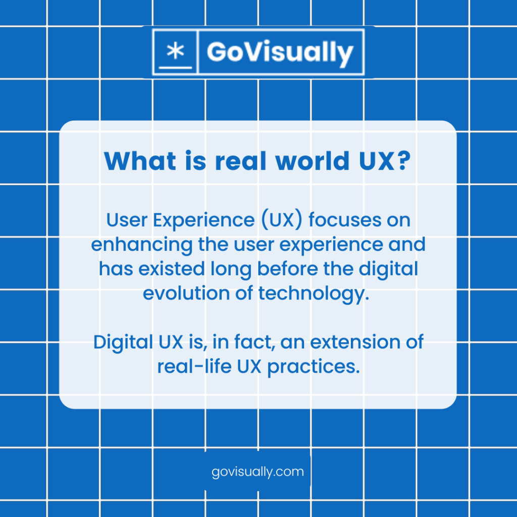
A red light signaling ‘stop’ and turning green for ‘go’ are basic examples of UX in the real world. They work because they are easy to understand and follow. But what about instances where things aren’t quite so obvious?
When we look around the real world, we see user experience in its rawest and most human form. UX was a concept even before the digital evolution of technology. As we look into old product design strategies, we can find a basic creativity strategy to innovate solutions that may not have occurred to us before.
UX design and the real world have been interconnected since the beginning, and digital UX evolved as an extension of real-life UX practices. But since we’re getting farther and farther away from the real-life implications of UX, here’s the most basic design strategy that will take you back to the roots.
Cut design & video review time in half
Try GoVisually free today!
How do you design with real-world UX in mind?
Design for the real world can be compared to a process that creates an experience. From graphic designing to product design, from the user interface (UI) and user experience (UX) design, all types of designs have one goal: to create an experience.
In a process called design thinking, researching and collecting helpful information, designers put themselves in place of users who try out their products. And then, they make choices about how to solve problems. In this process, designers also try to understand what might happen if things go wrong.
It’s the same for digital and non-digital products so let’s briefly walk you through how design thinking for real-world UX apps and products works.
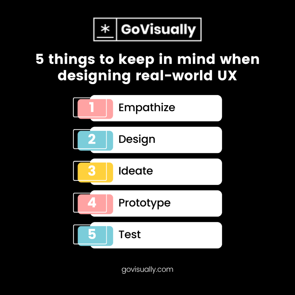
1. Empathize
The first phase allows designers to empathize with the problem through user experience research. The empathize phase includes user research, focus group analysis, personas definition, benchmark analysis, interviews with stakeholders, interviews with users, and user journey mapping.
2. Design
At this stage, designers analyze observations and systems to identify core issues that must be addressed. This is where you create an information map, a wireframe, and design sitemaps or flowcharts to pinpoint your user’s journey from start to finish with the solutions you provide.
3. Ideate
This phase starts when you decide your solution, how you will present it, and what alternatives you will pursue next. You’ll do wireframes and mockups and maybe even a mood board. How you take on the ideation process depends on your product, users, and personal preferences as a designer.
4. Prototype
This stage in the development cycle is all about experimentation and trial and error. It is important to understand how the user perceives the problem you are trying to solve to iterate effectively.
A prototype can help you test your ideas and may reveal valuable insights into how users interact with the system that you haven’t considered during ideation.
5. Test
Once you’ve built something, putting it through its paces is important. In this phase, you’ll get input from users about how they perceive your product. You can also use this feedback to make changes and improvements.
If you are stuck, take a step back and turn to creativity again. As we said, trial and error will polish your real-world UX into a success.
In essence, the same steps apply to any design project. However, what makes UX useful in the real world is that you need to think about physical activity. It’s not a matter of consumers acting behind a screen but interacting with your product in the real world.
So to make it easier for you, we’ve found 9 inspirational ways to use real-world UX and make your product better for the users!
9 ways brands use real-world UX for the better
Let’s review some real-world UX examples that brands have used over the years (for better!).
1. A second to gain attention

This design by Heimat transforms over time to show off the quality of the knives they sell. Initially, passers-by faced a mysterious piece of metal bearing only a brand’s logo.
Within a few weeks, the surrounding was covered with rust, leaving just the shape of a knife untouched. The tagline “Flawless. Forever.” drives home the message and gets instant attention. Who wouldn’t look at a huge knife on a board of rust?
The idea of gaining attention doesn’t only apply to marketing UX but to every real-world UX case ever. Take the use of interactive product design as an example. Anyone would enjoy packaging they can interact with rather than throwing it in the trash right away, like the famous sticky note pad that turns into Hogwarts!
2. Design for functionality
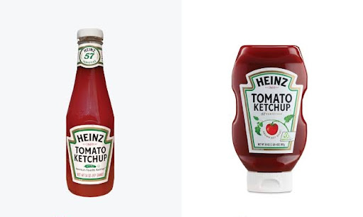
We’ve all seen memes on this multiple times. Although the Heinz bottle design here compares UI-focused vs. UX-focused design, it also reinstates the importance of prioritizing functionality over tradition.
The original glass bottle, intended to be used primarily for the product’s showcasing rather than for the consumer’s use, is a significant challenge in serving a good user experience.
For instance, it is difficult to extract additional ketchup from the bottle without shaking it. In contrast, the squeezable bottle is designed specifically for better use, a single squeeze. So that’s real-world UX law #2, always design for functionality.
3. A push in the right direction
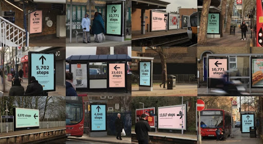
To advertise the green credentials of an IKEA store, the company enlisted the services of Mother, one of the UK’s leading creative agencies. Mother created poster designs all around London directing people to the store, inviting them to make the most environmentally friendly choice possible by taking the most eco-friendly path possible.
Not only did this support their cause, but also positively reinforced people to take part in their initiative. Now, imagine seeing these posters every turn you make. Some people interacted with this design and felt compelled to walk to IKEA.
This is a peak example of UX uses in the real world. User experience design is not simply about designing for experience but also pushing the audience toward gaining that experience. And, of course, it’s great marketing.
4. Be real, sell real

If you intend to mislead the consumers, your audience will be turned off if you fail to deliver what your design promises and lose brand reputation over time. Consumers in the real world ask for transparency. They’ll appreciate your honesty and, on the other side, won’t forget that you made an empty claim.
A great UX design does not overshadow a product’s features but enhances them and lets the product itself do the talk. This part is more crucial in real-world UX when compared to digital products like web or app design.
Even real-world UX apps strive to complement their services by providing a user-friendly experience instead of using design to cover up their product’s shortcomings.
5. Accessibility for all
In technology and product design, inherent biases can be hard to root. Our technology reflects the perspective of those who design it. To address this, organizations work to level the playing field for diverse groups, including people with disabilities and people from marginalized communities.
Obviously, to build more inclusive products, we need to change our design process, and here focusing on UX design and real-world people that need attention is the best route to take.
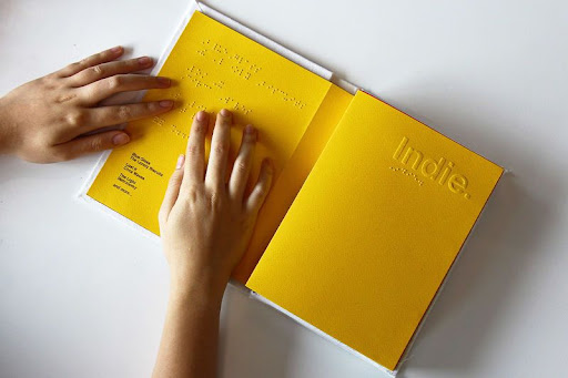
The conceptual ‘Note’-like smart speakers that use Braille, designed by Stephen Ow and Kah Kiat, are examples of what can be done if accessibility functions were embedded into everyday products to help them reach all users instead of one particular segment of society.
6. There’s more to colors
Color is a powerful signaling source. Warm colors suggest action, and cool colors imply calmness. In general, warm colors make people feel a range of emotions, from alertness to comfort, while cool colors encourage calmness and trust. Green is also a popular color because it is perceived for growth.

Every brand uses color psychology to gain a specific response from their users during UX. It applies to digital UX as well as real-world UX. Take this Mcdonald’s sign as an example. Red and yellow are indeed the brand colors for many brands, and they usually serve as a base for their UI and UX because red gets an instant response to alert people.
Using the right colors is crucial for UX design because it plays a significant role in UX, whether behind a screen or in person.
7. Keeping it simple – don’t innovate for the sake of innovation
That’s it. Someone had to say it.
In today’s competitive market, many designers need to focus more on being creative and different than being helpful to their users. This is where UX design and the real-world fall apart.
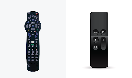
A few years back, almost every TV remote was filled with complex buttons. However, people used only a small percentage of these buttons, leaving the rest unused. It was especially difficult for kids and the elderly to use them easily.
The real helpful innovation was the recent Apple TV remote controls. An elegant device moved most features on-screen, instead having a separate button for every function. The Apple TV Remote was designed for a simple concept, making things easier.
It represents not a technical improvement but rather a reconsideration of the user’s experience.
8. Understand user psychology
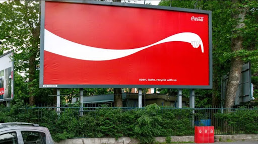
Sometimes, people fail to take a cue, literally. There are inside jokes between product designers about how people feel lost using their greatest inventions precisely because they use them incorrectly or don’t get the message.
That somehow still works in the digital world, but imagine people missing the whole point of your product in the real world. That would be one big fail. Understanding user psychology means using design cues to encourage the right action.
We, as designers, should use soft psychological nudging to guide our users to a positive outcome. Still, it is important to understand that it is designed when needed and not when it is assumed beneficial.
9. Look at the real world for real inspiration to kick in!
When designers empathize with consumers, any negative user experience will greatly diminish, and our world will become a much better place. This is why the first step to making real-world UX work is looking at the real world!
As a designer, sticking to your principles and taking the time to understand how your product design should enhance the real-life experience is the way to go.
As for inspiration, everything around you, from that coffee mug to the keyboard, is part of some great UX design strategy that made life easier for everyone. There’s more waiting for you outside this article!
Create the best versions of your UX designs with GoVisually
Is the toughest part of creating real-world UX coming up with ideas?
To some extent, yes. But we’d say the toughest part is collaborating with your team for implementation and getting feedback and approvals from the stakeholders to make the final call.
GoVisually is an online proofing, project management, and collaboration software that helps designers streamline their projects and workflow on a single platform.
Designed specifically for creative professionals, the platform offers a range of features to assist you at every step of your design journey, from visual annotations, diverse file support, all types of online proofing tools, and one-click approval workflow to version control and comparison.
Many advanced tools are waiting for you!
Not sure how it will work for you? Book a free demo with an expert and unleash the GoVisually power with great UX to help you design even better.
Want to send big files?
Need a quick way to share large files and creative assets?
With GoVisually Share, it’s absolutely free! Try today.
