32+ Drool Worthy Restaurant Websites for Inspiration in 2021
The year 2020 has been a gamechanger for pretty much everything and everyone. And in 2021, we enter with some of the biggest lessons to improve our business and how we perceive consumer behavior. This also translates to one of the leading global industries of food and restaurants. From improving restaurant websites to making them more user-friendly, the trends are changing.
Wondering why?
There's a simple reason behind it - the world has finally come to realize (perhaps for the better) that operating remotely is possible! This doesn't, however, mean an end to the restaurant industry. It only means that restaurants now need to change their marketing strategy and invest more in their digital presence that begins with restaurant websites for their business.
Fortunately, several great restaurant websites out there will give you the right kick to create your own. More importantly, do it the right way!
So in this article, we will be discussing 32+ restaurant websites and their amazing design sense that you can seek inspiration from. We'll review these sites, use visuals and typography to analyze why they are best in grabbing users' attention.
Now before we proceed, we'd like to give a special and much-needed shoutout to Wix and Squarespace. Many of these websites are made on these platforms and the ease and variety of templates are outstanding. The layouts are easy to follow which enhances user interaction. And as is visible, there are so many relevant and interesting layouts to choose from.
Let's see what's cooking! (pun intended)
1. Highlands Bar and Grill
Highlands Bar and Grill is a restaurant based in Alabama. The website takes a minimalist and modern approach, creating a unique user experience for the visitors.
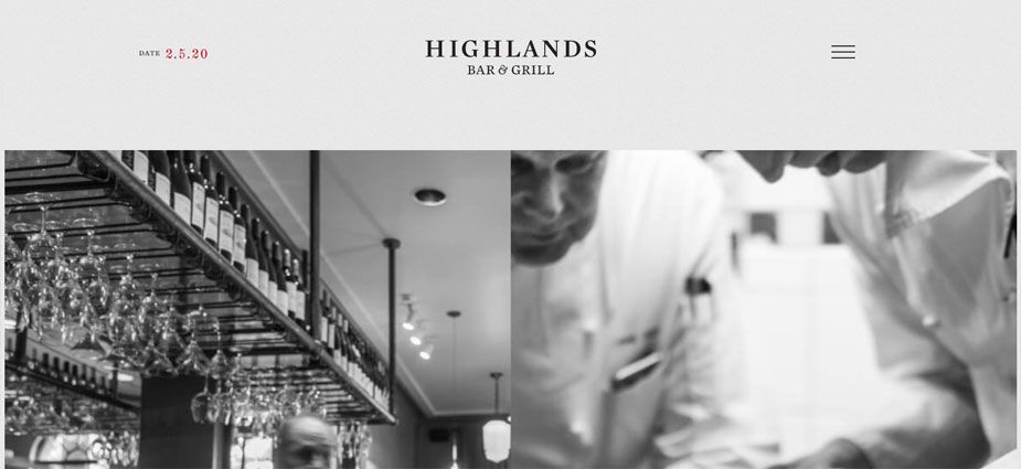
The header perfectly encapsulates the essence of the restaurant with just 2 images of chefs working on food. These images alone set the website's mood and begin your visual journey; as you scroll down, the website's aesthetic changes alongside. The website is great at proving that restaurants can capture your attention using a simple black and white theme.
The font family that is used for the website is Museo Slab. In my opinion, it enhances the sophisticated and minimalist appeal of the site and makes it appear more classy!
So if you're going for a classy and minimalist look, check out Highlands Bar & Grill!
2. Jack Sprat
Jack Sprat is a vegan restaurant operating throughout Alaska. It is becoming quite increasingly popular with vegetarian lovers and even those who like trying out different cuisines!
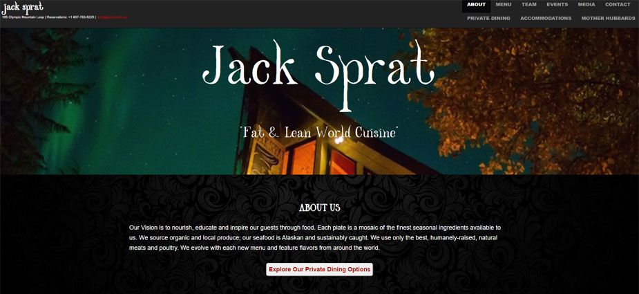
The website has a Halloween-y feel to it. It strikes as a design from a Halloween lover from font to the color selection (black and orange mostly). Or one reason could primarily be that the restaurant has leveraged the Northern Hemisphere setting in its visuals and design sense. Either way, the website looks super cool and is easy to interact with.
The header has an image of the restaurant against the Northern Lights backdrop that looks stellar! It moves across as you scroll down, creating a good illusion. Apart from that, you can easily access the menu and all the other core elements from the website's top.
The font used is Open Sans that is rendered with Helvetica at some points. But if you ask me, it really adds to the thematic concept of highlighting the Northern setting.
3. Ella's Table
If you're ever planning to go to Arkansas, a great restaurant will be waiting for you there! How do we know that? Well, would you look at the website? I'm sure the restaurant would be just as good as the delicious video on the site's header.
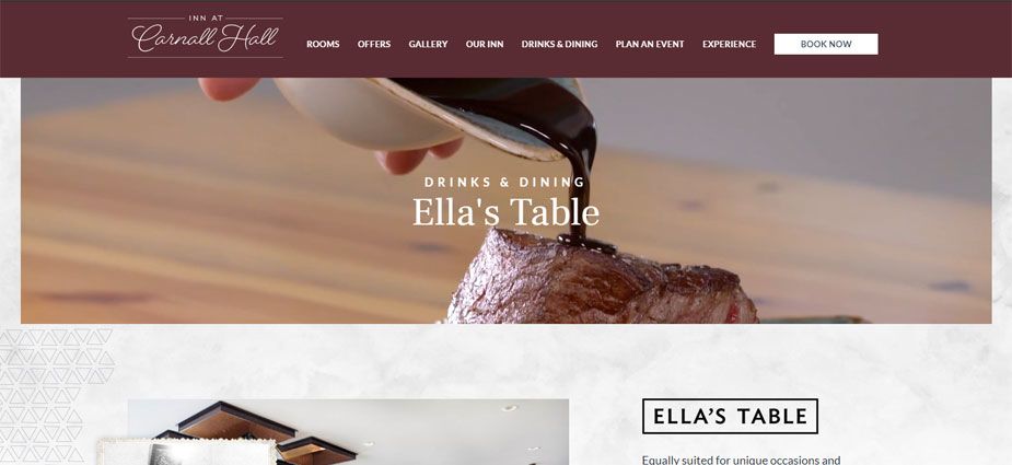
The restaurant relies heavily upon visuals and great photographs, and rightly so! A restaurant's strongest suit is the food it serves, of course, and Ella's Table ensures that they lure you in with magnificent photography and presentation. As a viewer, you'll be impressed with the high0-definition images all over the home page.
The website also has a pop-up offering you a discount on your next meal. At the footer, you'll also notice reviews from TripAdvisor to boost their credibility. Together, these little but effective strategies prove great to attract customers' attention.
It appears that they've used a custom font, Frank Ruhl Libre, but it goes well with the website's light tone theme.
4. Nobu Restaurants
Nobu is a world-famous restaurant with successful chains and restaurants all around the world! But the website that we'll be looking at is of their Malibu branch.
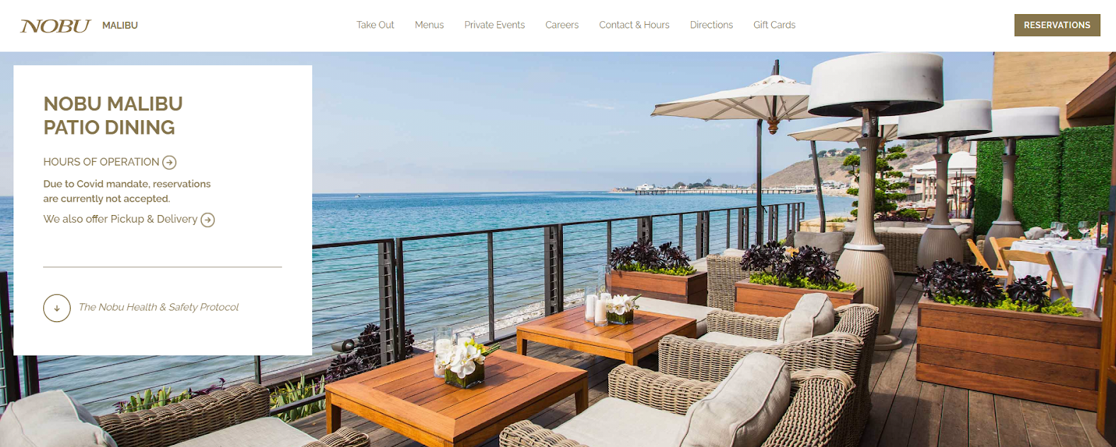
The website is quite minimal and adapted to well, modern times, to say the least. The header has a serene image of beach coastline and restaurant sitting that captures the dining experience at Nobu in just an image.
This might surprise many restaurant owners - using the venue and not food as leverage. However, I'd like to weigh in and say that ambiance and experience are just as crucial to eating as the food itself, and that is what this website preserves - the complete experience of dining out.
The font family that is used is Raleway that goes well with the minimalist conception of the website. Overall, it's a good inspiration for restaurant owners who plan on opening multiple chains and sites.
5. City O City Denver
City O’ City restaurant is a vegetarian restaurant based in Colorado. The coolest part? They have a merch of their own, and they're not afraid of flaunting it on their website! Now that's great marketing - putting down two birds with a single stone.
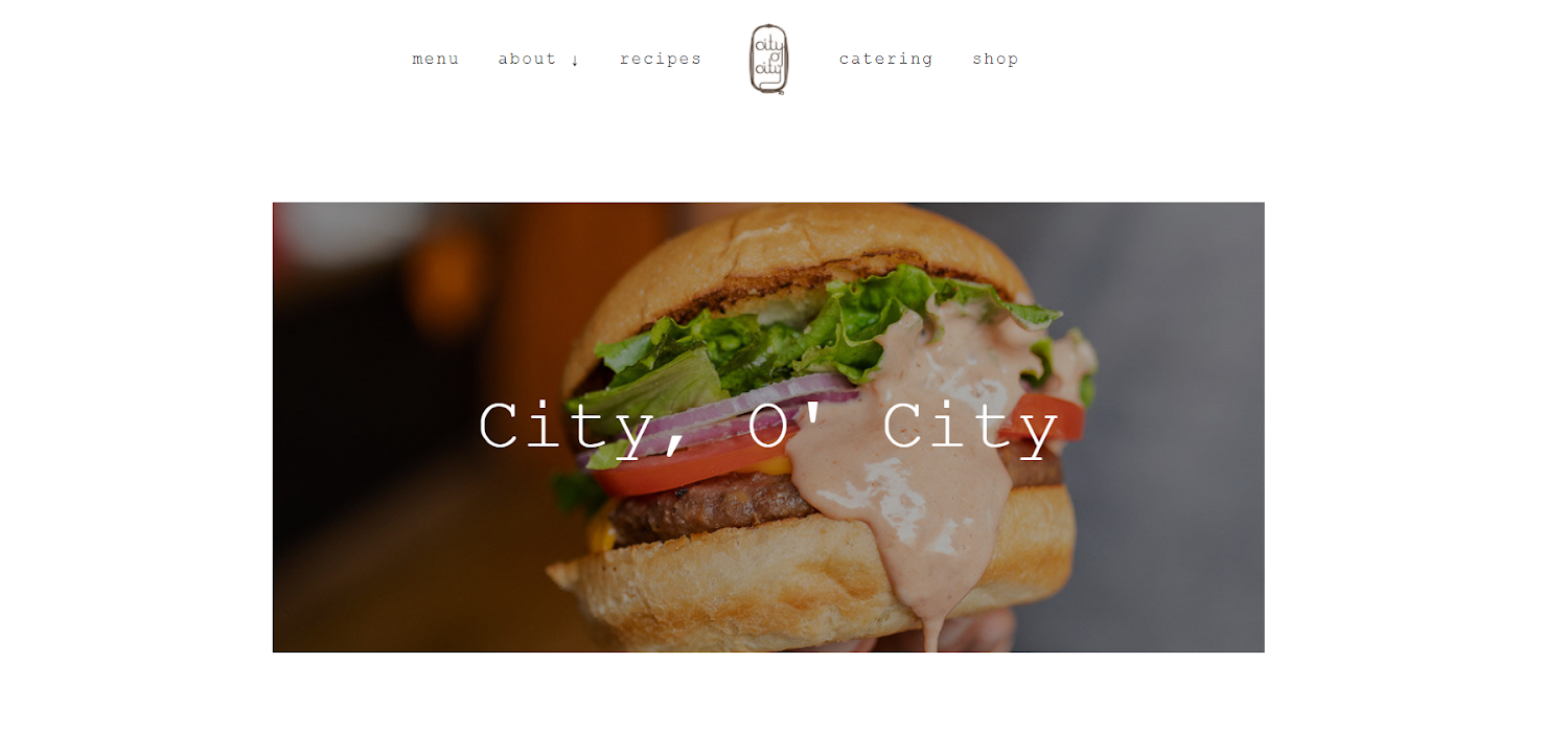
The website's design is quite basic, to say the least - great images over a white background. However, it's in line with the modern theme that elevates your web design. The font family used is Courier New. Again, a basic font but equally effective in keeping the minimalist look alive and breathing.
- Some of the features that I personally loved on the website are:
- Embedded map and visiting hours for new visitors.
- Discounts and deals targeted at different groups for the increased influx of visitors.
- Merch inclusion.
- Catchy call to action and the overall simple functionality of the website.
If you're planning on launching your restaurant website soon, choose to go for something like this.
6. Oriole
Oriole is quite a famous fine dining restaurant adding life to the modern Chicago city. If I could encapsulate the essence of the website in one word, it would be refined! The entire look is quite exquisitely crafted with a special focus on high definition images and great typography!
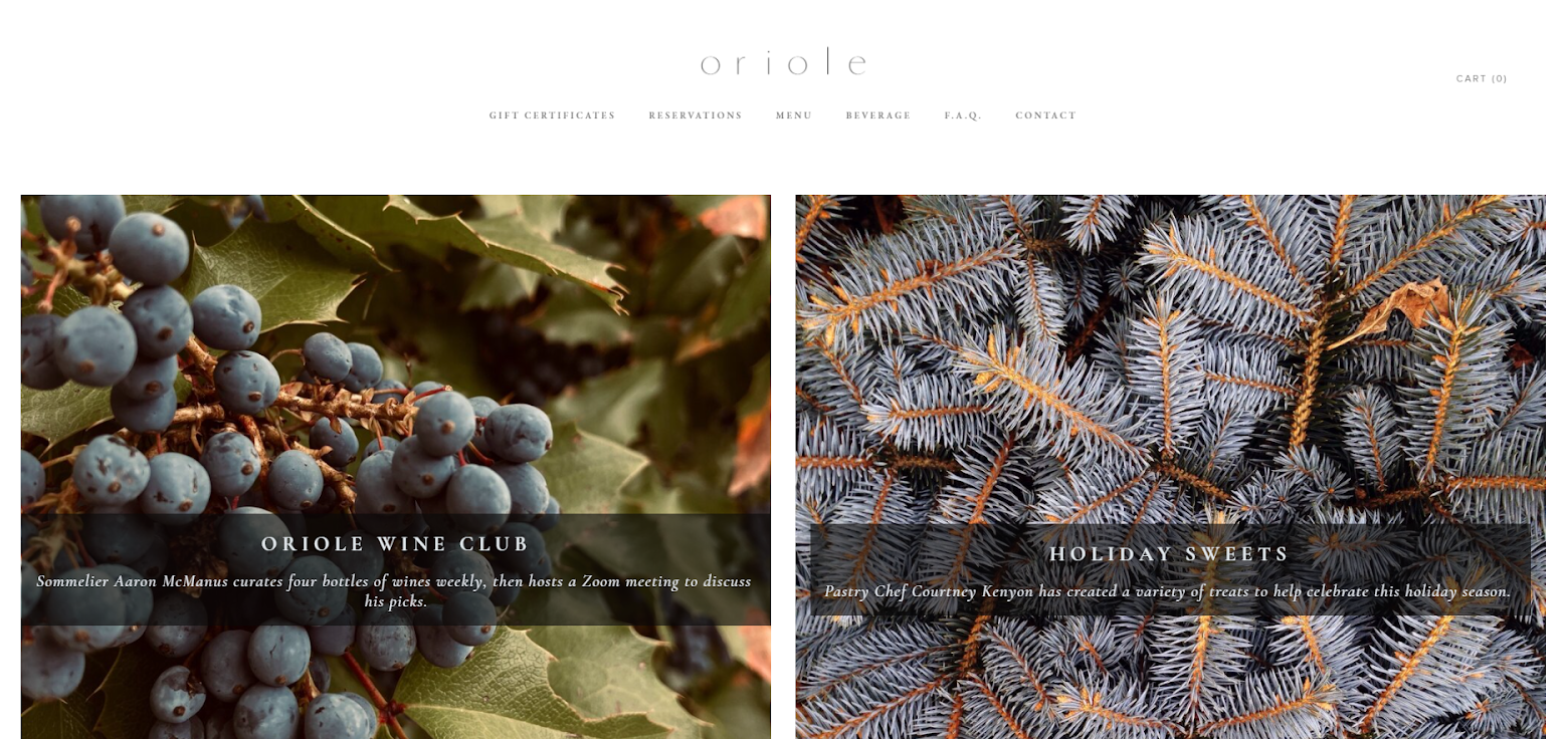
The website is quite simplistic, with big text blocks and a backdrop image for each. In my opinion, the interface is easy-to-use for the users. Moreover, the font family, Garamond, is also in line with the modern image of the website.
It's a great template to use if you're going for a simple yet professional look.
7. Trumpet Blossom Cafe
Trumpet Blossom Cafe's website is the perfect illustration of how to craft your site around images and great visuals! The restaurant is based in Iowa City and offers a great variety of delicious food to the customers. Or at least, so it appears from the drool-worthy content on the website!
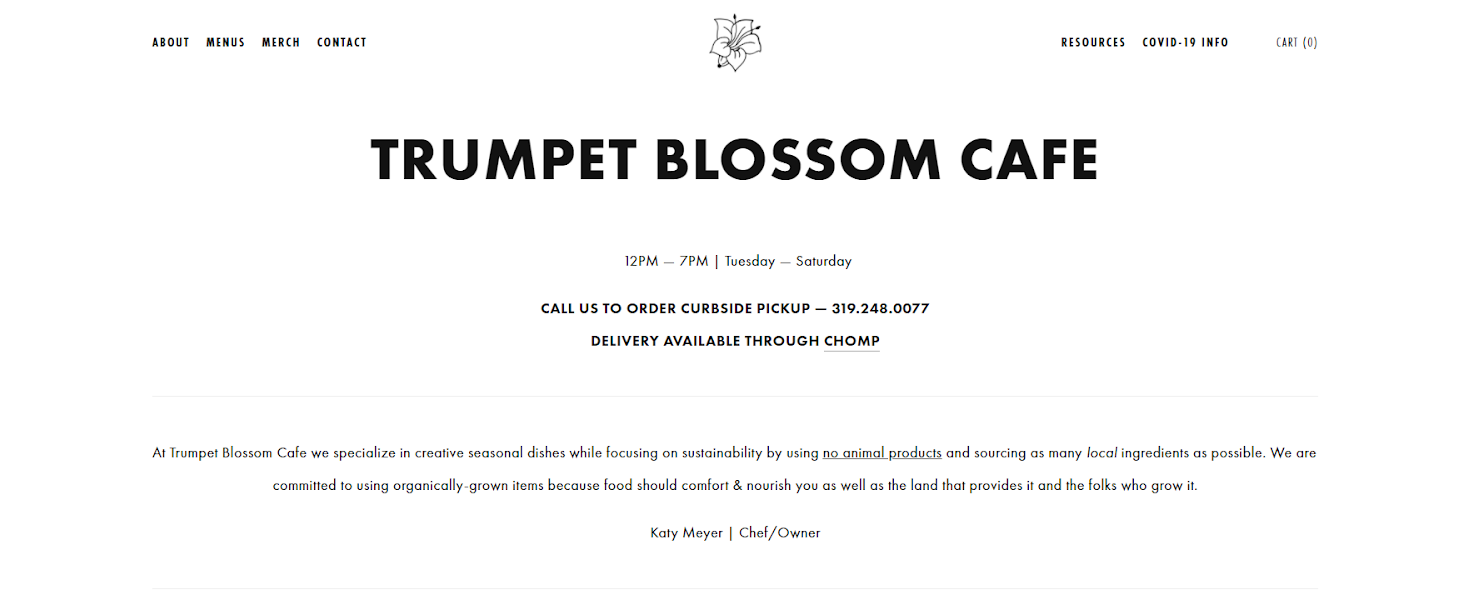
The website is powered by Squarespace, an online platform to create restaurant websites or buy templates. And might I add, the simple design layout actually helps with the user journey. The font used is one of my favorites, Futura. The website also has an option for merch on the main header.
And the element I liked the most on this site is that it mentions the chef. This is important because, for many, it adds credibility to the restaurant itself. Apart from that, when you arrive on the landing page, you get all the information you'd need to know:
- The Chef
- Opening Timings
- Delivery Options
Everything seems sorted - just as it should be!
8. Seviche Restaurant
Seviche is a high-end restaurant based in Louisville. From great visual representation to all the information one would need, this restaurant website is an absolute winner!
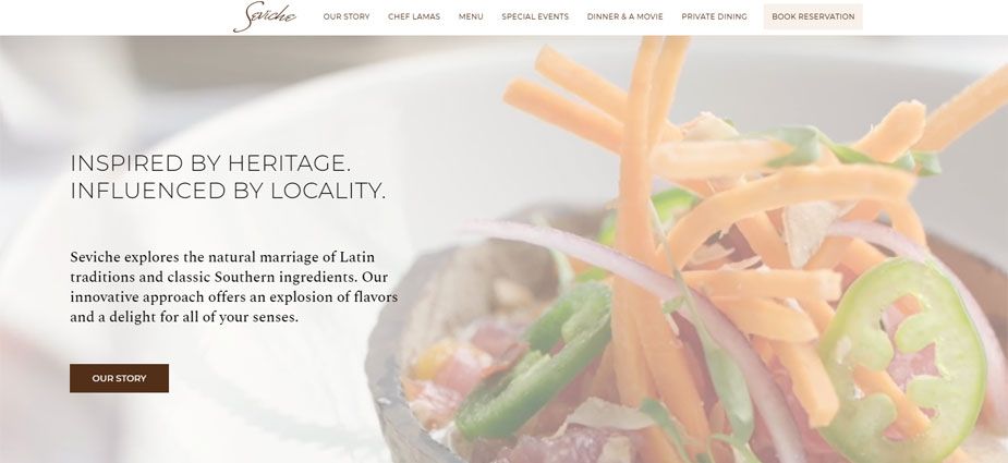
The header on the homepage is a slow-moving video of the food the restaurant serves. That alone is enough to entice any customer to eat food from here. Just look at the visuals! The font that is used is Montserrat, a great choice to add a touch of grace.
Next, there's a small but important section on the chef. Again, a great feature to add credibility to your website. But the element that has won my attention is a section for the awards the restaurant has won over the years. That is a great marketing technique to boost a restaurant's credibility.
After that, there's a section on the activities the restaurant offers. (Hint: movies to enjoy along with the food. How cool is that?)
And lastly, there's a section for the current deals being offered to make your eating choices easier. All in all, this is one of the best restaurant websites and a total winner for me.
9. Buena Vida Restaurant
Buena Vida is another classic example of a great restaurant website inspiration. The restaurant is based in Maryland. Their selling point is their emphasis on bringing fresh and healthy food to your table, and they've left no stones unturned in ensuring that they show their commitment to you through their website.
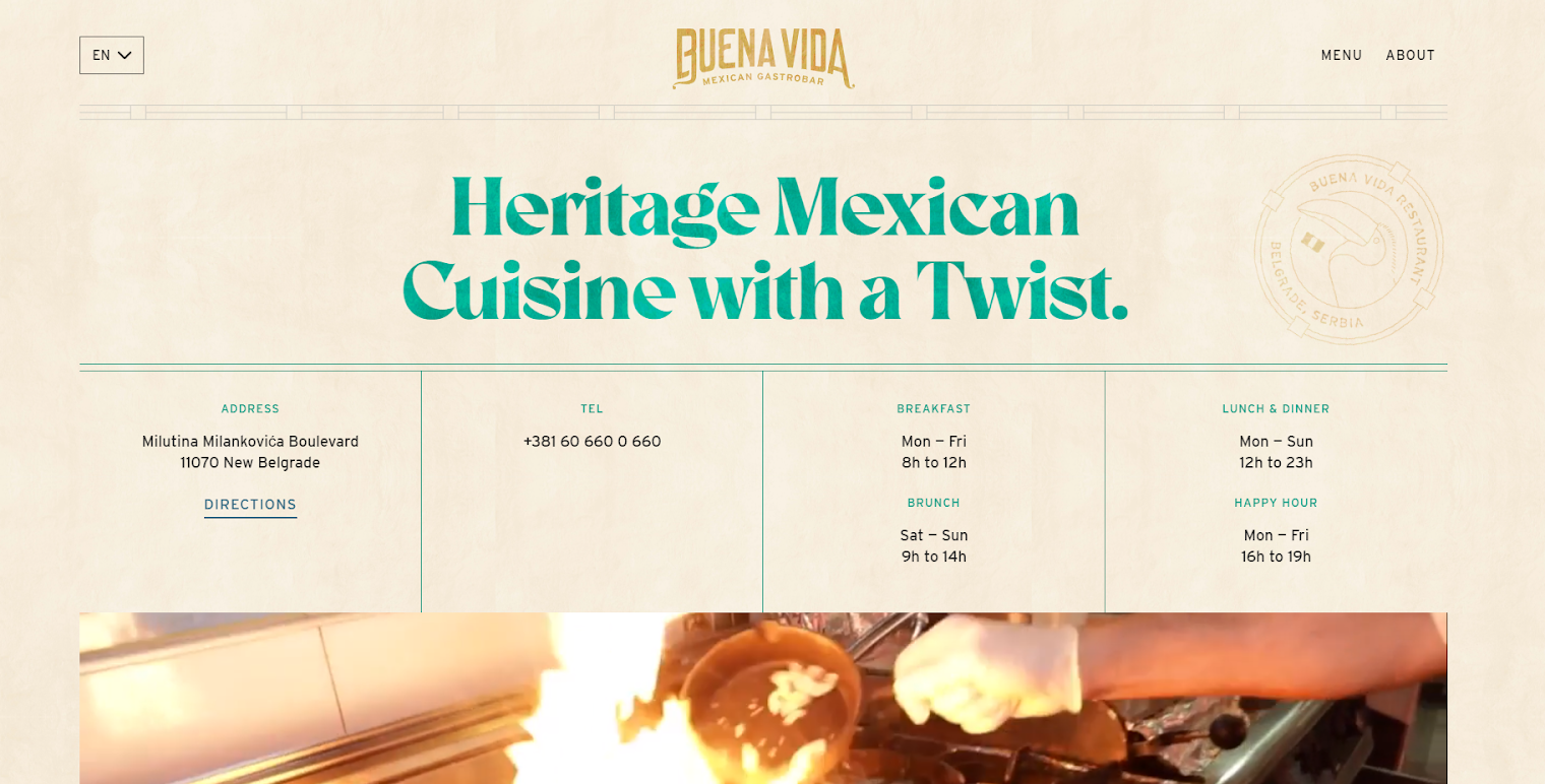
The header has all the information needed for a first-time visitor. Then, there's a wonderful video of the food being prepared in the kitchen. This is a great tip for new restaurant owners. Showing behind the scenes to your food process adds credibility and is a great visual experience for your customers.
Then there's a section on the offers and happy hours in the restaurant, and my favorite part? The great mix of image palette - a literal palette of food being served and the eating experience. Even the font family used, Interstate adds more class to the website.
Overall, it's a strong 10/10 for how a restaurant website should be.
10. O Ya Restaurant
O Ya is a Japanese restaurant based in Boston. And might I add, a great one from the looks of it!
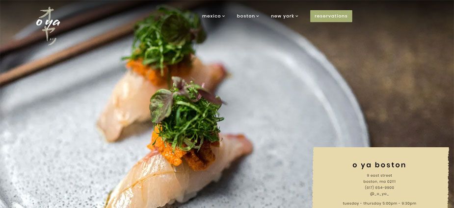
The website is built by Bentobox, a website design form for great restaurant websites. The template that they've used for this restaurant is simple and effective.
The homepage only features a header with restaurant information and visuals enticing enough to bring you to the restaurant. The next section has food reviews from leading food review platforms in the States. – a high-end restaurant website design firm. The homepage features sleek pictures that fade into a dark background. The restaurant also uses the homepage to display reviews from prominent food review platforms. Even the font that is used is basic but useful to read - Poppins.
Overall, it's a good showcase of how to create simple but great restaurant websites.
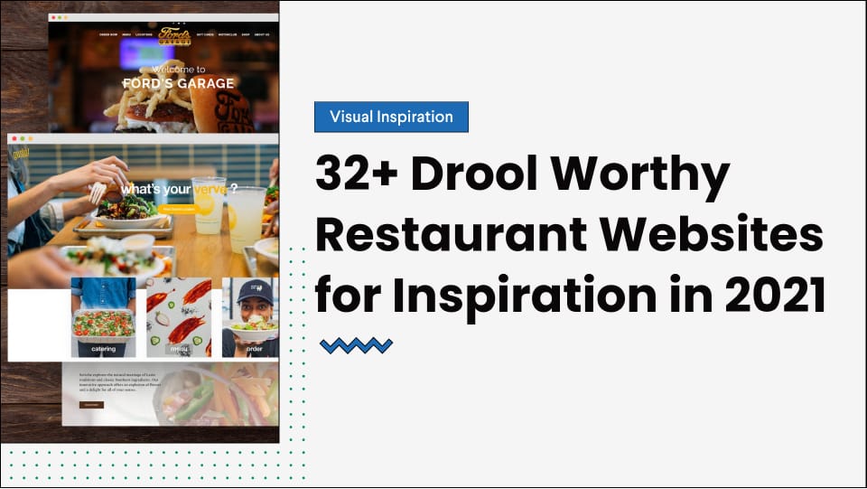
11. Ford’s Garage
Ford’s Garage is an officially licensed restaurant of Ford, the car company. It's a restaurant based in Michigan and focuses on the place's automating history. Hence, the name and the affiliation with Ford.
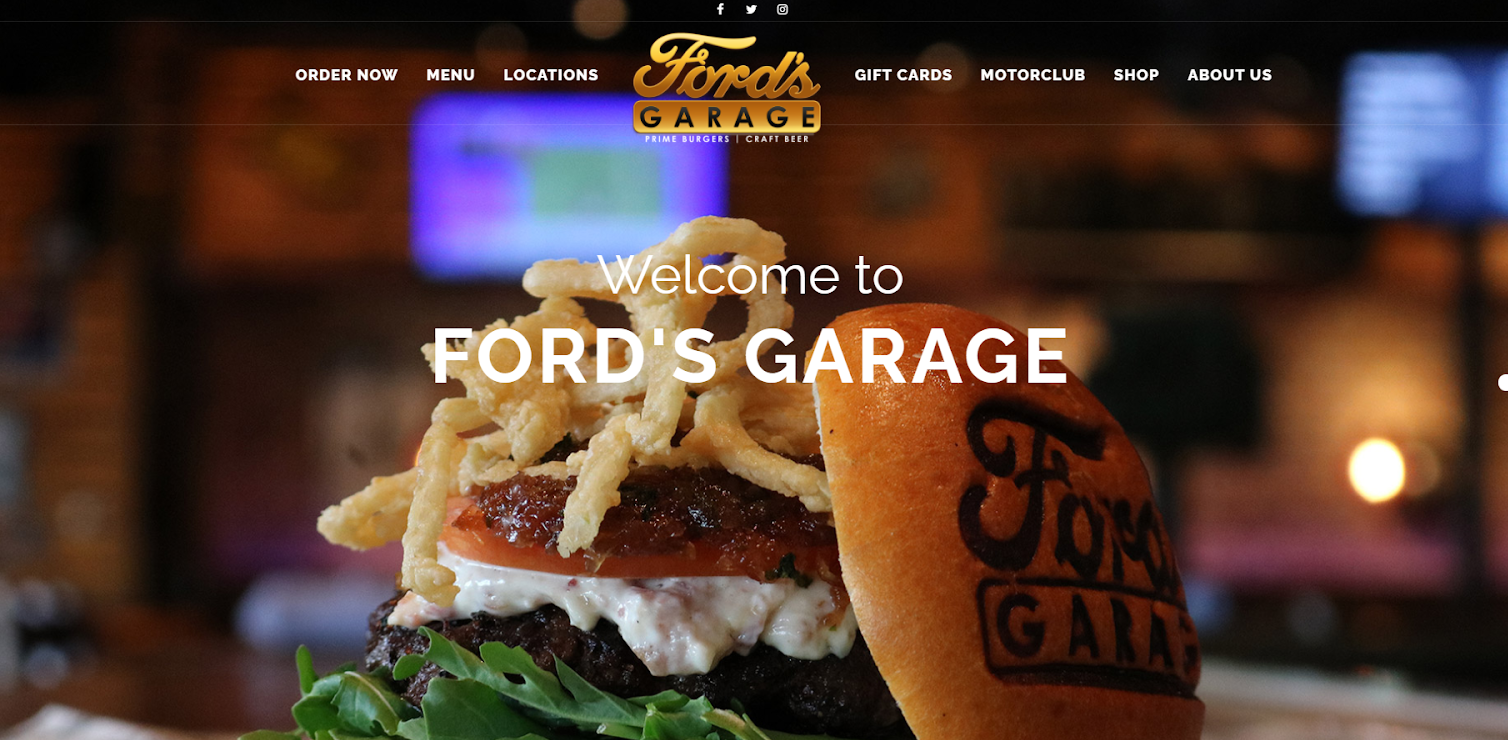
The font used on the website is Raleway that blends in well with the theme. The header image greets the visitor with a mouthwatering burger - I mean, would you look at it?
And for the rest of the landing page - the layout is pretty user-friendly and packed with the right ingredients of information.
12. Spoon and Stable
Our next pick is one of the classiest establishments of Minneapolis, Spoon, and Stable. And the website is just as sleek and modern as the vibe of the restaurant.
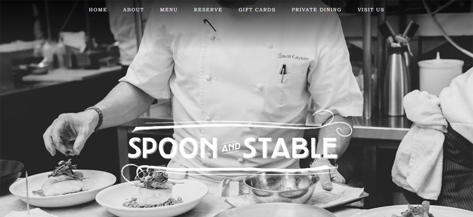
The landing page only has a header with rolling images of delicious food and the restaurant itself. It's a nice mix of food and the scene behind creating it. You can see the other information on the top menu bar and the social links, as well as the address at the bottom.
The font used is Bookman Old Style Std Bold, just like the vibe of the website. It's simple, direct, and perfect for anyone who doesn't like being smothered with too much on the landing page.
13. McEwen’s Oxford
McEwen’s Oxford adds scene to the food town of Mississippi. It's one of the perfect depiction of a Southern restaurant in a famous university town. The website ensures that it has the same vibe as well, and I love it!
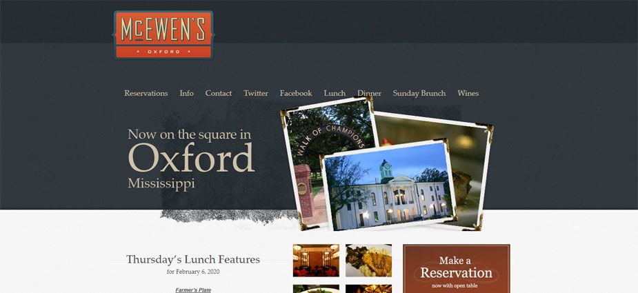
Again, the website is quite simple - with just one header section. That alone is enough to dispart all the information required for a visitor. The font used is Garamond - an excellent choice for a clean website.
What I love the most about the website is the smart integration of postcards with a modern design. You can find all the necessary tabs on the top bar.
14. Flat Creek
If you want a simple yet beautiful website for your restaurant enterprise, Flat Creek would be a great website to look at!
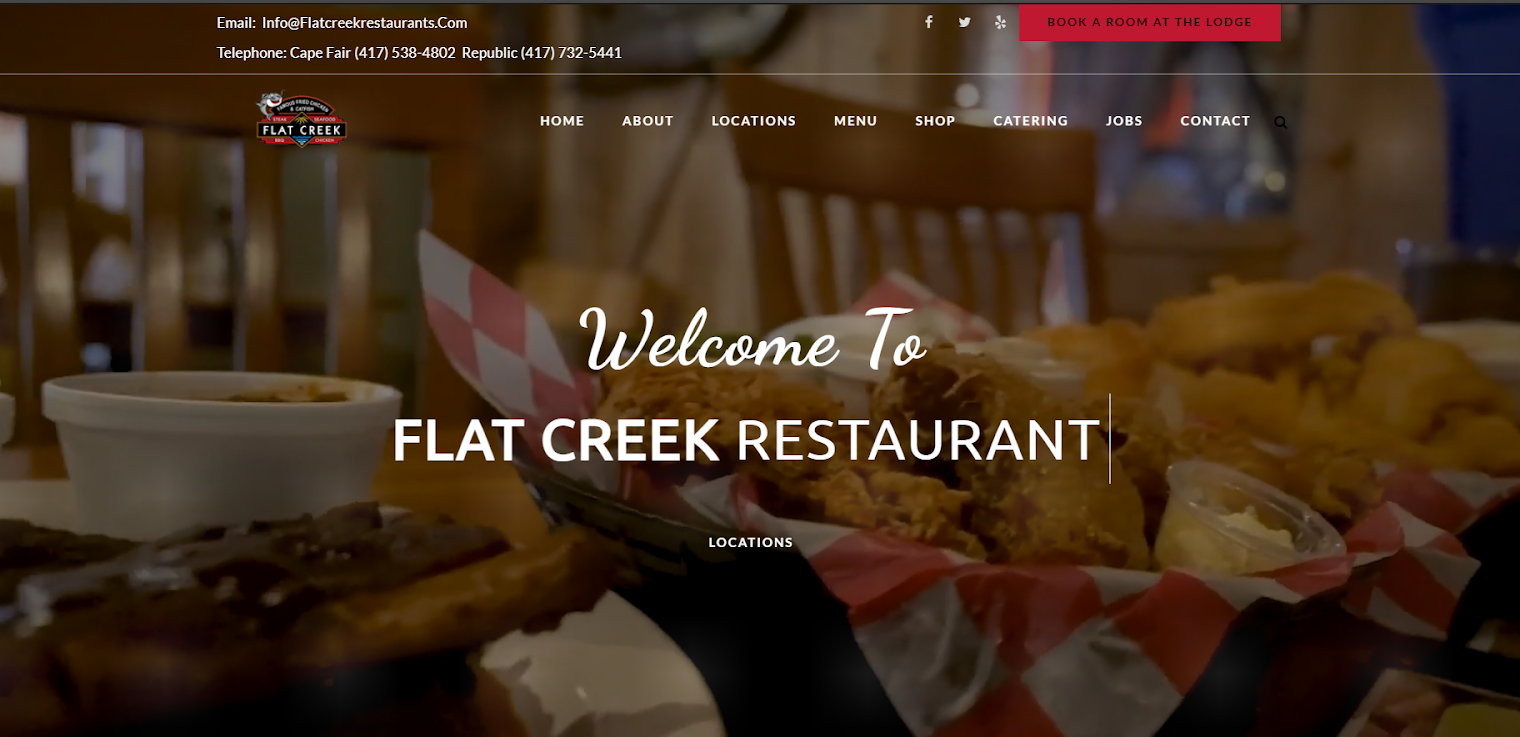
The header has an overlay with changing text on it. In my opinion, this is a great way of highlighting the service areas. In this case, they're lodging, catering, and restaurant. There are several fonts used throughout the website, including Lato and Dancing Script. While that might be a good decision to reflect diversity, there should be a standard font to strengthen brand affiliation.
Still, the website is a great one in terms of other aspects. All the sections have the information needed, and there's a section for a shop as well where you can directly place your orders.
15. The Keeping Room
The Keeping Room’s website is yet another example of how to catch attention with an overlay header.
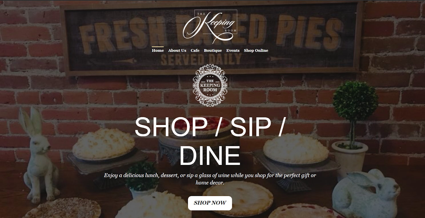
The header also has a Shop Now icon, which serves as a direct CTA for first-time visitors or even regular customers. That's great placement right there as it pushes you to purchase without wasting any scrolling. Other than that, the choice of Abraham and Lora as the website's font is also great. It blends well with the dark theme in contrast to the light.
As you scroll down, you'll also see sections on reservations and events happening at the restaurant. Again, that's a great use of a landing page to elaborate on important things, and it's highly recommended, especially if you host regular events.
16. Carson Kitchen
Carson Kitchen is a restaurant chain that has establishments all over. It's a great website to showcase for business owners planning on opening multiple branches in different cities.
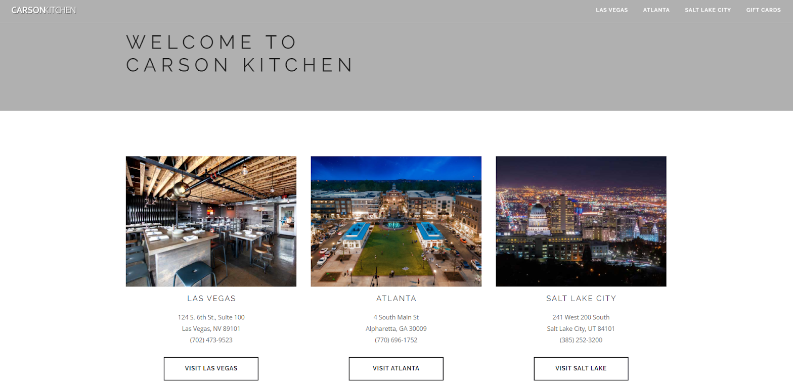
The header has small icons for the location-specific websites. It's a great way of redirecting your customer to the place closest to them or the one they intend to visit. As you scroll down, you'll find a rather simple yet beautiful collage of food and restaurant interior. The font selection of Open Sans is also great.
17. Carlo’s Bakeshop
Carlo’s Bakery's website is a great example of a baked good centric website. Hint: Focus on great food photography, and you'll be good to go!
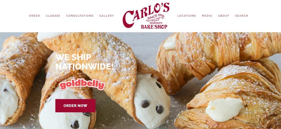
The landing page has enticing and absolutely mouth-watering images of cakes and baked goods. You can also find other necessary information such as the founder's bio, shipping places, and opening hours as you scroll down.
I suggest looking in the Gallery from the top bar to be inspired by some mindblowing food photography. You can even book classes or get consultations from the tab above the header. And finally, choosing Raleway as a font makes the website pop out even more.
18. Quay
Ever seen a website so beautiful that you could look at it for hours and wonder at the amazement? No? Well, check out Quay's website and see if it changes your mind. (It sure changed mine).
The restaurant is one of Australia's most celebrated and high-end places to dine in and for the right reasons!
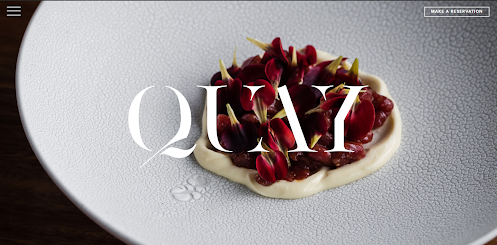
Let's start with the photography and concept - immaculate, in a word. With so many restaurants focusing on less is more ideology, Quay stands out to show how to do just that.
The website is divided into block sections for easy navigation and the font used, Oakes Grotesk Bold, is a perfect choice. It enhances the eliteness of the site. There's also an awards section towards the end of the website. Again, a great way of establishing credibility and an effective marketing hook to invite customers.
19. Gazebo
At #19, we have the amazing Gazebo's website. It's one of UAE's most celebrated restaurants for its Indian cuisine and authentic taste. Gazebo certainly stands out as one of the best restaurant websites in a proud land of diversity and great food.
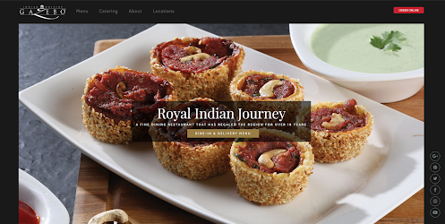
They've done almost everything right.
- Catching food photography
- Simple layout with a header image and the rest following in as tabbed options.
- Direct CTA for delivery and dine-in options.
They've used Playfair Display and Cabin - both great choices, but using the same font would've helped strengthen the brand presence more. Overall, a strong 9/10 and great inspiration for restaurant owners planning on creating their website.
We're almost halfway into our list of amazing restaurant websites.
And with that, there's a pressing matter that we must look into. Most restaurant owners don't just need a website - they need a website that will stand out among crowding competition.
Till now, we've witnessed and discussed several ways of ensuring that. These include establishing a brand presence, focusing on food photography, and ensuring that the layout is simple and interactive. However, making sure that all the designs go through as planned can be a real bummer.
Often, you can find yourself stuck in a limbo of revisions. Sometimes, it's between the design team and the content team trying to debate the best layout. And often, it's getting the editing done right with the photographer. In any case, you can easily find yourself scrolling through a chaotic email thread.
To ease your operations and get designs and assets approved quickly, I strongly recommend using GoVisually, the #1 proofing platform for the restaurant industry.
20. Vollerei
If perfection in restaurant websites had a name, it would be Vollerei. The design is awe-inspiring and represents a corporate restaurant business with utmost creative dedication and beauty.
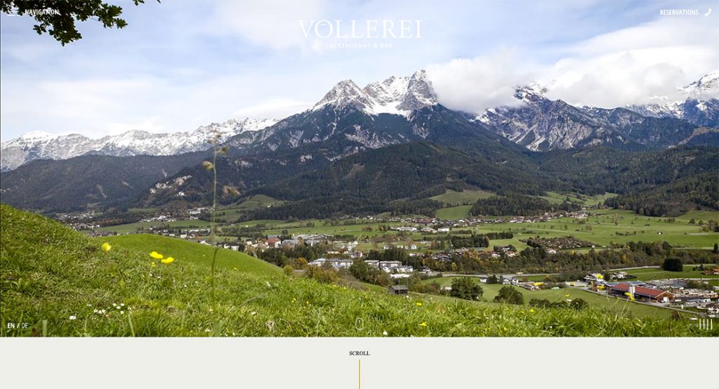
The website has a wonderous and serene video on the header. From the natural selection of ingredients to cooking and presentation, you can see it all panning out in the video.
But my favorite part has to be the raw feel to the website that is enhanced by visuals and animations. Without a doubt, it's a 10/10 on excellent exhibition and craftsmanship in design. They've even used one of my favorite fonts for typography - Georgia.
Anyone who wants to out great video and animation content should check out this website.
21. NOMAD Restaurant
Next up, we have another masterpiece from the land down under, Australia! Nomad Restaurant is a great showcase for new restaurant owners. It's everything you should do on your website to make it appealing and informative.
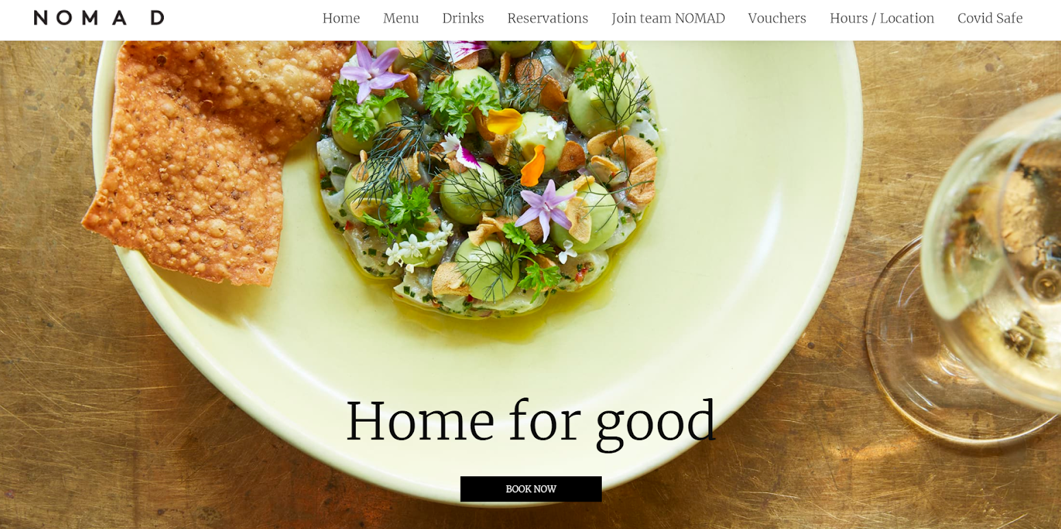
The font used is Lato, which is stunning for the design. The website itself has great photography - almost too real and beautiful!
There are well-crafted menu sections, a section on the reservation with calendar - great use of embedded feature there, and a gift voucher section.
As you scroll down, you'll witness some great food photography - so amazing that you'd want to book a table for yourself, as should be the case with any good restaurant website.
22. Ammolite
Ammolite is a great depiction of the website for new restaurant owners. It is located in Michelin inside a lighthouse.
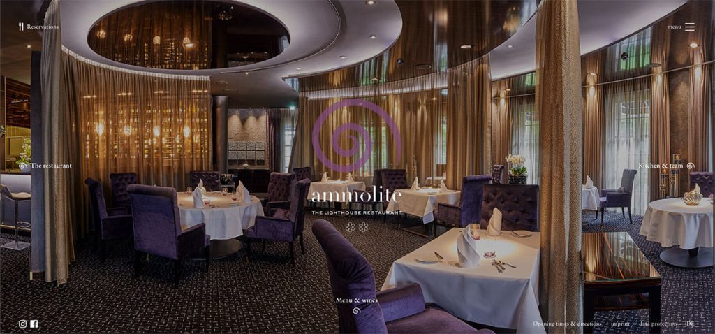
The website is simple and makes use of a header section only. This trend is quite impressive and effective to demand action. And the homepage itself is packed appropriately with the information needed. The font is simply too, just like the layout - Times New Roman.
My favorite part, however, is the subtle yet creatively fantastic slow-motion movement of the header images.
23. il Buco
il Buco is an Italian restaurant and just as magnificent as its name. The website is bound to inspire some of the finest restaurateurs and web designers with its sleek design.
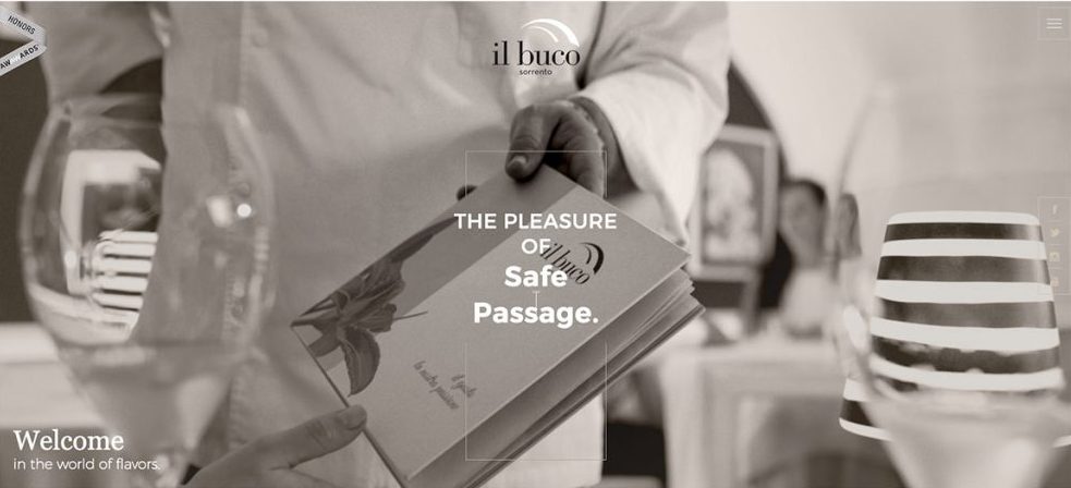
The elements are fully responsive, and the layout takes you on a visual journey of the restaurant, the team, and the cuisine. There's a touch of retro elements added throughout the website that makes it stand out. It's paired with the fonts Lato, Dancing Script, and Montserrat.
24. Haberbueni
Haberbueni is a German restaurant and, might I add, quite a charismatic one. The rawness and culinary delight in the header image speak for the restaurant's merit and the website.
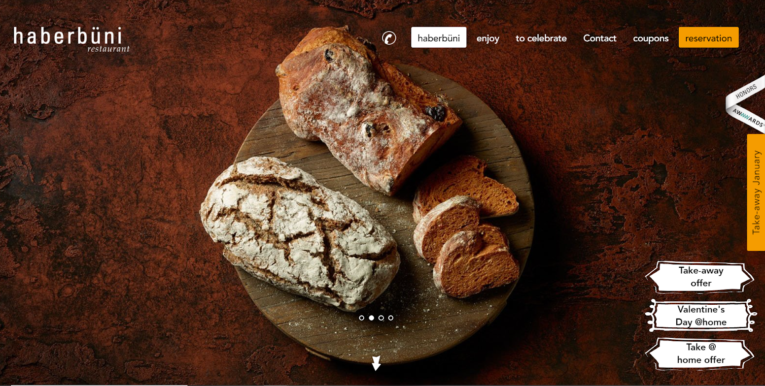
The choice of font, Avenir, is also unique as the design. What I like the most about the landing page is the direct CTAs on the header. As you scroll down, you see the delicious gallery of food, meet the team, and reach the footer with all the information you need.
There's also an email collection section at the end - a good strategy to follow to build databases!
25. Inavoue
If you think that falling in love with a website isn't a real thing, you're about to be proven wrong. Inavoue is a dream come true of a true romantic. With its Parisian effect and popping animations, it's sure to win over your design senses.
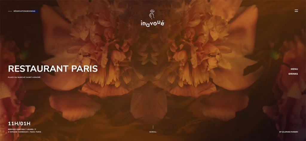
From the font selection of Nunito Sans to the grandeur of animations, everything is delicate about this site. So if you're looking for a modern-day romance with your design layout and restaurant, choose a template or design sense like this one.
26. JB Restaurant
JB Restaurant is a neat website and great layout for first-time restaurant owners looking to be inspired simplistically. The website is made by Bepet and looks absolutely remarkable!
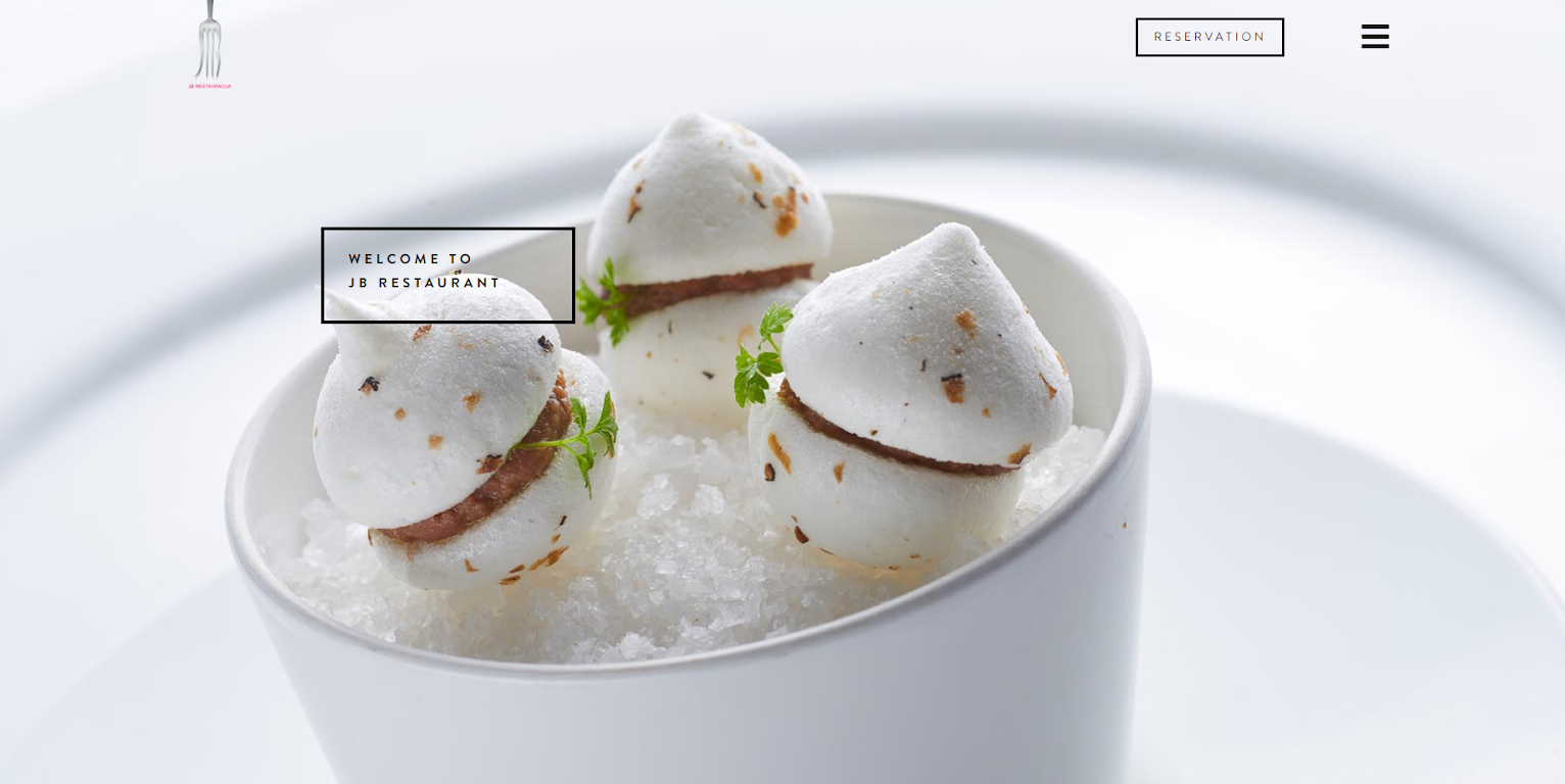
The homepage is user-friendly with a neat and easy to follow layout. The font used is Brandon, which is a great choice to maintain the neat feel of the website. There's a section on the menu and one on reservations. But the one that caught my eye was JB Literature - what a great way of patronizing literature coming from the team and a useful marketing tactic!
27. Sass Cafe
Sass Cafe is the name of elegance redefined. It's a global restaurant that welcomes visitors from around the world with ultimate authenticity and prestige.
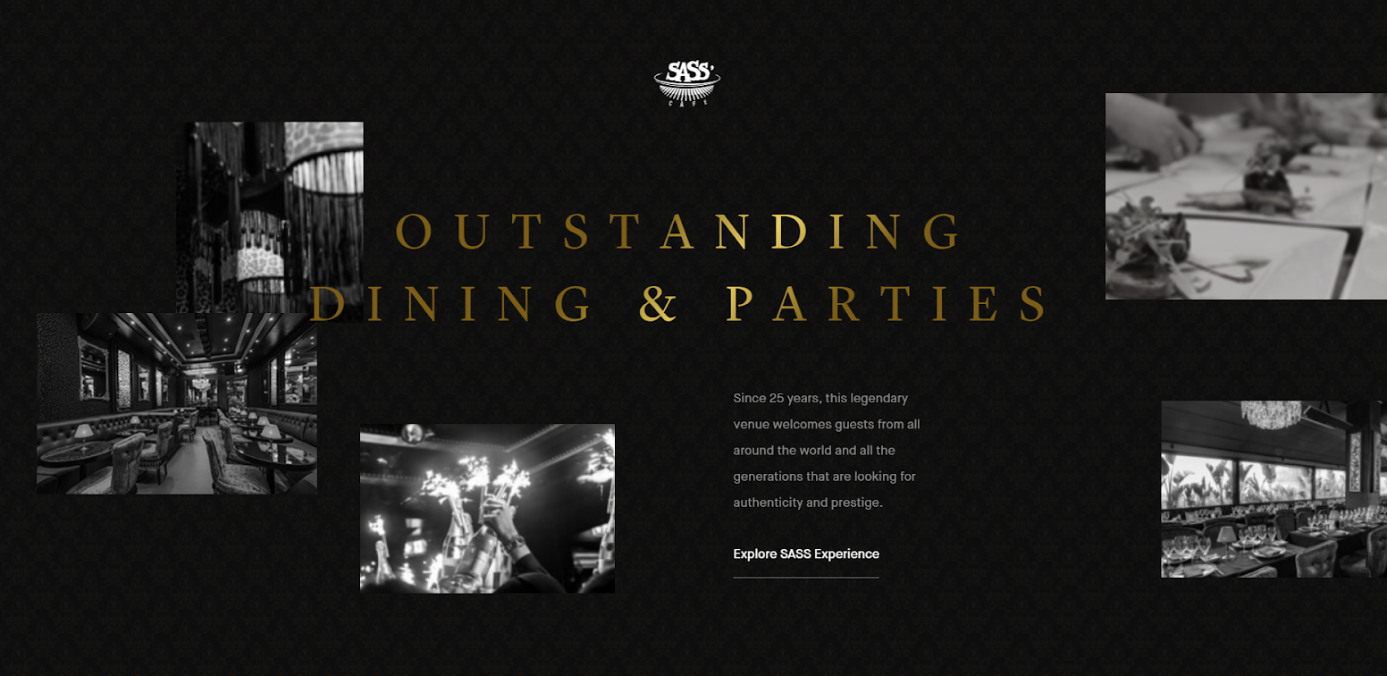
The landing page for the website has a slow-moving video animation on the header. The font used is Maison Neue - a graceful choice for an elegant design.
There's a CTA on Explore SASS Experience, and once you click on it, it takes you to the next page with great animations. The dining area is fumed in red and vigor hues to invite more customers, while the clubbing has a wide contrast of black and white.
My favorite part about the website is the virtual tour of the restaurant. They've effectively shown what it means to take the viewer on a journey.
28. Preto
Bursting with flaming hot colors, Preto offers a dining experience like no other. Wondering how I know that? Just from their perfect website filled with colors and excellence!
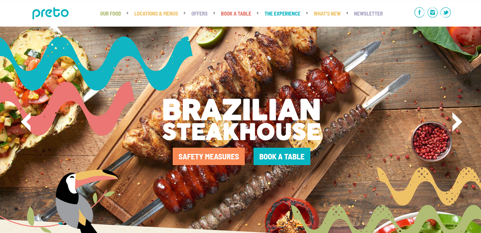
The website offers an interactive layout with vivid colors. This is an interesting way to brand a restaurant and catch the audience's attention. Even the font used, Barlow ensures that it adds on the funky element.
The sections are also limited and highlight the CTA of booking a table. Overall, it's a great inspiration case for restaurateurs wanting to experiment with color and funk.
29. Panini Bay
Whoever says that Italian cuisine has a calming effect is probably right. Panini Bay is another Italian cuisine focused restaurant that promotes breathtaking food photography and a simple layout.
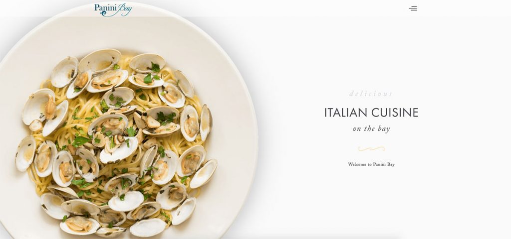
The design is super clean, dominated by white spaces. In my opinion, using white to your advantage can be tricky but also highly effective, especially if you pair it with great photography. The font, Adobe Caslon Pro, also highlights the clitter-free and modern vibe of the website.
For me, it's a good visual representation of less is more.
30. Gusto
Gusto is another example of a colorful and vibrant website for restaurants.
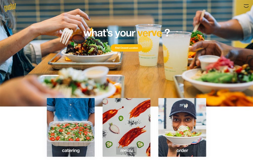
The color yellow is used predominantly throughout the website giving off happy vibes to the audience. The font selection of Helvetica also adds on to the light-mode and colorful vibe of the website. In terms of design, the website offers a simple layout filled with good visuals and photographs.
31. The Fiction Kitchen
The Fiction Kitchen has a simple yet effective website layout. There's a fixed side section on the website's left side with details of the restaurant's opening hours and location.
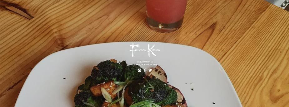
While many websites choose to divulge in exaggerated tones and themes, The Fiction Kitchen immerses in simplicity. The homepage is simple and offers clear sections with a menu and an embedded map location.
32. Le Pigeon
Who says restaurant owners can't get creative with their website designs? Take one look at Le Pigeon, and you'd be impressed with the interesting approach they've used in their design sense.
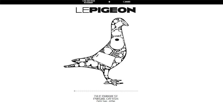
Instead of any colorful or vibrant food images, you'll find the brand's logo on the landing page. That is one of the most effective ways of brand building and brand marketing. This way, you make the customer affiliate your brand with nothing more than the brand itself. And so they come for the experience of being included in the brand. Interwsentaly, the font used is Conqueror.
Well, well, they surely have conquered the art of great marketing with an effective web layout.
33. Oyster House
Oyster House is the 2nd last restaurant on this list and for the right reason; the inclusion of great food photography and a clean website design.
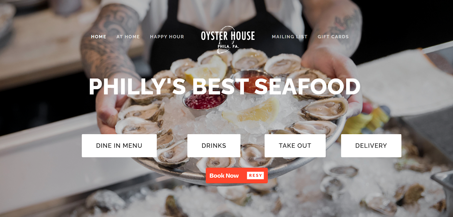
One thing that you should understand while designing your website is to keep it as clutter-free as possible. The other is to insert a clear and actional call to action, so it's easier for the customer to choose. And as it happens, Oyster House checks off all these great design senses.
The font used is Raleway - one that seems to be a favorite of the restaurant industry!
34. Círca 1886
And finally, we've reached the last inspiration on this list - Circa 1886. The website prioritizes modern feel like most other restaurant websites. However, there's a subtle touch of antique elements that makes it stand out.
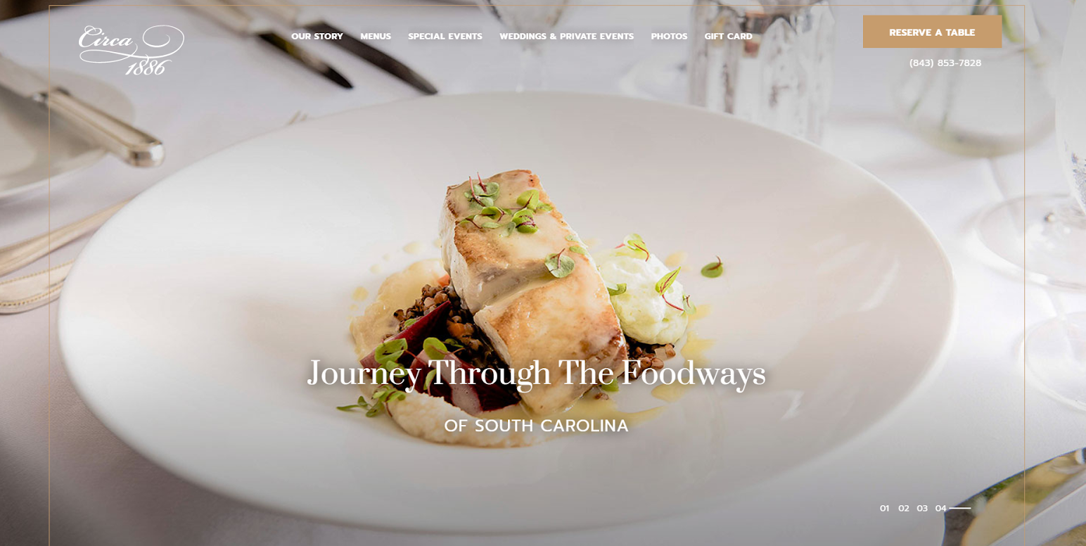
The font, Prompt, also adds to the grace of this antiqueness. And even the images used have a slight grading of old times. You can access the gallery, gift cards, and bookings & reservations through the top bar. Overall, the website looks like a work of elegance and offers a satisfying user experience.
I hope you liked the list, and if there's any great inspiration for restaurant websites that you'd like to share, don't hesitate!