Your product’s packaging is the first impression that compels customers to check the product in grocery stores or web-stores.
The customers have tons of options right there, and creating a jaw-dropping product packaging is the only way to make them stop by. Your product’s packaging should capture attention, trigger emotional appeal, and visualize your brand’s value.
But that’s not just it.
Designing CPG packaging involves much more than just capturing customer attention. It requires a deep understanding of the market, developing strategies, and navigating technical constraints like guidelines.
If you’re just getting started with CPG packaging, this guide will assist you through the ABCs of CPG package design. Here we will uncover basic CPG terms, factors, tips, trends, strategies, case studies, and guidelines.
By the end of this guide, you will feel more confident and encouraged to create your next design for CPG packaging. So let’s get started!
Table of Contents
What is CPG packaging?
Packaging for consumer packaged goods (CPG) goes beyond encasing the product in a box; it involves an approach. Why is that? Let’s delve into it!
The packaging of CPG serves as the encounter with the brand. Acts as a persuasive tool as the consumers walk through the store aisles. Basically, it is a storyteller that creates a connection between your brand and consumers.
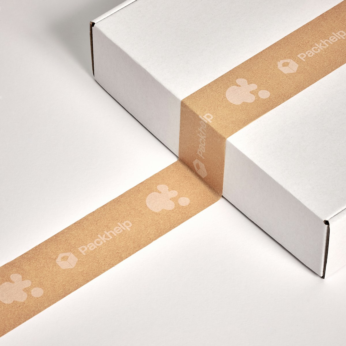
In short, the packaging of a product is something that draws an emotional appeal between customers and the product. It strategically communicates brand messages to attract like-minded customers to the product.
For instance, consumers are more inclined to buy a product that promotes sustainable packaging. Infact, Roland Berger’s latest report found 7x growth for CPG companies promoting sustainable packaging.
And due to the rising customer preferences, sustainable packaging material will increase by 11 million tonnes by the year 2030.
Today, the consumers are aware of environmental issues, and they resonate with brands that promote environmentally friendly packaging.
And that’s how CPG packaging speaks to the customers and impacts their purchase decision.
Do you know that 70% of consumers decide what to buy solely based on packaging, and 63% say that packaging design impacts their purchase decisions? Indeed, packaging plays an enormous role in the eye-catching delivery of the brand’s message and its influence on purchases.
CPG Packaging Design Process
The CPG Packaging design process is a step-by-step strategic approach to understand the consumer persona, brainstorm ideas & strategies and execute it all into an appealing and pretty packaging design. So if you mindfully follow the below steps, you can create packaging designs that always convert.
Here’s the roadmap to creating compelling designs for CPG packaging.
1. Research and Discovery
Every good design process starts with thorough research. So, understand the product: concept, essence, aim, and the USP. Dwell on the market trends, but most importantly, understand your target audience. What appeals to them? What is their preference? This way, the stage is set for power in design.
2. Brainstorming and Ideation
Summon the creative team, pull the sketchpads, and let the ideas come out. But why? Because ideation is the birthplace of innovative designs. Consider several concepts, try different color combinations, and visualize how the design would complement the product and the brand identity.
3. Idea Development
Refine the ideas that came during your brainstorming session. Afterward, develop strong candidates about the brand message, the audience, and product attributes. What is needed? Remember that each concept should have a storyline and strike the exact emotions.
4. Design Execution
Refined concepts in hand—time to bring them to life. How? For that, select a design software and illustrators or graphic artists with meticulous attention to detail. Additionally, colors, typography, imagery—every element shall work harmoniously to ensure a visually stunning package.
5. Prototyping: From Screen to Reality
The next step is to create physical prototypes before going into mass production. Because this will enable you to consider size, texture, and the general look and feel. Also, these critical checks guarantee that the design translates seamlessly from the digital to a natural product. Therefore, it is a crucial step to follow.
6. Test the Concept with Consumers
Now, put these designs in front of your target audience. And how to track it? You can use focus groups or questionnaires to determine how consumers react to the concept. Consider: what do they like or dislike? Therefore this feedback is invaluable to the adjustments that will be made to the design.
7. Finalization – Refinement and Preparations
It is most important to take consumer testing feedback and make the necessary adjustments to finalize the design. This will help you understand what your consumers are looking for. After this, cooperate closely with the production teams to ensure the design is feasible for mass production. To put it briefly, the practical details are as important as the attractiveness of the design. You might agree to this!
8. Production and Printing
With the final design in place, it is time to give the green light to production. How this could be done? Packaging designers and engineers should work closely with printing and manufacturing partners. This will ensure the design is appropriately translated into the packaging materials. This means quality control will be the order of the day at this point.
9. Launch and Monitor
As soon as the package hits the shelves, follow the consumer responses. Measure your sales, gather feedback post-launch, and measure how well the package contributes to your product’s success. Hence, you can use these metrics to develop and advance your next design.
10. Iteration and Evolution
CPG packaging is a dynamic place. Why we are saying this? Well, consumer preferences change, market trends vary, and your brand might make a turn. So, be dynamic and ready to modify the design. Your packaging can remain relevant and impactful by introducing continuous improvement into the process.
Why is CPG Packaging Design Important?
You might have a good design for your products that are doing good. But, why should still consider the supreme design for your product? Because CPG packaging design is crucial for various reasons. Let’s explore some key aspects that highlight its significance:
1. Attract attention
The consumer market is hypercompetitive, what could help you there? There comes the packaging design which is the foremost factor in attracting consumers’ attention. A point to remember: packaging that is of a high aesthetic level and attractive on the shelf will help stand out and grasp a potential buyer’s attention. It’s obvious! And hence, it will increase the chances of purchase.
2. Brand perception
You know what people consider when buying? They prefer what the product represents than what the brand says it does. Let’s understand it more precisely. According to research by Nielsen:
- 64% of consumers are usually open to new products based on the packaging,
- With 41% of them probably swayed to making repeat purchases, depending on the packaging.
What to understand from this report? This underscores that packaging design has a role in shaping the consumers’ perceptions regarding a brand. And, a good image of a brand and its products can be cast by the visually appealing and well-designed design.
3. Emotional connection
There are several researches emphasizing the importance of branding and creating an emotional connection with customers. Studies say humans are guided by emotion rather than mere reasoning. Hence, emotions play an important role in consumer decision-making.
So, brands can build trust by understanding the emotional needs of their target audience and having a positive experience. And you know what, Dr. Shields warned that neglecting to create an emotionally charged environment can be harmful to patients. This principle applies to all businesses that seek long-term customer relationships.
4. Shelf appeal
The packaging design sometimes becomes a key shelf-impact indicator in view of very competitive and cluttered retailing. That’s impressive! But, how’s that possible? The Point of Purchase and Advertisement Institute says that 70% of purchasing decisions occur at the point of purchase. Therefore, good packaging that catches the eye and communicates the product value significantly increases consumers’ chances of being noticed and chosen.
5. Social media engagement
Here comes the most exciting step of every business and sometimes the more hectic one! Getting social media engagement. So, let’s understand this way. Packaging designs that are attractive, unique, or innovative, look distinctive and stand out from others, and gain the most sharing across social media. In support of this, we found a study.
According to Dotcom Distribution, 40% of consumers are likely to share images of the package on social media if they find the design interesting. This is very common in millennials and GenZs. This can for sure lead to increased brand exposure and word-of-mouth marketing.
6. Sustainability in packaging
Among numerous consumers, you might encounter those who support the environment. Therefore, at this time you should encourage sustainability in your packaging. Let’s talk through the numbers!
According to research conducted by GlobalWebIndex, 57% of consumers claim they are willing to pay higher prices for products packed in environmentally friendly packages. Great, isn’t it? So, brands that encourage sustainable packaging design will attract a growing segment of environmentally conscious consumers. Stay green, smart, and sustain the future with your packaging!
Best CPG Packaging Examples to Learn From
Grasping the impact of the best CPG packaging on the consumer psyche becomes more apparent when one delves deeper into exceptional examples that have set high standards in the industry. Let’s check out a few of the best CPG packaging designs that have captivated the consumer.
1. Apple
Apple’s packaging is unique and keeps the look clean and sleek, offering a luxurious feel to their customers. The clean white boxes are combined with very high-quality images of the product, which makes the package look stylish.
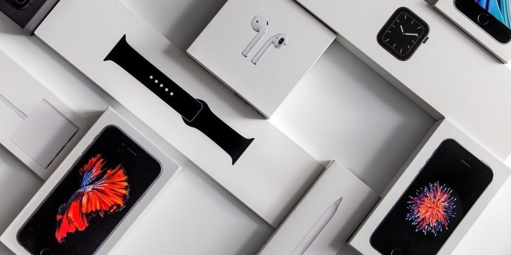
This design is aligned directly with Apple’s focus on simplicity and innovation; it embodies a premium unboxing experience that appeals to consumers and maintains the image of a luxurious technology vendor.
The attention to detail in packing reflects a brand’s commitment to excellence in the entire consumer journey.
2. Coca-Cola
Coca-Cola thinks differently when it comes to packaging. For example, materials, recyclability, reusability, and environmental impact are considered. Currently, different packaging materials such as plastic, aluminum, glass and composite materials each have their own advantages and disadvantages. But Coca-Cola is working hard to develop more sustainable strategies. Also, people are encouraged to choose reusable bottles and cups to help the environment and reduce waste.
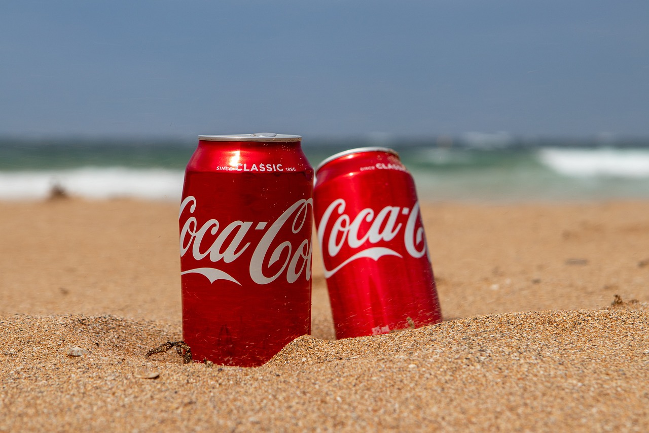
Also, the brand decided to take action by setting a ‘Virgin plastic reduction goal. What is it? Basically, the goal aims to reduce the use of non-renewable plastics by 3 million metric tons over the next five years. By 2025, the brand hopes to use about 20% less virgin plastic based on business growth.
3. Oatly
As for clever packaging design, Swedish oat milk brand Oatly has taken the lead. How exactly?
It uses cartoon illustrations and offbeat copywriting to create a playful, arresting, and utterly memorable look. It’s pretty, no doubt!

The packaging makes the shelves shine. Additionally, it helps in selling products by ensuring an eye-catching design and reinforcing the brand’s claim of an approachable and appealing character.
However, the design of Ottley’s packaging gives them the pleasure of building a close relationship with customers.
It also stands out as a fantastic example of how cool ideas can boost a brand’s visibility, and customer engagement.
4. Method
A bold and unconventional vision inspired it; household cleaning brand Method knows how to make a statement with its packaging.
Vibrant and eye-catching designs, sleek bottle shapes, and sleek typography create a modern and visually appealing aesthetic. No doubt in that!
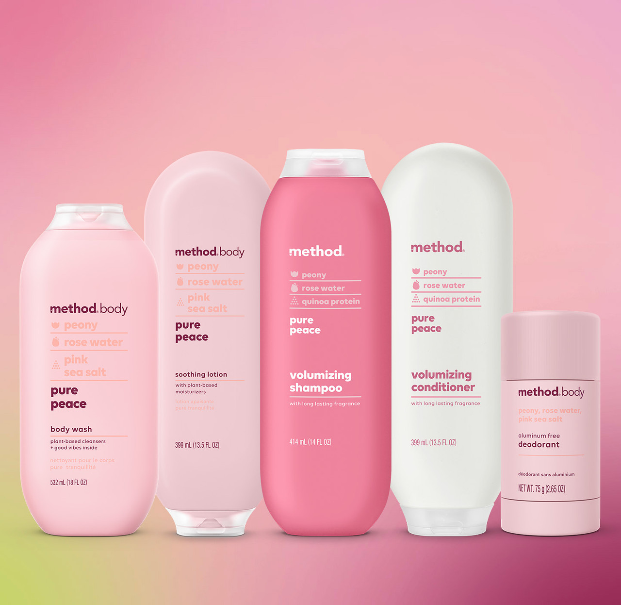
Not only does this unique packaging make Method stand out on shelves, but it also conveys a sense of innovation and freshness.
Also, with its clean and modern look, the packaging reflects the brand’s commitment to effective cleaning. It also communicates a contemporary and stylish image.
This sums up that that packaging design can elevate a brand’s identity and presence in the market.
5. Glossier
Now there’s Glossier: the cult beauty brand with simple, Instagram-friendly packaging. By Instagram, we mean the trendy, attention seeking CPG packaging.
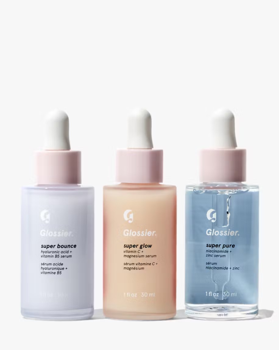
The clean, simple product packaging fit hand in glove with the Glossier mantra of effortlessness in beauty and a fresh, youthful aesthetic.
The beautiful packaging definitely makes it worth the purchase.
This is a perfect case of how sensitive and aesthetic packing design leads to the creation of an identity of a brand. Also how it wins the loyalty of consumers who appreciate the combination of simplicity with a sense of fashion.
6. RXBAR
RXBAR, the protein bar label, every fitness freak must know. It made its brand recognizable via the transparent packing.
Thus uncovering all the consumers whose glance has slid on its natural ingredients.
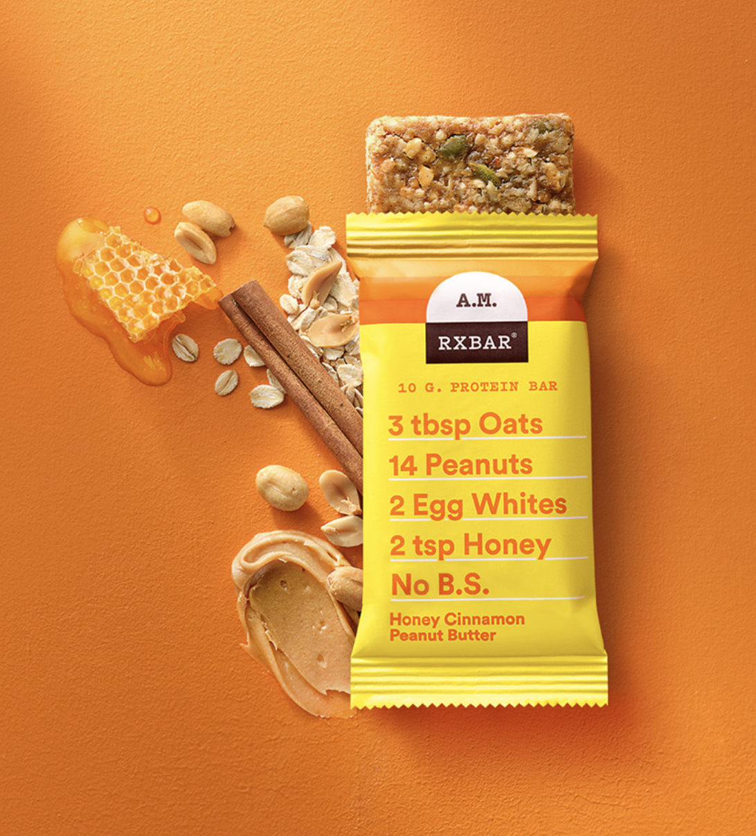
The packaging form only screams transparency and vibrates through the brand’s slogan: authenticity and simplicity.
See how!
The logo and clear characters used on the packaging show the brand’s commitment to purity of ingredients. So, it shows their commitment to deliver high quality.
7. Nutella
Who doesn’t love chocolate? There comes Nutella, a brand which is everybody’s favorite.
Just look at the simple yet defined packaging.
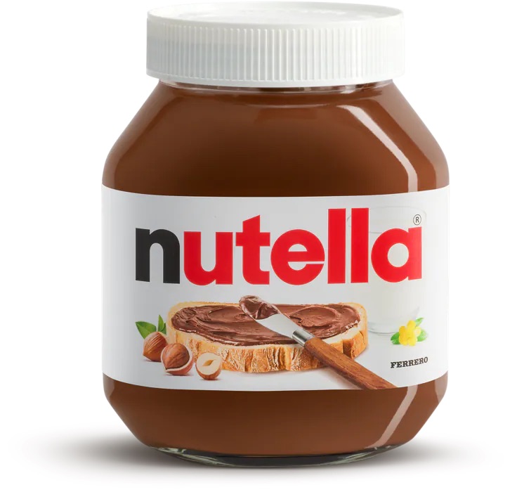
The Nutella brand silhouette, bottle and bold red logo are instantly recognizable.
They exude joy, happiness, and reflect Nutella’s status as the most delicious and beloved spread.
Thus, Nutella, in its distinct jar shape, is forever linked with the experience of enjoying this delightful experience, creating a solid visual association.
Thus, the choice of packaging is an excellent example of what design can be when competently and characterfully carried out.
It helps to identify the brand and communicate the essence of the product visually and emotionally, reaching consumers in multiple channels.
Tips to Create the Best CPG Packaging Designs
Creating top-tier CPG packaging designs requires careful planning, creativity, and an understanding of your target audience and brand identity. Here are some tips for achieving excellent results:
- Understand your audience: Research your preferences and demographics. Then, create designs that connect emotionally with your target market.
- Reflect brand identity: Align design with brand personality, values, and aesthetics. This includes color palette, type, and imagery, in order to reflect brand identity.
- Keep it simple: Use readable typographies, organized layouts, and intuitive visuals. It will help with essential product information because clarity is crucial in a cluttered market. Do you agree?
- Differentiate yourself from competitors: It could be done by incorporating eye-catching designs that utilize bold colors, unique shapes, and creative illustrations. So, ensure that these designs remain relevant to existing brands while also standing out.
- Consider how things work: Make sure the design is attractive and functional. Because ease of use, resealability, and durability are some factors that create a good user experience.
- Choose quality materials: Choose materials that match your brand and reflect the sustainable options for eco-conscious consumers.
- Tell a story: Use visuals, graphics, and copywriting to contribute to unique selling propositions, brand stories, or product benefit claims that create emotional connections.
- Test and iterate: Collect feedback, perform small-scale tests, and respond by refining designs.
- Go green: How about using materials in your packaging that are friendly to the environment? Stand on it and you will get the thumbs up!
- Remain current: Keeping up with the fads and inclinations of design and taste is essential. The packaging must be reviewed and refreshed regularly to look captivating and live to the consumer.
Strategies for CPG Packaging With Case Studies
For any business, nothing could help without a case study. If you too want to have a glance over how other brands played with their packaging, let’s figure them out!
Here are a few tactics the big companies use, with some examples of how they work, to spark bright packaging ideas:
1. Telling stories on the packaging
The most famous of all nowadays. Many big brands use the packaging to connect more with customers by telling stories.
Like Patagonia, the outdoor clothes company. What they did?
They put tags on their product, talking about where it came from, what it’s made of, and how it impacts the environment.
It jives with their sustainability and connects with people who care about that.
2. Personalization
Who doesn’t like personalized products? Personalization is a huge deal these days. Brands that let you customize your packaging make the experience more memorable for customers.
It’s like this super neat thing they can do just for you.
The “Share a Coke” campaign was successful for several reasons. One of them was how to make their own.
Personalized names printed on Coke bottles and cans gave customers a more personalized experience.
This moreover, created a strong bond with the brand and a sense of ownership plus exclusivity.
The campaign launched in Australia, and it was a hit! Sales were up 7%, plus more than 250,000 individual bottles of Coke flew off shelves in the first three months.
3. Limited edition and seasonal packaging
Limited edition or seasonal packaging can get customers pumped up. Why not? Well, it’s like an exclusive club that people want to be part of!
Starbucks and their famous red holiday cups have people practically counting down the days until Christmas.
As soon as you see someone walking around with one of those red cups in their hands, you know the holidays have arrived.
It’s definitely a clever way for brands to generate hype around everyday products.
What are your thoughts on this?
4. Minimalist and sustainable packaging
You know which companies can connect with customers?
The one which care about using less packaging and stuff that doesn’t hurt the environment and can connect with customers who also care about that.
For example, Lush. It is a makeup and soap company that tries not to use a bunch of packaging so there’s less trash.
Many of their products don’t even come in packaging. They do that because they want to help the environment, not just as some marketing ploy.
Hence, the people who buy from Lush appreciate that they’re not just talking about being green.
So we’ve got a perfect lesson from this case study.
Focusing on ways your business can reduce waste can be worthwhile if you believe in it.
Let’s focus on less is more funda as it is a future in CPG packaging.
5. Interactive packaging and gamification
There are some brands who take out a kid in everyone. Have you ever encountered with any such brand? We will talk about it later in this section itself!
When companies use fun activities or game-like features on their product packaging, they make shopping more memorable and fun for people.
Lay’s had a “Do Us a Flavor” event, asking people to develop new chip tastes. Felt nostalgic? Yes, that was amazing!
The best ones were made and put on unique bags. This made shoppers want to interact with Lay’s and pick the taste they liked best.
https://www.youtube.com/watch?v=ue8gkFcAME4
6. Functional and convenient packaging
Packaging that’s easy to use and handy can make customers happy and keep them coming back.
For instance, Amazon packaging that is a breeze to open, cuts down on trash, and keeps items safe while they’re being mailed.
This attention to what the customer needs has helped build Amazon’s fame for putting customers first.
FDA guidelines for CPG packaging
Here comes the most important section. If you are thinking of doing some amendments in your packaging or want to make a new one, consider the following FDA guideline.
Because, the FDA is responsible for setting the rules for packaged food in the US.
Have a look at these FDA packaging regulations to sell your food products legally.
1.Labeling Guidelines
The FDA demands clear labels when it comes to consumer packaged goods (CPG). Ofcourse, the consumer would want it too! Brands must give comprehensive information on the product. What’s in it, the nutritional details, any allergens present, and any claims the company makes. In short, the label information must be straightforward, correct, and easy to read.
2. Nutrition Facts Panel
CPG items are supposed to display a nutrition facts panel. This tells consumers what nutrients are in the product – how much energy it gives, fats, sugars, protein, and various vitamins and minerals. So, the way this information is presented should follow the FDA’s design rules.
3. Ensuring Food Safety for All
Companies must disclose any significant allergens in their products. It’s important! This includes milk, eggs, fish, shellfish, nuts, peanuts, wheat, or soy ingredients.
4. Honest and Scientifically Supported Claims
When it comes to health and nutrition, the FDA closely monitors statements made by consumer products. So, claims such as “low fat” or “high in fiber” must be truthful, not deceptive, and backed by scientific evidence.
5. Types of Packaging
The FDA regulates the materials used to package consumer goods, especially foods and drinks. These rules ensure packaging doesn’t pose any risks and keeps the contents from getting tainted.
6. Amount of Food Inside
This is the total amount of food you get, shown by how much it weighs, how big it is, or how many pieces there are.
7. Who Made or Packaged It
The food’s wrapping must have the name and address of the person or company that made it or packaged it. You’ll see the maker’s or packager’s name with words like “made for” or “packed by,” plus an address listing where they are located.
Conclusion
In conclusion, this blog post provided the ultimate packaging designer’s guide to CPG packaging.
As a result, we explored key points such as the importance of packaging, the psychological effects of packaging, how to approach sustainable packaging and what etc.
By understanding packaging design, you can unlock the full potential of your packaging to increase sales.
Ready to take your packaging game to the next level?
Now that you’ve internalized this knowledge, it’s time to boost the power of design and take action.
Start experimenting with new packaging techniques and use our guide as a reference.
Remember that your packaging design can subconsciously influence a customer’s perception of your product, so make sure it truly captures your company’s mission and values.
Continue your journey by checking out our new blog posts on design and packaging.
Stay ahead of the curve and promote your brand presence with our expert advice.
Ready to upgrade your packaging?
Get started today!
