The Designer's Guide to Acing Typography in 2021
From packaging designs to website designs and even social media posts, typography designs are everywhere!
They are taking upon the digital world like a storm, and it's high time that you learn the very basics of it. This will help you communicate with your designers better and develop a better understanding of typography.
So in this article, we will cover the rules, terms, and guides to typography. Get ready because it's the ultimate basic guide for 2021!
Let's dive right in.
Few Things You Should Know About Typography and Its History
Now before we dive into the rulebook of acing typography designs, let's get a necessary background.
Humans have used their words to express and portray themselves since the beginning of time. While at first, what was merely scribbled on tablets of stone or cave walls, now is on the modernized web designs, apps, and websites. This is typography.
The craftsmanship and skill graphic designers use to turn a simple scribble of a website on a piece of paper to the artistic sites and web pages we usually see on our phones and computers.
In Essence, Typography Is...
Typography is the focal point of a graphic designer’s skill set and range of abilities and is about considerably more than just turning simple words into funky-looking fonts.
Typography decides the layout of a site or a webpage as your graphic designer works with how your site functions with your format, content, and shading theme. These are all the factors that can turn a boring site into a mesmerizing and artistic one.
The typography field is playing around with the art of a language that covers everything from deciding the length and width of letters to deciding their fonts and alignment. This post will introduce an essential guide of typography works and some of its basic rules, and designs, terms.
3 Typography Design Terms That You Should Know
The world of typography is vast and seemingly infinite. Therefore graphic designers have come up with some design terms that help them trade through their work. If you are looking to dip your toes in typography, learning these basic design terms will help your venture considerably.
Styles
Font style plays a significant part in typography. The two major styles that graphic designers play around are Serif and Sans Serif.
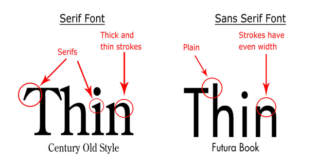
Serif textual styles
They are the go-to for general graphic designers. This in-vogue style is set apart by the little runs that reach out from each letter's stroke. Serifs have been used for quite some time on early newspaper designs and ancient websites. They give sites an excellent old, complex tone.
The two most common font style examples of Serif are:
- Times New Roman: Going back to the 1400s, these serifs are set apart by low line differentiation and the inclining font stroke.
- Palatino: If you want to see more contrast and expression in your graphic design, Palatino is the one you go for. This is more of a conventional Serif font style that differs the most in its stroke variations.
Sans-serif
Sans-serif, however, is the textual style that comes up short on the little strokes toward the finish of letters and is a more optimized style that is more readable on screens despite the zooming range. This textual style is more new and advanced in look and appears stylistic at any size and in any text length. Graphic designers use it when they are going for an advanced or moderate vibe.
Some common examples of Sans-Serif fonts are:
- Arial: The most common and used font ever, this text style is straightforward and intense, frequently with a square shape to its letters.
- Helvetica: This font style is a more clean-cut and fluent type that gives its text an air of modernization.
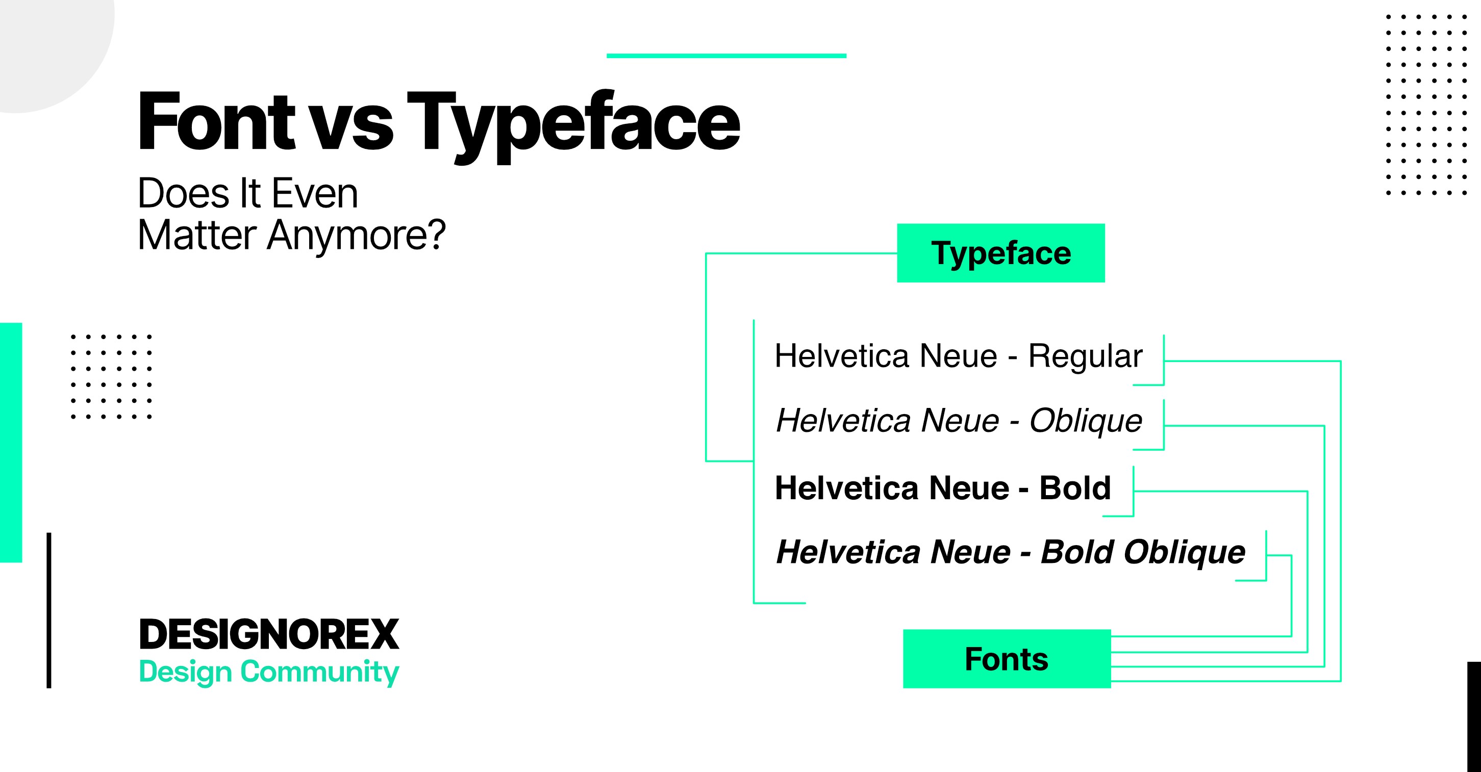
Font vs. Typeface
If you have some knowledge of typography, you may have seen fonts and typefaces used together. So it is not an uncommon mistake to view them as the same thing. However, they are not.
Fundamentally, a typeface involves numerous characters of shifting weight and sizes, and it makes the content style look similar to Arial and Helvetica. A typeface is a more general aspect that commonly includes numerals, symbols, and letters.
Fonts, however, allude to the length, widths, and styles of a typeface and are a realistic portrayal of text characters or letters. Fonts are about the width and stature of a typeface and relate to their style. A font is a more defined typography aspect that focuses on the geometrical aspects of letters and characters in a text.
Anatomy
Anatomy commonly refers to the structure of something in a general manner. Similarly, typography's anatomy refers to the graphic and structural elements that make up letters and characters in a text. Some terms that make up typographical anatomy are:
1. Strokes
The strokes are the segments of a letterform. Strokes might be straight, as in w x z, or bent, as in u m s. Assuming straight, they might be flat, vertical, or corner to corner, whether bent or open.
Graphic designers also use a term called an instroke, where one begins composing the letter at the highest point such as c f, and an outstroke, where the pen leaves off, as at the lower part of j t y. Some common kinds of strokes are:
- Leg: A segment of a letter that expands downwards, joined toward one side, and free at the other.
- Arm: A straight or bent part of a letter that broadens upwards or outwards, connected toward one side and free at the other.
- Ear: The little stroke that broadens outwards from a lowercase g in some typeface styles.
- Shoulder: The stroke that bends downwards and to one side of the lowercase m and n.
- Spine: A bent stroke that is inside the upper and lower case S.
2. Terminals
The terminals are the finish of an instroke or outstroke. A terminal might be depicted as a wedge or a bulbous part of a stroke. Their look groups terminals and style whether serif or sans-serif.
3. Space
Space is a blank area framed by straight or bent strokes called counters. Shut counters are found in a b d e, and A B D O, and open counters are found in a c e f and s t u. The shut space in e has a space like an eye. Similarly, the angles in the void area of w are corners. This term is used to give more definition to the letters and their geometrical formation.
4. Baseline
A change in baseline impacts the width, length, height, and stroke structure of a letter. A baseline is a foundation where a letter is formed. Any change in baseline alters the angle proportion of a letter. A baseline must be intact and formatted according to the letters to have a text with anatomically straight letters.
The 5 Important Illusions of Typography
Ever wondered how some artistic sites and pages on the internet look so mesmerizing and advanced? Well, they are using literal illusions. Typography majorly focuses on using literal illusions, which turn a simple letter into a hidden letter from the eye. It's all about playing with angles and strokes of letters.
Here's a list of the 5 most common illusions used in typography.
Illusion 1
This illusion plies around with the thickness of the letters. For Instance, the letter S seems straight as it is, but if we turn its angle to 90°, you'll see the difference between the thickness of the letter and its height. Overlap it, and you have an infinity sign.
Illusion 2
Illusion 2 is similar to 1 and takes the art of flipping letters further. For instance, if you flip the letter V, you'll see a big difference in its balanced proportions. It is not balanced like the letter Z. This can create mesmerizing and unique letters and symbols in a text by a graphic designer.
Illusion 3
When you look at the letters E and B, their middle crossbars seem alike. But If you look at A and E, they are not. Graphic designers also use this little cheat to give the illusion of several letters while using a couple only.
Illusion 4
Even though all letters appear to be precisely the same stature, the round letters are different. If we take the letters O and Y, their proportions seem a bit odd. This is because O is around letters and Y is not. While Y hits all three imaginary baselines, O only hits two.
This illusion is used to create odd and unique symbols and logos in typography that stand out.
Illusion 5
Typography often plays around with the thickness and thinness of strokes, For instance, the letter T. The upper stoke is thicker than the downstroke. This can be adjusted accordingly to alter the height and proportions of the letters. This illusion is used to portray the height of letters as per the graphic designer’s choice rather than their formation.
6 Rules of Typography Design That Every Designer Should Keep In Mind
Typography isn't just a common way to orchestrate typefaces as it used to be once. With new techniques and technology, graphic designers utilize numerous terms to play around with their letters. Still, there are some rules they must adhere to.
To give you a heads-up, we've listed these below.
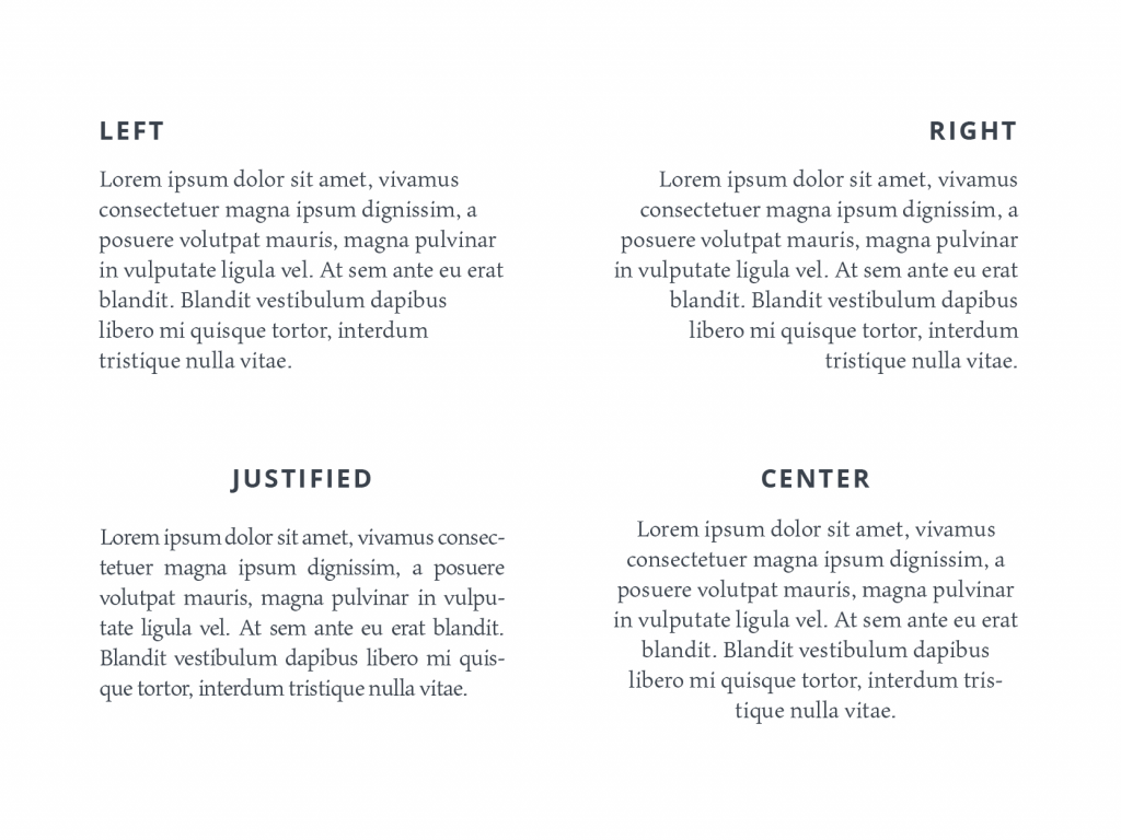
Alignment
In typography and page format, alignment is the setting of text stream or picture position comparative with a page, section, or tab. The alignment settings are also known as text alignments or type support. The corner of a page or a paragraph is known as an edge, and the part between paragraphs is known as a passage.
There are four essential typographic alignments:
- Left Adjusted: The content is adjusted along the left edge or passage.
- Right Adjusted: The content is adjusted along the right edge or passage of a page.
- Justified: The text is adjusted along the left edge, with letter-separating and word-dispersing changed, so the content falls in between the two edges of a page.
- Centered: The text is adjusted to neither the left nor right edge; there is an even distance on each line's side.
Tracking
To change the general space between letters, graphic designers must follow tracking or letter separating. The larger the content gets, the larger the space between the letters gets. There isn't a cheat to change the distance between letters. Graphic designers must follow the rules of tracking always.
Kerning
Kerning is the rule that graphic designers must follow to change the space between characters to agree on blending. For instance, where a capitalized 'A' meets a capitalized 'V,' their slanting strokes are normally kerned with the goal that the upper left of the 'V' sits over the base right of the 'A.'
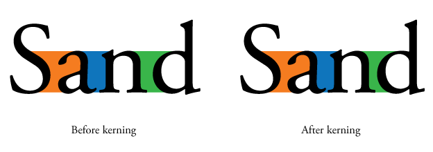
Kerning is like leading with a few differences. However, they are not very similar.
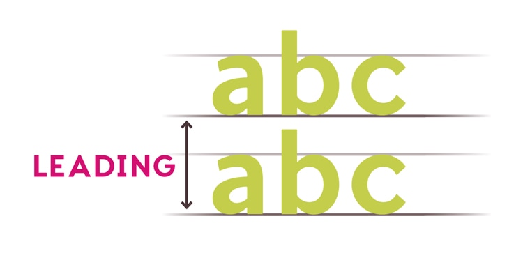
Leading
Leading depicts the vertical space between each line of type. Each letter must follow a set distance of its previous one to seem readable and fluent. For a text to look presentable, it must follow the distance-leading guidelines somewhere in the range of 1.25 and 1.5.
Hierarchy
For a body of text to become readable, it must follow some set guidelines that determine its structure and readability level. This is called hierarchy. Like Heading 1, Heading 2, and Heading 3, a text must be set in order.
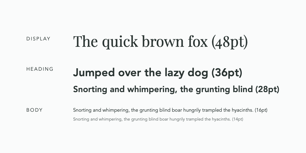
Setting a text to increase visual interest helps manage the watcher's eyes across the page, making the content much simpler and natural. The most evident and simple way to make a text follow an order, have it written in different font sizes, following an ascending format.
Grids
While hierarchy in typography orders the text internally, grids help in arranging them. Graphic designers follow grid lines to make the content more aligned and structured. By utilizing grids, graphic designers fundamentally outline the data on a given page.
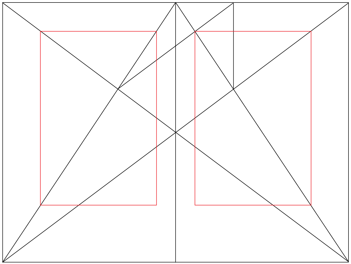
This gives them better control over how they orchestrate the data on the page. With the proper use of the grid rule, they can make syntheses that control the watcher's eye, making the data simple to read and comprehend.
Key Takeaway
Typography is impossible to learn in one day. It requires determination, an ability to pay attention to minute details, and an eye for art. It is a science comprising numerous guidelines, yet enough space allows graphic designers to be creative in their work.
We have come a long way from craving symbols in walls to designing on a gadget, yet the essentials of typography remain the same.