If you’re here, you might already know the importance of the right packaging in selling your product.
But here’s what you don’t know.
When you rightly and most importantly, transparently package your product, your sales skyrocket.
Wondering how?
According to JohnsBryne’s reports, 63% consumers re-purchase a product because they liked the aesthetic and appeal of the packaging.
Apart from selling products, packaging can massively help in building a loyal and satisfied relationship with their customers.
Want to know how you can build a loyal customer base? Follow our top 10 expert tips to create the most appealing CPG packaging designs for your brand.
Let’s check them out!
Table of Contents
What is CPG packaging?
Before proceeding further, let’s clear out the basics. What is CPG packaging?
Well, it refers to the design plus presentation of the packaging materials for the consumer products. What’s the purpose? It’s simple; protecting the product and also attracting the consumers.
What does it include?
CPG packaging consists of the elements like labels, fonts, images, materials, color, packaging, graphics, and also functional features. The primary role of packaging is to answer these two questions:
- What’s inside the packaging?
- Who makes the product?
CPG packaging of the product has a visual impact, conveys emotions, and communicates the values proposition of the brand.
But the most important role of CPG packaging is to be transparent in conveying the product expectations for the consumer.
How does effective CPG packaging design influence customer retention?
When we talk about the competitive market, the CPG packaging design significantly improves customer retention, making your brand unique.
1. Build customer loyalty
CPG packaging designs are also responsible for building customer loyalty over time. And that’s why you should think through while developing a design strategy for CPG packaging. A deliberate and impactful packaging can send the right message to the right consumer, converting them into life-long customers.
Additionally, if the packaging is informative, visually appealing, and functional, it will reflect your brand’s dedication and care towards customers.
2. Repeated Customer
Packaging that shows what’s inside the product’s package increases the likelihood and the satisfaction of customers’ towards your product. Product transparency leads to positive experience, encouraging repeat consumer purchases.
So if you pay attention to the details carefully, you can get better customer retention for a long run.
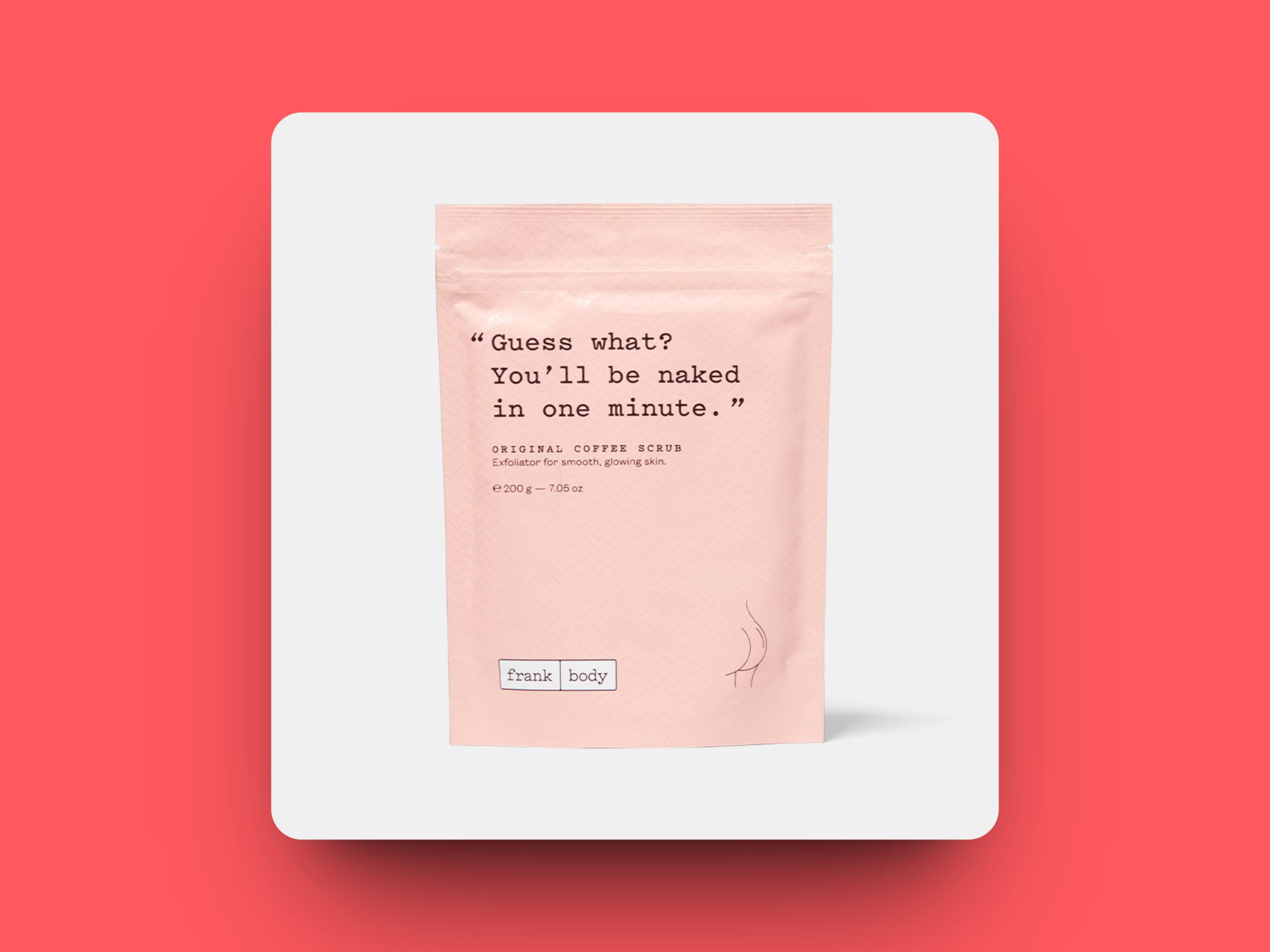
When it comes to brand loyalty, packaging designs definitely set lasting experiences. Let’s understand this with Frank Body’s example.
Frank Body is an Australian skincare brand that prints amusing one-liner product descriptions. Their packaging designs, quirky and playful product descriptions, and great quality products have helped them sell 2 million body scrubs worldwide.
This design acts in two ways. It engages the customers and communicates with them through the brand’s fun personality.
Top 10 tips for creating appealing CPG packaging design
Want to make a packaging design that engages with the audience and also boost brand loyalty? If yes, then check out the top 10 tips for CPG packaging design here.
1. Understand Your Target Audience
We have already established how effective packaging can skyrocket the market performance of a product. Understanding your target audience is the foremost requirement of creating outstanding packaging designs. Because there’s no one-size-fits-all approach to create a packaging design.
Conduct thorough research on your target audience through surveys, focus groups, etc. Breakdown your analysis to understand your target audience’s preferences, interests, choices, and buying habits.
Now combine this research with your brand identity to create a packaging design that clicks with your audience as well as serves the brand.
Let’s say, if you are targeting millennials, go with vibrant or bold colors and modern typography. Or else, if targeting elders or adults, go with more elegant plus classic designs.
2. Keep It Simple
Keep it simple! An overcomplicated packaging design could confuse the customer and also mess up the visual impact.
Messy, stuffed and overcomplicated packaging has led to failures of many brands in the past. Orbitz soft drink is one of the examples of bad & messy packaging. The brand was launched in the 1990s and quickly became famous for the beverage texture which had floating edible balls. But due to its off-putting packaging design, it ultimately failed to survive in the market.
While there’s no exact formula for ensuring your brand’s success, one golden rule to survive— keep your packaging simple and single-minded.
One of the best examples of simple packaging is Apple.
Apple’s minimalist and white packaging design gives consumer’s a premium feel. It’s simple and presented in a sleek and straightforward design that draws attention to the product.

3. Be Authentic
Point to be noted: be authentic with the design because this way, you can stay true to the values and messaging of the brand.
Make sure your packaging screams your brand message.
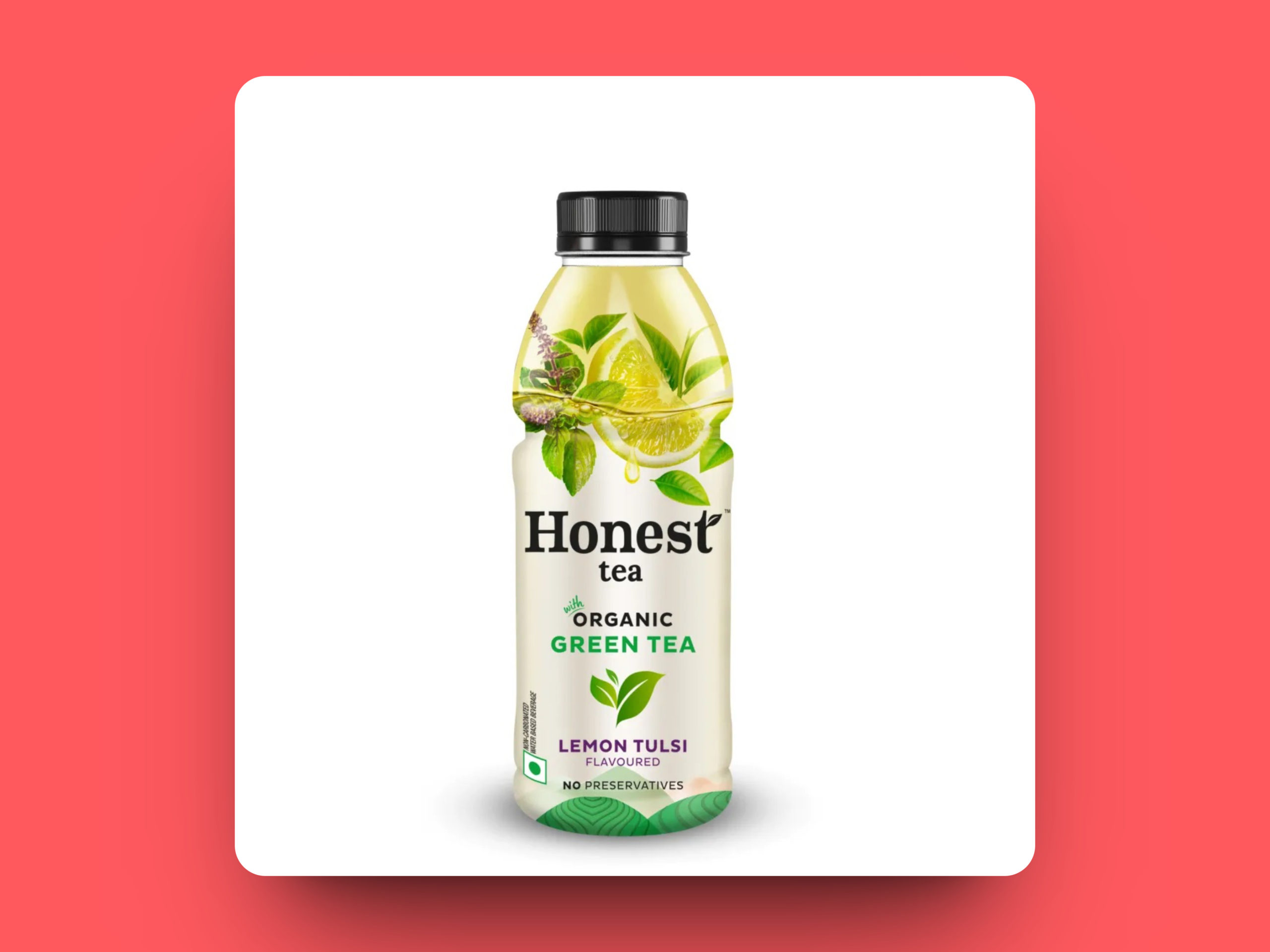
Honest Tea is a brand that could be the perfect example of this. The packaging is clean and transparent, showcasing the commitment, honesty, and transparency of the brand.
4. Keep It Functional
This could be an essential tip for your brand’s CPG packaging. It shouldn’t only seem good but functional, too. While adding an aesthetic appeal is important to lure customers, keeping it functional is equally important to protect your products.
In short, create packaging that should be practical, easy to use, transport, and store.
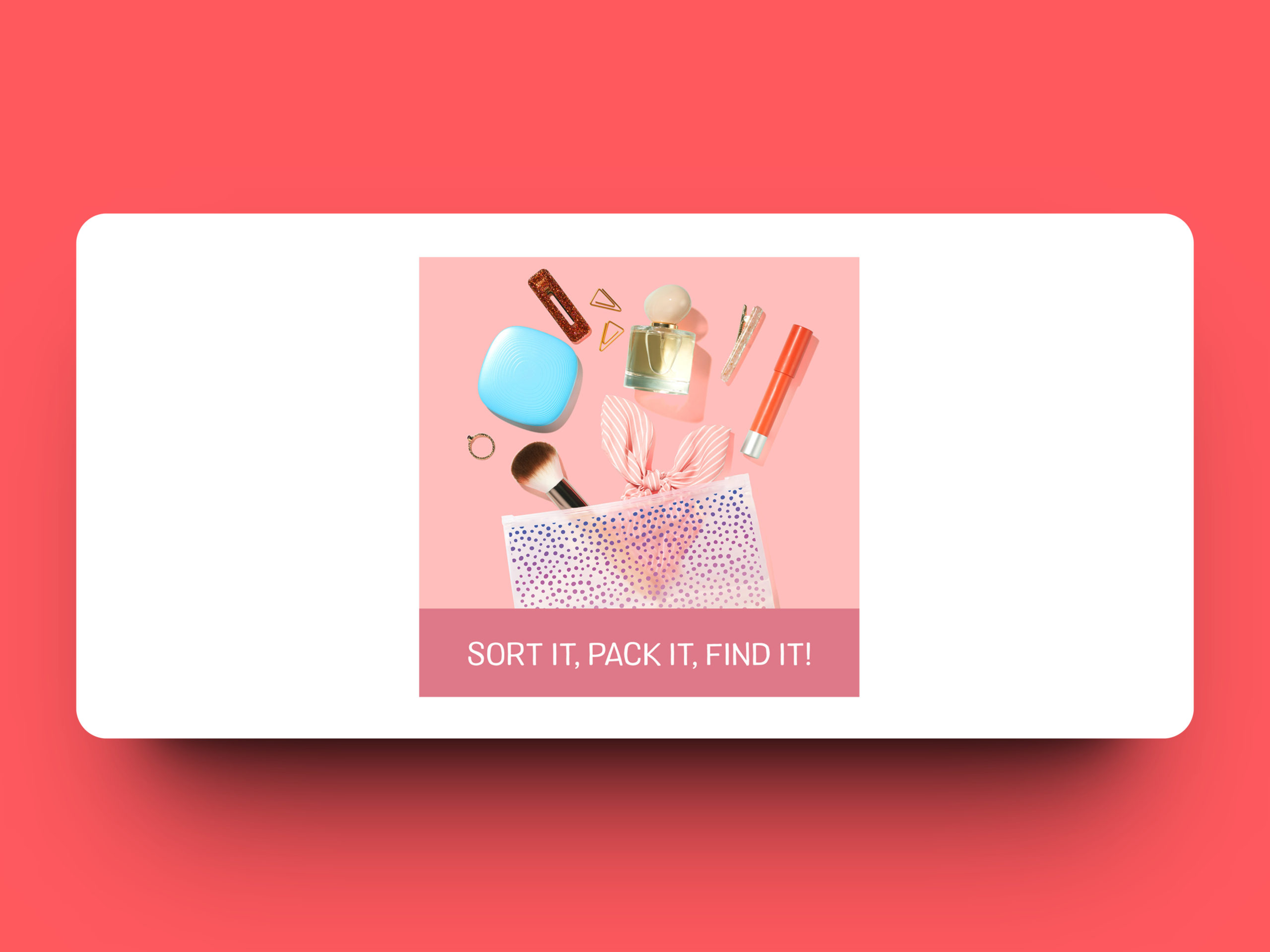
If you look at Ziploc’s packaging design, you’ll find a perfect balance of functionality and visual appeal. It has a functional design that is easy to use, plus it stores. The packaging design comes with a unique interlocking zipper design, which helps food stay fresh.
5. Consider Sustainability
Nowadays, we hear sustainability is a key to a promising future. Well, undoubtedly, it is! When it comes to consumers, it has become a growing concern. So, incorporating sustainable packaging design became the perfect weapon for a successful future in product packaging that improves customer retention and satisfaction.
Seventh Generation’s packaging design supports eco-friendly and sustainable materials, which resonates with the brand’s commitment to sustainability.
6. Tell a Story
Your brand could make a perfect, memorable experience for the customers. How? By telling a story. Well, Frank Body is the best example of this, but we will also look at another famous brand. CPG packaging design could communicate a brand’s values, purpose, and message.
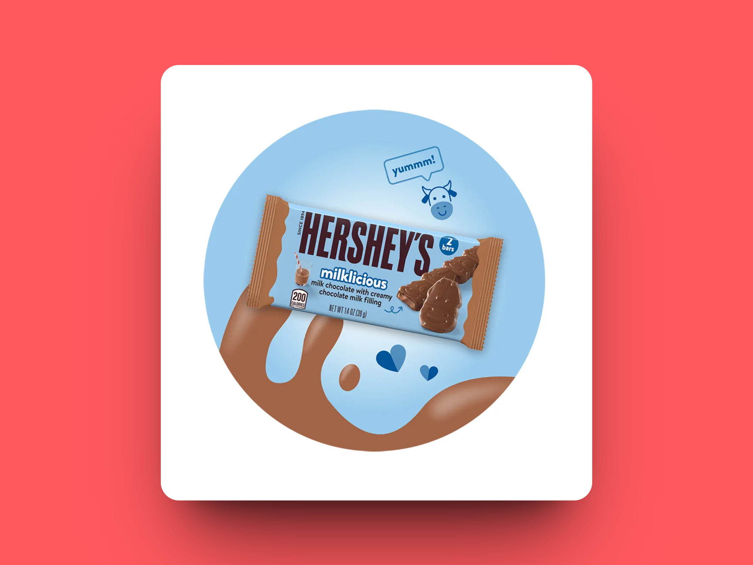
Now, here comes an example of Hershey’s chocolate packaging design. Well, it presents the story of the brand’s history, setting up a sense of nostalgia and an emotional connection with the customer.
7. Differentiate from Competitors
Don’t think like your competitors. Ignore their packaging and think out of the box for that hit touch. What you can consider? Consider the unique features, a message that could set it apart, or a unique visual impact.
CPG packaging design should differentiate your product from competitors. It would be best to consider the visual impact, unique features, and messaging that can set your packaging apart.
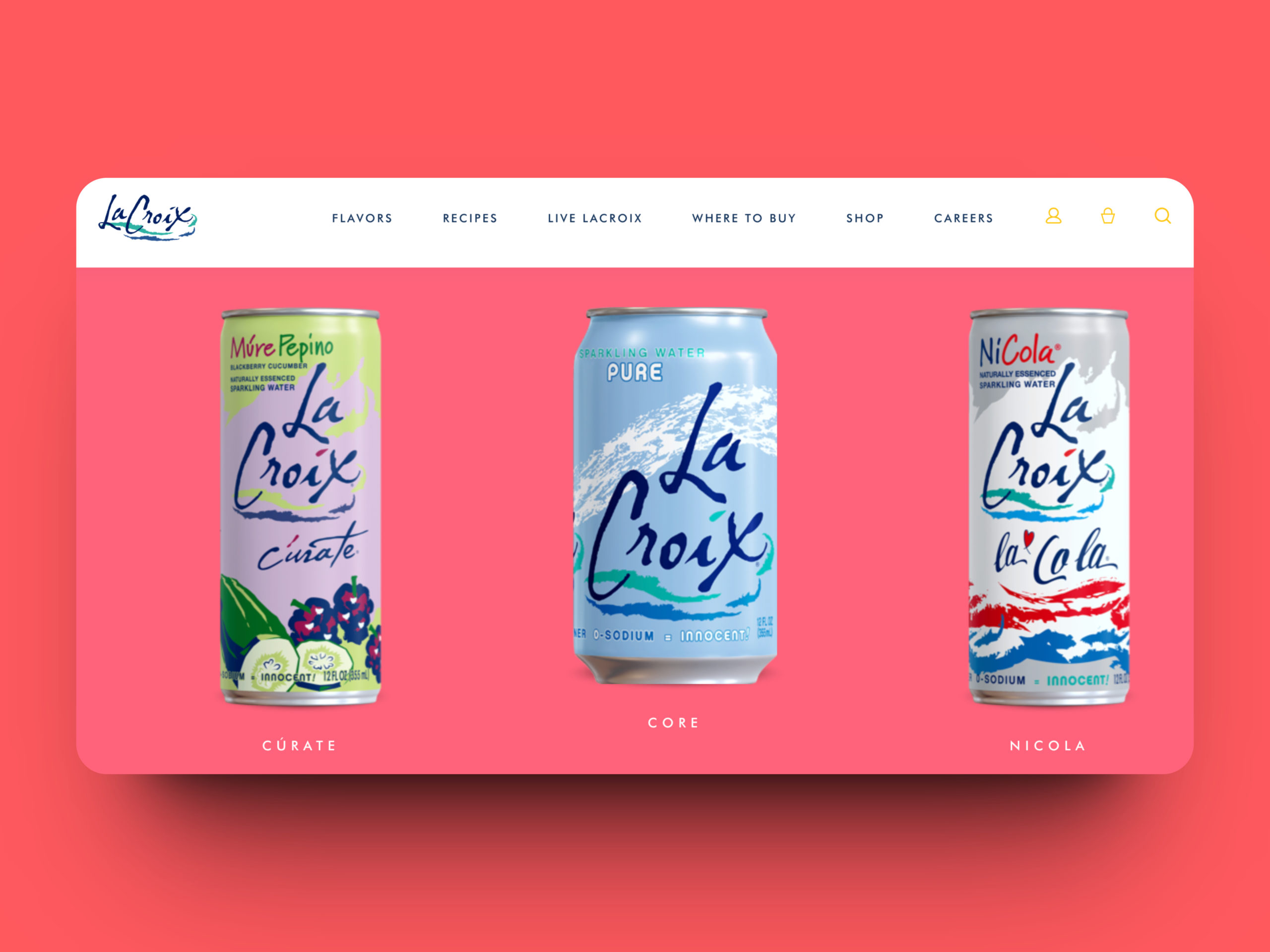
Take a look at LaCroix’s packaging design, which has vibrant colors that differentiate it from competitors. It can easily evoke a sense of fun and excitement. What do you say?
8. Make it Memorable
Your CPG packaging design should be memorable for the customer, so create it with that mindset. It should be so impressive that it could become the talk of the town.
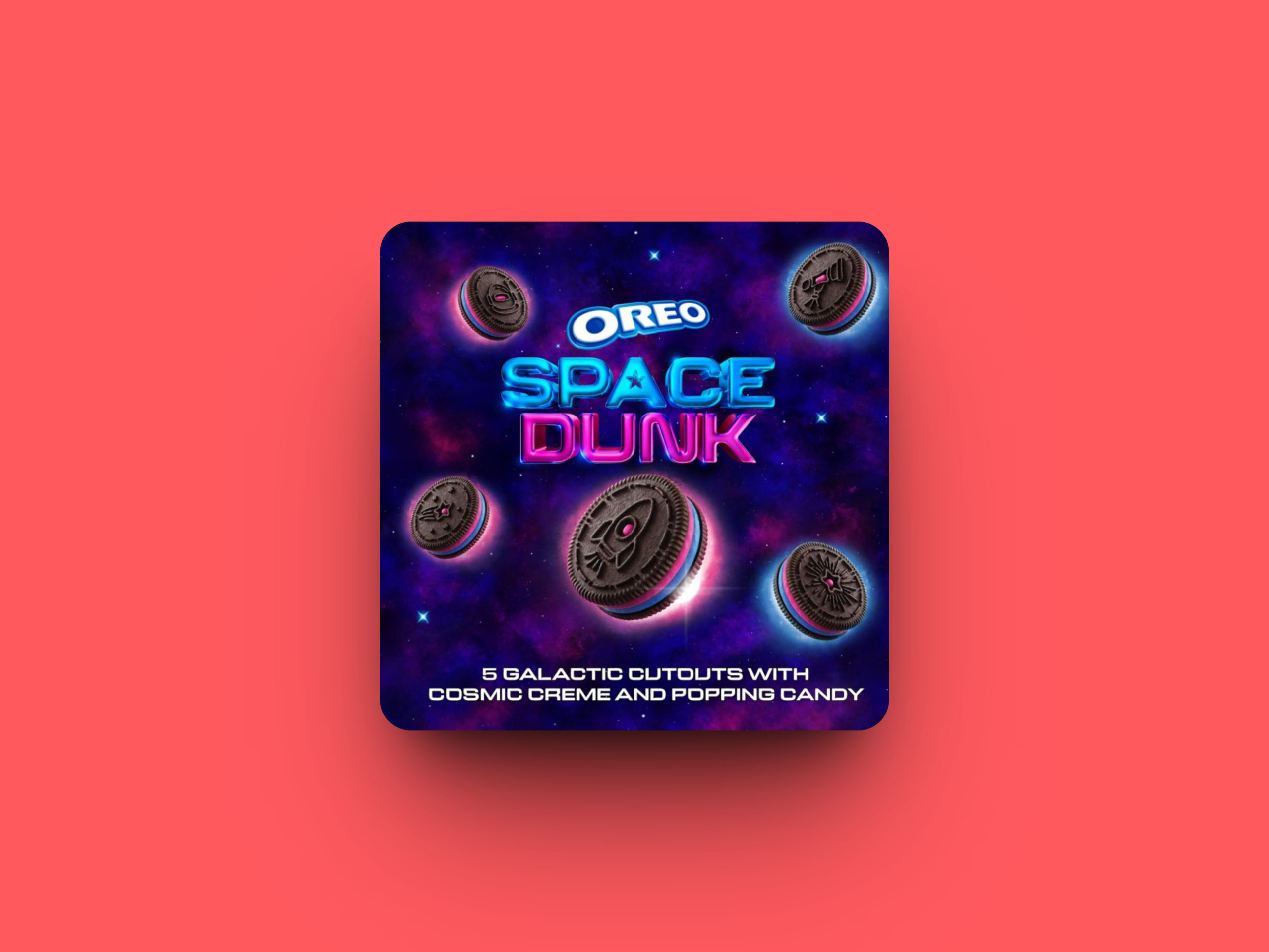
Here comes everyone’s favorite, Oreo. It comes with a playful and interactive design that tempts customers to stay connected with the brand.
9. Consider the Retail Environment
Don’t miss out on the retail environment where your product will be displayed. Make your product packaging stand out on crowded shelves with a visually appealing design.
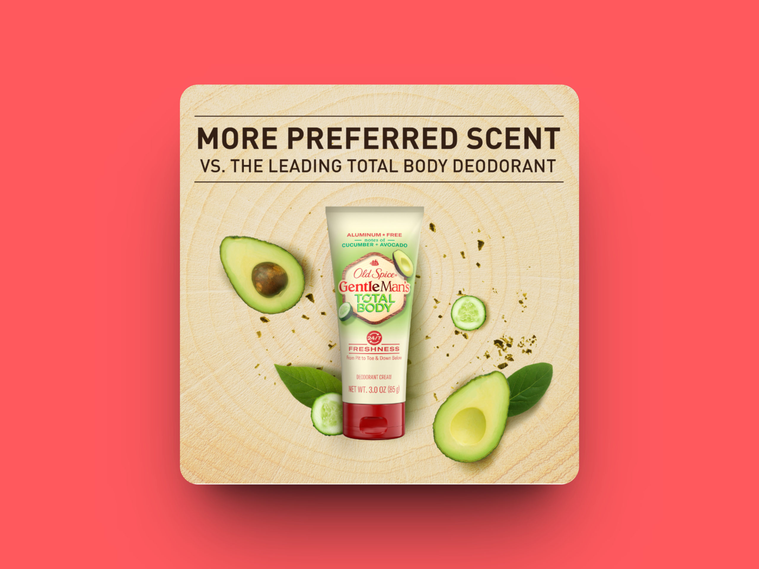
Old Spice has done it better. It comes with a bold and striking design that shows that sense of confidence and masculinity when it stands out on the retail shelves.
10. Test and Iterate
CPG packaging design is an ever-changing process, so testing and iterating the designs is very important for creating an appealing packaging design.
For a more visually appealing design to which the customers can resonate, PepsiCo tested and iterated its Tostitos packaging design.
Level up your brand consistency with GoVisually
Are you looking for the right solution to help you maintain brand consistency and collaboration for your business? If yes, you should check out GoVisually right now.
GoVisually is one of the advanced design collaboration tools with features like global settings, revision tracking, comparison mode, and more. Our features have simplified the creative process for brands such as 2San, IBrands Global, Viori, and more.
Sign up to GoVisually and achieve brand consistency, speedy design approvals, streamlined workflows and a lot more!
