With almost 4.66 billion internet users worldwide, it has become imperative for businesses to maintain an online presence. That’s because they have such a massive pool of potential customers to tap into. By penetrating the online market as a business, you can open your business up to a lot more visibility than you would get organically.
However, to have a killer online presence, you need to have a killer website.
And although social media marketing is essential, it’s always better to have a website to direct customers towards through your social media. But simply creating a website isn’t enough; the market is saturated with billions of websites, 1.88 billion websites, to be exact!
It would help if you established what sets your brand and its website apart from your competitors. The first thing you need to consider is its functionality. We’ve all opened a website at some point and become frustrated with it immediately. Whether the speed, the hard-to-navigate layout, or the copywriting, something made us click off and switch to a better website. This is where UI (User Interface) and UX (User Experience) design comes into play.
Table of Contents
User Interface (UI)
User Interface refers to the features of your website; it’s what users see on their screen. The User Interface design of your website decides what options are available and how they interact with your website’s functions.
User Experience (UX)
User Experience (UX) is the overall experience a user has with your product, or in this case, website. UX extends to the usability, branding, and functionality of your website, among other aspects. Enhancing User Experience means creating an easy-to-navigate interface that is visually appealing. UX is also optimized through optimizing website speed and responsiveness.
Your UI and Ux design make or break your website’s dwell. The average internet user takes 3 seconds to decide whether or not they’ll stick around on your website or move on. A high bounce rate means your website is not serving its purpose; generating leads and conversions.
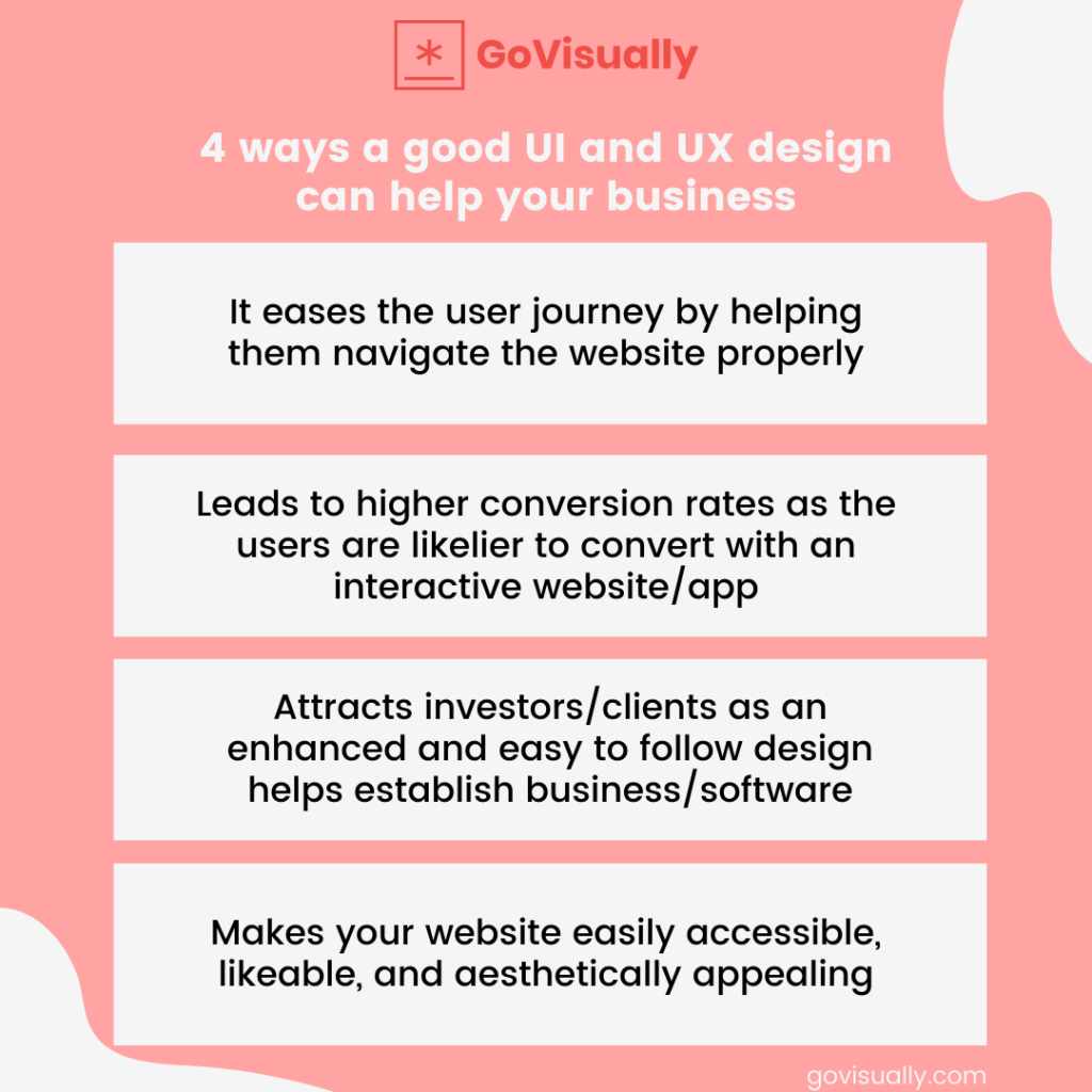
Top 7 Websites with Stellar UI and UX Design
If you’re thinking of creating a website for your business or even revamping your current website, you’re going to need some research and inspiration! Here are our top picks for 7 websites that have stellar UI and UX designs.
1. Airbnb
Airbnb is an online marketplace for booking vacation rentals and temporary homestays. Simply put, the service connects you with people that are putting their spaces up for rent across the globe.
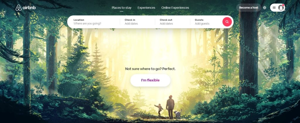
Airbnb has excellent UI and UX website design. Their website design emphasizes minimalism and clarity. The landing page is simple; a CTA card drives users to search possible locations and bookings, and behind the CTA card is a background.
This simplicity does not overwhelm the users when they come onto the website. Think of this as opposed to a landing page filled with copy and graphics; your eyes wouldn’t know where to look! It would simply overload your screen with information, discouraging any action you may have taken towards a conversion.
It’s no secret that internet users have short attention spans and can be a bit lazy; you need to ensure that your target audience doesn’t need to do any cognitive heavy-lifting to go through your website.
How does Airbnb’s UI and UX design fit perfection?
It helps you connect with strangers and form a trusting relationship. The website has a simple interface, and the helpful copywriting makes it easy to use. It serves its purpose as you can begin planning your stay at the homepage.
It is a streamlined process because it does not involve any additional filters when you start. You can begin making your choice by choosing the destination you are planning on visiting, the number of guests, and the number of days for your stay.
The website is highly thought-out and easy to navigate. Before you check out, you are allowed to acquaint yourself with your host. By doing this, you connect with the host and form a bond. It is a genius feature as it enables you to be more invested even before you pay for your experience. The engaging content on the Airbnb website helps the users form an emotional connection with the hosts.
Airbnb has over 1.5 million users globally. By June 2021, Airbnb’s website saw 99 million unique visitors, proving the effectiveness of its UI and UX design. If you haven’t yet checked the website out, we highly recommend doing so for some web design inspiration.
Cut design & video review time in half
Try GoVisually free today!
2. Medium
Medium is an online publishing platform that helps authors and bloggers publish their work to an online audience. It has one of the most aesthetically pleasing UI and UX designs on the internet.

The website uses beautiful typography and excellent colors to make the design stand out. Medium is a platform for publishing and reading online. The generous spacing makes this website functional and easy to use.
With Medium’s website, you get a clean platform for writing whatever you want to write. The blank white space without any clutter provides you with a platform without any distractions, and you can focus on your writing.
The “write here” prompt when you open any article on Medium encourages website users. It enables all its users to have an excellent editorial experience. On the Medium website, you can highlight and directly respond to articles. You can also see the estimated time it will take for you to read an article, and multiple other minor features like this help Medium stand out.
3. Dropbox
Dropbox is an online file hosting service that offers cloud storage, and since its inception in 2008, the platform has accumulated 700 million users and $1.91 billion in revenue annually.
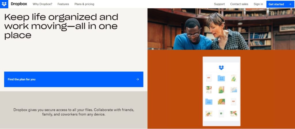
Having an understandable and easy-to-use UI and UX design can benefit the website, and that is why the Dropbox website is known for having the most familiar interface. With easy-to-navigate folders and file organization. Dropbox’s interface is user-centric, making the user experience effortless and effectively streamlined.
Suppose you’re thinking of creating a website with the same capabilities of file synchronization and cloud storage. In that case, we’d recommend checking out how Dropbox’s web design makes the user journey from lead to conversion a walk in the park!
4. Feed
It is a platform dedicated to intellectual property rights and payment. Feed music aspires to use its website and mobile application to revolutionize the music industry by offering complex intellectual property rights and security.
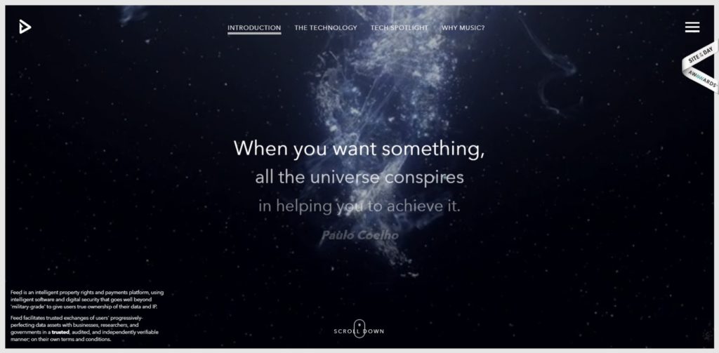
When it comes to UI and UX design, Feed’s website is an immersive blend of animation, graphics, and text guaranteed to capture the user’s attention. The website is unique, with one-of-a-kind features and usability. The interface is ‘mysterious’ without being hard-to-navigate, focussing on aesthetic appeal and balancing it with functionality.
Feed’s website is best described as a highly intriguing concept that pulls you in the right from the landing page if you haven’t yet seen it, head over to the website right now for some inspiration!
5. Mikiya Kobayashi
Mikiya Kobayashi is a Japanese interior designer with one of the best websites we’ve seen regarding minimalism and effectiveness. The site conveys its purpose through high-quality photography coupled with an elegant design. The website uses the same formula as Feed when it comes to scrolling doubling as navigation.
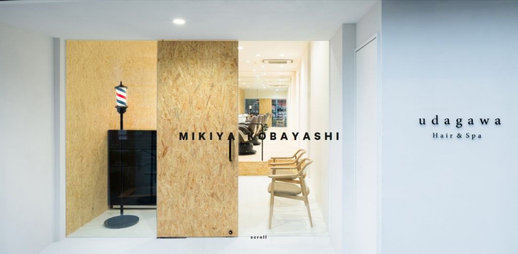
There is a clear emphasis on the design being user-friendly. Mikiya Kobayashi’s online portfolio is a refreshing change of pace from overcrowded, overly graphic websites. The landing page is bright and airy, letting the artist’s work speak for itself.
The site also automatically translates from Japanese to English, widening its appeal worldwide, boosting the user experience. If you’re looking to create a portfolio website, this is all the inspiration you need!
6. Virgin America
Virgin America is an American airline. Since its inception in 2004, the company has grown significantly, accumulating an annual revenue of $1.295 billion. The airline ceased independent operations in 2018 when it merged with Alaskan Airlines.
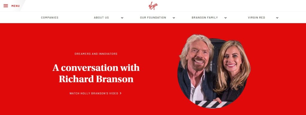
The website is still active and is exemplary due to its emphasis on streamlining the user journey. Airline websites are notorious for being confusing and difficult to navigate; well, not this one! Virgin America’s website extends beyond the airline, giving users information about all the subsidiary companies and services.
If you’re promoting service through a potential website, the UI and UX design are fantastic! Its responsive, actionable, and simple, making it the perfect beginning to your audience’s journey to a conversion!
7. Human Interaction Company
Human Interaction Company is a web, mobile design, and content management design service. The brand’s website takes an in-depth look at the interaction between computers and humans, offering countless resources and case studies to support the ethos behind the operation.
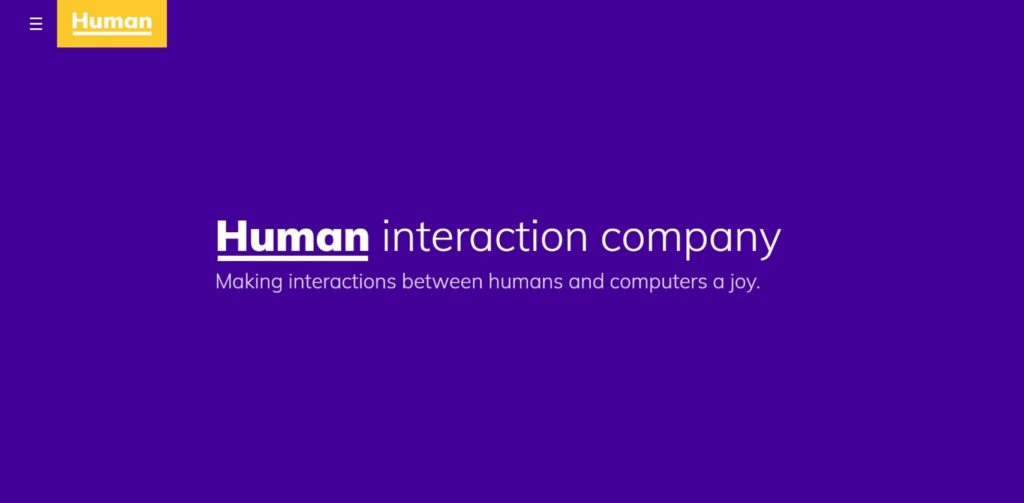
In terms of UI and UX design, the Human Interaction Company keeps it entertaining and straightforward. The landing homepage has a fun video that pulls the audience right in, sparking their curiosity to explore the site further! The copywriting is personable and down to earth, taking an easy-breezy approach to business.
Human Interaction Company’s website is an excellent example of creating a brand persona through digital content, enhancing the user experience. The interface is interactive and easy to navigate, making it the perfect inspiration!
Share and Review Your UI and UX Design with GoVisually!
Creativity is hard to come by, but sometimes all you need is a little inspiration and the right work process to finalize your designs. And this is where a little magic from GoVisually can set you on the right track. You can upload your design mockups and wireframes on GoVisually, invite reviewers, gather feedback, and finalize designs.
You can also gather feedback from focus groups to ensure that your UI and UX design is customer-centric. And this way, you can always stay ahead in the design game!
