Can you convince your audience that your landing page is worth their time using a bunch of UX principles?
Well, only if you know the strategies proven and tested by experts in the industry!
High conversion rates for landing pages are about giving your audience the greatest experience and the information they need and making it easier to take the next step with your brand. The best UI and UX designs use strategies to achieve that perfectly.
Many factors go into creating a great landing page, so it’s important to know what makes them successful. Most people respond a certain way to the experiences we design for them regarding landing pages.
Great experiences can be created with simple guidelines, which is precisely why we’re here to share the secret UX principles experts apply daily.
We know you’re excited to know them, so let’s begin!
Cut design & video review time in half
Try GoVisually free today!
Table of Contents
What is a landing page?
Let’s start by answering the question, what is a landing page?
Landing pages are designed for a specific target audience; they give you the ideal opportunity to convert visitors into paying customers. Landing pages are great for digital advertising campaigns because they allow your customers to focus on one service at a time.
The purpose of a landing page is to convert visitors, so it’s an important tool at your disposal for all marketing campaigns. A landing page is a standalone web page that “lands” after being clicked from an email, advertisement, or other digital location.
While landing pages are a key part of any content strategy as they can help convert more traffic and increase conversions, most pages fail to convert because they ignore the underlying UX principles that make them successful.
Before moving on to UX principles, you need to understand the importance of UX design, specifically for landing pages.
Why are UX designs important for landing pages?
A landing page’s whole structure and value depend on its design.
We don’t say it; experts do.
This tells us enough about why landing page design principles are essential.
However, we’ll explain why if you still want to hear it.
We all know that a customer’s journey is not a one-way street. Viewers often bounce around from page to page, looking for outside input before taking the next step. The more effective your UX and UI designs are, the more your audience stays on them, leading to higher conversion rates.
So, in the end, using design elements and UX principles reduce friction and help users move forward in their journey with your brand through effectively designed landing pages.
That said, even the smartest UX designers out there would make mistakes leading to low user satisfaction. The solution is sticking to these not-so-secret UX principles like gospel and implementing them on every page.
10 high-conversion UX principles for landing pages
It’s been a while since you’ve wondered what UX principles they keep discussing.
Don’t worry; that’s all we will be talking about from now on.
You might find other use cases for these tips.
Still, we refer to them as UX principles because, when applied together, they turn your landing page into a powerful source of information, aesthetics, and marketing combined.
1. Create a true landing page
Like we said before, to be successful on your landing page, it must effectively convert visitors into customers. A low-converting landing page often results from misconceptions about what a landing page is.
A true landing page is a standalone page specifically dedicated to one offer. It should be easy to navigate and help users reach the offer quickly. Because your landing page is meant to promote/advertise/highlight one product.
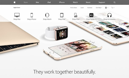
Making it about other services will result in confusion and a high bounce rate because your customers won’t find what they’re looking for. A landing page should be relevant and focused on a single message to provide a positive experience for the user. The best example is Apple and its dedicated landing pages for every project.
2. Design for clarity
From a practical standpoint, distractions are a major factor in reducing conversions, and among these distractions is the navigation bar. If you can keep your work environment distraction-free, you’ll get better results, so always design for clarity.
This includes increasing readability as it should be easy to understand for the potential customer. It’s a given that communication is more than just words; use white space, images, and a conventional UX design to keep things clear and on point.
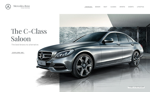
Our favorite here is this Mercedes Benz landing page that keeps the focus on visuals and two simple CTAs for their users.
The example also takes us to our next UX principle.
3. Use simple CTAs
What happens when you find yourself on a page where you want to do something but don’t know how to do it? You leave.
Using simple CTAs that stand out more than other content on the page is crucial for high conversion rates.
Minimal designs convert 7% more than complex designs for web pages.
Taking the same Mercedes Benz landing page from the previous example, you can see how it allows the user to either ‘Explore’ or ‘Find a Retailer.’ Other great examples of effective CTAs are the ones where CTAs are easy to find and are effective in getting people to take action.
4. Embed social proof
The belief that people and other people’s actions influence people-accepted and has been used extensively and profitably in human history. Social proof has become an important part of UI and UX designs on many websites, applications, and even real-world UX that we learn daily.
Social proof is considered one of the essential UX principles for landing pages because it gives users a sense of trust and credibility. For example, since many people are already subscribed to a service, it encourages others to do the same.
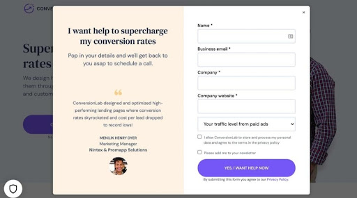
You can use this the ordinary way, like mentioning how many people have used your product/service or adding a testimonials section to your landing page. Or you can get creative like Conversion Lab and embed a customer review on your CTA to reinforce your customer into taking action.
5. Make it interactive and lively
Making your UX designs interactive and lively comes as no surprise to anyone. However, there are facts and strategies you aren’t aware of when designing a landing page.
The first impression you make is important, so make sure you create an irresistible one. Show your product or service in the context of how it is used. This will help you to understand the customer’s needs and desires better.
This can be done using a video or user-interactive animation instead of plain images or illustrations. It can be a very effective way to engage visitors and increase conversion rates.
Unbounce found that conversion rates can increase up to 80% by adding moving pictures to your landing page’s intro banner.
6. Optimize for speed
Several factors influence page speed, especially high-resolution images, videos, and animations like the example above. Slow page loading speed negatively impacts user experience because users find it uncomfortable to stay on websites where everything loads slowly.
Your video and imagery content should load quickly because it’s the first thing your visitors see. The speed at which your content loads greatly impacts how long your visitors will spend looking at it.
There are many ways to optimize your landing pages and make them fast to keep your visitors on your page, decreasing the possibility of them leaving your site before the page loads. It’s also an important part of search engine optimization (SEO) to make your landing page appear in top search rankings, both of which will lead to high conversion rates.
7. Implement a visual hierarchy
Implementing a visual hierarchy can be important in planning your website’s information architecture. It can help your users navigate your landing page more easily since UX designs reduce friction and make the product more usable for users.
Your users are usually not readers when they are on a website. Instead, they are simply scanning information. Visual hierarchy is a tool to organize design elements and influence how you want your visitors to view them and how they view them.
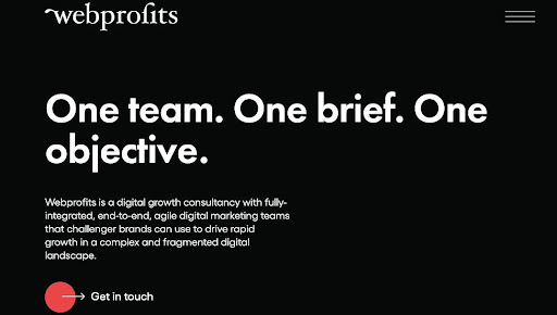
For us, an unmatched example of visual hierarchy on a service landing page is Web profits. The pitch-black background works better than an image or video to push the reader into reading their tagline and about section. Then it’s followed by a visual appeal with video and graphics to gain the user’s attention and a perfect CTA that stands out with a pop of red.
8. Make your UX copy persuasive
The content on your landing page will explain to the visitor what your company and products are all about. You have something that they want, so use it to your advantage. This is where understanding the psychology of UX writing makes a significant impact.
The secret UX principles depend more on writing than on design. This sounds simple, but effective UX copy is more than just features. In today’s crowded, consumer-focused digital landscape, it’s not enough to say, “Click here or Register for this class now.”
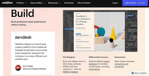
For UX copy to be compelling, it must be written to be felt. This design solves the experiential letdown of technical jargon by invoking human emotion. It creates compelling opportunities for users to seize and build on the insights and opportunities presented.
The landing page for Webflow is the perfect example of using UX writing and all other UX principles mentioned in this guide down to a T.
9. Use color contrast wisely
Every color has a place on the color wheel, which dictates which colors work. Using colors located at opposite ends of the color wheel can make reading easier for people reading something from a phone screen in bright light; a basic yet crucial UX principle is using color contrasts correctly.

When designing a website, you should avoid using certain color combinations. For example, combining bright red and blue or red and green is not a good idea. Chromostereopsis is a phenomenon in which different colors seem to be clustered together. This effect can create the illusion of depth in a picture or text, often negatively affecting users.
Take inspiration from Great Jones and use common color combinations that look pleasing to the eye, like yellow and black. Also, use color contrast for your CTAs to make them stand out more.
10. Write headlines that pull
Think about why your visitors should take action after hearing your call to action.
Then make it your headline. The campaign headline should accurately reflect what the ad is promoting, and the landing page should accurately reflect what the campaign promises.
Remember, the visitor was interested in clicking the ad in the first place because they saw your headline. So stay true to your proposal, and stick to all other UX principles to ensure your landing page converts!
Want to send big files?
Need a quick way to share large files and creative assets?
With GoVisually Share, it’s absolutely free! Try today.
GoVisually – effective collaboration makes great designs.
These ten UX principles are meant to help you create better user experiences. You can never know how a group of people will react to a landing page, but if you get buy-in from your team and clients, you’ll be able to find things you couldn’t find on your own.
Creative professionals should always be looking for feedback on their landing pages. To create the best user experience possible, you should continue to test your copy and design and make adjustments based on the feedback you’re getting to maximize conversions.
GoVisually is the leading platform for creative professionals, marketers, and designers who like to work on all things visual. An all-in-one solution for your team for effective collaboration, project management, proofing, and communication.
Revolutionize the way you collaborate on your UI and UX designs with the most advanced tools. Book a free demo with GoVisually and see how it works for your team!
