Very Peri - everything about Pantone color of the year 2022
In a world of dull, repetitive blues and reds, be a Very Peri.
The color expert Pantone picks a color from its existing palette to be the Color of the Year every year. This color then sets the trend: it dominates apparel, branding, decor, shoes, and even skincare.
This year is no different... for the most part. Pantone announced its 2022 Color of the Year in the last few weeks of 2021 - but with a twist.
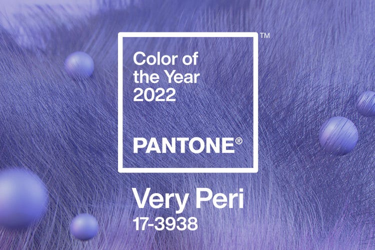
Instead of choosing a color from its roster, Pantone decided to debut an entirely new color for the upcoming year. Meet Very Peri, Pantone's Color of the Year for 2022, and the first color to be given the title right after birth.
So, what is it about this stellar shade of blue that qualified it for its status as the color of the year?
This article covers everything you need to know about Pantone's sparkling 2022 Color of the Year: Very Peri.
The rationale behind Pantone's "Color of the Year:"
Before we dive into the intricacies of this delightful shade of blue, we should take a look at what the Color of the Year initiative is and what is Pantone's rationale behind it.
Pantone first came up with the idea for Color of the Year in the 2000s, which means that this project has been around for over 20 years. Since 2000, Pantone has chosen color to be the Color of the Year.
The significance this carries is entirely monumental, as Pantone's selection for Color of the Year tends to be quite influential in all regards. It impacts the color and branding of many products across all industries, including fashion, home furnishings, and even industrial design.
But why is Pantone's Color of the Year such a big deal?
Well, the answer to that question lies in our surroundings. Pantone has stated that the Color of the Year reflects what is going around the globe each year.
The selection process involves color experts from the Pantone Color Institute to look at everything happening globally, which entails an in-depth analysis of trends, socio-economic conditions, art and culture, the mainstream media, and even the recent technological advancements.
The result is a color reflective of where we stand as humankind and resonates with billions of people across the globe. For this reason, Pantone's Color of the Year is likely to be the most popular color throughout the year. Whether product development or purchasing decisions, Pantone's Color of the Year finds its place in people's hearts.
And that is exactly what we expect Very Peri to do in the year 2022.
Very Peri: a description.
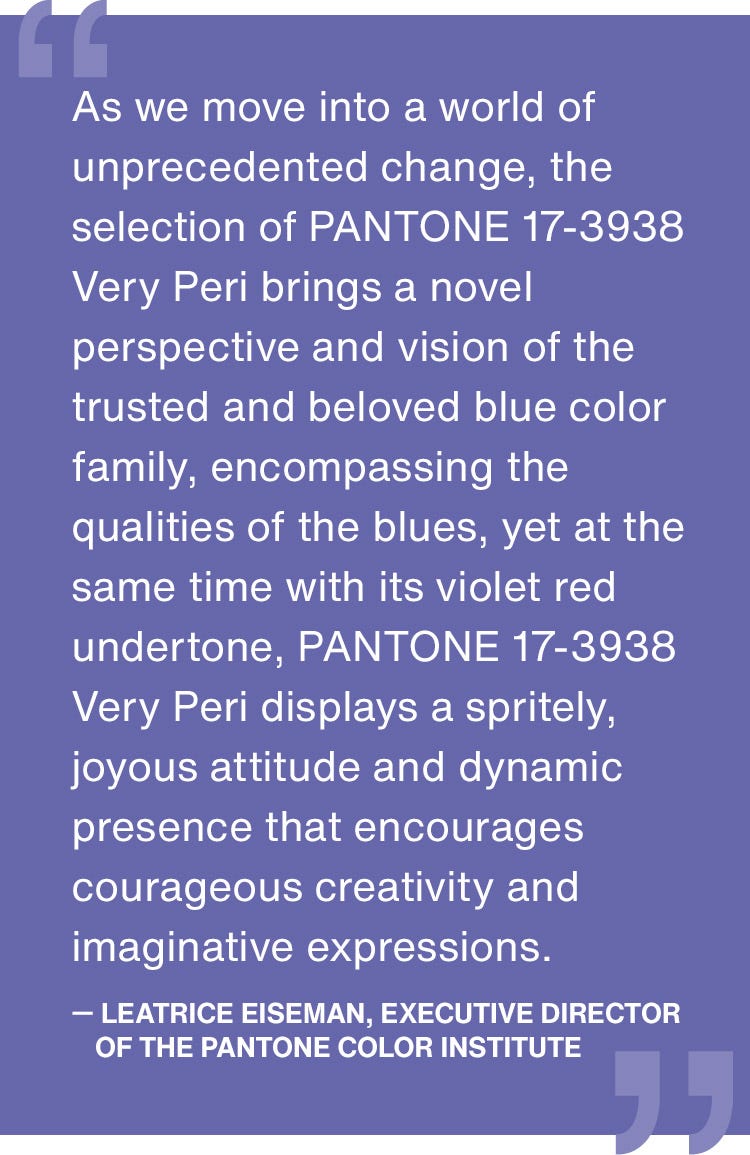
Describing a color is no easy task, but when it comes to its latest creation, Pantone does a stellar job. This is how Pantone has officially described the color:
Encompassing the qualities of the blues, yet at the same time possessing a violet-red undertone, PANTONE 17-3938 Very Peri displays a spritely, joyous attitude and dynamic presence that encourages courageous creativity and imaginative expression.
In actuality, Very Peri is an intriguing blend between a soft blue and a fierce red. It is quite reminiscent of lilac but carries slightly more depth than that. All in all, it is light and breezy on the eyes and has a strange, soothing effect on the viewer. It is natural for us to expect this color across multiple industries planning to attract a more extensive customer base.
But that's all very surface level. What was the reason behind Pantone inventing a brand new color for the Color of the Year this year? Well, according to the color expert, this decision stemmed from the unprecedented times we have found ourselves amidst.
According to Laurie Pressman, the Vice President of the Pantone Color Institute, the fact that a new color was created and then awarded the Color of the Year 2022 title is supposed to be a nod to the rapid global transformation and innovation we have witnessed in the past year. She states that as a society, we increasingly recognize color as a critical form of communication of ideas, emotions, and thoughts and as a way to connect with our fellow human beings.
As such, the Color of the Year amalgamates all the significant thoughts, feelings, and ideas expressed in the past year.
The theme of the Pantone color of the year, Very Peri is transformation
It's representative of something we have experienced in the past year and continue to experience as we move forward into the future.
According to Pantone, this particular shade of blue also marks our emergence from "an intense period of isolation." It symbolizes the evolution of our standards and the merging of our digital and physical lives.
Very Peri is from the blue family is also very symbolic. In the light of the technological revolution, the rise of the metaverse, and changes in the dynamics of the digital world, the fact that the Color of the Year 2022 is a beautiful shade of blue is no surprise.

Pantone color of the year's entanglement with the color blue
Ever since Pantone started its Color of the Year project, it has awarded the title to a color from the blue family many times. The first-ever Color of the Year in 2000 was Cerulean Blue - a chilly, blue color that instills a sense of calmness on sight.
Over the years, different shades of blue such as Aqua Sky, Blue Turquoise, Blue Iris, Turquoise, Serenity, Ultra Violet, and Classic Blue have taken the spotlight as the Color of the Year.
It might seem like a coincidence, but it makes perfect sense when you look into it! If you notice, many big brands, including tech giants, have blue branding. Facebook, Twitter, LinkedIn, PayPal, Samsung, Unilever, Ford, Pepsi, and even Oreo have blue branding. It's mainly because blue inspires a sense of calm, confidence, and professionalism. The color's association with tech companies is now automatically equated with technological and digital advancements.
It is no surprise that Pantone's choice for the Color of the Year title this year is Very Peri.
It's a brilliant, new, and refreshing shade of blue. It brings to the table everything that a "normal" blue would. But along with that, it also adds extra depth that can only be associated with everything we have felt over the past year.
Very Peri: already in use.
As expected, people are already jumping on the opportunity to use Very Peri. Many designers and illustrators on Behance and Dribbble have already uploaded work that uses this brand-new color by Pantone. Let’s have a look at a few top picks:
Very Peri, an illustration.
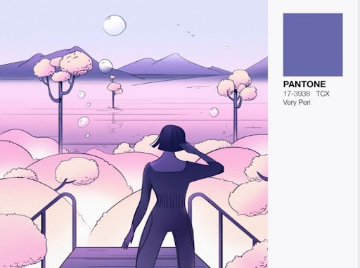
This illustration on Dribbble by Outcrowd is a beautiful piece of art that employs color very effectively. The artist pairs Very Peri with other soft shades of pink and purple, and the end result is a sight you simply can’t take your eyes off! This illustration proves that Very Peri is a color that is likely to instill a sense of calm and can elevate any illustration if used cleverly.
Very Peri and the space.
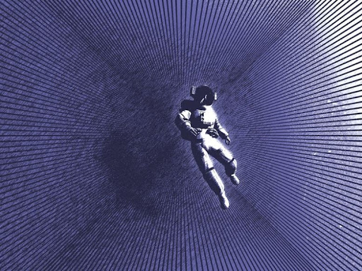
Another artwork using Very Peri that caught our eye is this. The artist (Alex Pufan for Nextiva) titles this “Gravity in three colors” and describes it as “some lines, an astronaut, and the Pantone Color of the Year 2022 mixed together in photoshop.”
We love it because it infuses different dimensions of Very Peri together: you can identify a sense of a nod to technological advancement as well as serenity in this digital painting. Amazing!
A series of paintings in Very Peri.

Our third and last pick is by iclick art on Behance. This one’s a series of digital artwork and illustrations that uses Pantone’s, Very Peri. The paintings are quite quirky and use Very Peri in the best possible way! Mostly, the color is paired with pink, a pastel orange, and a dark purple: a combination that elevates Very Peri and brings it to the forefront in each of these digital paintings. Hats off to the artist for a job well done.
Looking ahead...
We can only speculate, but from where we see a hit! It is unique from where we see it is likely to be the primary color of many branding kits across different industries. If you are a part of a creative team, you should play around with Very Peri for future projects.
And for the best results, you can execute your very colorful project with GoVisually!
Good luck and a happy new year!