In the ocean of websites on the internet, 200 million to be precise, your website needs to stand out. It’s no longer to have a functional website, designers need to work extra hard to make sure their web designs stick out from all the other sites out there.
Creating a good website goes beyond getting all the technical details ironed out. We mean things like speed, security, data safety, etc. While these are extremely important, they alone don’t help your website achieve its purpose.
Your website needs to market your product or services just as much as any other channel your audience engages with your brand. It’s the primary representative of your brand for the biggest audience out there; the internet. The ‘face’ of your brand needs to make an excellent impression to lead potential customers through the conversion funnel.
Don’t get us wrong, we’re not simply talking about visuals here. Web design goes much deeper than creating a ‘pretty’ website, and it’s about creating an experience.
Before we get into the top design concepts for inspiration, let’s discuss what constitutes a ‘good’ web design. Here are some helpful tips!
Cut design & video review time in half
Try GoVisually free today!
Table of Contents
Web design: 5 things you need to know
Here are some things you need to know to understand better how to create an impactful and successful web design.
1. Branding
Make sure your branding is consistent throughout the entire website. This should be easy if you’ve already got a set of brand colors, fonts, and graphic styles. This gives your website a more professional look like some thought was put into the web design.
Think of branding as the glue that holds your content together, making your business look uniform, consistent, and well-established.
2. Color association
If you haven’t done the branding for your business, it’s time you start. Branding establishes an identity for your brand. There’s a reason why branding is considered such an integral box to tick off when setting a business. One of the most important ones is brand recall.
Your web design needs to incorporate the right colors that help customers make the correct associations. You want your target audience to recall your brand by specific identifiers too. These also include colors and fonts that help your customers remember you better.
Since you haven’t picked out your brand colors, use the psychology of color in web design as a guide.
3. Split test for navigation
When it comes to navigation and the menu interface of the website, you’ll need to do some experimenting. While most users prefer minimalistic web design, you still need to gauge what your target audience in particular prefer.
Split test with different variations and determine which navigation option works best, complements the design better, and helps your website perform better.
4. Typography and fonts
While it’s common sense to assume that users prefer clean, legible fonts and typography on websites, it can differ based on demographics.
For example, a younger audience is likely to gravitate towards poppy, trendier fonts, and interface. On the other hand, an older or more corporate audience will gravitate towards something more conventionally professional and minimalistic. This also differs based on your niche and whether your business operates B2B or B2C.
The typography and font you use help establish your brand’s personality, whether your brand wants to appear fun, creative, and trendy, or severe and polished.
5. Attention to detail
What makes a ‘good’ website ‘great’? Attention to detail. Web design is not relegated to the big stuff, like colors and fonts, good web design considers every minor detail. Every detail needs to complement the overall design of your website! One helpful tip is to take a tour of the entire website yourself from a user’s perspective, you’ll see what detail sticks out and doesn’t quite ‘go’.
Alright, now that we’ve got the basics covered, hopefully, you have some frameworks to build web designs around. If you’re a web designer who designs websites for various brands, it’s essential to research and get as many insights about the client’s preferences and audience as possible.
As is inevitable with every creative field, getting stuck in a creative block is easy. And when your career depends on your creative juices flowing, it’s an emergency! Worry not, we’re covering some of the best web design concepts we’ve seen this year that are guaranteed to inspire you.
Best web design concepts 2021
As the end of 2021 approaches, use these web design concepts to guide your creations in 2022. Let’s get started with the best web design concepts for beginners to take inspiration from.
1. 3D
Website design has come a long way, many web designers have branched out of 2D and 3D design.
You might be thinking, 3D websites have been around for decades. And while you’re right, new developments in code have made it possible to make the 3D design more seamless and exponentially more impressive than 3D design in the past. In 2021, we saw some fantastic 3D website designs.
Totem’s website is an excellent example of how far 3D web design has come. This is a truly unique website, backed by impressive creativity and the right design to help it shine. The website only gets better as you scroll through the sections and pages.
The design is brought to life against the dark backdrop of the site, bringing the elements in cohesion with the overall theme of the website.
Pocket Verse’s website
The same is the case with the Pocket Verse website.
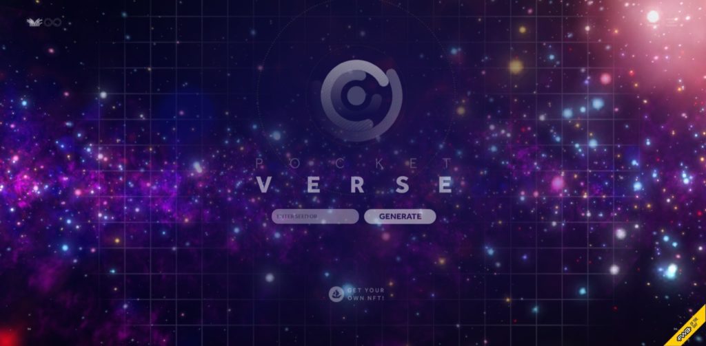
Pocket Verse is a design project created by Karsten Weils. The website is a one-of-a-kind experience; Weils brings outer space to life, complete with fictional planets and mythologies.
Weils database of planetary bodies is remarkable for its attention to detail and stunning web design carrying her ideas. As you can see with both above-mentioned web designs, there isn’t a ton of text on the screen. This is an intelligent decision; letting the 3D design shine. The darker tones in both cases are intentional; since both websites are grounded in science and technology, the branding fits the stellar web design.
In case darker aesthetics are not your cup of tea, let’s take a look at one of the best 3D web designs that set brighter colors.
The Photo Vogue Festival’s website
The Photo Vogue Festival website is a sight to behold. The website is an immersive experience dedicated to promoting creativity and design. The eye rotates three-dimensionally as you scroll, set against a muted pastel background that pulls the design together.
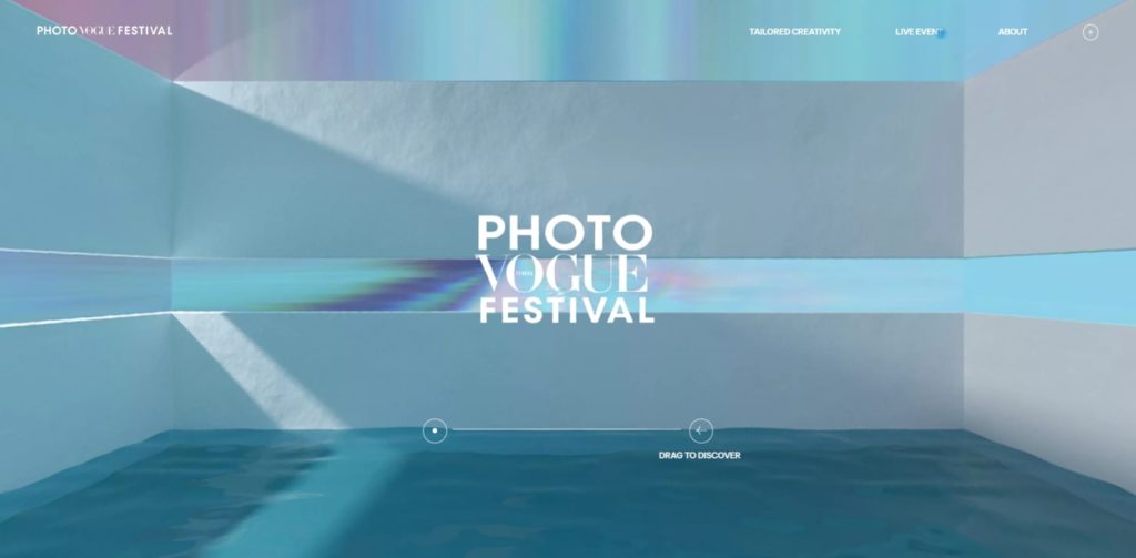
It’s simple and elegant, and we highly recommend you check it out for yourself!
An upcoming design trend we’re seeing is the use of pastel tones. Pantone’s Color of the Year for 2022 is Very Peri, a beautiful powder blue and lilac mix. The color is soothing to look at, so we agree with Pantone in assuming it’s going to be seen a lot more in the coming year.
2. Multimedia use
The concept of using video and motion graphics for websites has become a popular trend. Like the psychology behind using 3D web design, web designers also use multimedia to turn websites interfaces into more of an ‘an experience’. We can all agree that no other rich media captures the digital audience like video, and brands have clocked in on that! Let’s look at one of our favorite websites; the Human Interaction Company’s website.
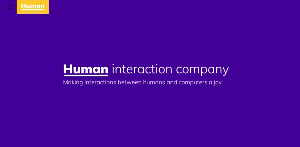
The website opens up to a video on the homepage’s first section, so it’s the first thing you see, immediately capturing your attention to find out more about the brand. The bright colors throughout the site’s interface carry straightforward, trendy content.
As you open the menu, there’s another video playing on the right side of the screen. The purpose of the videos is not to capture the user’s attention but to establish a brand identity and personality.
The Human Interaction Company is trendy, current, fun, and entertaining. These characteristics can be inferred from the first few seconds you spend on the website, making the web design pretty genius if you ask us!
3. Parallax scrolling
Parallax scrolling is where the elements of a website move at different speeds as you scroll, making the design appear three-dimensional. This is an excellent web design idea for beginners. Even without 3D design and multimedia, designers have innovated their way into creating more depth in their work.
Let’s take Alex Dram’s website as an example.
The website begins with four triangles set up against a plain background. The triangles unravel and reveal the text and content below as you scroll.
The triangles reassemble into a paper airplane-like cursor on the screen! Alex Dram is a UI/UX designer, and the website acts as the perfect portfolio to showcase his talent and creativity.
Webflow’s art and history website
Let’s look at another of our personal favorites; Webflow’s web art and history website.
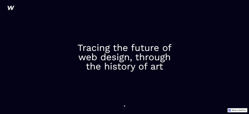
The website is an immersive journey through the history of web design. The parallax scrolling takes you through each segment, the screen transforming as you scroll down. We highly recommend seeing it for yourself, so no spoilers!
Parallax scrolling is a compelling concept because it makes your interface look like it’s not simply switching sections, but the UI is transforming on the same screen, in the same section. It gives web designs more depth and room for creativity than flat designs.
4. Minimalism
Imagine clicking onto a website and landing on a page crowded with text and elements. You’ll probably immediately be compelled to click off and opt for a more straightforward, easier-to-understand interface instead.
Readability is an essential determining factor of how long users stay on your website and how ‘interested’ they are in what you’re saying. It’s not a secret that internet users have short attention spans and quickly get bored. Your bounce rate will shoot up if your website is boring, which does not bode well for your SEO.
Designers have clocked in on the benefits of having minimalistic website designs. When a user clicks onto your website, your website needs to feed them information in bite-sized chunks to make it more digestible, easier to process, and understand.
Let’s take a look at some of the best minimalistic websites on the World Wide Web (in our humble opinion).
LA Art Box’s website
The LA Art Box’s website is a perfect example of what we mean by minimalism. The screen is not entirely bare, but only the necessary content is there. The LA Art Box is a creative project that holds art gallery events and creates immersive experiences.
The website’s homepage has three sections that deliver all the necessary details one by one. It’s also interesting to note that the interface uses horizontal scrolling, which feels kind of like flipping through a book!
Since the website is only meant to lead the customers to the events, it achieves that simple purpose ideally, with a call to action placed on the first section of the homepage.
Mia is an e-commerce beauty and skincare store. The website follows a remarkable minimalist web design concept. The opening words on the homepage are actionable enough to have the user scroll down.
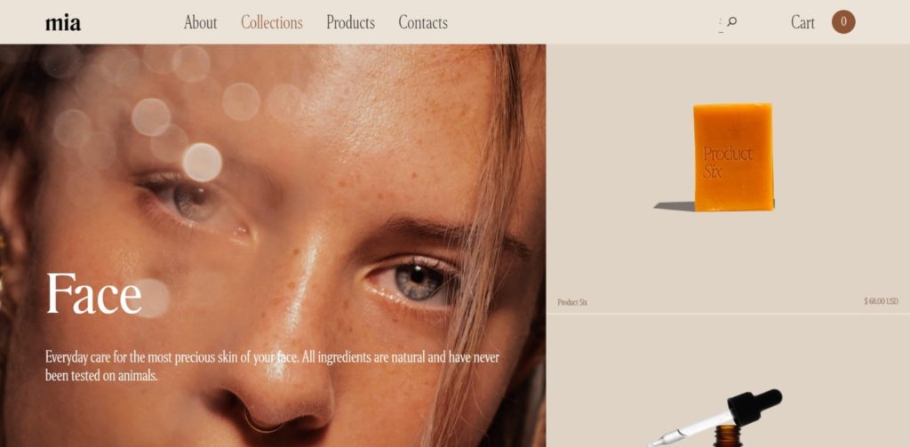
The sales pages follow the same concept; everything is simple, to-the-point. The muted tones make the website even more aesthetically pleasing, forming the brand’s personality as a catalyst to relaxation, wellness, and beauty. The following sections jump into the brand’s unique selling points (USPs).
Final Takeaway
Alright, that was our rundown of some of the best concepts for web designs we’ve seen in 2021. If you’re struggling with creative block, we hope these websites delivered the right boost of inspiration you needed. As 2022 approaches, we’re excited to see what other innovations we’ll get in web design and web design concepts.
Want to send big files?
Need a quick way to share large files and creative assets?
With GoVisually Share, it’s absolutely free! Try today.
