The New Day – Kofi Kingston, Big E, and Xavier Woods have formed one of the most charismatic and in-ring gifted tag teams in the current era. The WWE is promoting them as possibly the best tag team in history, but it’s hard to ignore the dearth of quality tag teams during their runs, and that’s the lack of competition is the only thing holding them back from ranking higher.
One thing that makes New Day fans scream with love is the out of the box, funky, splash of colour and toons they brand themselves with. So we reached out to the team behind this surreal but stunning branding. Art director at WWE Corp, Josue Diaz shares the story behind his team’s work on this iconic design.
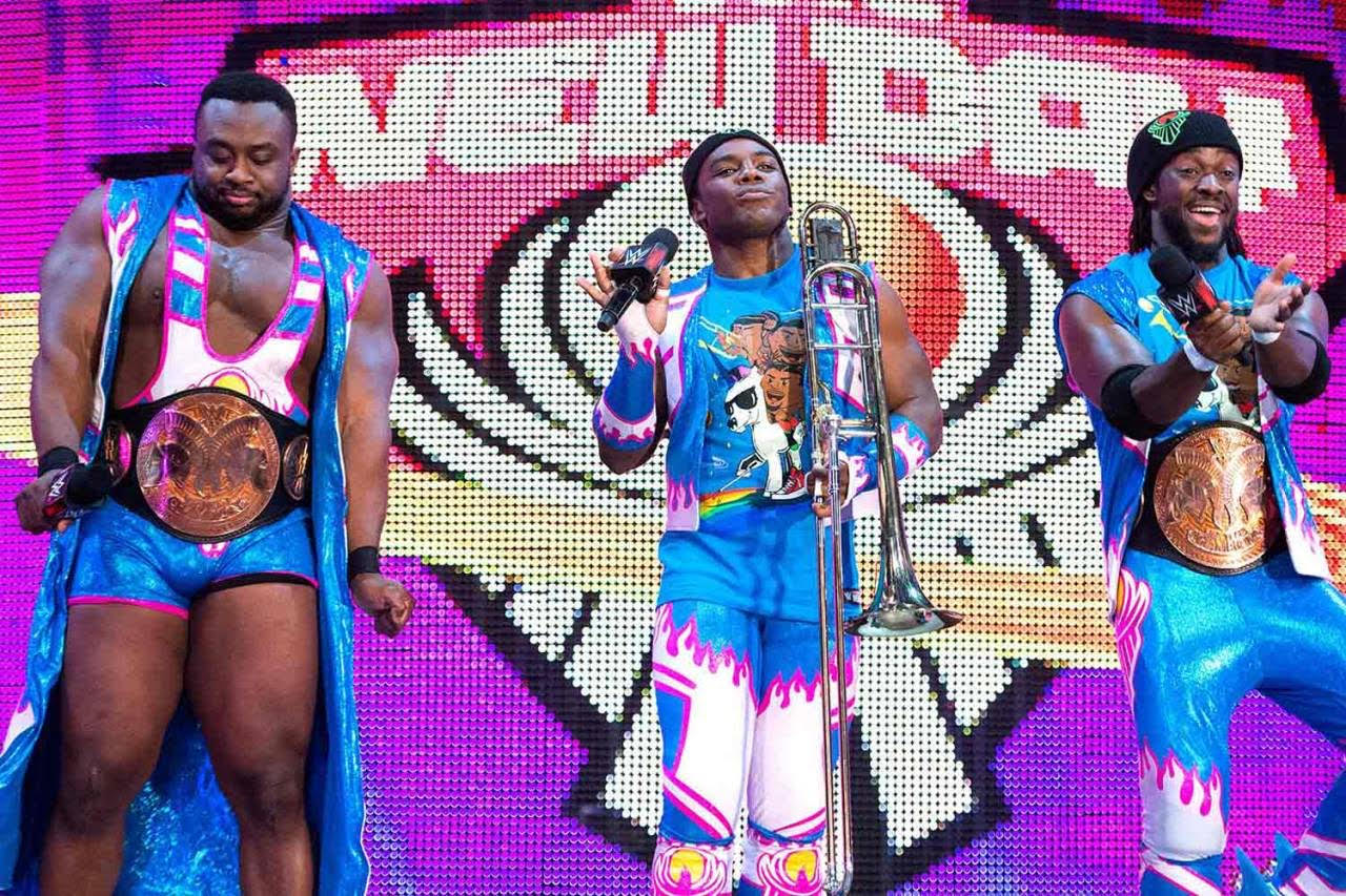
Table of Contents Josue DiazArt director at WWE CorpI’m going to talk about the designs we came up with for the WWE tag team ‘The New Day’. |

The project briefing
Our project briefing was direct from the talent themselves, they wanted to be branded as outlandish, with a positive and fun approach. At the time their branding was more conservative, they felt it lacked identity, so they wanted us to come up with an eye catching memorable design that would immediately make people recognize The New Day.
Finding inspiration
Xavier Woods, one of The New Day members, had an idea to explore the idea of the team sitting on a unicorn – pretty memorable! Creative went from this lead and we pulled swipe, searching online for inspirational ideas. I create mood boards, we fill a wall and we brainstorm. This happens for every talent branding. Then the VP of creative breaks it down for us and we begin our individual tasks. Every team member had a different task; Adam McGinnis created the characters, and I created the unicorn and surrounding aesthetics.
I found inspiration from my 5-year-old daughter, she is crazy about unicorns! The style I was drawn to was the new My Little Pony drawings, which my VP was also in to. I sketched it up and from there we just added outlandish detail after outlandish detail. It seemed like the more weird and far fetched we went, the better it became. The talent were really pleased and the creative team were all on board.
Tools used in creation
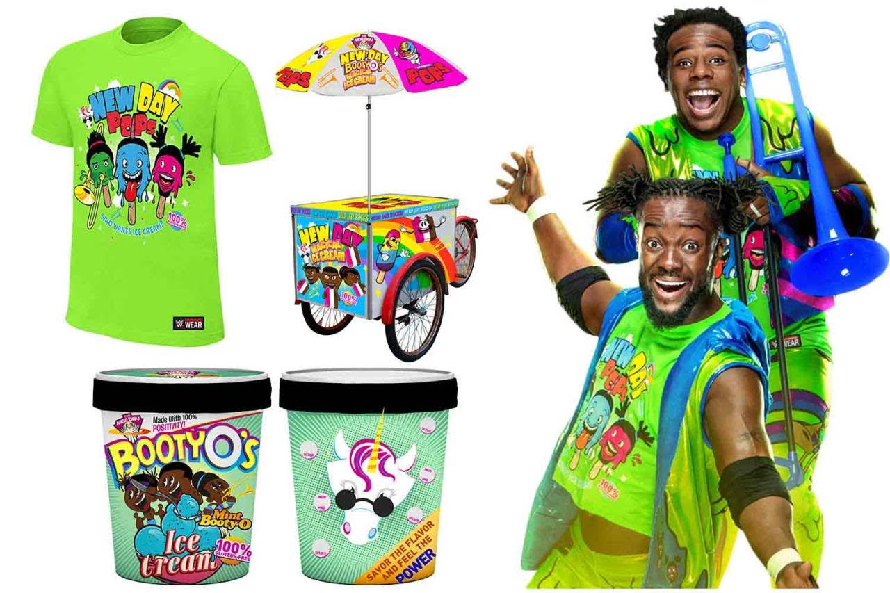
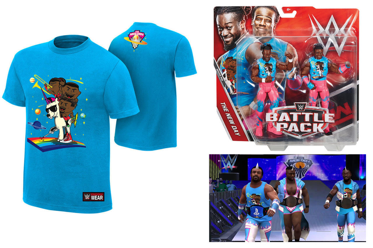
We used illustrator for the characters and photoshop for the other details. It’s all Illustrated, taken from inspiration sourced digitally. The New Day branding was such a hit that their merchandise is one of the most popular wrestling tag team products. It has been used on T-shirts, figures, ice cream containers and they even have their own cereal box.
And Result?
The New Day wanted a crazy design that would make people look twice and still be confused so that is was we gave them.