4.85 star rating
Deliver creative work faster, without the chaos
Transform your review process with collaborative tools for designs, PDFs, and videos - get to final approval in half the time

Trusted by 10,000+ teams
worldwide to deliver projects faster


Centralized feedback
Kill email threads forever. All feedback in one place – no more chasing 12 versions of ‘final_final_v3’”
Rapid approvals
Turn endless review cycles into 24-hour sign-offs. Clients approve work 50% faster (even the picky ones)
Client collaboration
Let stakeholders mark up PDFs, videos, and designs – without logins
Version control that doesn’t suck
Manage multiple versions effortlessly, allowing you to track changes and maintain consistency across projects.
The Old Way
GoVisually way
Get to "Approved" 2x faster
Everything you need to collect feedback, get approvals, and ship great work - minus the usual headaches
Visual Precision
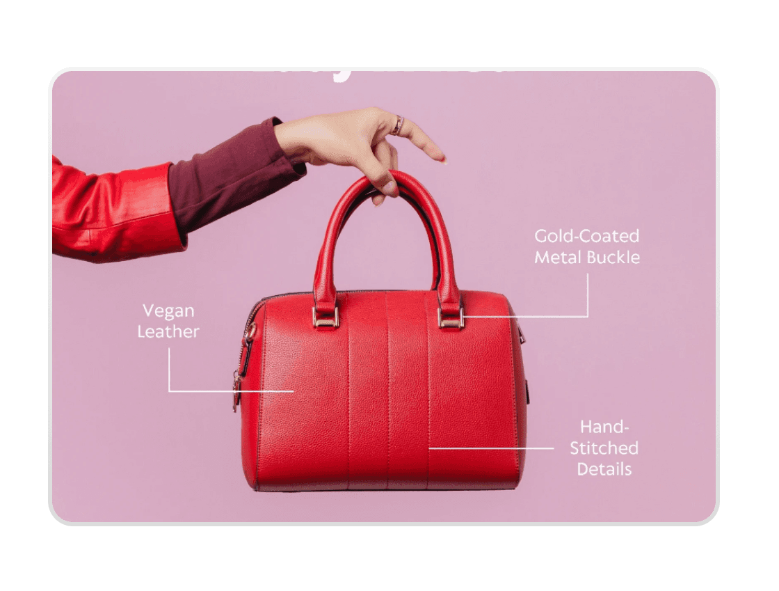
Mark up designs, PDFs and videos with pinpoint accuracy
Annotate images, PDFs, and videos directly
Precise comments for crystal-clear feedback
@mentions and file attachments for enhanced clarity

Effortless Sharing
Securely share with reviewers with a single click
No account required for external reviewers
Secure, customizable access controls
Mobile-friendly interface for on-the-go collaboration

Streamlined Approvals
From feedback to approved in record time
One-click approval or rejections
Automated notification system
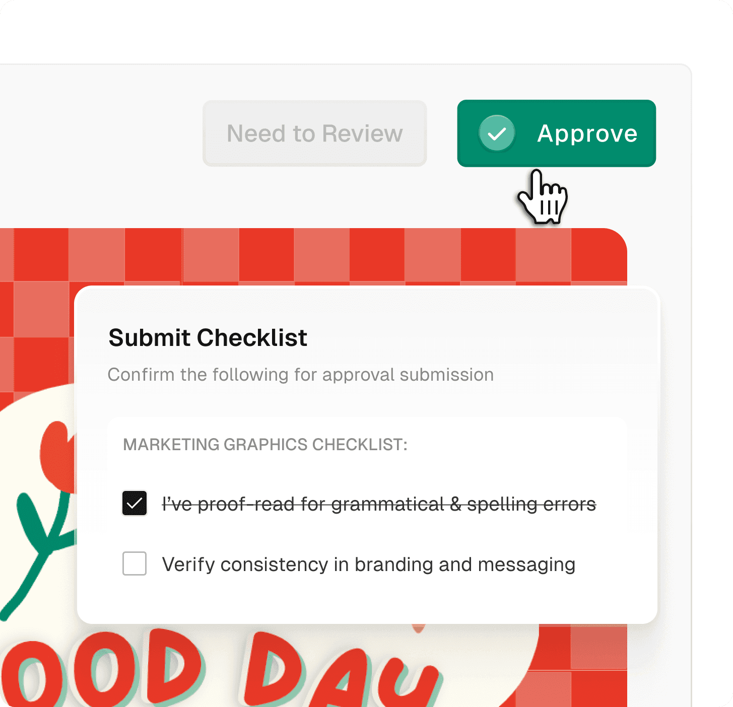
Create approval checklists
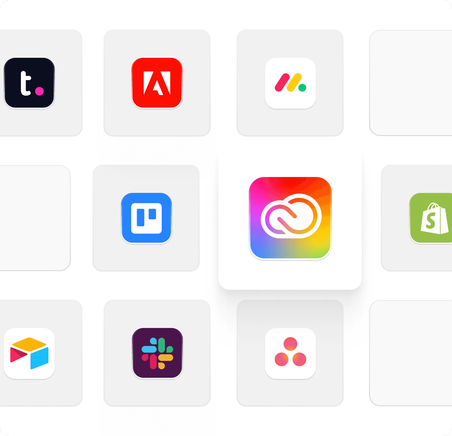
Seamless Integration
Works where you already work
Native Adobe Creative Cloud plugin
Connect with 3000+ apps via Zapier
Native Asana integration
Packaging and Labeling Teams
Breeze through compliance checks and complex approvals. Every detail tracked, every stakeholder aligned.

Marketing & Creative Agencies

eCommerce & Retail
Speed up your content production. Get quick approvals on product shots, descriptions, and campaign assets to keep your store fresh.
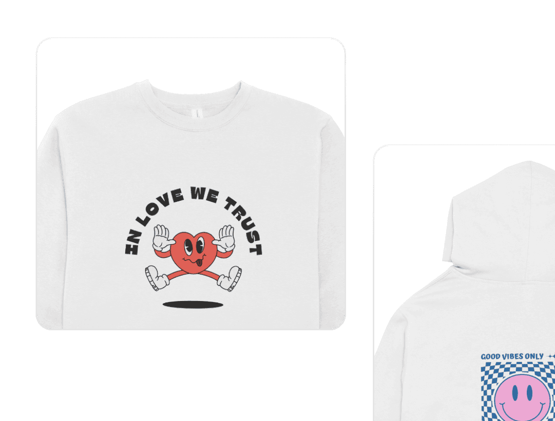
Apparel & Merch
Get instant approvals on designs, mockups, and seasonal collections.
Video Review & Approval
Review videos frame by frame. Get precise feedback on every shot.

Detection of potential compliance issues
Real-time suggestions
Customizable compliance checklists
Unrivaled Ease of Use
Experience the industry's most intuitive interface. Get your entire team up and running in minutes, not
Human, Authentic Support
Say goodbye to chatbots. Our dedicated support team is always ready to help, ensuring your success.