In 2009, Tropicana tried its way into rebranding its design to a more minimal design. The new packaging featured a minimalist design with a plain white background, a simple logo, and a small image of an orange.
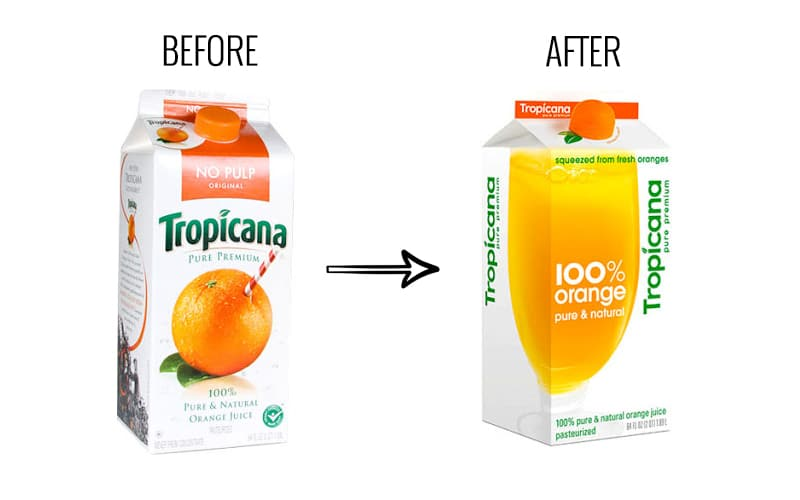
Despite a good intention to revitalize the brand, it did not work out well for them.
Consumers reacted negatively to the minimalist design, as it led to a lot of confusion and frustration. The new design did not reflect Tropicana’s identity, nor did it reflect that it was a juice box. The large image of an orange with a straw sticking out, did it no good either. They even saw a 20% drop in revenue as a result.
Wasting no time, Tropicana went back to its old packaging as soon as possible.
Case studies like these remind us that packaging design is a hefty task and should avoid any mistakes possible. That’s why we brought this guide for you to make the process smoother.
Table of Contents
Why should you avoid making mistakes in packaging?
At some point, we all have seen that “the internet never forgets”. It is one of the major reasons why a packaging design mistake could become a nightmare for your company.
So, let us understand the biggest implications of mistakes in packaging design:
1. Increased Wastage
As per a recent study, 60% of people globally value sustainability as one of the important criteria when they make a purchase decision.
However, packaging blunders make the company go the other way by increasing wastage significantly. Wastage is not just in terms of materials used but also the resources invested in the entire process.
If the product packaging’s quality is poor it can lead to spoilage of the product. In the worst-case scenario, you might have to recall the entire batch. Such cases waste a lot of monetary and natural resources. Consequently, also harms the sustainability goals of the company.
2. Bad Reputation
With social media spreading news like wildfire, any slip-up quickly goes viral. This makes it incredibly tough for businesses to control how customers and the public perceive them.
When a company messes up its packaging, everyone takes notice. The criticism and negative comments pour in from all directions. This not only damages their reputation but also shakes the trust customers have in them. That’s why companies must be extra careful and avoid such blunders in their packaging designs altogether.
3. Reduced sales
In a survey by Ipsos, it was found that 72% of Americans believed that the product’s packaging design affected their purchase decision. So, we cannot deny the correlation between the product’s packaging and the revenue generated.
If the packaging design has any mistakes, it creates a lack of trust from the potential consumers. When they are hesitant, they might not prefer to purchase your product. As a result, there is an instant effect on sales and revenue.
4. Consumer Discomfort and Negative Reviews
Technical glitches in packaging, like difficulty opening or closing, can cause real discomfort for consumers. Such packaging errors can not only frustrate the customers but also leave them with a poor product experience. Ultimately, it tarnishes the brand’s image.
For example:
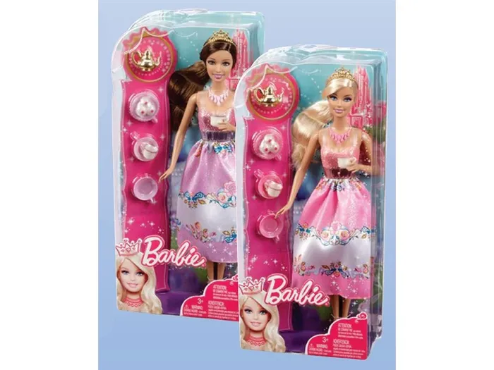
Children’s toys are often notoriously hard to open. These toys typically use tough plastic that leaves sharp edges when cut. This poses a safety risk as it can easily injure a child’s hands.
Such incidents often build up negative reviews online and offline. These reviews can make a prospect think twice before purchasing.
5. Lack of product differentiation
A well-designed package can set a product apart on the shelf. It has the power to stand out from other products in the same category.
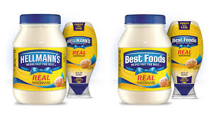
However, if your design is generic and similar to other products in the same line, like the mayonnaise shown above, consumers might mistake your product for someone else’s. Simply put, a similar design creates confusion which can reduce sales.
Deliver accurate & compliant
label artwork with GoVisually
Experience the simplicity of artwork review and approval process
Dodge These 8 Common Mistakes in Packaging Design
1. Generic design
If you use a generic CPG packaging design for your product, it will not differentiate your product from similar ones on the shelf. Take this one, for example:
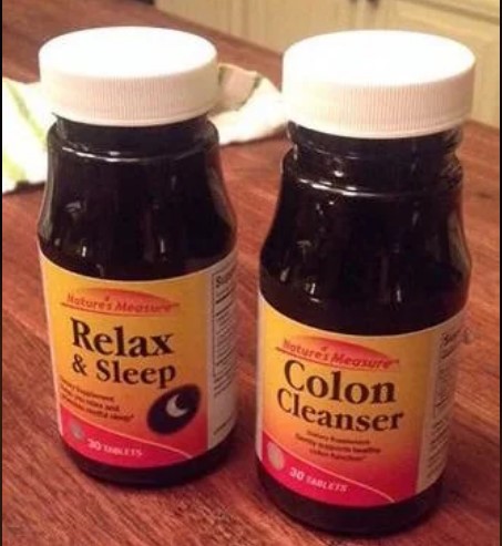
If they take the wrong pill due to confusing packaging, they will regret buying from your brand big time. Not only does it create a negative impression, but it also starts a chain of bad-mouthing, which can lose you a current customer and potential prospects.
Another such example:
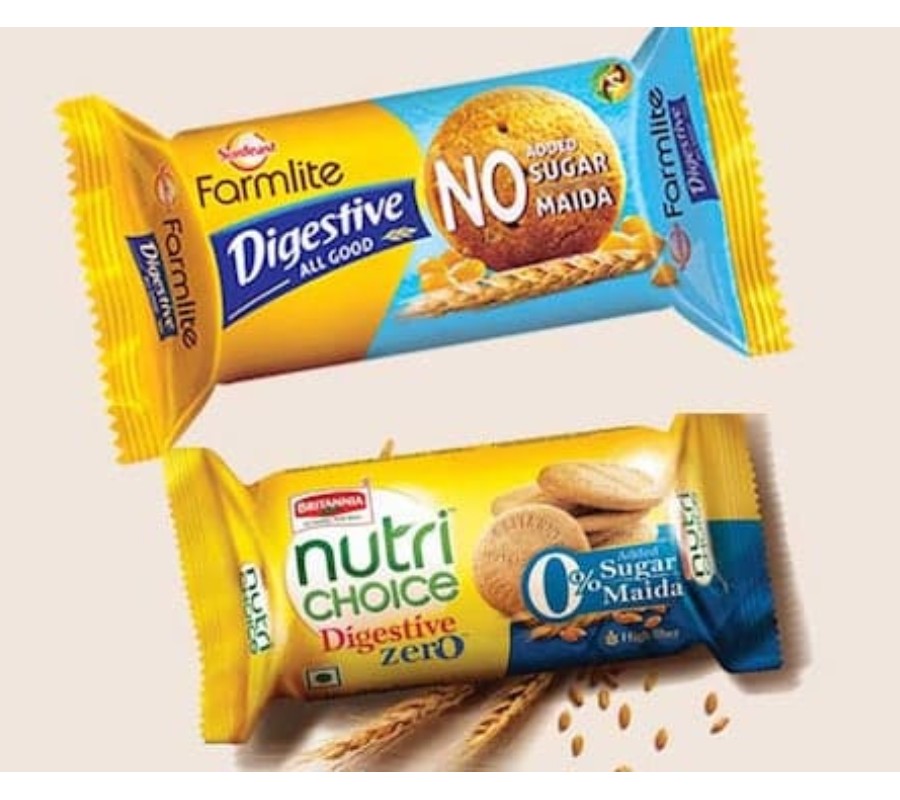
How to avoid designing generic packaging?
- You can easily avoid such mistakes by conducting market research before designing your product.
- From the data you collect in the surveys, you can discover the design trends of the product line and get ideas for your packaging. You can use these trends to merge with elements of your brand’s identity and create a unique design for the product.
- You can even conduct shelf tests to understand customer perceptions of the product to see if the product is being picked up in the store.
2. Misleading and Misrepresentation
There are so many instances where brands have tried to misrepresent or mislead what they offer. This could be in terms of quantity provided or the ingredients used.
For example:
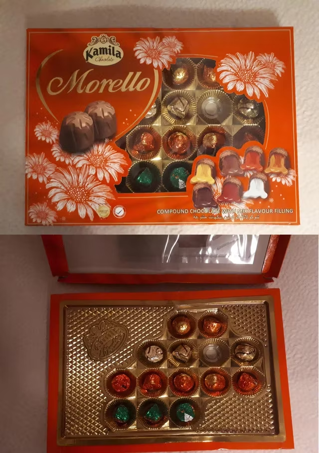
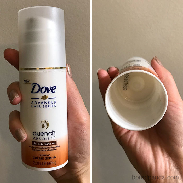
Such packaging designs can be mistaken for the ethical values the company follows in general. Once, a customer feels betrayed, it takes a lot of time to gain the respect back.
It’s because it could lead to:
- Decreased consumer trust and loyalty.
- Legal consequences and potential penalties.
- Difficulty gaining and sustaining market share.
That’s why it is said that misrepresentation is one mistake that has the worst long-term effects on the brand’s image.
Being smart when designing these products is okay. However, misleading consumers by building false expectations is not the same. The consequences are larger than the short-term profits it might gain.
How to avoid this?
- Ensure all product information is visible and accurate on the packaging.
- Regularly gather and consider customer reviews to address any concerns about misrepresentation promptly.
- Implement strict quality control measures to make sure that the packaging and actual product are consistent
3. Improper spacing, fonts, and visual elements
Design issues, especially in the case of how the packaging looks, can create a lot of havoc.
Take this, for example:

It is supposed to be a burn gel. But you have to put in a conscious effort to read it right.
Not only does it create confusion, but the company also becomes the joke of the day.
So, if the packaging you have designed is unintuitive and has spacing or alignment issues, it can create discomfort for the users. Such discomfort can make them hesitant to pick up the product from the shelves.
How to design the packaging with balanced spaces and fonts?
- To avoid this, use grid spacing to create a balanced design.
- You can even conduct consumer surveys to understand how consumer feels about the product, and what affects their purchase decisions
- Prefer using fonds that are easily readable. Bureau of Internet Accessibility suggests that Times New Roman, Verdana, and Open Sans are a few of the most easily readable fonts.
4. Unbalanced packaging
When it comes to packaging design, the right material balance is important to reduce unnecessary wastage. This goes for both – monetary and material wastage.
Redundant wastage is particularly common in the packaging of goods ordered from e-commerce websites.
Have a look at this one:
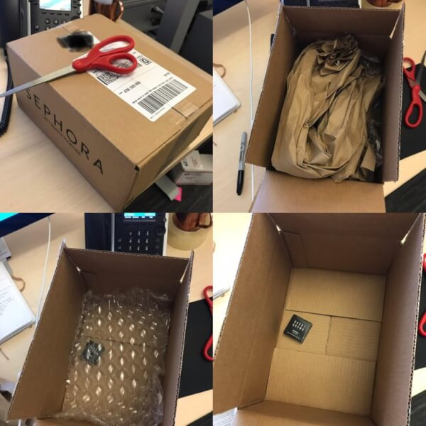
In this, packaging so many layers are used to pack just one small makeup sample. This is a classic example of imbalance. These additional layers are simply going to be disposed of by the consumer. For environmentally conscious consumers, this also creates a negative product experience.
How to get the perfect balance in packaging materials used?
To avoid this it’s important to understand the perfect balance required. To get this balance, you can:
- Conduct rigorous testing with real-world scenarios. Such testing will not only ensure product integrity but should also improve consumer satisfaction.
- Try considering materials with minimal environmental impact, such as recycled paper or compostable plastics.
5. Confusing packaging
A packaging’s design should clearly reflect the product inside. An overcomplicated design just creates needless confusion. It could be because, in an overloaded design you have no idea what to focus on.
Have a look at these:
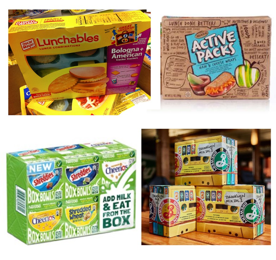
On the first look, no one can tell what the product is.
A good packaging should be intuitive and help consumers find out what the product is at first glance.
How to avoid a confusing packaging?
- Use graphics that directly depict the product inside the packaging.
- Avoid abstract or overly stylized designs that obscure the product’s identity.
- Put yourself in the shoes of the consumer and consider what information would be most helpful and relevant to them. Design with their needs and preferences in mind to create packaging that resonates with them.
6. Wrong type of material and structure
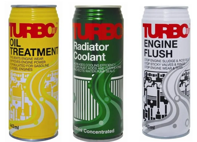
Cans for engine oil?
At first glance, any can looks like a beverage because that’s how we are conditioned.
Such mistakes of the wrong type of material used can create unnecessary confusion, again. If consumers mistakenly use the product for unintended purposes, such as drinking engine oil from a can designed for beverages, it could pose serious safety hazards and health risks.
How to avoid using the wrong type of material?
To prevent this, you can conduct market research and surveys to find the type of design consumers prefer most. This will help you streamline your choices and push you to make a more successful design choice.
7. Typos
Typos are mistakes that can be easily avoided by proofreading the content of the design. Some typos are negligible and are ignored. However, others can create a lasting impact on the way consumers look at the company’s strife for quality.
Have a look at these two products:

It should have been Cream Classics Minis. Instead, it is “mini’s.”
Such small errors might make the consumers rethink the product and brand quality. They might think that if the brand is negligent about something like this, it might as well not be a good brand.
Similarly, the same mistake can be seen here:
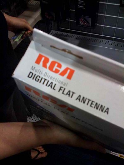
How to avoid typos in the packaging?
- Carefully proofread all text and content in the design before finalizing.
- Use spell-checking tools and enlist multiple individuals to review for errors.
- Make a style guide outlining preferred spellings, punctuation rules, and formatting conventions. This will help you to maintain consistency across all materials used by all the products of the same brand
8. Unreadable print
Print and text that is difficult to read pose a great risk, especially in consumable products like foods and beverages.
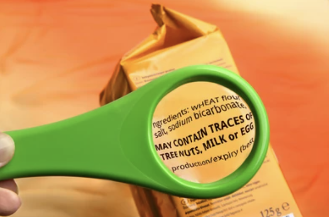
For example, if the food label has ingredients written in a font that is difficult to read or has a small font size, then people might ignore its potential allergens.
Illegible prints and labels like these can affect the consumer’s health if they get a bad reaction. This can lead to bad word-of-mouth if the consumer is affected by it and brings this to the public attention.
How to improve the readability of the packaging?
- Always keep essential information like ingredients, license information, and possible allergens in easy-to-read fonts.
- Test readability under different lighting conditions and viewing angles.
- Use high-contrast colors between text and background to improve readability
To conclude
The competitiveness of the consumer goods industry makes it a sector where only the best packaging designs can exist. Competitors not only fight to be spotted first on shelves but also to be remembered by the consumers. This strife is why CPG companies need to be extremely cautious when making their CPG packaging design.
If the CPG packaging design goes wrong, it will make your company look bad and maybe a meme. Not only does this give a bad reputation, but it also reduces sales and revenue instantly.
That’s why designing packaging is one of the toughest tasks. A designer has to live up to a lot of conditions and details expected in an ideal design. Some of the most important points are that the packaging should be:
- easy to use,
- clearly reflect the brand’s identity,
- and communicate the purpose of the product clearly to the target audience.
If the design perfectly balances these conditions, then it can make the consumer experience a good one.
But, to achieve the perfect design, companies should avoid any kind of mistakes possible as well. That’s why we brought this guide for you, to discuss the 8 common mistakes in CPG packaging design and how to avoid them.
And, if you are looking for the perfect tool for your designing your CPG Packaging design, then check out GoVisually. It is one of the best tools to design CPG packaging, as it helps to maintain brand image and consistency.
With features like global settings, revision tracking, comparison mode, and more, we were able to simplify the creative process for brands such as 2San, IBrands Global, and Viori.
So, don’t wait! Check out GoVisually now!
