Irresistible Packaging Design from TRIP
It's not every day that you come across a can that you can't take your eyes off. Yet here we are, the moment I saw these cans from TRIP, I just couldn't look away. The minimalist design.. simple colours and.. matt finish.. I mean who can resist? I honestly would like to collect and line up these cans on my desk someday.
Anyway, I got curious. So, I reached out to the team behind this amazing work to know more about how they came about this design. Katie Edmunds from TRIP was kind enough to take my questions to the team and show me the art behind the iconic TRIP can.
1. The Project
We wanted the look and feel of our products to represent the feeling that TRIP gives you. That meant using muted pastels, calming visuals and soft-touch packaging, which all feature on both the sleeves of our cans and our newly launched CBD oils. We wanted everything about the product to reflect TRIP’s values of being playful, aesthetically pleasing and most importantly, high quality.
When we first launched our drinks, a majority of the products on the market were male-orientated, decorated with green logos and cannabis leaves. We wanted to create a product that would fit into your life seamlessly; something that wouldn’t look out of place on your desk at work, in your local health or grocery store, in a yoga studio, or in a bar or restaurant. While the most important aspect of our products is authentic functionality, we felt it was important that our products provided an entry point into CBD, to those who may have previously found the packaging intimidating, or the messaging confusing.
Our products also had to be 100% recyclable, there was no compromise here.
2. Finding inspiration
The original product was created because we loved the effects of using CBD, having discovered it ourselves back in 2018, but we couldn’t find a product that fit what we needed and loved. Out of this passion and our hectic lifestyles (then working in big corporates in busy London) we created something beautiful yet convenient, a symbol to take a moment, take a TRIP and find happy days.
When initially designing our drinks we took inspiration from everywhere, from our travels (pre-lockdown), from time in nature and nostalgic moments. These things really resonated with the feeling that CBD provides, allowing you a small escape when navigating the everyday grind, taking that moment of calm in the middle of your day.
Since launching, we have built a large, engaged, online community and so their thoughts, feedback and messages have become our biggest inspiration. Our product resonates strongly with urban millennials who share many of the same experiences as we do in navigating the daily grind. We use our Instagram @trip.drinks as a strong platform to connect with our community, and create a uniquely playful and often dreamlike space filled with images that reflect the product design touchpoints and ethos of our brand.
3. The tools used
One of the main tools we used was Instagram, for inspiration and to keep track of trends. As a team, we constantly flick each other travel images and lifestyle inspiration over Instagram, so that we are always developing our product image and remaining creative and on the ball.
When it came to the initial design, the tools we used were not very technical! We used scrap paper and last remaining pages of old sketchbooks to collaborate and set out initial ideas and gradually built out the design that you see today.
4. Execution
Once we had built out a clear idea of our visual identity ourselves, we worked with an agency to iron out all of the details and bring it to life. Locking down typography, pantones and our logo.
We then found production partners that produce the highest quality, premium components to make our products. We don’t compromise on functionality or flavour so we didn’t compromise on design either.
5. What result this packing had
We receive lots of lovely comments on our packaging and branding, someone said we look like the Glossier of CBD, which was definitely a big compliment, but we do think we are uniquely TRIP.
In general, it’s really hard to pick apart what has resulted from the packaging, our voice and the product. The combination of all three is what we believe has gotten us this far, and led us to being a leading CBD brand.
We think that creating a product that looks at home in a bar, restaurant or yoga studio has opened doors that were previously not open to brands which played with cannabis iconography. We created TRIP to share a bit of calm in the everyday chaos and the designs bring that to life.
Our community loves TRIP because we try to focus on making the whole experience enjoyable, and that means focusing on creating beautiful packaging as well the taste, quality and functionality of the product.
The Team Behind TRIP
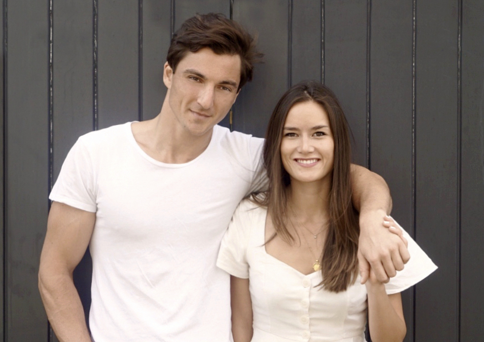
TRIP was co-founded by Dan and Liv, the lovely couple in the image above, and is managed by an amazing team of creatives and managers from London.
"We created TRIP to share a bit of calm in the everyday chaos. CBD experiences that are just as enjoyable to taste as the feeling after. Products with amazing flavour that leave you more productive, less stressed and more you."
Favourite Playlist:
A team favourite is ‘Lorem’ on Spotify, it has the tagline ‘music that breaks the rules, just a little bit’.
We nominate Fix8 Kombucha for the next feature article on GoVisually.
..