In the realm of consumer goods, packaging design is a make-it-or-break-it deal. Ever wondered why some products fly off the shelves while others gather dust? It’s all about the packaging. Think about it: when was the last time you picked up a product just because the packaging caught your eye?
Well, that’s the magic of good packaging. It’s like a silent salesperson, screaming your brand’s message from the crowded shelves (looking at you, Chobani). Be it dairy, drinks, or high-end beauty, one thing’s for certain: CPG companies are pushing the boundaries of innovation, offering consumers a wave of fresh choices. Here are some research-backed stats to consider:
- A whopping 72% of American consumers say attractive packaging design influences their purchase decisions.
- The design side of packaging is a multi-billion dollar industry, with a projected market value of $32.42 billion by 2030.
- E-commerce packaging is a significant segment, valued at $27.04 billion in 2020 and expected to reach $61.55 billion by 2026 [Meteor Space].
Therefore, getting it right is crucial to grab eyeballs anywhere. In this blog, we dive into all things CPG, discuss CPG packaging designs, and marketing strategies, and review brands’ case studies.
Table of Contents
Understanding The Power Of Packaging On A Brand’s Reputation
On crowded CPG shelves, aesthetics are just the beginning. Every detail matters. After all, first impressions stick. Here’s how effective design goes beyond the surface to fuel brand success:

1. Grab attention and build brand recognition
Effective CPG design creates a visual signature that resonates with consumers just like Dove’s instantly recognizable white and silver packaging. It’s almost like you can close your eyes and visualize the product! The brand recall value of Coca-Cola’s iconic red can is so strong because it grabs attention and makes your product stand out in a crowded aisle.
2. Packaging as a storyteller
Think of your packaging as a mini billboard, like the playful graphics and bold colors on a box of Kellogg’s Frosted Flakes. It’s a powerful tool for storytelling. Through visuals, colors, and messaging, CPG design can communicate your brand personality, values, and commitment to sustainability, just like Patagonia’s use of recycled materials. Consistency across product lines, like the minimalist aesthetic throughout the packaging of Apple, reinforces brand identity and builds trust with consumers.
3. Design with feeling in mind
Effective CPG design goes beyond functionality, it taps into emotions. Consider the calming blues and natural imagery often used on The Body Shop’s skincare products, conveying trust and tranquility. Playful fonts and vibrant colors on a Capri Sun pouch, on the other hand, might evoke feelings of fun and refreshment. Understanding design psychology allows you to create packaging that connects with consumers on a deeper level.
Showcasing How Brands Use CPG Design To Build An Identity
By strategically leveraging design elements, you can craft packaging that doesn’t just sit there but pops on the shelf. It might just be the secret weapon that propels your brand to the top of the shelf (and the hearts of your customers). Here’s how CPGs can leverage design to fuel their growth:
1. Usability matters
A beautifully designed box like the one holding a box of Godiva chocolates is only half the battle. User experience matters. Packaging should be easy to open, reseal, and dispose of. A poorly designed package that spills, leaks, or is frustrating to navigate can damage brand reputation in an instant. Remember, functionality is a key ingredient in building a positive user experience. Nobody wants to wrestle with a stubborn yogurt container, right?
2. Open communication is key
Today’s consumers are more conscious than ever. CPG designs that communicate ingredients, sourcing, and sustainability efforts, like the fair-trade certifications on ethically sourced coffee packaging, foster trust, and brand loyalty.
Highlighting eco-friendly materials or sustainable sourcing practices can resonate with environmentally conscious consumers. Think of it like an open dialogue with your customers – a way to build trust through transparency.
The Science of Colour Selection Behind Packaging Design
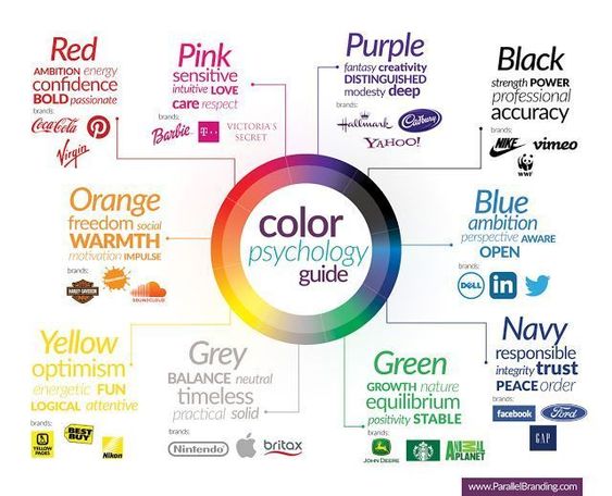
Imagine a shopper bombarded by a sea of packaging. Their eyes dart, searching for a familiar brand or something visually captivating. Here’s where color theory comes in. Studies suggest colors evoke specific emotions:
- Warm Colors: Reds and oranges are often associated with energy, excitement, and passion. Think of the bold red packaging used for energy drinks or the playful orange hues on children’s vitamin gummies.
- Cool Colors: Blues and greens evoke feelings of calmness, trust, and security. Imagine the calming blues on sleep aid packaging or the minty greens used for toothpaste.
- Black and White: This sophisticated combination signifies luxury, elegance, and purity. Think of the sleek black packaging of high-end cosmetics or the minimalist white cartons of organic dairy products.
By understanding these emotional associations, one can use color strategically to grab attention and subconsciously influence purchase decisions. But color isn’t the only player. Clear, concise messaging that highlights product benefits is equally important.
CPG Industry Examples: Top Brands’ Case Studies
Let’s dive into the world of winning CPG marketing campaigns and see how some brands strategically leveraged different tactics to achieve success.
1. Liquid Death: The Unwaterly Water
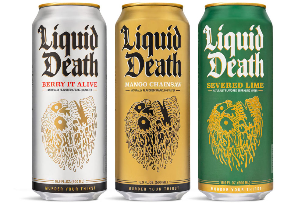
Image Source
This renegade water brand has splashed onto the scene with its wildly unconventional marketing tactics. Instead of boring plastic bottles, they dole out their flavored H2O in funky cans that look more like energy drinks than anything health-conscious. Their whole idea? Sell you healthy water by using the same in-your-face branding as those sugary swill companies.
- Challenge: Standing out in a sea of plastic water bottles.
- Solution: Liquid Death went rogue! They ditched the norm with funky, can-sized packaging that resembled energy drinks. This bold move, coupled with their dark humor and #deathtoplastic campaign, created a distinct personality and sparked curiosity. Their packaging, with skulls and vintage fonts, resembled a rock album cover, making it an intriguing new player in the beverage industry.
Key Takeaway: Don’t be afraid to break convention! Bold packaging choices can grab attention and set your brand apart.
2. RXBAR: Unveiling Simplicity
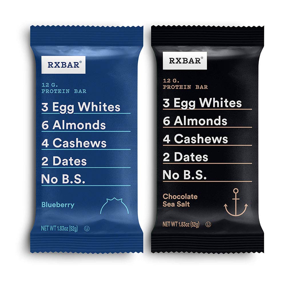
Image Source
RXBAR isn’t your average protein bar. This brand ditched the sugary, over-processed options and went for a clean, no-nonsense approach. They’re all about simple ingredients you can pronounce, packed into a bar that fuels your day.
- Challenge: Attracting customers in a crowded protein bar market.
- Solution: RXBAR revamped their packaging to reflect their brand values – honesty and simplicity. They ditched generic designs for bold labels that clearly showcased the key ingredients. This transparent approach resonated with consumers seeking a no-nonsense option. RXBAR became the go-to choice for a quick, protein-packed snack, solidifying its position as a trusted brand.
Takeaway: Transparency builds trust! Highlighting what’s in your product can be a winning strategy.
3. Oatly: Owning the Plant-Based Space
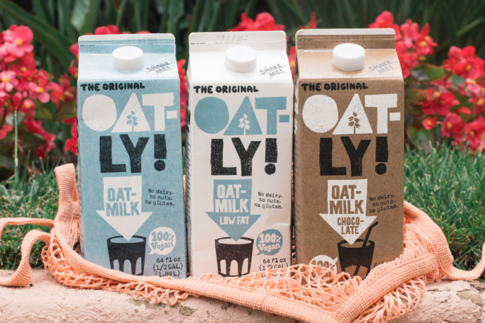
Image Source
Oatly ditched dairy to embrace the power of oats. This brand offers a full lineup of plant-based alternatives – milks, ice creams, even yogurts – that are perfect for folks ditching the dairy or just looking for a delicious, eco-conscious option.
- Challenge: Standing out in the booming vegan CPG market.
- Solution: Oatly embraced simplicity with eye-catching packaging. Soft colors and bold text ensured their brand name stood out. Their commitment to health and sustainability was evident on the packaging, with eco-friendly materials reinforcing their values and attracting environmentally conscious consumers. This approach not only fueled sales growth but also secured a hefty $200 million investment.
Takeaway: Aligning packaging design with your brand values can resonate with the right audience.
These are just a few examples of how other brands have leveraged creative marketing strategies to achieve success. By understanding your target audience and utilizing impactful packaging design, you too can make your brand stand out in a crowded marketplace.
Final Words
We hope the CPG industry examples above have helped you gain an insight into the world of packaging. Our blog section is a great resource where we cover everything from expert tips and industry trends to free, downloadable guides and checklists curated by packaging professionals. These resources can help you improve your CPG packaging design and make a strong impression on consumers.
