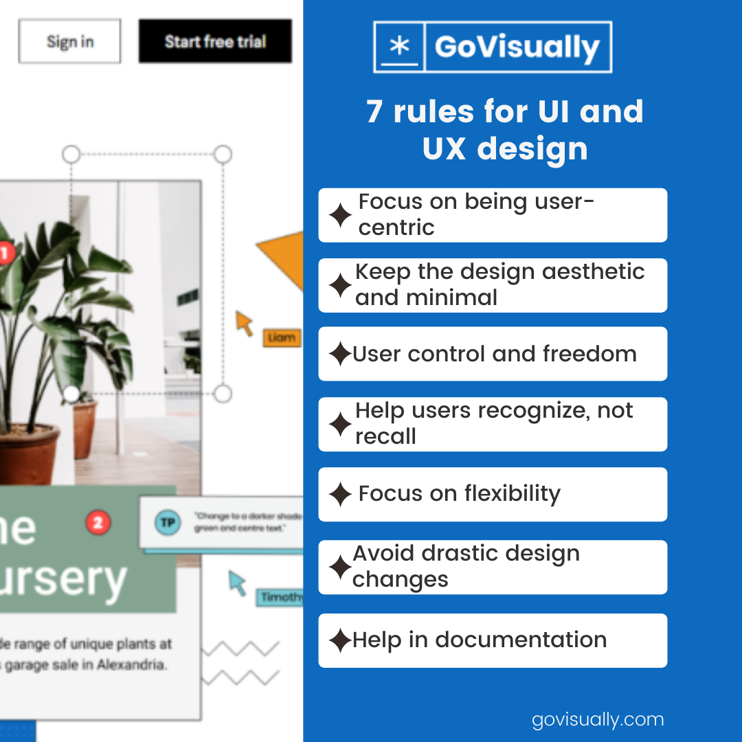
7 rules for UI and UX design to create stellar web experiences

Wondering how to excel as a UI and UX designer who can create unique and practical designs? You’ve landed in the right place!
That’s because today, we’re going to discuss the essential rules for UI and UX design that every designer should know of.
Any average user nowadays puts efficiency and simplicity above all. And that’s because as a user, when you’re rummaging through websites and applications, you want everything laid out exactly where it should be and meet your objective in record time.
And this is why a high-quality UI and UX design makes all the difference. It’s where the aesthetic elements of the interface (UI) blend with the broader spectrum of the experience a user had with a product or service (UX). If the two aren’t in perfect harmony with each other, you won’t be getting the results you want as a designer.
And while there are no hard and fast rules to excel as a UI and UX designer, there are some key elements that can give you a headstart. Let’s discuss them!
[elementor-template id="3538"]
1. Focus on being user-centric
The first step is always research. You have to look into the habits and preferences of the user and figure out the wants and needs of your audience.
That’s because figuring out what they find convenient and how they generally navigate online spaces will help you arrange site elements in a better way. You will lack the end product to project your behavior and reactions on the audience you don’t know enough about.
So, by gathering this information, you will also avoid the most common mistake designers tend to make: thinking that they are the user.
According to Jakob’s law (defined by the director of Neilson Norman Group, Jakob Neilson), you must design with familiarity in mind. There has to be a match between the system and the real world to do so, and according to Neilson,
“the system should speak the users’ language, with words, phrases, and concepts familiar to the user…”
To put it simply, when the user is trying to get the job done using an interface, the design and mechanics should annoy them as little as possible. Their imagery should indicate precisely what they are.
A good example is Apple’s Homekit icon shaped like a typical house that anyone can recognize. So don’t make the user do mental gymnastics to get to the items they selected while browsing an online store; the shopping cart icon button should take them to their online cart, and so on.

Another way to keep the experience smooth is by minimizing the number of actions needed to perform a task. The less they have to navigate, the more it will elevate their experience.
2. Aesthetic & minimalist design
A clean and visually pleasing interface is bound to make the user believe that the site is easy and convenient to use. The visual appeal of the design shapes their first impression, and the more unnecessary clutter they would face, the less likely they are to stay for long.
One way to look at it is that you are essentially adapting UI/UX for a short attention span. Combine the minimalist design with its usefulness and present the information displayed that isn’t fighting for the user’s attention. Instead, the design should redirect their focus to exactly what they came looking for.
According to Hick’s Law, too many choices lead to information overload and deters the user away from making any choice at all. That’s why the more simple the design is, the better. An example of this implementation is essential is a website’s landing page. Check out more rules you should follow when designing one, besides keeping minimalist functionality in mind.
Some ways to avoid creating a messy interface are proper alignment and color, brightness, and contrast to draw attention to critical features.
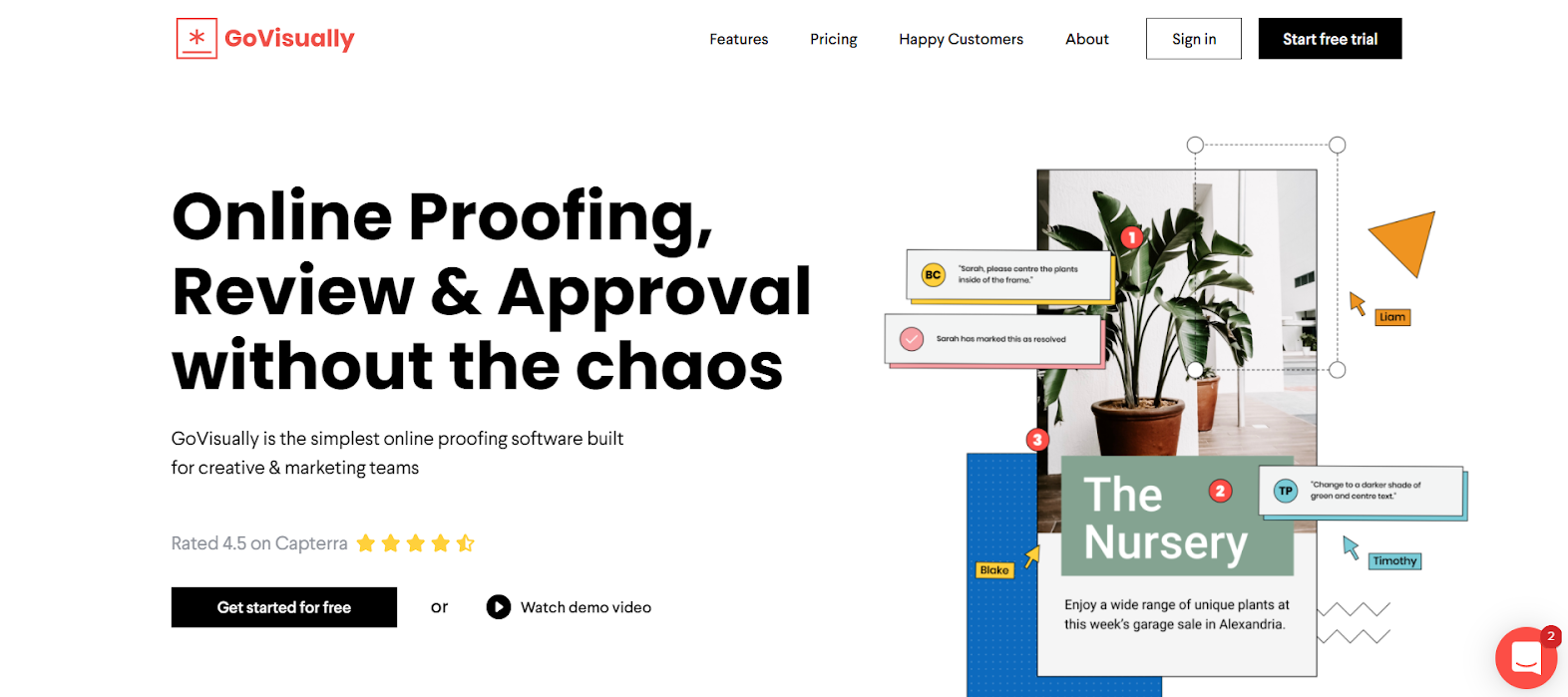
Just take a look at GoVisually’s landing page. You'd notice how there is a minimalist theme but a striking visual to catch the user’s attention, encapsulating the site. There are understandable action buttons to redirect the user depending on where they want to go and easy navigation options at the bar on the top of the page.
Keeping up a consistent theme on all pages is also important to avoid confusing users. In addition, this also helps to maintain brand consistency and have an added layer of professional vibe to the interface.
3. User control & freedom
Maybe it’s just an inherent part of being human, but users sure do love control. That’s why giving as much possible control over the interface to the one using it is one of the necessary rules for UI and UX design.
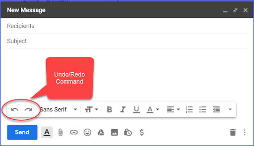
One way to do this is by allowing users to correct any mistakes they make quickly. Error messages should be displayed in simple language without getting into technicalities, and marked ‘emergency exits’ should be prominent. This will aid the user’s comprehension of the interface they’re dealing with and give them the freedom to explore it in peace.
Try using particular UI design patterns (for example, pre-fill forms, putting controls near the objects it’s controlling, etc.) to help guide the users and decrease the effort they’ll have to put in figuring things out. In some ways, you can never have enough backlinks, cancel, close, and undo options.
This circles back to keeping the user’s annoyance from a minimum to zero. Any situation that causes the user to feel trapped or frustrated is what you should avoid as a UI and UX designer.
4. Help users recognize, not recall
As mentioned earlier, always assume that the user’s attention span is akin to a goldfish. There’s no easier way to put them off than trying to get them to remember more than one thing at a time. At the same time, too much irrelevant information will increase clutter. So what’s the best way to go about it?
First off, understand that recognition involves familiarity while retrieving a memory’s details. The keyword here is visibility. The user won’t have to recall information from one part of the interface to another if the navigation options are displayed neatly on most pages.
Field labels, menu items, and other items should be easily spotted and retrievable when needed. This way, the user won’t have to waste time jumping hoops to get to something they forgot the location of.
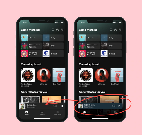
Take a look at Spotify’s article Small but Mighty: We’ve Rolled out Changes to the Now Playing bar to see how a good designer uses their expertise to address user navigation and flexibilities by implementing UI and UX design rules in their way.
5. Flexibility & efficiency of use
Remember the point about giving users as much control as possible? Increasing flexibility and efficiency regarding their commands is the second part of that.
The more flexible a system is, the more it controls the users to choose the best option. Giving users more than one option of getting the job done increases accessibility for both the experienced and non-experienced demographic.

Adding shortcuts, for example, increases the satisfaction for those who use them, speeding up the process. At the same time, with the lengthy but more straightforward route also present, it will avoid confusion for those with limited knowledge and give them another pathway to take.
6. Avoid drastic design changes
You don’t need to research much to know that if users despise one thing, it’s a massive design change that pop-up out of the blue.
Just take Twitter’s history of UI design changes over the past few years; initial reactions have always been terrible among the masses. Their more recent change last year in August, in the colorings of action buttons (such as “Follow” and “Following”) from blue & white to black & white, have also garnered backlash from users regarding the confusion they face while browsing the site.
So the bottom line is, design changes that improve the user experience, in the long run, are not a bad thing if done moderately and slowly over time. You could quickly lose a large chunk of the audience by creating changes that are not only sudden but also cause more problems than solve them from the user’s point of view.
7. Help & documentation
No matter how sleek you design everything, depending on the context, you will have to provide additional information somewhere to aid users even further. One of the crucial rules for UI and UX design is avoiding clutter and blocks of texts that will only frustrate users.
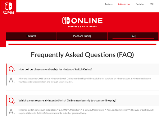
Detailed instructions, FAQs, and any extra documentation about errors and other such topics should be easily searchable and accessible. Keep in mind that websites and applications can offer two kinds of help, proactive and reactive.
Proactive help involves tutorials and tips which guide the user to avoid the potential problem to begin with. Its primary goal is to help familiarise the user with the interface.
A designer can implement this is to prioritize pull over push revelations, which are essential tips that pop up relevant to the task the user is undertaking. An example would be a small bubble with short, to-the-point information that appears when the user’s mouse hovers over a control button.
Reactive help, on the other hand, includes documents and videos for when the problem has already occurred, and the users are now trying to seek help and advice. Make sure information in this domain is detailed but relevant, and there’s no need to include anything evident because that’s just going to waste their time.
Wrapping up
These are just some brief rules for UI and UX design that you can incorporate in your work as a designer, but they are bound to be helpful.
However, remember that you can’t refine your design skills unless you put something out to the world and receive feedback from the users you are catering to. So, always keep trying new techniques and keep up with the changes of the audience and how their manner of online interaction is changing when it comes to websites and applications.
You can also check out these 4 web design concepts for inspiration in 2022 to help you understand what direction to take while going forward into the new year.
[elementor-template id="9369"]