Typography Compliance for Food Packaging: Font Size, Style, & Legibility Requirements

Typography isn't just for the aesthetic appeal of a packaging label, it is mandatory regulation under well-known food regulations like FDA for US, FSA for UK and more.
And this guide provides a practical, technically-grounded framework for navigating the complex world of food packaging typography. We will cover specific FDA and international requirements, explain the technical nuances of legibility, and demonstrate how to build a scalable, automated system for ensuring every label is compliant before it ever reaches the printer.
Key Takeaways
- Legibility isn’t optional: Non-compliance can lead to penalties and recalls.
- Font size depends on context: Rules vary by regulation and packaging size.
- Manual checks don’t scale: They’re slow and prone to costly errors.
- Automation reduces risk: AI speeds up reviews and ensures consistency.
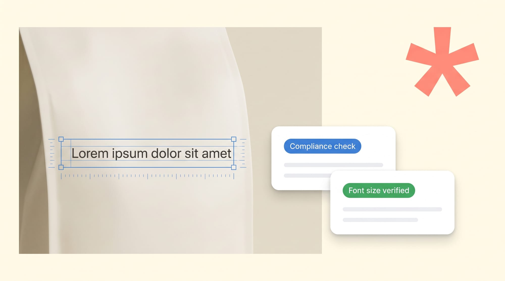
Automation is the New Standard
AI-powered platforms can analyze typography, regulatory statements, and brand guidelines in seconds, not hours. This allows teams to catch errors instantly, enforce consistency, and accelerate speed to market.
The Regulatory Framework: Why Font Size and Style Matter?
Typography on food packaging is not a design choice; it's a legal requirement. Regulators view clear and legible text as fundamental to consumer safety, enabling individuals to make informed decisions about allergens, nutrition, and ingredients. Ignoring these rules carries significant risk.
The Real Cost of Getting It Wrong
2026 has just begun, and in January alone, the FDA issued 19 recalls in the food, beverage, and drug sectors. Of these, 8 recalls (approximately 42%) were due to undeclared allergens, including wheat, sesame, milk, and egg. These aren't minor issues; they lead to product recalls, regulatory fines, and a complete loss of consumer trust. Getting typography right is your first line of defense.
What the FDA Actually Requires?
Some of the world’s most widely-followed and strict food & drug guidelines such as the FDA have established clear, enforceable rules on the fonts and sizes permitted on Nutrition Facts labels. The goal is to create a uniform, easily readable format that consumers can quickly understand. Any deviation, even by a fraction of a point size, can be flagged as a compliance violation during an audit.
Global Regulations Add Another Layer of Complexity
Internationally, the requirements become even more complex. In Canada, for example, new Front-of-Package (FOP) labeling regulations mandate specific symbol sizes based on the principal display panel's dimensions. For a package over 600 square centimeters, the symbol must be precisely 4.42 by 3.3 centimeters—a non-negotiable specification that can disrupt existing artwork and branding.
Why Manual Compliance Slows You Down?
For CPG companies managing multi-market portfolios, these variations create a significant compliance burden. A label compliant in the US may be illegal in the EU or Canada, necessitating different artwork versions and rigorous, market-specific reviews.
For regulatory affairs directors and packaging engineers, complying each label with international regulations can take up to months, hence delaying in label approval, product shipment, making you lose money with each passing day!
That’s why you need GoVisually’s AI Compliance tool, that assist your regulatory team with label compliance, leading to
- 80% faster approvals
- 50% faster time-to-market
- 30% lesser revision rounds
Our AI agents are trained over 10+ widely used label regulations, including FDA, FSA, USDA, and more! Book a demo now to understand how you can save up to 6 weeks in your entire label compliance process!
A Step-by-Step Framework for Typography Compliance Guide
Step 1: Mastering FDA Nutrition Facts Panel Typography
Typography requirements for the Nutrition Facts panel are defined under 21 CFR §101.9 and supported by general labeling provisions in 21 CFR §101.2. These rules specify hierarchy, spacing, and minimum size requirements to ensure information is clear and consistently presented.
Approved Font Styles: The FDA does not mandate a specific font family. However, all mandatory information must be clear, legible, and not decorative. Simple, highly readable typefaces (typically sans-serif) are commonly used to meet this expectation.
- Minimum Font Sizes: "Nutrition Facts"
- Heading: Must be larger than all other text on the panel.
- Serving Size & Servings Per Container: At least 10-point font.
- Calories: At least 22-point font.
- Vitamins & Minerals: At least 8-point font.
In addition, other mandatory information must comply with minimum height standards and formatting structure outlined in the regulation.
When managing multiple SKUs or frequent artwork revisions, even small point-size adjustments or hierarchy shifts can introduce compliance risk. For this reason, many teams move beyond manual review and implement structured validation processes to ensure typography remains aligned with FDA specifications before final approval.
Check out how you can verify these label requirements under 2 minutes here!
Step 2: Ensuring Legibility Across All Label Elements
Beyond the Nutrition Facts panel, general legibility requirements apply to all mandatory information on a food label, including the ingredient list, allergen declarations, and net weight statement. The FDA's general principle is that all required text must be "prominently and conspicuously" displayed.
While this may sound subjective, it is enforced with specific guidelines:
- Height Requirements: Letters must be at least one-sixteenth (1/16) of an inch in height, based on the lowercase letter "o".
- Contrast: There must be sufficient contrast between the text color and the background to ensure it can be easily read. A dark font on a dark background, for example, would be a violation.
- Font Style: Overly stylized, condensed, or decorative fonts that impede readability are not permitted for mandatory information. While a brand might use a custom font for its logo, the ingredient list must be in a simple, clear typeface.
Need typography checks structured to catch subtle legibility risks before they reach print? Use GoVisually’s AI Compliance tool now!
Step 3: Automating Typography Checks for Multi-Market Compliance
Managing typography for a global product portfolio is exponentially more complex. EU Regulation 1169/2011 has its own set of rules, including a minimum font size of 1.2mm for mandatory information (based on the x-height). Canadian regulations require bilingual text (English and French) in many cases, adding another layer of complexity to layout and font management.
A manual process simply cannot scale to meet this challenge without introducing significant risk and delays. Teams are forced to rely on regional experts, external consultants, and dense, multi-page checklists—all of which are slow and disconnected.
GoVisually's AI Playbooks System solves this scalability problem. You can configure a unique playbook for each target market.
- Create a "Canadian Market" Playbook: This playbook automatically triggers on any file with "Canada" in its custom metadata. It first runs the EU Regulatory Agent (customized for Canadian rules via the knowledge base) to check FOP symbol sizing and bilingual requirements, then the Barcode & QR Code Validator for GS1 compliance.
- Configure an "EU Market" Playbook: This playbook validates against EU 1169/2011 using the EU Regulatory Agent, checking for the 1.2mm x-height rule, QUID declarations, and proper allergen highlighting.
- Deploy a Universal "Print Readiness" Playbook: Before any file is finalized, this playbook runs the Print Readiness Agent to check for embedded fonts, CMYK color mode, and proper bleed settings, preventing costly printing errors.
By leveraging Custom Fields to tag each proof with its target market, the correct AI Playbook is automatically initiated upon upload. The compliance team doesn't need to remember which rules apply to which product; the system handles it for them, providing a complete compliance report with visual overlays pinpointing every issue.
Check out our detailed guide how GoVisually's AI can help you slash down 80% of compliance cycle and cost.
Step 4: Integrating Brand Consistency with Regulatory Compliance
Compliance isn't just about meeting government regulations; it's also about adhering to internal brand standards. Inconsistent typography can dilute brand identity and confuse consumers. A common challenge is ensuring that logos, brand-specific terminology, and approved marketing claims are used correctly across all packaging.
The old way of managing this involved brand managers manually reviewing proofs, cross-referencing a 100-page PDF of brand guidelines. This is a massive bottleneck in the approval process.
GoVisually provides a more intelligent solution. Using the Knowledge Base Integration, you can upload your brand's typography and style guide directly into the platform. The AI automatically extracts these rules, and they become part of the automated check.
- The Visual Elements Validator can detect if an outdated logo is used or if the logo is placed in a "no-go" zone on the packaging.
- The Spelling & Grammar Agent can be configured with a custom dictionary to flag violations of brand-specific terminology (e.g., ensuring "Brand-Name Sweetener™" is always used instead of just "sweetener").
- The Dynamic Compliance Auditor can run checks against your marketing claims library, ensuring that only approved health or product benefit claims are used on the final artwork.
This creates a single, unified review process that checks for both external regulatory compliance and internal brand compliance simultaneously, eliminating the need for multiple, sequential review cycles.