
Packaging prepress checklist: bleed, CMYK, fonts and a print-ready PDF
Bleed, safe area, CMYK, spot inks, fonts, white ink, varnish, the dieline and the barcode: one checklist before every pack goes to print.
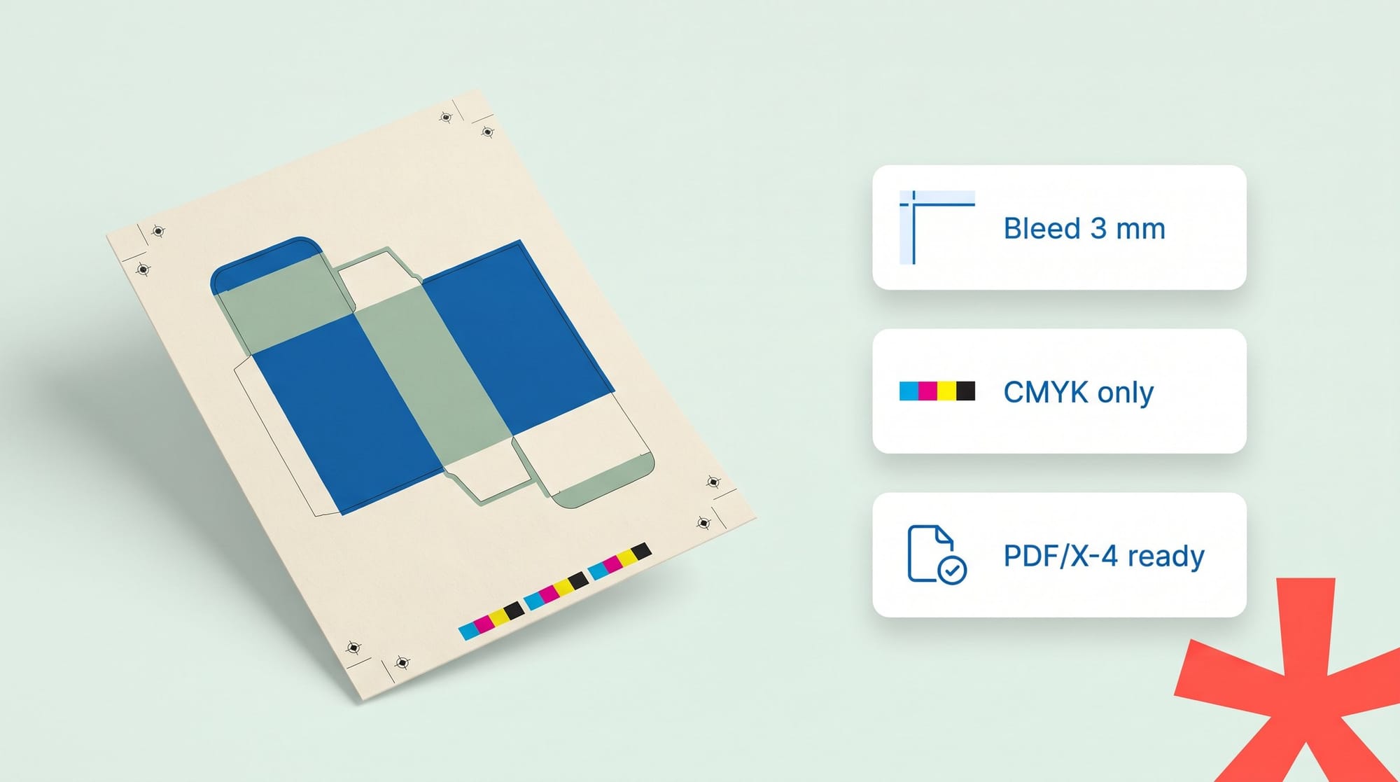
Packaging prepress is the work that turns approved artwork into a file a printer can use. You check bleed, safe area, colour mode, spot inks, fonts, image resolution and the dieline, then export a PDF/X file. Bleed is extra artwork that runs past the cut line, usually 3 mm (0.125 in), so no white edge shows after cutting.
Most prepress guides are written for flyers and books. Packaging has more to get right. A carton or pouch also needs white ink, varnish, a dieline layer and a barcode that scans. Each one is a separate instruction to the printer, and each one can go wrong.
This guide gives you one checklist for all of it. Use it before every file goes to print.
Why packaging prepress is different
A flyer is a flat sheet cut to a rectangle. A pack is cut, creased, folded and glued. It may be printed on film, foil or brown board. That changes what the file needs:
- The cut and fold lines come from a dieline, not from the page edge.
- Clear and metallic materials need a white ink layer under the colours.
- Finishes like varnish and foil need their own layers.
- The barcode has to scan at the till, so its colour and size are fixed.
- Flexo and corrugated presses take less ink than offset presses.
A mistake here costs more than a reprinted flyer. It can mean new printing plates, a lost press slot or a pallet of cartons that can't be sold.
The packaging prepress checklist
Work through these 12 checks in order. Ask your printer for their spec sheet first. Their numbers beat any general rule, including the ones below.
- Build on the printer's dieline.
- Use the dieline your printer or converter sent, at 100% scale.
- Keep it on its own layer, as a spot colour named something clear like "Dieline".
- Set it to overprint so it never knocks a hole in the artwork.
- Add bleed on every cut edge.
- 3 mm (0.125 in) is the common minimum.
- Some flexo and corrugated printers ask for more. Check.
- Extend the background, not just the colour block, past the cut line.
- Keep text inside the safe area.
- Keep text, logos and claims at least 3 mm inside the cut line.
- Keep them away from fold lines and glue flaps too.
- Set the colour mode to CMYK.
- No RGB images or RGB colours in the print file.
- Use the colour profile your printer gives you. See the CMYK section below.
- Name spot colours exactly.
- Use the exact Pantone name, like PANTONE 350 C.
- Delete unused swatches and duplicates ("350 C" and "PANTONE 350 C" become two plates).
- Decide which brand colours print as spot inks and which as CMYK builds.
- Embed or outline every font.
- A missing font gets swapped at the printer, and your text reflows.
- If you outline the text, keep a live-text copy for the next edit.
- Check image resolution at final size.
- Aim for 300 ppi at the size the image prints.
- An image scaled up to 200% has half its resolution.
- Check thin lines and small text.
- Strokes under 0.25 pt may vanish on press.
- Small reversed text (white on a dark colour) fills in first. Make it a little bolder.
- Set up white ink.
- For clear film, foil or metallic board, add a white layer as a named spot colour.
- Set it to overprint. Ask the printer whether they want it choked (pulled in slightly).
- Leave white out where you want the material to show through.
- Put varnish and finishes on their own layers.
- Spot varnish, foil and embossing each get a named spot colour, set to overprint.
- Line them up exactly with the artwork they sit on.
- Make the barcode scannable.
- Print the bars in one solid dark ink, ideally 100% black.
- Put them on a white or light background.
- Never use red bars. Scanners read with red light, so red bars disappear.
- Keep the quiet zones (the clear space at each side) and don't shrink the code below the size your GS1 guidance allows.
- Need a fresh code? The free Barcode Generator makes UPC-A and EAN-13 files.
- Export a PDF/X file and preflight it.
- Use the PDF/X standard your printer asks for, usually PDF/X-4 or PDF/X-1a.
- Remove comments and form fields. They can print.
- Run a preflight check on the final PDF, not on the design file.
Bleed, trim and safe area: what's the difference?
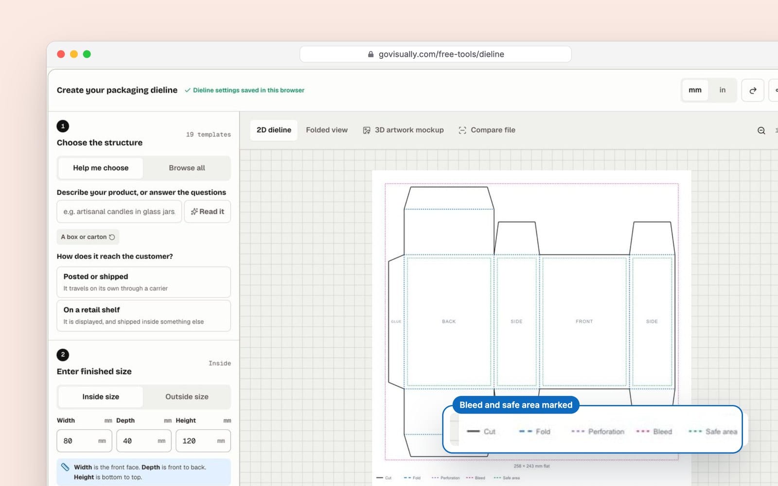
These four lines sit on top of each other in a packaging file. People mix them up all the time.
| Line | What it is | What goes there | Typical size |
|---|---|---|---|
| Bleed | Artwork that runs past the cut | Background colour and images only | 3 mm (0.125 in) outside the cut |
| Trim or cut line | Where the blade cuts | Nothing. It's an instruction. | The finished size |
| Safe area | The zone where nothing gets cut off | Text, logos, claims, barcodes | 3 mm or more inside the cut |
| Fold or crease line | Where the pack bends | Nothing important across it | Set by the dieline |
Trim marks (crop marks) are small lines printed outside the artwork to show the cutter where to cut. Bleed is the artwork itself, running past those marks. On a pack, the dieline does the job trim marks do on a flat sheet.
If you don't have a dieline yet, the free Dieline Generator draws one from your box size. It exports SVG, PDF, DXF or PNG with cut, fold, bleed and safe layers. Still check it against your printer's own template.
CMYK vs RGB (and where Pantone fits)
Screens make colour with light: red, green and blue (RGB). Presses make colour with ink: cyan, magenta, yellow and black (CMYK). RGB can show bright greens and blues that CMYK ink can't reach. If you send RGB, the printer's software converts it, and those colours go flat or shift.
Spot colours, like Pantone inks, are pre-mixed. They print the same exact colour every time. Brands often use one or two spot inks for the logo colour and CMYK for photos.
| RGB | CMYK | Spot (Pantone) | |
|---|---|---|---|
| Made for | Screens | Process printing | Exact brand colours |
| Use in a print file? | No | Yes | Yes, as named spot inks |
| Colour match | Changes when converted | Depends on press and profile | Most consistent |
| Cost | n/a | Four plates | One extra plate per ink |
Convert to CMYK in your design app, with your printer's profile. Then look at the colours again. Don't leave the conversion to the press.
How to export a print-ready PDF
A print-ready PDF is a file the printer can make plates from without fixing anything. In Illustrator or InDesign:
- Choose File > Save As (Illustrator) or File > Export (InDesign), then Adobe PDF.
- Pick the preset your printer asks for, such as PDF/X-4.
- Under Marks and Bleeds, set bleed to 3 mm, or your printer's number.
- Check that the output intent matches your printer's colour profile.
- Keep the dieline, white and varnish layers as spot colours. Don't flatten them into the artwork.
- Name the file clearly: product, version and date.
Then preflight the PDF you just made. That's the file the printer will use.
Check the file before it goes to the printer
Preflight is a check of the PDF itself. It finds problems a person can't see on screen, like an unembedded font or an RGB image.
We ran a draft of the Nourish & Co. Peanut Butter Crunch bar wrapper through GoVisually's free PDF Pre-Flight Checker. It came back 5 passed, 5 to review and 2 failed:
- Fail: the file was RGB.
- Fail: one font wasn't embedded.
- Review: no bleed (the trim box matched the page).
- Review: the lowest image was 255 DPI.
- Review: ink coverage peaked at 296%. Fine for offset, maybe too high for flexo.
- Review: PDF 1.4, not PDF/X.
- Review: 7 elements sat within 3 mm of the trim edge.
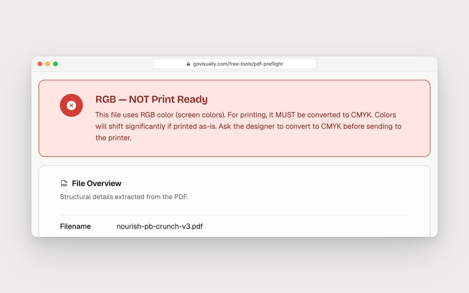
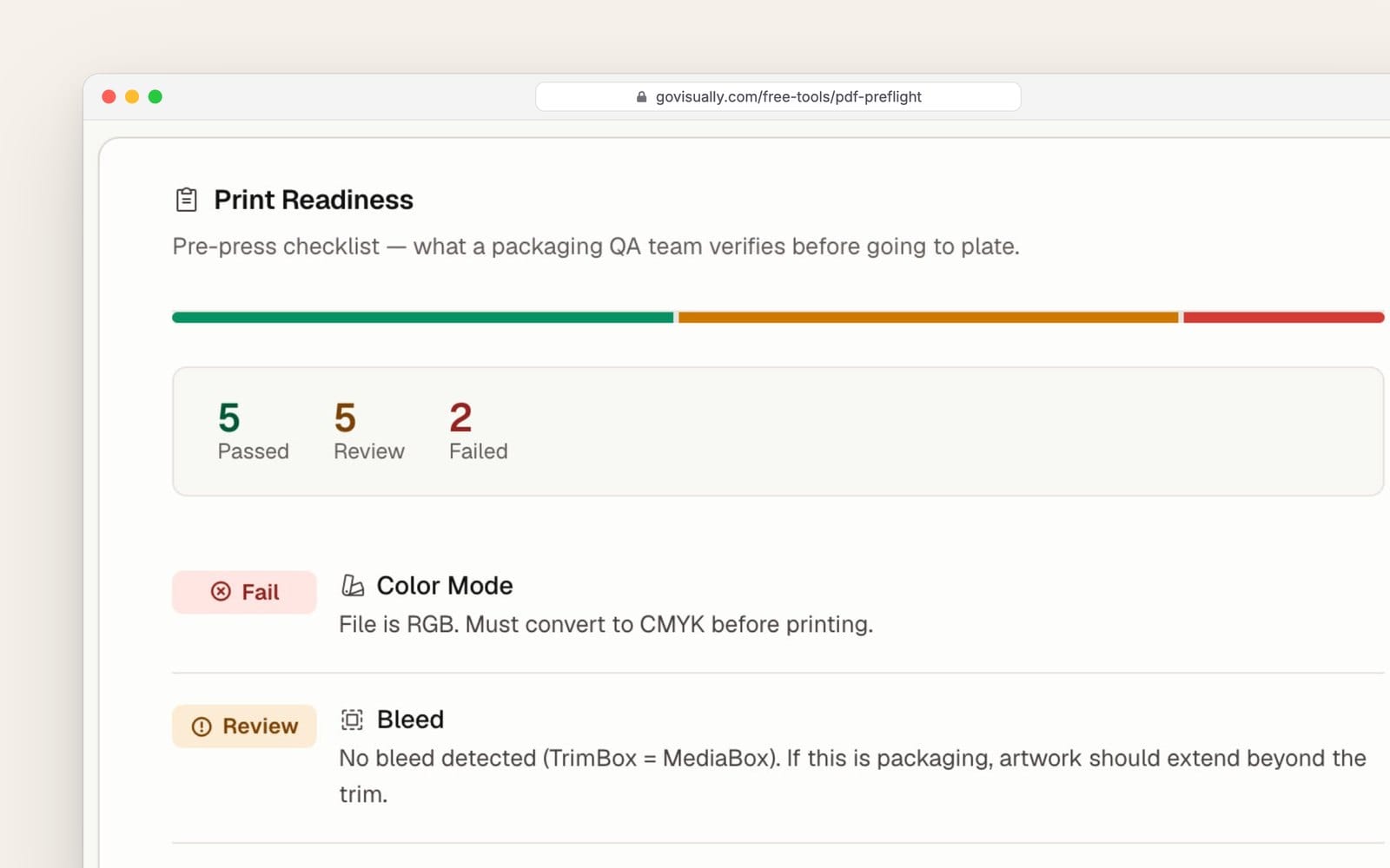
The tool checks colour mode, spot colours, bleed, image resolution, font embedding, ink coverage, PDF/X, ink separations, annotations, hairlines, overprint, safe zone, ICC profile and PDF health. The ink separations list shows technical layers too, like the dieline and crease lines. The report shows on screen. You give an email to download it as a PDF.
If your team reviews artwork in GoVisually, the same kind of check sits inside the proof. Open the proof's AI tab, choose Print readiness and click Run check. It runs 14 pre-press checks on the PDF and shows the results next to the artwork. Your reviewers see print problems in the same place they approve the design.
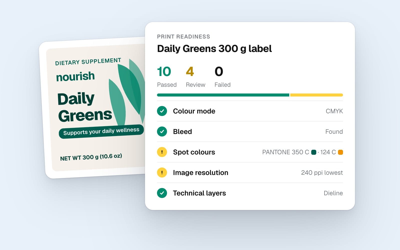
Both checks read the file. They don't approve a pack, and they don't replace your printer's own preflight. Treat a Review or Fail as a question for your designer or printer. A person makes the call.
After prepress: proofs and the press check
A clean PDF is the start of printing, not the end. The printer still makes plates, sends a proof and runs the press. Things can change on the way. A font can be swapped, a colour can drift, or the wrong version can get printed.
That's the next step. Our guide to print proofing and the press check shows how to compare the printed pack with the approved artwork. For the approval steps before prepress, see the artwork approval checklist for CPG teams.
FAQs
What is bleed in printing?
Bleed is extra artwork that runs past the cut line. The blade can move a fraction of a millimetre. Bleed makes sure colour still reaches the edge, so no thin white line shows.
How much bleed do I need for packaging?
3 mm (0.125 in) on every cut edge is the common minimum. Some flexo and corrugated printers ask for more. Always use the number on your printer's spec sheet.
What's the difference between bleed and trim marks?
Trim marks are short lines that show the cutter where to cut. Bleed is the artwork that runs past those lines. On packaging, the dieline shows the cut and fold lines instead.
Should packaging files be RGB or CMYK?
CMYK, plus any named spot colours. RGB is for screens. If you send RGB, the printer converts it, and bright colours often go dull.
What is a print-ready PDF?
It's a PDF the printer can use without changes. It has bleed, CMYK or spot colours, embedded fonts, images at about 300 ppi and the right PDF/X standard.
Do I need to outline fonts?
Not if they're embedded in the PDF. Many printers still ask for outlined text on packaging. If you outline, keep an editable copy for the next version.
What is a preflight check?
Preflight is an automatic check of a print file before it goes to press. It looks for problems like RGB colour, missing bleed, low-resolution images and missing fonts.
Is Pantone better than CMYK?
Pantone spot inks give a more exact, repeatable colour, so brands use them for logo colours. Each one adds a printing plate, so they cost more. Photos still print in CMYK.
Want print checks to sit next to your artwork approvals? See how GoVisually's artwork management software keeps review, approval and print readiness in one place.
Disclaimer: This article is general information, not legal or regulatory advice. Rules and product features change, and we can get things wrong. Check the current rules with the relevant regulator or a qualified adviser before you print. Last checked: November 2026.